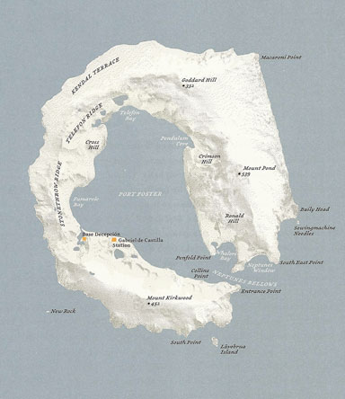
Deception Island (Antarctica), Antarctic Ocean, drawn by Judith Schalansky
When we dream of escaping from frantic modern lives into another more perfect kind of existence, the image of an island often comes to mind, a refuge where time slows down, the living is easy and we can at last find inner peace. It’s a fantasy, practically a Jungian archetype now, endlessly reworked in movies, advertising and travel brochures. Take a well-earned vacation lounging around on a palm-fringed, sun-kissed ribbon of golden sand, knowing all the while that the essential conveniences of 21st-century travel — poolside service, round-the-clock power showers, wi-fi — are close at hand in your newly built luxury hotel complex.
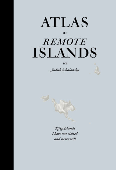
A casual glance at Judith Schalansky’s Atlas of Remote Islands might lead one to expect the ultimate travel guide: islands so far off the radar of mass tourism that only the most discerning travelers know anything about them, the perfect place, perhaps, for a visionary entrepreneur oozing style and savoir faire to locate the last word in hip hotels. But the cover is too downbeat for that, the type too obviously historical. Then you notice the subtitle: “Fifty Islands I have not visited and never will.” Why ever not, if they make such fabulous holiday-of-a-lifetime destinations?
Design by Judith Schalansky. Penguin Books, 2010
Schalansky’s book won a prize in Germany as the most beautiful book of the year. It deserves to win several more. Atlas of Remote Islands is a stunningly accomplished piece of work, as well as being a rare feat of total authorship. Schalansky wrote the text, designed the pages — the typography is faultless — and drew all the maps. Her conception of what this book should be permeates every detail: the restrained but ravishing use of color, the elegant typographic devices to convey distances and dates, the elaborate indexing of places on these islands so obscure, so difficult to reach, that no reader is ever likely to visit them. Many will have been seduced, as I was, by a love of islands and admiration for the book’s design, while having no inkling before reading the atlas of what it is really about.
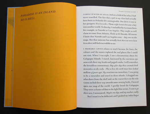
Not that Schalansky, born in East Germany before reunification, conceals her purpose. “Paradise is an island,” she titles her introduction. “So is hell.” No doubt some islands far from civilization are idyllic — before the people arrive there. From her historical researches in the archive, Schalansky has brought to light alarming stories of cannibalism, sexual abuse and murder. On Clipperton Atoll in the Pacific, a Mexican lighthouse keeper ruled for two years, raping and killing until the women he dominated struck back with a hammer and disposed of him. Only a few years ago, half the adult males on Pitcairn Island, descended from the sailors on the Bounty who mutinied, were convicted of abusing underage girls. “There is no untouched garden of Eden lying at the edges of this never-ending globe,” writes Schalansky. “Instead, human beings travelling far and wide have turned into the very monsters they chased off the maps.”
She recounts the tale of Scott Moorman from the San Fernando Valley who went missing at sea with four companions. Nine years later his remains were found buried in the sand near his wrecked boat on Taongi Atoll. No one knows what happened to the other men. Schalansky paints a horrifying picture of rotting whale carcasses left by whalers in the bay at Deception Island. As if resentful of these destructive intrusions, the land itself is often hostile. On Macquarie Island, a mob of furious penguins snap at a man's legs, like a lost scene from Hitchcock. Describing a sailor’s fear and panic on finding himself trapped in a dense thicket on Socorro Island, Schalansky reiterates her theme: “This is what hell must look like.”

Macquarie Island (Australia), Pacific Ocean
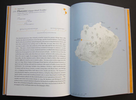
Floreana, Galapagos Islands (Ecuador), Pacific Ocean
By the end, it’s entirely clear why Schalansky has no intention of ever visiting these 50 islands. This is in no sense a travel guide. There are more than enough of those breezy tip books already, peddling a give-it-to-me-now sense of entitlement to a world that we believe (in our billions) to be ours for the taking. We delude ourselves, just as the hapless travelers in these eloquently told tales often deluded themselves in the quest for a paradise they didn't have it in them to create.
Meticulously detailed maps are a way of laying claim to territory appropriated for your own ends. “Every map is the result and the exercise of colonial violence,” writes Schalansky. She annexes the deceptively sedate and authoritative form of the atlas — the most poetic of books, in her view — to express some disquieting truths.


Comments [5]
12.10.10
09:46
12.11.10
07:07
It seems unlikely that Schalansky was denied the chance to review the English layout so it looks like she chose to live with the line. As both author and typographer, she faced an interesting conflict. Leave the page a line short? Clumsy. Lose the paragraph indent by joining the paragraphs together? Not good. Rewrite and then re-translate? Maybe but where do you stop? In her place I'd have done the same thing -- this kind of widow has never seemed to me a great problem. The writing should come first.
12.12.10
11:57
Since many sophisticated German words are compound, they are very long. Sometimes giant. In English the phrase "remote island paradise" which are three distinct words, becomes in German "Ferninselparadies", one long word. The relentlessly challenging word lengths mean German typographers tend to be (have to be) far less fussy at breaking words strictly at the word-root, as in English, because in compound words where is the word root? Or worrying if a word breaks into an orphan.
In German there is also less elasticity over word order, a further restriction on editing a line to take a word back...
12.13.10
08:51
In a deep and dark December;
I am alone,
Gazing at the
widow . . .
I am a rock,
D A D A
D A D A
D A D A . . .
I am a fountain.
12.13.10
09:47