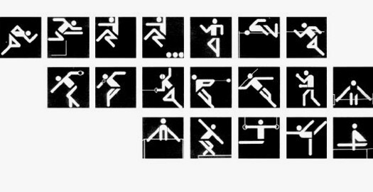
Pictograms for the Munich Olympics, Otl Aicher, 1972
While watching the Olympics this past week, I noticed another competition. Hiding in and around the swimmers, vaulters, runners and shotputters swarmed a veritable Armageddon of logos. Front and center, of course, are the five interlocking multicolored rings that have symbolized the Olympics since the 1920s, designed by Baron Pierre de Coubertin, founder of the modern Olympic Movement. Based on patterns common in ancient Greece, the five rings represent Africa, the Americas, Asia, Europe, and Oceania; every national flag in the world includes at least one of the five colors.
You would think that such a powerful, well established symbol would suffice. But no. The sponsoring city develops its own separate logo, usually after having developed an entirely different logo as part of the competition to host the games. Then competing nations develop their own logos, as do national teams, as do the official broadcasters. Then sponsors jockey for position, creating combinations of their own corporate logos with the Olympic entity they're sponsoring, resulting in a logo for, say, the Official Breath Mint of the 2004 Athens Olympics US Water Polo Team. All of these contraptions pay for the privilege of incorporating de Coubertin's pretty rings, usually submerged beneath a heap of other crap.
You wouldn't blame graphic designers for wanting to steer clear of this mess. But nearly 250 firms from 14 countries submitted proposals to design the symbol for the 2004 Olympics; the winning olive wreath ("kotinos") design is a collaboration between Greece's Red Design Consultants and Wolff Olins. The appeal, of course, has much to do with the prestige of the games, and even more, with graphic design triumphs from past Olympics. Of these, everyone has their favorites; here are my personal nominations for medals.
Gold: Otl Aicher, Munich, 1972
Pictograms have a long history, with figures like proto-information architect Otto Neurath playing major roles. They first appeared at the Olympics in London in 1948, and came into wide use, and necessarily so, in Tokyo in 1964, with a symbols for individual sports developed by Masasa Katzoumie and Yoshiro Yamashita.
But it was eight years later that Otl Aicher, design director for the Munich 1972 games, developed a set of pictograms of such breathtaking elegance and clarity that they would never be topped. Aicher (1922-1991), founder of the Ulm design school and consultant to Braun and Lufthansa, was the quintessential German designer: precise, cool and logical. The design system he developed for the Munich games, all geometry, grids and Univers 55, is perhaps his greatest achievement.
The pictograms were used once again, for the Montreal games, and then were licensed to ERCO . Since then, each Olympics has been given the more-or-less impossible task of topping Eicher's perfect ten with their own offerings. This has led to some renditions of surpassing corniness, with this year no exception.
Lest anyone get misty-eyed about design's Golden Age, according to one account Aicher's original "wreath of rays" symbol for the Munich games was rejected and opened to competition. Over 2,000 entries were considered and rejected before the Olympic committee returned to Aicher for a variation of his original solution.
Silver: Lance Wyman, Mexico City, 1968
Has any design scheme so perfectly caught the graphic spirit of the times as Lance Wyman's op-art influenced motifs for the 1968 Olympic games in Mexico City? Starting by incorporating the Olympic rings into the circular portions of the numbers 6 and 8 (taking liberties with the sacred symbol which have rarely been permitted since), Wyman, in collaboration with Pedro Ramirez Vazquez, architect and President of the Organising Committee for the Games, Eduardo Terrazas, worked out a geometric fantasia of concentric stripe patterns that expanded to engulf a custom alphabet, groovy minidresses, and eventually entire stadia.
Designed to be nothing if not of the moment, Wyman's aesthetic has proven surprisingly durable. As Peter Bilak has pointed out in dot-dot-dot 7, there's no mistaking the influence behind Armand Mevis and Linda van Deursen's 2003 identity for the Museum Boijmans Van Beuningen in Rotterdam.
Bronze: Sussman/Prezja and Jon Jerde, Los Angeles, 1984
Trust Los Angeles to finally understand how to stage a modern Olympics: design it to be seen on television. So out with the costly white elephants of permanent venues built of steel and concrete: Deborah Sussman and Jon Jerde, working on a tight schedule and a tighter budget, led a team of designers that created one of the most cohesive Olympic design schemes ever. It was all Hollywood stagecraft, including fabric banners, painted cardboard shipping tubes and what was reportedly all the aluminum scaffolding west of the Mississippi.
The dazzling color scheme of the 1984 LA games, which Sussman dubbed "festive Federalism" was purportedly based on the hot pinks and oranges of southern California and Baja Mexico, but looked to American designers like a hyped-up reiteration of the prevailing West Coast design aesthetic led by Michael Vanderbyl and April Greiman. And why not? It was the ultimate California moment.
Sussman's brilliant success had a not-so-brilliant aftermath, as dozens of designers, developers, and local Chambers of Commerce burghers realized that they had been delivered a formula for civic identity on the cheap. This led to a "festive" profusion of garish banners and over-decorated wayfinding systems in every down-on-its-luck shopping mall and town square in America, all of whom hung the crepe and waited for a Hollywood close up that would never come.


Comments [34]
However, I have to suggest an alternative to your gold medal. Although Aicher's pictograms surely have been the most influential, my gold would go to Roger Excoffon for his beautiful pictograms for the 1968 Winter Games in Grenoble.
(Can anyone find a link to these?)
Their repeating-line patterns predate Lance Wyman's version by nine months, and have a more visceral connection to the sports. Meanwhile, the influence of Wyman's set also lives on in Ogilvy's identity for the Times Square Business Improvement District.
08.23.04
11:40
Perhaps you meant the poster and not the emblem? Links on the right, down the page a bit.
g
08.23.04
01:26
08.23.04
02:36
This site has a pretty representative survey of pictograms from nearly every Olympiad and Winter Games since Tokyo.
08.23.04
05:07
08.23.04
09:43
Thanks for the informative Editorial and links on
Olympic Pictograms.
Gunnar Swanson and myself were having a conversation in May 2004 on the same subject.
I have the 1984 Stars In Motion Identity Manual
Designed by Robert Miles Runyan. The Official LA Olympic Identity Designed and Developed by Jim Berte while at the Runyan Office.
Both Gunnar and myself commented on Otl Aicher's
Stupendous Job Designing the Olympic Pictograms.
At the same time, we noticed Keith Bright's Pictograms for the 1984 Los Angeles Olympics were nearly identical.
Perhaps, the Los Angeles Olympics were the biggest Olympic Fiasco in IOC History.
Anyone in Design Observer Community interested in reading about the LA Olympic Fiasco should search their archives or obtain a copy of CommArts Magazine Jan-Feb 1984.
It was certainly a Comedy of Horrors.
In reference to Olympic Pictograms. I would be remiss if I didn't acknowledge the fine work by
Yusaka Kamekura in 1964s Japan Olympics.
Although, Yusaka Kamekura didn't create the Pictograms. I have to give his Development of the Olympic Games Design the Silver Medal. Shared with Lance Wyman's 1968 Mexico Identity Implementation.
You don't hear a lot about Lance Wyman now-a-days.
With his Partner Bill Canan. Wyman and Canan
were in the forefront of American Corporate Identity. I dearly miss them. I know Lance Wyman is on the Board of Society of Environmental Designers.
Gunnar, actually worked at the Dominguez Hills Velodrome in 1983 preparing for the Olympic Cycling Event.
I'll see if he'll chime in.
Another Olympic Website Link:
Beginning with Olympic Symbols from 1896
http://www.aldaver.com
08.24.04
01:27
I looked in vain online for an image of Sussman/Prezja's graphic standards poster for the games, showing the LA 84 "kit of parts." Odd, because it has been in many museum exhibitions.
08.24.04
06:58
Don, I'm impressed. Both by the pictograms and your perseverence in finding them. I confess that I initially scoffed at the plea for help (did I think "wusses"?—ay, the word crossed my mind), but I soon gave up my own attempts to hunt them down. So thanks for the web savvy, which will allow us to link to those 1964 Japan Olympics pictograms noted by D'Maven.
08.24.04
11:53
an article on Excoffon in U&lc:
Link
08.25.04
08:56
And with the advent of the Web and digital printing and HDTV, I'm surprised that pictograms have not taken the full-color-and-shading trend that can be seen in recent logo like Kinko's and UPS.
Maybe I just like the new better than the past.
08.25.04
04:54
For any misunderstanding: The olympic sport pictograms for the modern Olympic Games (1896 - ...) first appeared at 1936 Berlin's Olympic Games (Wei Yew, 'The Olympic Image - The First 100 Years', Canada: Quon Editions).
Here is my ranking:
Gold:
- Sarah Rosenbaum (Graphic Designer) - Lillehammer (1994) (their inspiration was based on the pre-historic Norwegian rock carvings, like the oldest known portrayal at Rodoy Island in Alstahaug municipality in northern Norway).
- Otl Aicher, Munich (1972)
Silver:
- Nikolai Belkov, Moscow (1980)
- Lance Wyman, Mexico City (1968)
Bronze:
- Masasa Katzoumie (Art director) and Yoshiro Yamashita (designer), Tokyo (1964)
- Yiannis Kouroudis (Creative Director) and Chrysafis Chrysafis, Dimitra Diamanti (Designers): k2 Design Agency, Athens
R E F E R E N C E S
GENERAL FOR OLYMPIC SPORT PICTOGAMS AND PICTOGRAMS OR PICTOGRAPHS
- International Olympic Committee (I.O.C.). 'Olympic Message - Olympic Pictograms' - No 34, Switzerland: International Olympic Committee, 1992
- Frutiger, Adrian. 'Type Sign Symbol', Zurich: ABC, 1980
- HME Media. 'Symbols '98 Encyclopaideia Pro', Software, 1997 - http://www.symbols.com
- 'Ηistory of Graphic Design', Design Systems for the Olympic Games, p. 381-388
- Goddy, Karen R. & Freedman-Harvey, Georgia L. 'Art and Sport, Images to Herald the Olympic Games, Los Angeles: Amateur Athletic Foundation of Los Angeles (A.A.F.L.A.), 1992
- P22 Type Foundry - http://www.p22.com/typecaster/master/caster.html (select 'P' and then: Petroglyphs African, Australian, European, North American)
- Amateur Athletic Foundation (Search Page) - http://www.aafla.com/search/search.htm
- Get2Testing - http://www.get2testing.com/pictograms.htm
- Wilkins, John. 'Essay Towards a Real Character and Philosophical Language', London: Folio,1668
- Olympic Studies Centre - http://olympicstudies.uab.es/eng/yellow/dir/os.html
1948 LONDON SUMMER OLYMPIC GAMES
- Official Olympic report for London '48 Olympic Games - http://www.aafla.org/6oic/OfficialReports/1948/OR1948.pdf
1968 MEXICO SUMMER OLYMPIC GAMES
- Lance Wyman - http://www.lancewyman.com
- Official Olympic report for Mexico '68 Olympic Games, Vol. 10 (read chapter: 10. Informacion_y_Comunicaciones) - http://www.deporte.org.mx/biblioteca/M68/Disco2/libro/capitulo_10.pdf
1972 MUNICH SUMMER OLYMPIC GAMES
- Official Olympic report for Munich '72 Olympic Games, Vol. 1 (read chapter: 18. Visual Design)
http://www.aafla.org/6oic/OfficialReports/1972/1972s1.pdf (44 MB)
- Design, sport and culture, colour consciousness, Olympic Games Munich 1972, Author: AICHER Otl (FRG)- http://www.ioa.org.gr/books/sessions/1986/1986_163.pdf (7 MB)
1980 MOSCOW SUMMER OLYMPIC GAMES
- PictoMania - http://picto.mania.ru/pict/olymp/olymp-80.htm
1988 SEOUL SUMMER OLYMPIC GAMES
- Official Olympic Report for Seoul '88 Olympic Games, Vol. 1 (read chapters: 22. Public Relations and 23. Design and Environmental Decorations) - http://www.aafla.org/6oic/OfficialReports/1988/1988v1.pdf (75 MB)
- Examples for pictograms from the 24th Summer Olympics 1988 in Seoul - http://www.get2testing.com/Pics_O_88_E.htm
- Bu-Yong Hwang (Designer of 1988 Seoul's olympic sport pictograms) - http://www.buyong.com/picto.htm
1992 BARCELONA SUMMER OLYMPIC GAMES
- Olympic Official Report for Barcelona '92 Olympic Games, Vol. 3 (read chapter: 10. Image and Communication) - http://www.aafla.org/6oic/OfficialReports/1992/1992s3.pdf ( 82 MB).
- 'Symbol and logo of Barcelona'92 Olympic Games' Josep M. Trias (Creator) - www.blues.uab.es/olympic.studies/web/eng/blue/dossier/down/wp082_eng.pdf
- COOB '92 'Image and Communication Division. 'The Sports Pictogrammes of the Barcelona '92 Olympic Games', Barcelona: Centre Impremta Municipal, 1992
1994 LILLEHAMMER WINTER OLYMPIC GAMES
- Olympic Official Report for Lillehammer '94 Olympic Games, Vol. 2 (read chapter: Public Relations)- http://www.aafla.org/6oic/OfficialReports/1994/E_BOOK2.PDF (32 MB)
2000 SYDNEY SUMMER OLYMPIC GAMES
- 2000 Sydney Olympic Games' Spectator Guide - http://www.gamesinfo.com.au/pdf/spectator.pdf (11MB)
2004 ATHENS SUMMER OLYMPIC GAMES
- Athens 2004 Sport Pictograms (Vector format > .swf) - http://olympics.ert.gr/en/images/athlimata/athlimata2.swf
- Athens 2004 Olympic Pictograms (Bitmap) - http://www.athens2004.com/en/35Pictograms/nochildren
- Athens 2004 Paralympic Pictograms (Bitmap) - http//www.athens2004.com/en/19ParalympicPictograms
08.27.04
07:25
Just imagine what it took for Excoffon to draw all those beautiful curves.
08.27.04
02:14
08.28.04
03:57
09.03.04
04:55
Most of the olympic posters, flash site, a little confusing but you'll find your way
09.05.04
10:32
10.11.04
09:25
10.15.04
07:21
10.15.04
12:57
Aicher's posters are beautiful (nice colors), but the website says that a large number of the posters were commissioned to various artists and designers, including Josef Albers and Max Bill (among many others). The thing that really threw me was that none of these designers seemed to be art-directed in any way, other than being told that 'it's for the Munich Olympics.'
Does anyone know the purpose these posters served in the actual promotion of the games? Or of any other large-scale project in which the art director relinquished as much say as Aicher did?
10.16.04
09:20
10.26.04
07:31
10.27.04
10:04
10.27.04
02:54
I went to the USOC in Lake Placid this summer while family worked there and noticed that after an Olypic Games is finished, the logo design is not. As much as the 2006 Torino Italy Olympics and this summers in greece were being promoted, you could see as much merchandise and collectors items from the 1980 Olympics in Lake Placid where the US defeated the Russians. Basically the point I am getting at is that without the sport the design would not matter. With great design though, the governing bodies could bring in larger interest and eventually funds.
One other thing that I noticed while in Lake Placid is that the Olympic posters, which were discussed have lost luster. They are representative of the games and what happened during them. The 1980 poster of an eagle taking on a russian bear was memorable, unique and very appealing. With the advance of technology is seams as though the posters have suffered. This is unfortunate, and a great reason for designers to challenge themselves to take on such projects as IOC posters.
There should be a unified pride in the sport and the design to promote the sport.
10.27.04
06:03
10.28.04
12:34
11.16.04
12:20
Wei Yew, 'The Olympic Image - The First 100 Years', Canada: Quon Editions
11.16.04
01:58
11.16.04
05:51
01.10.05
10:53
01.18.05
03:53
The IOC apparently has a division that reviews the "look of the games" and I believe is headed by Brad Copeland from the Atlanta Games. who pulled things together under the "quilt of leaves" theme and saved what could have been a design fiasco. For more info, please see www.olympics.org (they have a white paper on the subject of Olympic Identity) for the in-fighting at the Atlanta Games, please read CA May/June 1996.
As for my opinion, I tip my hat to Aicher, Wyman and Susman/Preja but don't forget that the Barcelona Games broke the mold for logo as well as mascot design from what has been done at previous games thanks to Josep Trias and specially Javier Mariscal.
01.24.05
09:42
02.18.05
02:58
Hi, I am looking for information regarding the 1936 Berlin Pictograms.
03.11.05
09:02
wir möchten gerne auf unserem Programm für den Hochschulsport der Universität Passau die von Ihnen entworfenen Piktogramme für München 72 verwenden. Woher bekomme ich druckfähige Vorlagen und was kosten diese Vorlagen.
Gerne erwarte ich Ihre Antwort.
Mit freundlichen Grüßen
Franz Held
09.22.08
05:28
05.25.10
03:11