The new postage stamps honoring industrial design have given writers an excuse to bring up old timers. I’m grabbing this chance to write about Eliot Noyes, one of the USPS 12, and particularly to praise his IBM Selectric, which celebrates its 50th anniversary this year.
Who knows how many Selectrics continue to be used around the world? I would guess in the thousands. The machine’s works are sturdy, and ribbons are not hard to find from either online retailers or the oddball little office machine shops that continue to exist in many towns.
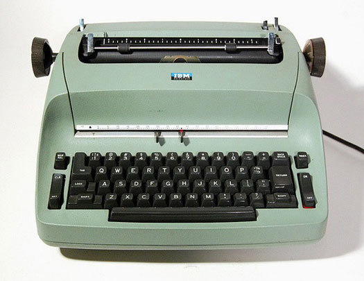
Turn on the Selectric, and the motor makes a patient, low humming sound, very different from the burbling of a computer disc drive. Touch the keys, and they operate with startling suddenness and force.
Appreciate the cast aluminum shell, which radiates competence and something like occasion. The slightly grainy surface suggests a serious piece of ovenware. Its shape seems as classic as a mid-century Saarinen, Eames or Bertoia chair. This is no accident.
When it was new, 50 years ago, the Selectric was a technological tour de force. The idea of an electric typewriter had been around for a long time, but the birth was difficult. Neither Remington nor Underwood nor any of the mainstream typewriter companies brought it into the world; instead, it was IBM, which was better known in those pre-computer days for calculators and card sorters — and only after decades of effort.
James Smathers, a Kansas City inventor, had been working on an electric typewriter since 1914. The task was so difficult that it was still far from finished in 1933, when IBM bought Electromatic, the company that had been struggling to make Smathers's technology commercially viable. During the ’20s, Electromatic’s sales still amounted to only a few thousand machines.
In 1935, with the Depression in full swing, IBM introduced the first electric model bearing the company’s nameplate. To promote the machine, IBM returned to the publicity techniques of the typewriter’s early days by hiring a champion typist, Margaret Hamma, who set new speed records. Hamma traveled the country, typing up to 150 words per minute with cups of water balanced on the backs of her hands to show how little effort the machine took.
The cups made a point about the new machine’s utility. Whereas automatic transmission in a car was a convenience, an enhancement of an existing technology, electricity gave the typewriter entirely new abilities.
It was lightness of touch that made electric typing useful. It reduced fatigue and increased speed, resulting in greater productivity. With varying force no longer required from different fingers, typing became more uniform, so quality improved, too. Electric typewriters furthermore accommodated multiple-copy forms, which were critical for bureaucracies in the days before photocopying machines.
And the Selectric was only the beginning. The first model gave way to the “self- correcting” Selectric II that allowed errors to be removed with a special ribbon. From this platform, typing evolved toward a more sophisticated manipulation of text. It was the gateway to, yes, word processing, and the personal computer beyond.
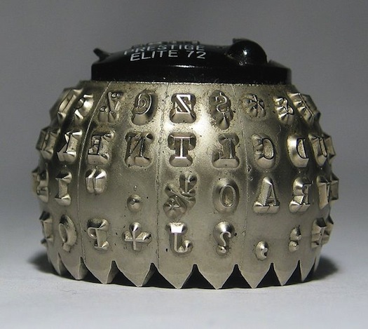
By the 1950s, electric typewriters had become common in offices. But the Selectric was based on a radically new mechanical system. The letters striking its ribbon were installed not on individual keys but on a movable metal sphere. Instead of a traditional carriage stuttering across the page, this embossed print element, or “golf ball,” rode atop a metal rod, twisting and turning, rocking and rolling with amazing dexterity as the keys were struck. Without a moving carriage, the typewriter could become more compact and self-contained, its messy machinery neatly enclosed. The ribbon was easily changed without threading or smearing of the carbon on it, because it was housed in a cartridge, not unlike that used for audiotape.
Unlatching the ball and replacing it made it possible to shift to a different typeface — or a different alphabet — in a matter of seconds, prefiguring the computer. (A similar idea had been tried around 1900 with the Blickensderfer, a lightweight machine from Connecticut that was decades ahead of its time. The Blick, which entertained a small coterie of enthusiastic followers, not unlike Apple today, had a cylindrical type element similar to an ancient roller used for printing on clay. Each font was priced at $1.25. In 1902, the company even offered a primitive electric model.)
The Selectric’s outer shell and keys were designed to reflect the aesthetic of the spherical print element while softening the machine’s geometry into a more natural shape inspired by biomorphic design
The Selectric was the centerpiece of Eliot Noyes’ s work as IBM’s chief design consultant in the late 1950s. Interviewed in the ’70s, Noyes related that his staff had shaped the Selectric using clay models and mirrored half-models, like those employed by the designers of cars and clipper ships. “We tried to emphasize the singleness and simpleness of form,” he said, “by making the whole shape something like that of a stone so that you are aware of the continuity of the sides and under the machine and over the top.”
Alan McCroskery, senior designer in Noyes’s office did the detail work. “The whole idea was to express the idea of a machine that did not have a carriage return,” he told me a couple of years ago.
To shape the outer shell, McCroskery had the engineers make a cast of the machine’s inner mechanism. He designed a single form that barely cleared the machinery’s edges. “I just drew the edges of that cast and made a Plexiglas template,” he said. “We fit the entire kit and caboodle inside. That gave us the shape of the whole beast. It didn’t take a lot of thought.”
McCroskery added, “I did it like a car designer doing a car, but with old-fashioned modeling clay.” Indeed, the Selectric’s controlled curves suggest some of the best automobile design of the time — an era when new compacts such as the Italian-influenced Chevrolet Corvair and Ford Falcon were moving beyond the tail fin.
The keyboard sat gracefully sheltered in a harbor scooped out of body. It was situated lower and flatter than most keyboards. In her 1976 prose poem “12 O’Clock News,” Elizabeth Bishop described her more traditional typewriter keyboard as a slope, an “escarpment.” “The elaborate terracing of its southern glacis gleams faintly in the dim light, like fish scales. What endless labor those small, peculiarly shaped terraces represent!” The Selectric freed climbing fingers from this landscape and helped mark the migration of the keyboard from typewriter to personal computer.
Unlike the vintage round keys that now show up as cuff links and earrings, the Selectric’s “squircle” keys, somewhere between a square and circle, echoed the rounded shape of its shell. (They also echoed shapes in architecture and products at the time, including Eero Saarinen’s furniture for IBM’s offices.) IBM ergonomists decreed in documents that “the plane of the keyboard shall be between 11 to 16 degrees off horizontal. Key tops shall be 9/16 inch in diameter.” But they didn’t dictate the form. Noting that “fingers aren’t flat,” McCroskery set the keys at different heights and gave their tops a gentle curve.
“We did it intuitively, with no research,” he told me. “Then the engineers tested it for two years and came to the same conclusion, that it worked.”
“Noyes wanted [the Selectric] to look like a piece of sculpture,” McCroskery explained. “He said it should look as if it had been carved out of a block of marble. The other main thing Eliot kept emphasizing was that the design should be timeless.” Saarinen famously spoke of furniture that would do away with the “slum of legs” in the office. The Selectric similarly did away with the slum of levers, the messy machinery of keys and carriage.
The forms of the Selectric can also be read as a mediation between the machine’s impersonal straight lines and the human body’s curvilinear ones. The Selectric also radiated a soothing presence in the rigid geometry of the office — an environment that was increasingly open to views from across the room. Unlike earlier typewriters set inside a desk or against a wall, the Selectric was designed with an eye to being viewed from 360 degrees. You can spot Selectrics in Mad Men, and they appear as transcendent as the vintage furniture or Don Draper's suits.
The machine was made available in many different colors; companies could even customize them. Ettore Sottsass’s 1969 plastic Valentine for Olivetti is rightly celebrated for its pop red, but it was the Selectric that broke from black, gray and beige office machines. It established the idea that office equipment could have an automobile’s panache. The type ball likely influenced the Eames-designed IBM pavilion at the 1964–65 New York World’s Fair, a spherical structure with letters on its exterior.
Eventually the machine held three quarters of the U.S. market for electric typewriters; subsequent models added such early word-processing features (primitively executed) as backspace correcting and memory of key repeated phrases. Selectrics were often lashed to electronic systems to serve as de facto terminals.
When IBM unveiled its landmark PC with great ceremony at New York’s Waldorf Astoria Hotel in August 1981, company executives boasted of the similarity of the machine's keyboard to that of the Selectric. The scooped key shapes survive the Thinkpad on which I type these words. But few other devices we use today retain the Selectric’s power and presence.


Comments [7]
No wonder I became a designer...
03.14.11
01:27
New Mexico State Personnel Directory, on a beautiful machine such as this... There were no mistakes to be made without, liquid paper or white out tape!!! LOL But it was really cool to be able to change fonts when you wanted to personalize a letter, etc. The good old days!!
03.15.11
07:34
I remember using IBM/ATS (Advanced Text System), you could just type along like a real typewriter and it would capture the text. But when you made changes, you could edit only one line at a time (a "line editor"). Then when you finished editing it line by line, you could get a proof and print out the document from beginning to end. If you used italics, it would stop, wait for you to change the golf ball, then press a key and it would resume typing. Then it would stop when it needed to be changed back. This discouraged a lot of short bursts of italics. But back in the day, I saw some quite complex documents with 3 or 4 fonts, they must have been a hell of a lot of work, but they looked beautiful.
03.16.11
04:52
http://www.ibm.com/ibm100/us/en/icons/selectric/
03.16.11
02:59
My high school had manual typewriters for Grade 10 typing class, and really nasty Royal electrics for Grade 11, but our school library had a Selectric, and it was working there that solidified my love affair with the printed word.
Thanks much for the piece, Phil!
03.18.11
02:37
Always a pleasure to read your words, however you keyboard them. Like the good reporter you are, you've included details that are fascinating, and given credit to designers who shaped out lives but got too little applause. I don't think I ever lost my fascination with that faster-then-the-eye-could-see track ball. How did anyone ever figure that out...pure genius. In post Selectric years, I have missed the confident sound of work that typewriters gave to offices and city rooms. Now, as they say in Western movies, it's quiet...too quiet.
Thanks for the memories, and keep typing.
03.20.11
09:52
I'm still waiting for some clever person to figure out how to re-purpose old Selectrics as computer keyboards that work with today's PCs and Macs. They set a standard for typing 'feel' that has never been matched.
07.31.11
11:32