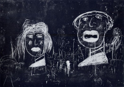
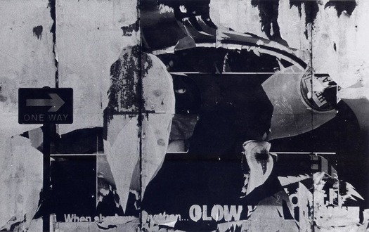
Herbert Spencer, Wall with graffiti, Rotterdam, early 1960s (published in Typographica new series no. 8)
In my last post about Robert Brownjohn’s photographs published in Typographica magazine, I mentioned the picture-editing skills of its editor and designer Herbert Spencer. Photography was central to the second series of Typographica, which ran from 1960 to 1967, and Spencer, too, was an accomplished photographer during those years. He had a darkroom constructed in his house and took lessons in technique from Alfred Lammer, a photography tutor at the Central School in London. In a study of Typographica, in a chapter tilted “The Camera as Pen,” I discuss Spencer’s photographs and show several examples, but the book is out of print. These pictures, like Brownjohn’s, are not widely known, even though they are excellent examples of the “designer’s photograph” and fine images by any standard. Other than a picture from my book, which someone has posted, there is almost nothing to be found online.
Spencer (1924-2002) produced two slim volumes of his photographs. Traces of Man, published by Lund Humphries in 1967, has 24 pictures. In 1999, to mark his 75th birthday, he self-published Without Words, in an edition of just 250 copies. It contains 32 additional photos, also taken in the 1960s. Mark Haworth-Booth, then senior curator of photographs at the V&A, wrote a preface and I wrote the introduction. In 1991, the Zelda Cheatle Gallery in London mounted an exhibition of Spencer’s pictures along with some photographers who had influenced him — including Man Ray, Lee Miller and Humphrey Spender — and Eye published a brief article with a few of the Traces of Man pictures. The text that follows here is adapted from material in Without Words and Typographica.
As a photographer, Spencer seemed to delight in unraveling the order he spent his days as a designer attempting to create. His most telling and memorable images, those that seem most fully his own, show a world in which things fall apart, signs of official communication fray into visual poetry, and ordinary people assert their presence by inscribing streets, buildings and land with unofficial messages and marks. Spencer brings a designer’s fascination to the exact physical aspect of the objects that catch his attention and he renders them with a sharp graphic eye. But the images that most fully absorb him are often far removed from the territory or influence of a metropolitan design consultant.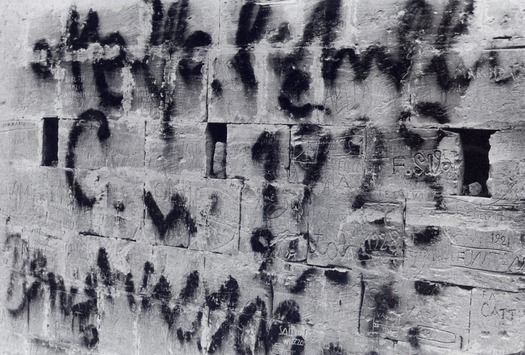
Herbert Spencer, Wall with graffiti, Noto, Sicily, 1962 (published in Typographica new series no. 8)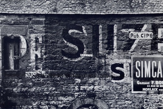
Herbert Spencer, Wall in Brittany, 1965 (published in Traces of Man)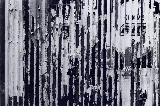
Herbert Spencer, Wall in France, 1960s (published in Without Words)
Spencer was most influenced by Bill Brandt’s use of lighting and controlled overprinting to form powerful graphic contrasts of black and white. He preferred Agfa paper and developers that would give rich burnished blacks, while bringing out the detail in the dark areas of the picture. Using a Pentax 35mm camera, he composed pictures carefully so that little if any cropping was required. Cropping was more likely when he took square-format pictures with a Rolleiflex, but he tended to favor the lighter Pentax for most of his work.
From his earliest pictures, Spencer found himself drawn ever closer to his subjects until the details that interested him were sometimes just a few feet away. “It wasn’t a conscious plan,” Spencer told me, “but I found the things which were significant for me were the close-ups of details and particularly what, afterwards, I regarded as chance art.” As he proceeded, he discovered, again without conscious intention, that most of his photographs, and certainly those that meant most to him, were devoid of people, though not without a human presence.
Spencer’s subject became the gradual accretions and inexorable attritions that slowly condense into expressive pattern: names scratched into a park bench; walls treated as blackboards; tattered posters layered on other posters so that word fragments fuse to suggest new meanings. His documentary audit reveals the inevitable fate of many public exhortations created by designers for the communications industry. Spencer’s torn poster studies closely resemble exactly contemporary works by European affichistes such as Raymond Hains, Jacques de la Villeglé and Mimmo Rotella, except that the artists mounted their damaged trouvailles on canvas.
Herbert Spencer, St Pancras street, London, 1960s (published in Without Words)
In one of Spencer’s most complex and original compositions, seen in Rome in 1961, the street wall of the Bar Toto becomes both palimpsest and collage, as successive modes of communication and styles of graphic address overlay earlier forms: stone-carved lettering, graffiti, post box lettering, neon sign and trademarks (Coca-Cola, Lambretta and the Totocalcio lottery). The typographer’s eye fits the stray “D” of a sign in a nearby doorway into the visual text.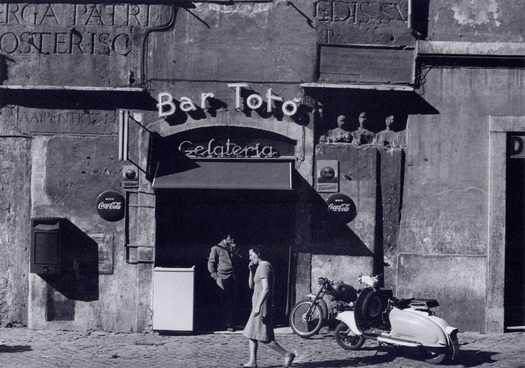
Herbert Spencer, Bar Toto, Rome, 1961 (published in Without Words)
In Typographica new series no. 8, in December 1963, Spencer published 17 of his photographs with a short essay by the artist and writer Barbara Jones composed after they had looked through the pictures together. “Decay is the most powerful medium for the improvement of cities,” she suggests, “. . . decay, not the architect, adds the last touches, blackens and peels the stone, applies lichen and cracks, softens the edges.” The photographer’s task is to discover and isolate as a picture these spontaneously formed but easily overlooked manifestations of “chance art” — the term Spencer and Jones favored. In Traces of Man, explaining his search for expressive pattern, Spencer describes how, “Occasionally, some detail in the landscape, some fragment of a wall, some echo of the cut and thrust of man and nature, seems to assert itself and vibrate with more significance than the rest.”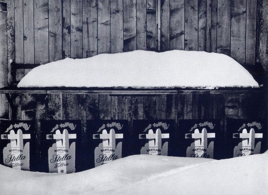
Herbert Spencer, Tobacco kiosk under snow, early 1960s (published in Typographica new series no. 8)
Spencer’s phase as a photographer was short but intense, effectively coming to an end in 1967 when he began legibility research at the Royal College of Art, and even at his most committed, photography was never his primary activity. As an article about his pictures in the British Journal of Photography noted in 1973, he belonged to an elusive new category (as did Brownjohn), neither professional nor amateur, but dedicated to using the camera as a recorder of “acute visual situations.” When I interviewed him about his photography, Spencer readily acknowledged the differences of concern and approach between a designer or an architect’s pictures and a professional photographer’s. “By virtue of one’s training or experience,” he recalled, “one simply looked at things in a different way and selected details and viewpoints which a professional photographer wouldn’t have chosen.”
See also:
Robert Brownjohn: Photos at Street Level


