That Americans live in an exercise-obsessed culture is perhaps only natural in a society where BMI correlates directly with socio-economic standing: fitness is a form of prestige. A decade ago, the critic Mark Greif astutely observed the psychological, social, and gendered reality of a modern world dominated by fitness, describing landscape where runners turned public streets into a modern version of classical gymnasia, workout gear replacing dresses and suits; sweat splattering innocent bystanders.
So it should come as no surprise that the branding of exercise wear is a complicated, profitable endeavor. But what is the message of the contemporary fitness logo? Some of the best known, such as Puma’s leaping cat and Adidas’ stripes, connote a combination of speed, virility, and loyalty. Or, like REI and Patagonia’s logos, they invoke a connection between the brand and the enduring strength of a mountain range. Dancewear and yoga wear, aimed primarily at female buyers, usually features more delicate iconography. Many of these marks are forgettable attempts to rouse interest in shorts or spandex. Some, like the Nike swoosh, are eye-catchingly clever, becoming part of a common visual language of fitness. However visually impoverished the iconography of the fitness market may be, it is worth examining these logos, which are part of a material quest for personal perfection in the service of capitalism.
So it should come as no surprise that the branding of exercise wear is a complicated, profitable endeavor. But what is the message of the contemporary fitness logo? Some of the best known, such as Puma’s leaping cat and Adidas’ stripes, connote a combination of speed, virility, and loyalty. Or, like REI and Patagonia’s logos, they invoke a connection between the brand and the enduring strength of a mountain range. Dancewear and yoga wear, aimed primarily at female buyers, usually features more delicate iconography. Many of these marks are forgettable attempts to rouse interest in shorts or spandex. Some, like the Nike swoosh, are eye-catchingly clever, becoming part of a common visual language of fitness. However visually impoverished the iconography of the fitness market may be, it is worth examining these logos, which are part of a material quest for personal perfection in the service of capitalism.

Yoga apparel brand LululemonAthletica (which began in Vancouver in 1998 and now operates roughly 250 stores worldwide) boasts one of the most effective logos on the market. The meaning of the small, feminine marque is unclear, but millions embrace it as a sign of membership in a petite, well-toned elite. In fact, the appeal of Lululemon’s small, seductive logo may be one of the reasons for the company’s otherwise rather inexplicable success in a crowded and competitive marketplace. (Lululemon rose to prominence on a crest of disturbing events, including a racist anecdote about its name and a 2007 controversy about whether the company’s VitaSea clothing line in fact contained healthful marine products.)
Consumers do not generally seem to know what the logo references. Nor do they apparently care about the bizarre opinions of the company’s founder, Chip Wilson, who responded to complaints about fabric quality in 2013 by telling customers that the problem was not the product, but rather with their fat thighs. Despite this, sales of the pricey yoga pants continue apace, and Lululemon’s Luon pants are widely considered the most flattering choice among Anglophone yogis.
According to Lululemon’s corporate history, the company’s logo is a letter “A,” purportedly a reference to “Athletically Hip” the original name of the company. Further efforts to obtain details about the design process are firmly rebuffed by the brand’s “education” coordinators. Yet asking consumers about the meaning of the logo will evoke dozens of answers, none of them related to alphabet.
Plausible interpretations include the silhouette of a perfectly groomed bouffant haircut; an omega sign; the outline of a uterus. Or, the blank oval might evoke a handheld mirror, that ancient and narcissistic symbol for femininity. Squint hard enough, and perhaps you will see the “A,” the crossbar just barely suggested by the cinching of the symbol’s waist. (Or should that be tail? There’s also more than a passing resemblance between Lululemon’s logo and the bottom half of a mermaid). Regardless of any official explanation, the logo conforms to Western visual associations of obedience: its tapered edges are softly compliant, its bilateral symmetry bends to convention. Whatever it is, Lululemon’s logo is clearly passive, receptive, a vessel: a wordless and powerfully reductive image of femininity, very much at odds with the mantras of liberation the company pitches cheerfully from its store windows.
.JPG)
Since Lululemon’s public relations department resists further inquiries into the origin and meaning of the unlikely “A,” intrepid observers must turn to other sources. And in fact, it turns out that stylized letters have a long history of being used to brand flesh. North American cattle ranchers have been using precisely these marks to claim ownership of the continent’s primary protein source for centuries. Although Lululemon would undoubtedly deny any association between the cleansing rituals of yoga and the rounding up of cattle, their signage systems have some remarkable similarities. In this lexicon, Lululemon’s modified A would read as “running circle A,” not entirely inapt.
Livestock brands are usually composed of one or more stylized letters, often set in a circle. Ranch owners design their own brands, to distinguish their herds from those of their neighbors. In a short manual that reads like a primer on modernist design, the association advises: “The best rule to follow is to keep the image simple. Simple brand designs are easier to read and are less painful for the livestock.”
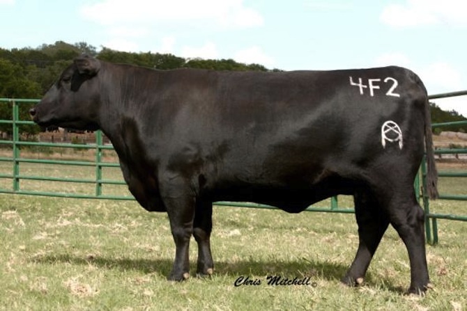
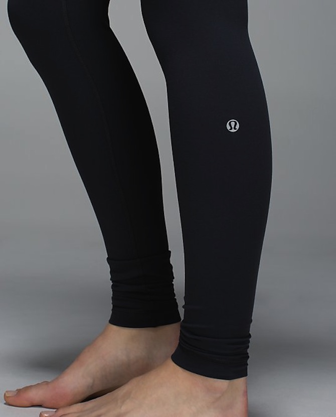
In livestock branding, the individual identity of the brand hinges not just on its form, but also on its distinctive position on the body of the animal. Lululemon hews to this advice, too. Unlike Nike and Adidas, which place most of their logos in traditional locations over the heart, centered on the chest, or at the upper thigh—Lululemon’s logo placement is distinctive, voyeuristic, and isolating. The stamp of the brand is always close to the skin, its placement isolating and erogenizing discrete parts of the body: the shoulder, the calf, the sacrum.
Lest you find this essay an exercise in pseudomorphism, consider the design and placement of the sportswear manufacturer Under Armour’s logo. Like Lululemon, Under Armour deploys a logo derived from stylized letterforms: an interlocking U and A form the brand’s distinctive sign. Yet in the case of the Under Armour logo, the edges of the logo’s lines are virile and outward flaring, and the logo is usually centrally-placed on the wearer’s upper body.
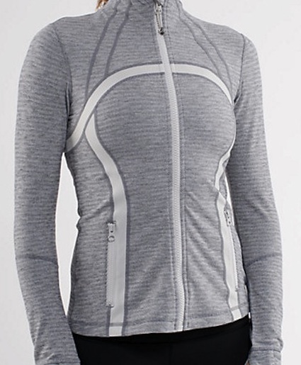
Lululemon’s designers turn brand hunters into voyeurs, looking at less public parts of the body, pulling attention away from the full frontal engagement with the wearer’s face. In contrast to an Under Armour consumer-athlete, the Lululemon wearer actively participates in the visual dissection of her body and the branding of her Luon-clad musculature. One of the company’s Instagram feeds, #thesweatlife, displays a carefully edited stream of images which are purportedly consumer selfies. Viewed en masse, these images feature a disproportionate number of portraits of women alone, viewed from above or behind, in the manner of a horror movie. Paul Rand himself might have enjoyed the design of the brand’s popular zip jacket, which features an oversize logo that allows the user to participate in the design by actually inhabiting the curvaceous logo, replacing her own distinctive form with a clever montage of brand and body image.
The muteness of Lululemon’s logo contrasts with the loquaciousness of the company’s shopping bag. Covered with bumper-sticker style imperatives, each more nonsensical than the next (“Dance, sing, floss and travel”), the bag nonetheless presents the practice of yoga as a democratic project, equal parts joy and self-improvement. There’s also pseudo-scientific advice. “Stress is related to 99% of illness,” and the bag counsels “10–15 friends allows for real relationships.” It’s hard to say which is the most patronizing of all, though “Children are the orgasm of life” is definitely a contender.
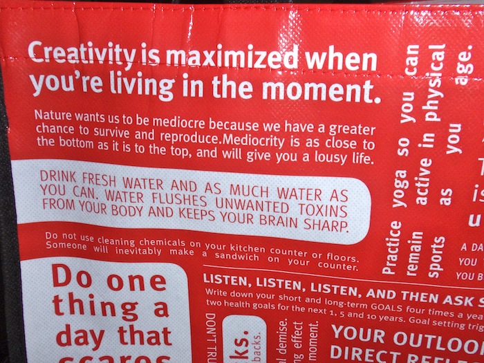
The visual intensity of the densely packed word collage seems to express a childish hope that repetition will make imperatives come true. And what does all of this have to do with athleticism, much less the achievement of personal fulfillment through yoga? The design of Lululemon’s “shopper” blurs the line between consumer branding, personal identity, and physical exertion—a process which has already been exploited by Nike and Adidas—but is pushed just one small iteration further by Lululemon. The women carrying these bags into the street and onto the subways disperse the ideology of fitness on the streets in a whole new way, advising passersby to “visualize your eventual demise.” Carrying the bag is a way to display allegiance to healthiness without actually doing yoga; the logo-marked bag is an easily-displayed souvenir of an “investment” in oneself. Like the marque, Lululemon’s mysterious void of a logo is a sign of passive consumption branded onto millions of bodies while the company simultaneously preaches a gospel of liberation through physical exertion.
Lululemon’s icon, not unlike the Western livestock brand, works as a mark of acquiescence to a painful regime, acknowledgement that a body is not quite one’s own. For certain women, though, the brand is also a mark of prestige. More than a pricey purse or a piece of jewelry, Lululemon’s clothes signify the wearer’s admittance into a higher class, a fitness elite. But the barrier to Lululemon cannot be overcome with a credit card: one must be able to squeeze one’s body into yoga pants which end their forgiving stretch at 32.5 inches around the waist. For unlike other sporting brands, Lululemon sells only to the thinnest of female consumers. As a point of comparison, Under Armour sells waist sizes up to 38 inches and Nike goes up to 42.5. Fully three-quarters of American women have waists wider than Lululemon’s maximum, according to the Centers for Disease Control and Prevention.
Inhabit the brand is an old message, but one given new meaning by Lululemon’s logo, energized each time a petite woman stretches a pair of pants over her hips. The past decade has seen an acceleration in the production of branded clothes which cater to a near-universal demand for physical attractiveness; self-care is an activity of the highest order in an age of narcissism. Lululemon’s cleverness lies in creating a logo which everyone—and no one—can hope to inhabit: out of reach and ordinary, all at the same time.