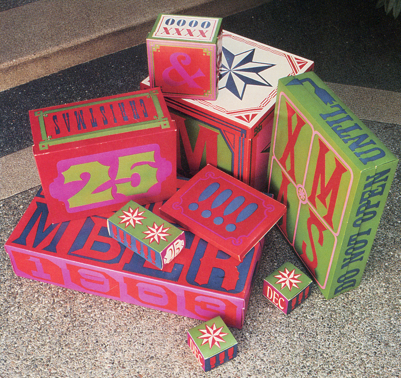
Christmas Boxes for Joseph Magnin, Marget Larsen, 1963. Image source: Communication Arts 30, March-April 1980
Years ago, a prominent architect on the West Coast told me, “If you’re working in California, you’ll always be considered weird. It doesn’t matter how established or successful you are.” While this may seem bitter, it does have a kernel of truth. Frank Gehry is “wacky.” Saul Bass was “only entertainment.” Deborah Sussman was “colorful.” The unfortunate consequence here is that significant design and designers are minimized as negligible. Consider the example of Marget Larsen’s Christmas boxes for Joseph Magnin, a San Francisco-based department store, from the early 1960s. Ostensibly, these are brightly decorated boxes for gifts. They are easy to dismiss as purely ornamental, but they epitomize a time, ethos, and aesthetic that influenced design for the next fifty years.
Joseph Magnin stores were the hip brother of the more staid and upscale I. Magnin department stores. In the early 1960s, the chain became the West Coast source of youthful, sophisticated, and cosmopolitan fashion. My mother shopped there, as did most of her friends. I recall an episode involving $300 boots (roughly $2,000 today), and my father’s expected response. At the time, Marget Larsen worked in-house art directing advertising, signage, packaging, and promotions. The Christmas boxes, pre-printed with pattern and imagery, eliminated the need for wrapping paper. Each year, Larsen designed a new set, eventually passing the project to Joe Hong. These boxes became a staple of Christmas in San Francisco and, as Joseph Magnin stores expanded, eventually the rest of the West.
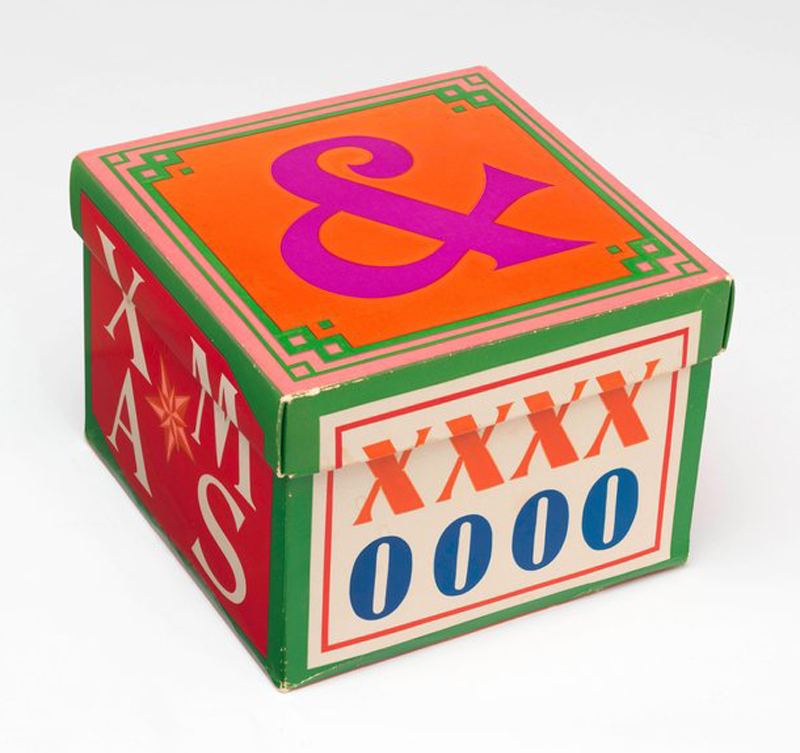
Joseph Magnin holiday box, Marget Larsen, 1963. Collection SFMOMA, gift of Mark Watters, © Estate of Marget Larsen
The design aesthetic and content of the boxes bridged post-war American modernism and 1960s hedonist psychedelia. Let’s begin with content. Post-war advertising (and much of it today) utilized a simple layout formula: one large image of the product, a clever or questioning headline, followed below with body text explaining the headline and product, and capped off with a logo in the bottom right corner. This is the source of the aphorism, “If you want to sell the cake, show the cake.”
In the advertising work for Joseph Magnin, Larsen ignored this formula, and focused on an illustration or attitude rather than representing the product. The Christmas boxes followed this maverick approach and defied traditional and banal Christmas iconography, turning to geometry and a vibrant California palette. This simple shift—the rejection of established conventions—was and is a historically San Francisco approach.
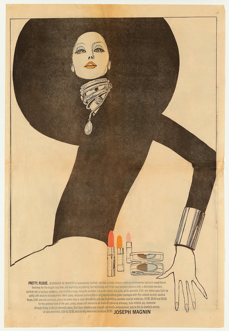
Marget Larsen and Betty Brader, "Pretty, Please," Full-Page ad. Image source: Earthquakes, Mudslides, Fires & Riots by Louise Sandhaus, published by Thames & Hudson.
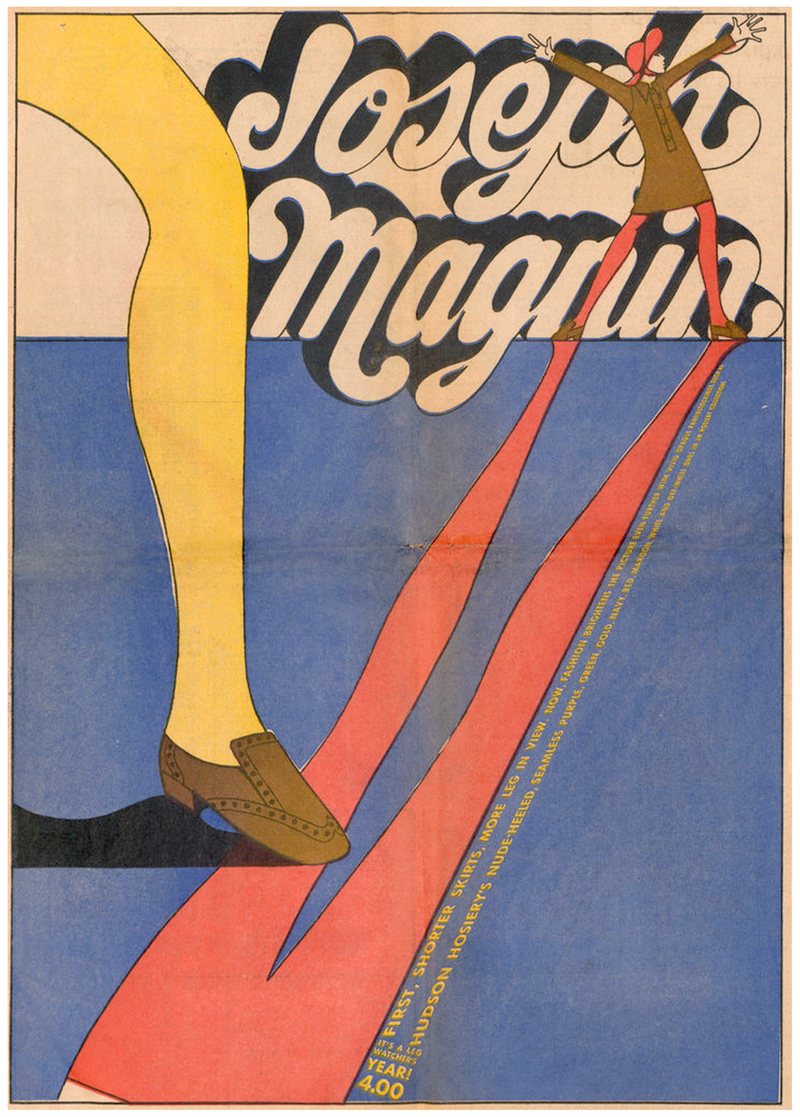
It’s a Leg Watcher’s Year. Full page ad. Marget Larsen and, 1967. Image source: Earthquakes, Mudslides, Fires & Riots by Louise Sandhaus, published by Thames & Hudson.
At the end of World War II, thousands of servicemen and women first disembarked in San Francisco. Veterans who were intellectuals, writers, artists, homosexuals, eccentrics, and just plain odd-balls remained in San Francisco rather than returning to their pre-war lives in rural America. It’s hard to return to milking cows if one is the strangest person in Kalamazoo. By the mid 1950s, City Lights bookstore was the center for “beat” culture. This was followed, in 1967, by the hippie movement reaching its zenith at the Summer of Love festival in the Haight-Ashbury district. I know. I was there with my parents.
Larsen’s Christmas boxes were, by no means, the sole inspiration for the Fillmore posters of the 1960s—colorful, psychedelic posters given to concert-goers at the Fillmore music hall in San Francisco. LSD, loose sexual morality, and anti-establishment ideas shaped these. The Fillmore posters, however, adopted the intensity of Larsen’s colors and her rejection of representational content. Designers that worked on the now famous posters, such as Wes Wilson, Bonnie MacLean, and Victor Moscoso, rarely displayed the image of the band or artist. For a 1967 Yardbirds concert poster, Bonnie MacLean chose an exotic peacock, hallucinogenic typography, and non-identifiable face rather than a photograph of the Yardbirds.
Larsen was selling fashion with Toulouse Lautrec-inspired illustrations. The Fillmore posters promoted music and hallucinogenic experiences. But they shared the same rejection of the traditional establishment, a sentiment native to San Francisco and the West Coast. It is not difficult, then, to see the trajectory leading to work created by other California designers, like the radical 1984 Olympics graphics by Deborah Sussman, April Greiman’s digital explorations, and Kyle Cooper’s disruptive title sequence for Seven.

Marget Larsen, photograph, Milton Halberstadt, 1960s. UC Davis Special Collections.
Marget Larsen died prematurely in 1984. She is remarkably under-represented in graphic design history, although she made significant contributions to building the San Francisco design aesthetic at a time when few women gained recognition in graphic design. Larsen has only recently been rediscovered in Louise Sandhaus’ opus, Earthquakes, Mudslides, Fires & Riots: California Graphic Design 1936–1986—but her work, specifically the Joseph Magnin Christmas boxes, is the flashpoint of alternative cultural values, aesthetic explorations, and risk-taking that defines the California design canon.