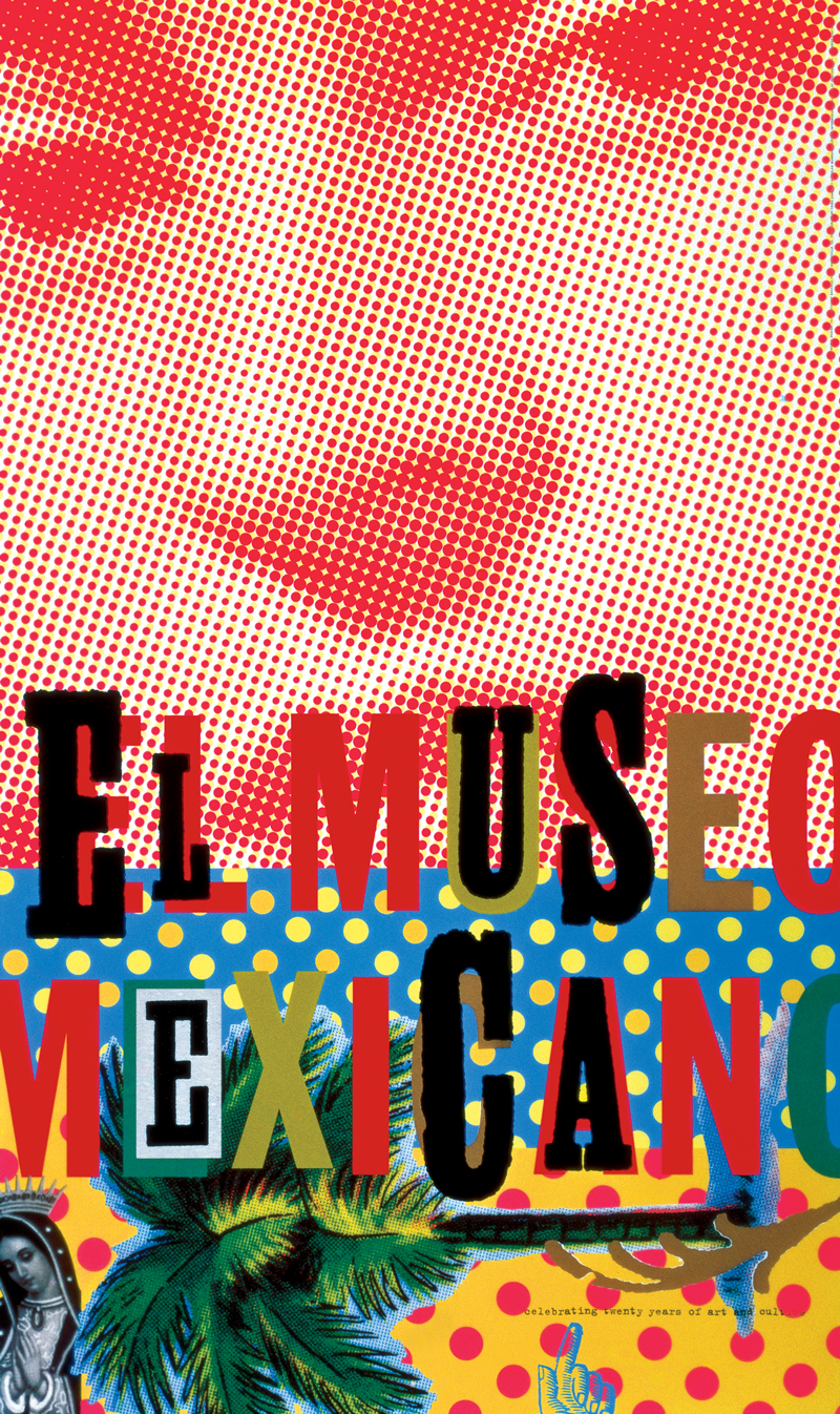
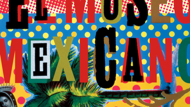
Jennifer Morla, El Museo Mexicano poster, 1995
There is a fine line between cultural hegemony and cultural representation. As a designer, does the work we create subjugate and presume superiority over another culture, or does it attempt to authentically represent it? That line is easily crossed from respect to caricature by the images, messages, and forms that we create. Clearly, Speedy Gonzales is a caricature. That’s an easy determination. But, for instance, something less clear is Paul Rand’s 1964 IBM Annual Report cover. Does the cover celebrate the woman and her culture in the foreground, or designate her as a decorative “historical” character in contrast to the modern IBM System /360 logo in the upper left corner? These questions are complex and rarely exist in a black and white reality—often it’s the response of the viewer, not the intent of the designer, that answers this question.
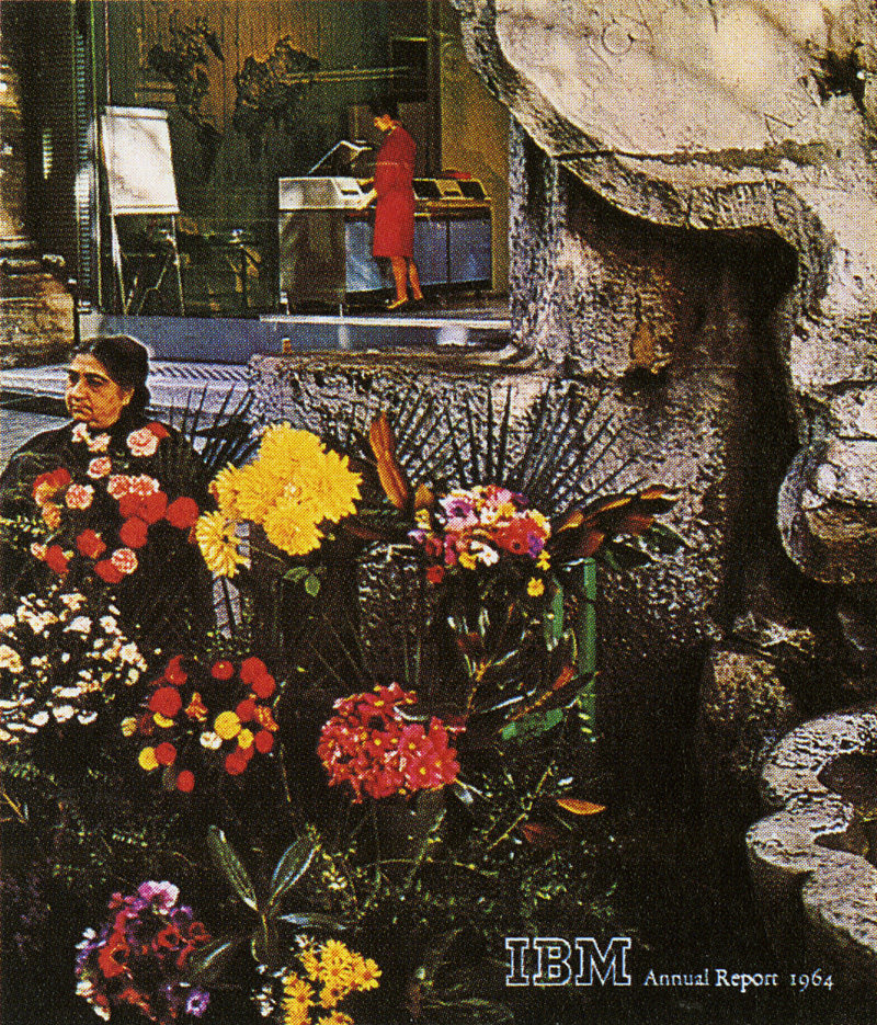
Paul Rand, IBM Annual Report, 1964
Designer and AIGA Medalist Jennifer Morla’s poster celebrating the 20th anniversary of the San Francisco Mexican Museum, El Museo Mexicano (1995), deftly navigated the path away from cultural imperialism toward a vibrant celebration of Mexican culture. She also tackled the issue of representing women and elements related to women—what might have been a caricature in another’s hands—in a way that was authentic, dynamic, and that presumed equal footing with the viewer regardless of his or her cultural values.
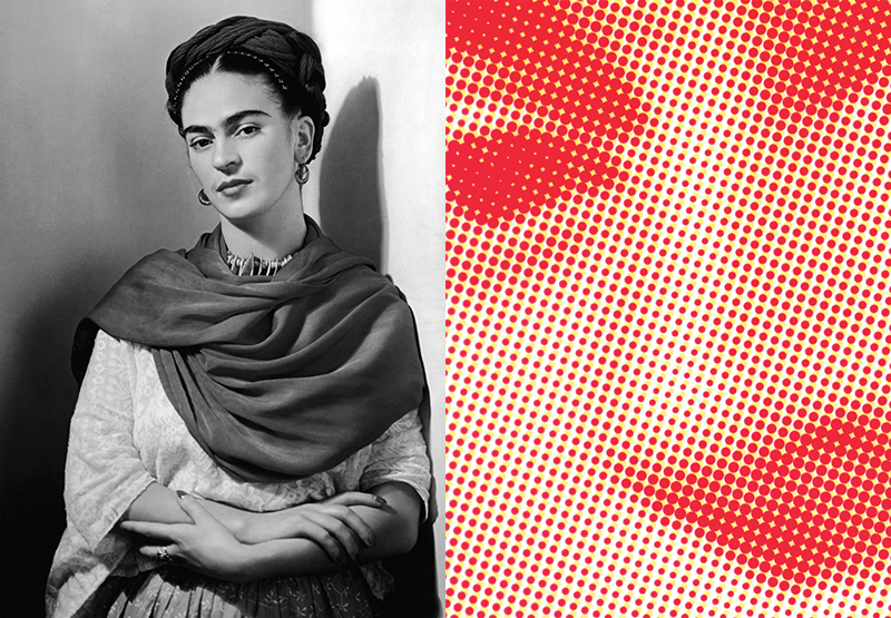
Nickolas Murray , Frida Kahlo, 1939
Morla used several elements on the El Museo Mexicano poster to create a message of vitality and excitement for the Mexican Museum. A large halftone dot pattern of Frida Kahlo’s face dominates the composition. Taken from a 1939 portrait by Nickolas Murray, the image connects the viewer with one of Mexico’s most renowned painters, while its treatment in halftone dots marries that tradition to reproduction and 20th century industry. It’s the way these elements play together that makes this poster so successful.
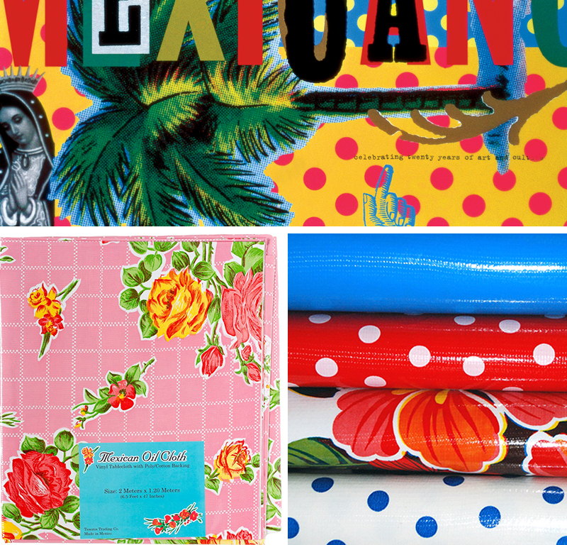
(bottom right) Mexican Oilcloth material
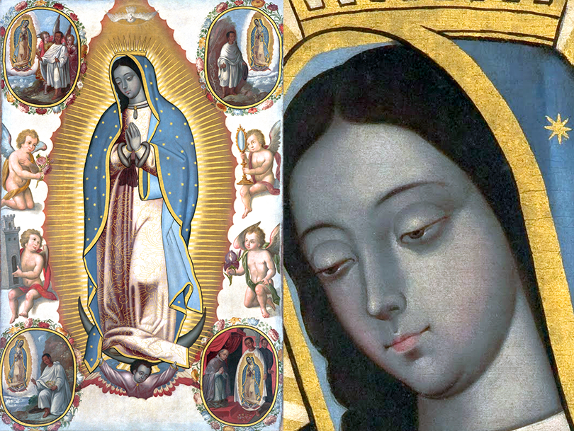
Virgin of Guadalupe, c. 1700, Maisie Eden Power Endowment Fund, Indianapolis Museum of Art
The polka-dot pattern on the bottom of the poster references Mexican oilcloth used for bags and tablecloths and speaks to the domestic sphere, and echoes the Kahlo halftone dots. Meanwhile, Nuestra Señora de Guadalupe (Our Lady of Guadalupe), reproduced on the bottom left, connects the viewer to the religious life of Mexico by referencing the image enshrined in the Basílica de Nuestra Señora de Guadalupe in Mexico City.
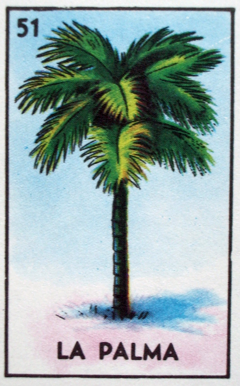
Postcard, Los Hornos, Acapulco, Mexico. c. 1950
Additional motifs add a layered nuance to the poster. The palm tree, with a clear offset printed texture, connects the viewer to traditional Loteria cards. It also alludes to Mexican tourism as a nod to vintage postcards of the 1940s and 1950s. Finally, the vernacular typography alludes to handmade signs and graphic artifacts found in Mexican culture. Morla’s choice of imagery tells the story of a rich and complex culture—from 20th century manufacturing to the domestic sphere to spiritual narrative. Understanding the need to have a multi-faceted approach in depicting Mexican culture, combined with her respect for each aspect’s individual integrity, affirms her skill in avoiding the projection of cultural superiority.
Morla’s adaptation of multiple images amplifies the complexity of the message. A visual pun of a sombrero on top of a cactus might seem clever or witty, but its simplicity trivializes the subject. The basis of this approach—multiple images combined—relies on the human need for storytelling. We are hardwired to create narrative: The man wearing the overalls on the corner is a farmer, in town for a visit, or he is an eccentric with odd concepts and a peculiar house. The car accident on the freeway occurred when the driver was distracted by a text, or perhaps when she fell asleep at the wheel. We tell ourselves stories to decipher our reality. By combining multiple images, Morla forces the viewer to do the same. We cannot make one narrative, but are forced to “connect the dots” and create our own message and meaning.
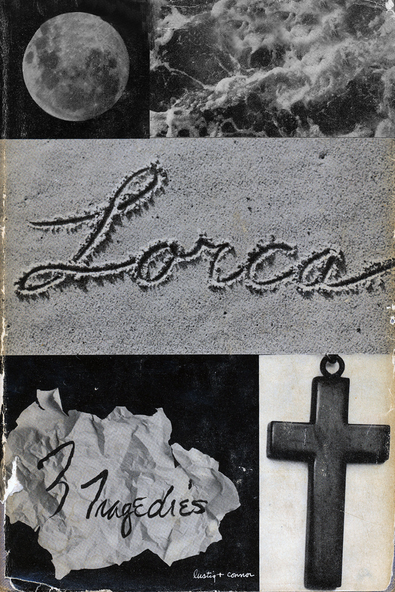
Alvin Lustig,, Lorca; 3 Tragedies, 1949. Lustig’s cover demonstrates the same concept of multiple images and connected narrative
There is no safe answer here. A woman at a conference approached a group of friends and myself demanding that we apologize for using the symbol of a leprechaun during a Command X (AIGA’s annual design competition) presentation. I didn’t realize that this was offensive imagery, and as someone named Sean, it didn’t bother me. But to some, that cultural reference carried weight and was interpreted as demeaning to the Irish. Recently a young designer asked me why critical thinking was important to her career. Morla’s poster for the Mexican Museum is a great example as to why. Morla’s success here is due to her ability to deconstruct the symbols and re-align them to create a message, all the while maintaining her balance on the tightrope of cultural respect.