Color is subjective and emotional. It is often the most volatile element of a project. To declare that the choice of a favorite color is inferior is to personally attack a person’s core. A client may arbitrarily demand a specific color or reject another based on outwardly irrelevant reasons. Our response to a color is based on our life experiences and cultural associations. If locked in a green closet for most of childhood, a person may be green averse. Regardless of the numerous rational reasons presented, and backup of research, that individual will forever despise green.
This is not a technical manual on the light waves of primary, secondary, and tertiary colors. It is not a technical manual on the mixing of paint. There are a multitude of other sources that do that. The Designer’s Dictionary of Color is a guide to the cultural, historical, and social meanings of a color. It is a resource with examples of successful application of each color and the range of options for an accompanying palette.
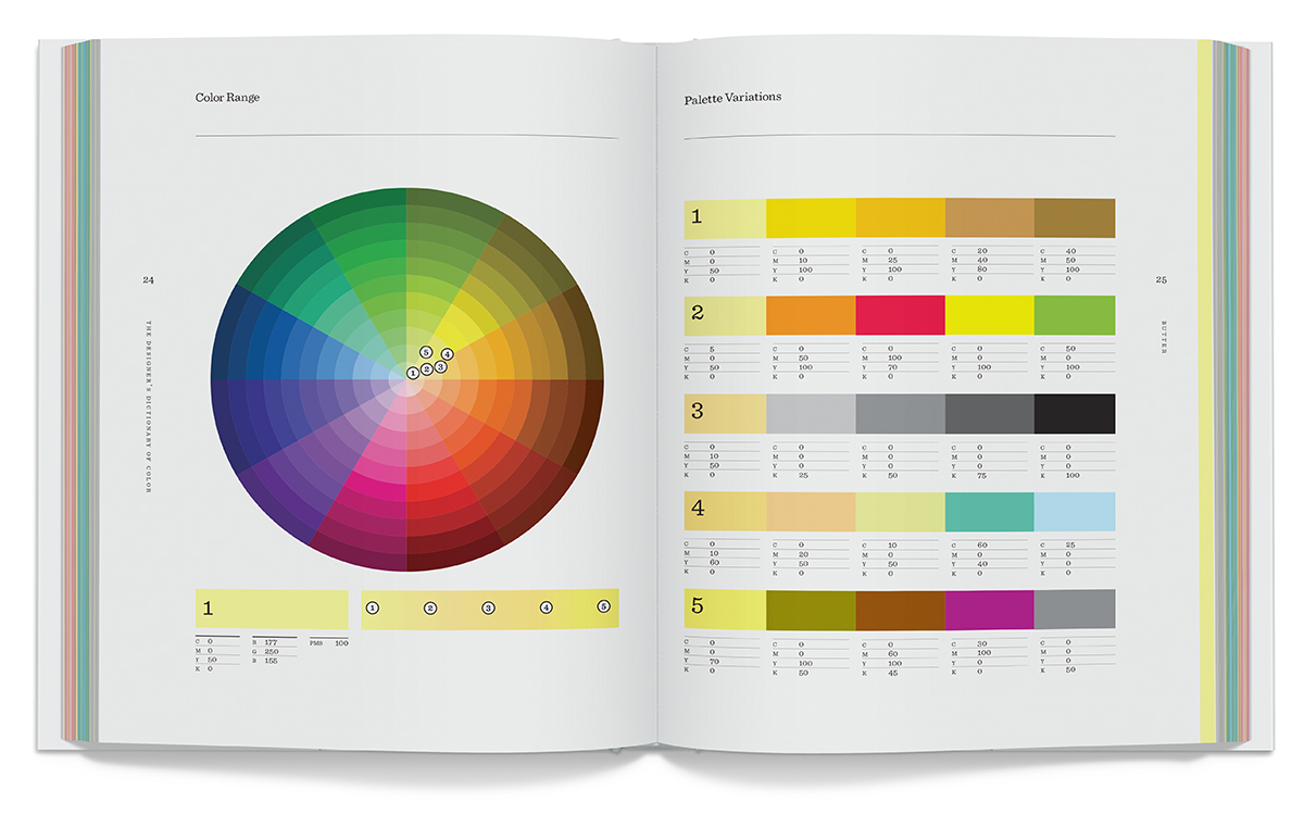
Expanding beyond the default swatch palette may be the difference between dull and powerful. Exploring the less expected, such as butter, mint, and fuchsia, lead to palettes that challenge the viewer. It is these colors, which live “in-between,” that create interest. If the viewer needs to work to decide if turquoise is blue or green, he has invested time and energy and the project has greater mnemonic value.
Design is 90% persuasion. Not to push a client to do something simply because it is cool, but because it is right. Every designer needs the tools to make an informed decision, and critically explain the choices. To describe the logic for using a bright yellow background with terms such as “bright” or “nice” is the first step to rejection and disagreement. To explain that this background color communicates optimism and warmth based on associations from 10,000 years of human culture will lead to approval.
Years ago, a client asked me for a specific color of green, Jaguar Green. After exhaustive research on the paint colors of Jaguar automobiles from 1922 to the present, I could not pinpoint the exact color he insisted existed. This green was a color that lived only in his imagination, based on the memory of a green Jaguar on a sunny afternoon in his youth. Only after I articulated the logical, cultural, and aesthetic reasons for the green I chose was he convinced that the final green was, indeed, Jaguar Green.
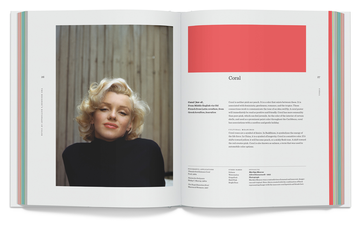
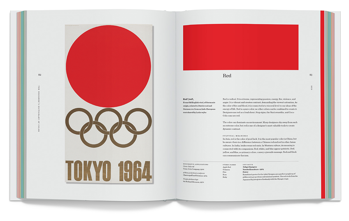
Coral
From Middle English via Old French from Latin corallum, from Greek korallion, kouralion
Coral is neither pink nor peach. It is a color that exists between these. It is associated with femininity, gentleness, romance, and the tropics. These connections work to communicate the tone of an idea swiftly. A coral poster will immediately be read as positive and friendly. Coral has more sensuality than pure pink, which can feel juvenile. As the color of the interior of certain shells, and used as a prominent paint color throughout the Caribbean, coral has associations with a carefree and gentle holiday.
Cultural Meanings
Coral roses are a symbol of desire. In Buddhism, it symbolizes the energy of the life force. In China, it is a symbol of longevity. Coral is a sensitive color. If it shifts toward yellow, it will become peach, or a sickly flesh tone. A shift toward the red creates pink. Coral is also known as salmon, a term that was used in automobile color options.
Other Names
Salmon
Watermelon
Grapefruit
Shell Pink
Bright Rose
Successful Applications
Thunderbird Samoan Coral: Ford, 1964
Nantucket Red pants: Philip C. Murray, 1960s
The Royal Hawaiian Hotel: Warren & Wetmore, 1927
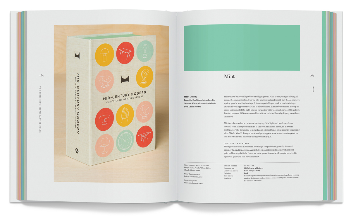
Mint
From Old English minte related to German Minze, ultimately via Latin from Greek minthē
Mint exists between light blue and light green. Mint is the younger sibling of green. It communicates growth, life, and the natural world. But it also conveys spring, youth, and beginnings. It is an especially pure color, maintaining a crisp and cool appearance. Mint is also delicate. It must be watched closely on press as it can shift to light blue or turquoise with too much or too little yellow. Due to the color differences on all monitors, mint will rarely display exactly as intended.
Mint can be used as an alternative to gray. It is light and works well as a neutral tone. The upside of mint is the cool and clean flavor, as if it were toothpaste. The downside is a chilly and clinical tone. Mint grew in popularity after World War II. Its synthetic and pure appearance was a counterpoint to the muted and dull colors of the 1930s and 1940s.
Cultural Meanings
Mint green is used in Western weddings to symbolize growth, financial prosperity, and innocence. A mint green candle is lit to achieve financial gain in New Age beliefs. In auras, mint green is seen with people involved in spiritual pursuits and advancement.
Other Names
Aquamarine
Caribbean Green
Celadon
Pale Green
Seafoam
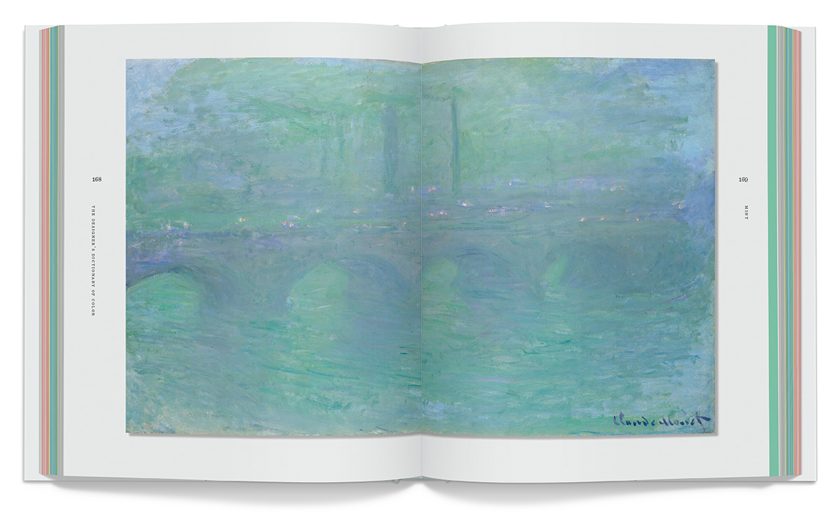
Successful Applications
Bridge over a Pond of Water Lilies: Claude Monet, 1899
Bitter Pastore poster: Luigi Caldanzano, 1910
Crest toothpaste: Procter & Gamble, 1955
The Designer’s Dictionary of Color is available at many book sellers and Amazon.