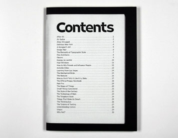
Last year, on the occasion of "Next," the AIGA's Biennial National Design Conference in Denver, Design Observer published a little book, The Next Page: Thirty Tables of Contents. For our readers not in attendance, we are sharing it here as a slide show.
| Play Slideshow >> |
The Next Page: An Introduction
What comes next? Is it real or imagined? The rapture or the revolution? Utopia or Armageddon? Or is it something simpler, more tangible and more immediate — like, say, lunch?
Next is often a material goal: what will I get, and when will I get it? Where am I headed, how soon and how fast? Is it mere ambition that fuels such persistent hunger — or is it apprehension, even anxiety? Maybe it’s just a pragmatic instinct, a way of negotiating a path through the unknown and the unknowable. Will it rain tomorrow? Should I upgrade now, or later? The I Ching or the iPhone? But the truth is, none of us really know what’s coming next. Not even designers.
With this in mind, we offer this book, compiled on the occasion of AIGA’s Twelfth Biennial National Design Conference in Denver last year. In it, we have choosen to narrow our sights to the written word, considering what we read next, how we move from one chapter to the next, and how we navigate through a single volume. Often overlooked by serious bibliophiles, the humble TOC is our portal into a world of knowledge. In the realm of the printed word, it heralds what comes next, a verbal proscenium with its own peculiar prose and typographic conventions.
In this book, we have gathered together thirty Table of Contents pages from our personal collections. On the surface, the selection may elude standard organizational conceits: why a design collection that also includes poetry and fiction? Why Philip Larkin and not Billy Collins, Ayn Rand and not Philip Roth, Paul Rand and not Jan Tschichold? Like “next” itself, there’s no intentional logic or over-arching plan: we just found these examples engaging, the discrepancies between them even more so.
Some readers will appreciate their typographic form, while others will see further strategies at work — informational, strategic, philosophical, literary. There are odd, even anachronistic cultural references, gestures that date these books in a manner oddly soothing. They remind us that what we will be has, by its very nature, a great deal to do with where we’ve been — and that there is no future without a past.
— Michael Bierut, William Drenttel and Jessica Helfand
Copyright ©2007 Winterhouse Editions
ISBN: 1-884381-23-5
Designed at Winterhouse Studio, August 2007
Retina Agate font by Hoefler & Frere-Jones
Paper by Mohawk Fine Papers, Cohoes, New York
Printing by Finlay Printing, Bloomfield, Connecticut


Comments [12]
04.15.08
03:19
04.15.08
03:38
04.15.08
05:36
Next
101 The Role of Humor
“I guess I was 101.”
04.15.08
10:37
Great to see some book design herewith though. More micro typography of interest to anyone? Index design; now that's a real test of typo+graphic craft.
04.16.08
09:14
http://www.arcroyal.co.uk/articles.php?id=7
I agree with many of the things said here and it's an interesting discussion to develop. Maybe here?
04.16.08
10:52
Thanks for posting.
04.16.08
02:51
04.17.08
08:28
Is a collection of TOC interesting? Mildly, yes. Was it a good idea to print a crap ton of them? It would be hard to argue against a firm, no. Alas, dichotomies and contradictions abound everywhere. I'd love to hear if the "necessity" of this book was ever addressed by those who created it.
I am glad that it finally found an appropriate home on the internets, where it should have been in the first place.
This is by no means a slight on the DO. But doesn't being responsible mean actually making the responsible choice?
04.23.08
09:27
http://www.flickr.com/groups/contents
05.07.08
02:45
05.12.08
10:52
05.13.08
08:20