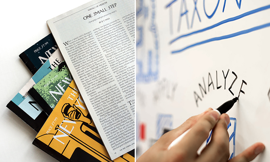
Left: A selection of NYer magazines to use as our class' “textbook”. Right: A Bloom’s Taxonomy whiteboard session; photo by Brooke Nelson.
What the New Yorker can teach us about understanding images
The New Yorker is better than a textbook (because of its text). In any given issue, lessons are learned though its elevated prose and parlance. And this we’d expect. It’s Strunk and White intellect. But have you ever evaluated the magazine based on imagery? Consider the collection: A Richard Avedon portrait that turns lighting conditions into revealing dispositions. A Roz Chast cartoon that draws on your hidden anxiety through every drawn line. A Christoph Niemann illustration that plays with your mind as it plays with perception. Simply put, these photographs, cartoons and illustrations make you think. So, too, does posing a question: How do we learn images? How are images constructed and constructive? What’s the relationship between visual language and language? For students in design, these questions are considerable, yet under-considered, especially when designing a publication.
Publication design is often not about the publication. Founding editor Harold Ross described the New Yorker not as a magazine but a “movement.” This statement has legs. It values a process over a product—or the momentum from ideas. While students see layout as the goal, it is not; it is simply the form. The goal is a thought process. (Think about that.) It’s about constructing ideas in the minds of designers and readers. Let’s call this learning. In the classroom, there are strategies to enhance learning. Connections with real-world projects help. So does “putting new knowledge into a larger context.” [i] Combining these agendas prompted an eBay order of some of the best back issues of the New Yorker—to use as our “textbook”. Auto-education followed. [ii] By distributing magazines in class, I distributed content (what’s happening in the world), and context (what’s happening in the field) and collaborators (what’s happening in the minds of writers). Teaching became simultaneously exponential and simple—as editors, art directors, writers, artists, humorists, and scientists took over instruction. This, for any introvert, is how you team-teach by yourself.
With magazines in hand, the stage was set. And the plot? To create images for a New Yorker essay, and then arrange text and image on the page. Simple enough, right? Sure, simple is enough if your goal is predictability. You see, without proper research and exploration, students tend to think in literal terms. (Text says “monocle” and so a monocle will be represented.) Why is this? Humor me with a hypothesis: If learning is a “change in neuron-networks of the brain” [iii] then one could argue that literal solutions only reflect existing neural networks—knowledge that’s already there. Sometimes visual verbatim works, but it often doesn’t challenge the reader. So, if images are “too easy or basic, you miss out on germane (meaningful) learning, because you do not add anything new to the way the learner thinks about instructional content.” [iv] Then how do we combat formulaic answers and develop new ways of thinking? Easy, through a formula: (1) Expose students to new inquiries and new processes (learning theories, lateral thinking methods, metaphor manufacturing, etc.), and (2) stir. And so, it is “our function as educators to provide students with the sorts of experiences that enable them to perceive ‘patterns that connect.’” [v]
Here’s how:
Students deconstructed their issues. Instead of reading them “from cover to cover like a long walk in the country,” [vi] they analyzed the structure to reveal patterns. (Meaning is constructed through pattern-seeking and pattern-organizing). Data sets were collected. Texts were annotated. Discussion groups were guided. Years ago, I wrote an article that critiqued the New Yorker through a typographic lens. Now, the focus turns from type to image. I asked students to investigate three things: (1) how images were made, (2) how they work, and (3) how they mean. (Pause there to process.)
Taxonomies are good teachers. The whole is greater than the sum of the parts, indeed, but examining the sum of the parts is educational. So in order to understand images comprehensively, we need to catalogue their properties. In the book Graphics for Learning, these are conveniently defined as: “(1) surface features that focus on what [images] look like and how they are created, (2) communication function that focus on how they convey information, and (3) psychological functions that focus on how they facilitate human learning processes.” [vii] We’re essentially talking about: features, function, and figuring out. Design school investigates categories 1 and 2 well, through a common cliché: form and function. But 3 is key. And it’s lacking from design education. Go figure. So how do we learn images? And is it possible to plan for perception? Visual Language for Designers responds with a resounding “maybe”: “It may not be possible to fully predict how an audience will perceive and interpret a picture because of the complex nature of human experience and the variable cognitive skills among individuals.” But it adds, “yet an awareness of an audience’s cognitive characteristics can bring designers closer to this goal.” [viii]
So what’s our know-how about how we know? One fascinating example comes to mind: Bloom’s Taxonomy of Educational Objectives.
Bloom’s taxonomy is often used as a guide by teachers when writing learning objectives. Just use the list of action verbs on your syllabus! But it’s more profound than that: How we learn seems to involve different types of thinking. The taxonomy orders these “thinking skills” into six categories:
Remembering
Understanding
Applying
Analyzing
Evaluating
Creating
As you can see, the framework is on a continuum of complexity. For example, “understanding” is more cognitively complex than “remembering”, et cetera. [ix] And while the purpose of the taxonomy is to assist in student learning, students are not often familiar with it, which I find peculiar. Wouldn’t knowing Bloom’s help them understand their understanding (i.e., metacognition)? Certainly. Then how else could it be applied? Let’s try combinatory play: What happens if we diagram images from the New Yorker onto a Bloom’s matrix? (In groups and on whiteboards, of course.) What would be revealed? Remarkably, students became full of wonder. And they wondered about only one thing: “Why are we doing this?”
I’m glad they ask. To recap, our class graphed New Yorker images based on thinking skills. Only images that related to text were permissible. And this is where it gets interesting: the class noted that different visuals required different levels of “mental energy.” Some images reiterated text (such as portraits, documentary photography, and 3D models) and fell into categories: Remembering, Understanding, or even Applying. These were quick reads. Other images interpreted text (such as diagrams, graphs, and maps) and fell into categories: Analyzing and Evaluating. [x] These involved critical thinking skills and took longer to parse. And populating the last category, Creating, were images that connected ideas (such as metaphoric imagery, puzzles with payout, or anything from Christoph Niemann’s brain). These sparked creative thinking and those “Aha!” moments.
Yes, we’ve all made images before but have you ever approached design through a framework of cognition? I think therefore I M A G E.
While this is not Bloom’s intended use, the exercise did have merit. The singular goal was diversity. Students were exposed to a range—a range of images, a range of communication strategies, and a range of learning. As students witnessed image-making at its finest, they were making mental directories of possibilities. One student even noted that she “understands how this could change the way [to] look at not only design but every other learning.” [xi] And there you have it. She’s making connections. Like an eraser on a whiteboard, the goal of the exercise was all cleared up.
So if different types of images make you think differently, can different types of thinking make you image differently? A plot twist!
The New Yorker is not Scientific American, but it does offer some of the best scientific articles. Just read “Unnatural Selection” about strategies to save the word’s reefs; or “One Small Step” about an innovative surgery for spinal injuries; or “The Unseen” about the discovery of new microbes. Now imagine making visuals for these articles. Because of their complex content and unfamiliar terms or scientific processes, language sometimes taxes working memory. In these moments of overload, could a certain type of visual help support learning? One that is designed with “thinking skills” in mind? Absolutely. Some types of graphics are packed with learning value (infographics, for example). In these cases, then, should Bloom’s categories help guide art direction?
Inspired by the book “Art Direction Explained, At Last,” [xii] our class decided to art direct each other, through an order form. Let me restate that: through an unusual order form where cognition was commissioned. Images were designed to help the reader either remember, understand, apply, analyze, evaluate or create new meaning from the text. In the end, and in truth, the forms were ineffective—but students did begin to image-make through image-making-sense. And monocles became meaningful.
Now, only one question remains: Why study the New Yorker? The simple answer is that the magazine has rigor. Its text-heavy pages serve as a visual metaphor for substantial writing. Writing that educates. And this has been the case from the start: It was a literary magazine first and foremost with a surprising aversion to imagery, outside of its renowned covers, spot illustrations, and cartoons. Photography was actually seen as “taboo” until 1992 when a new editor, Tina Brown, broke the spell. [xiii] Since then, images simultaneously gained real estate as they did distinction, so much so that now, ironically, design classes are built around them.
Literary experiences bend time. The time you just spent reading is analogous to three weeks in studio. From magazine audits to content analysis and image range, ours is a process of image-making through a process of learning. It’s a new way of working. And here we are at the end of the article, and only now at the beginning of layout. These extensive research strategies seem to elevate design. Or at the very least, the process makes you think.
In the spring of 2016, the cover of the New Yorker was wet from rain (or were they tears?). The background was solid purple. Prince had just died. In 1976, the cover displayed a Steinberg map of the world, if you consider the world to be mostly Manhattan. The map literally covered the issue, the issue of metropolitan viewpoints. And finally, in 1925, the year the magazine commenced, the cover revealed a dandy looking at a butterfly. Or was it a butterfly looking at a dandy? It’s endlessly up for interpretation. These iconic covers remind you that images—as they relate to text—motivate, stimulate, and educate. And their creators, like the editorial staff, are the best in the biz. The New Yorker is not just about excellent writing. It’s also about combinatory play: text and image. And Ross’ vision, believe it or not, included visuals. When the New Yorker was just a concept, back in 1924, his mission started with a single line with singular potential: “The New Yorker will be a reflection in word and picture of metropolitan life.”
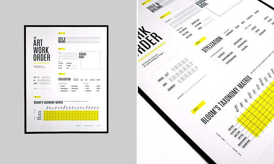
Art direction "order form" based on “thinking skills”. Design by Julia Rater.
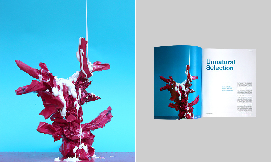
Left: Group photo by Lindsey McCann, Julia Rater and Jina Ro, which addresses a coral’s "bleaching event”. Right: Publication design by Julia Rater.
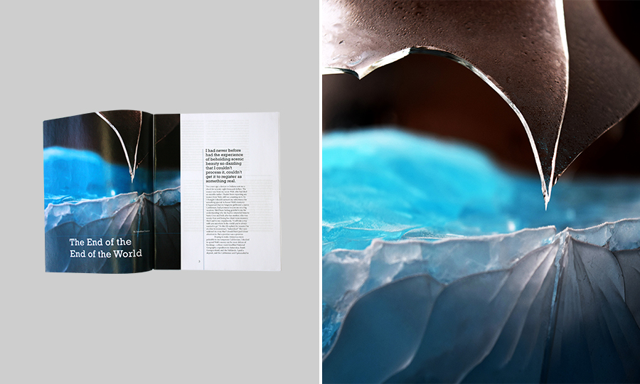
Left: Publication design by Brooke Nelson. Right: Group photo by Amanda Robinson, Brooke Nelson, Haley Cuneo and Erin Newman, which illustrates feelings from a trip to Antarctica.
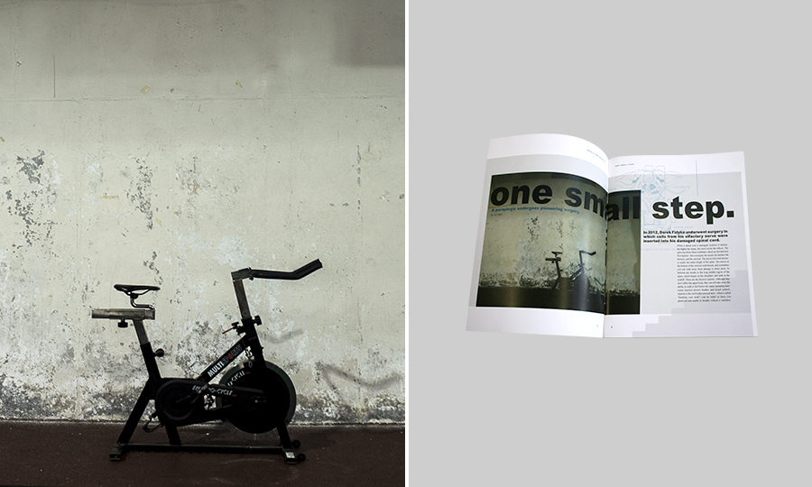
Left: Group photo by Hannah Largen and Tessa Riley about a spinal injury patient and his innovative surgery. Right: Publication design by Tessa Riley.
The following examples are from a separate class that clarified complex scientific text (from New Yorker essays) through infographics:
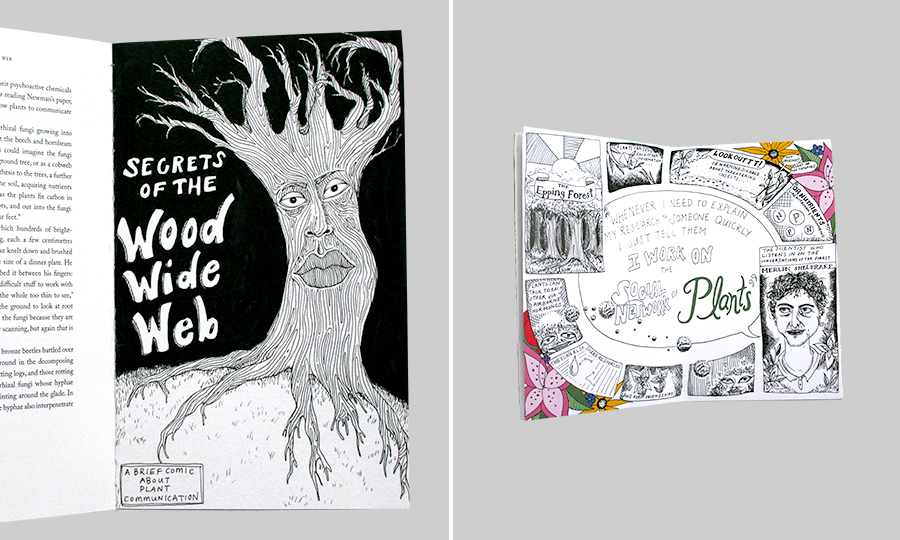
Through lateral thinking methods for image-making, students came up with a number of imaging strategies. This infographic is wonderfully inventive and uses hand-drawn techniques in a comic-book style manner. Design by Jessica Potter.
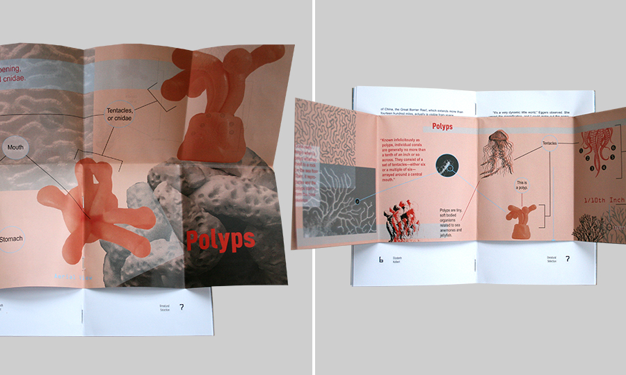
This infographic defines and explains an individual coral, otherwise known as a polyp. The design is also innovative as it folds out from the main essay. Design by Taylor Malavet.
i Peter C. Brown, Make it Stick: The Science of Successful Learning (Cambridge, MA: Harvard University Press, 2014).
ii Maria Montessori and Anne E. George, The Montessori Method (New York, NY: Schocken Books, 1964).
iii Terry Doyle, Learner-centered Teaching: Putting the Research on Learning into Practice (Sterling, VA: Stylus Pub, 2011).
This quote references research by John Ratey, a clinical professor of psychiatry at Harvard Medical School, in 2001.
iv Linda Lohr, Creating Graphics for Learning and Performance: Lessons in Visual Literacy. (Upper Saddle River, N.J.: Merrill, 2003).
This quote references instructional graphics, though it’s being used in a general sense.
v Renate N. Caine and Geoffrey Caine, Making Connections: Teaching and the Human Brain. (Alexandria, VA: Association for Supervision and Curriculum Development, 1991).
vi Elizabeth Kolbert, “How Tina Brown Moves Magazines.” The New York Times (New York, NY). Dec 5, 1993.
vii Clark, Ruth, and Chopeta C. Lyons, Graphics for Learning: Proven Guidelines for Planning, Designing, and Evaluating Visuals in Training Materials. (San Francisco, CA: Jossey-Bass, 2011).
viii Connie Malamed, Visual Language for Designers: Principles for Creating Graphics That People Understand (Beverly, MA: Rockport Publishers, 2009).
ix Lorin W. Anderson and David R. Krathwohl, A Taxonomy for Learning, Teaching, and Assessing: A Revision of Bloom's Taxonomy of Educational Objectives (New York, NY: Longman, 2001).
x One group supplemented graphs, diagrams, and maps from Scientific America, just to get a better range.
xi Great insight from Erin Newman. Thank you, Erin!
xii A kind thank you to Steven Heller, art director extraordinaire, for answering all of my questions in an expeditious and generous manner
xiii Adam Gopnik “Postscript: Richard Avedon,” The New Yorker,http://www.newyorker.com/magazine/2004/10/11/richard-avedon, accessed January 25, 2017. “When Tina Brown brought him to The New Yorker, in 1992, to be its first staff photographer, she was rupturing a long-standing taboo against photography…”