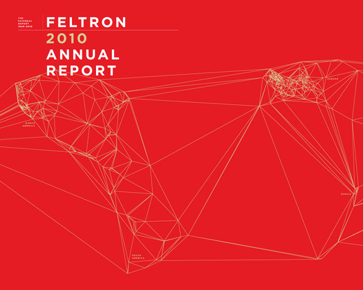
"Feltron 2010 Annual Report," by Nicholas Felton
Science Daily recently reported the results of a study involving the relative attractiveness of annual reports. Possibly that sounds a little frivolous. Possibly it is. But I couldn't resist reading the item — and passing it along as a minor weekend post, for your diversion. I remember, as a young reporter, encountering such documents for the first time, being startled by how lavish many of them were: heavy paper, beautiful printing, etc. What a waste of money! Right?
Wrong, according this study. “Investors, regardless of their experience, place a higher value on firms with attractive annual reports than they do on those that produce less attractive reports,” Science Daily tells us. Researchers at the University of Miami School of Business administration conducted their study across three groups: finance students, members of the general public, and “experienced investors.” In all cases, "participants rated firms with more attractive reports higher than those with less attractive reports.”
My favorite detail:
In the study involving experienced investors, in which participants were asked to rank companies based on how likely they would be to invest in those firms, the findings suggested that including an additional color throughout a firm's annual report would have the same impact on an investor's firm ranking as a 20 percent improvement in revenue from the previous year.
If only Nicholas Felton sold stock!
Anyway, what's presumably going on here is that subjects unconsciously assume that a firm that takes proper care and expense in presenting itself to investors must be healthier than one that doesn't. Of course that's a faulty inference — and just the kind of looks-over-substance mistake that most of us would deny ever making.
Unfortunately no visual examples are offered to show us what the “attractive” and “less attractive” reports actually looked like. The reference in the above to “including an additional color” gives me pause.
I dropped a note to the lead researcher, Claudia Townsend, of the University of Miami. She couldn’t provide me with images, but she did have a few details. “We used both real annual reports as well as mocked up versions,” she replied. “With the real annual reports, we looked at a bunch of quantifiable variables (e.g. number of colors, number of images included, etc) and then also an independent (blind) rating of the overall aesthetics. With the mock-ups we controlled for the number of images, what the images depicted, colors, etc., and ONLY varied the overall aesthetics — how well designed it was, how aesthetically pleasing the pictures were.”
Designers, before you go looking for holes in the methodology here, be advised that Townsend is your ally. She told Science Daily: "The implications of these findings should point firms in the direction of good graphic designers."
Just pass that on to your clients, and don't worry about the details.


Comments [2]
08.31.11
01:36
09.01.11
04:09