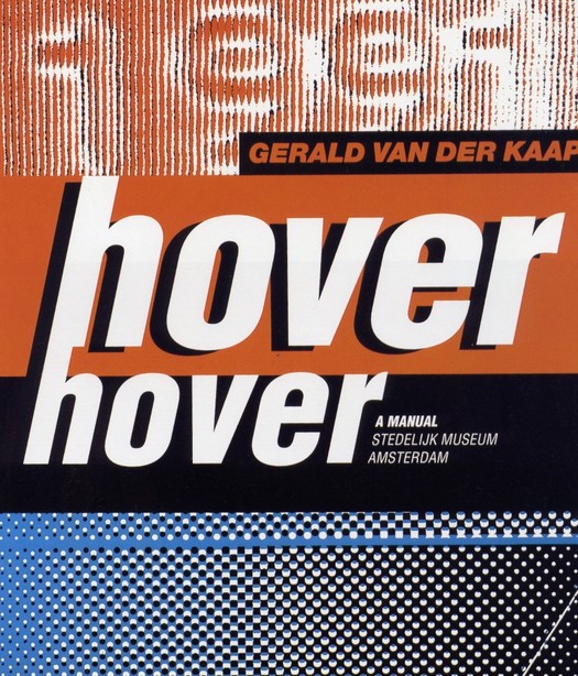
Hover Hover catalogue cover by Mevis and Van Deursen, 1991
Armand Mevis and Linda van Deursen belong to that elite group of designers who possess the magic ingredient that qualifies them, at least for a time, as it. How do we recognise such designers? One of the most reliable indicators is the Idea magazine portfolio test. If the punishingly expensive Japanese über-review features your work, you are well on your way to design hipdom. If its roving editors make you a cover-story centrepiece, devoting 60 or so pages to a no-holds-barred project round-up, and encourage you to lay out the whole thing yourself in an act of exquisite self-deification, you have unquestionably arrived. Welcome to the club.
Mevis and Van Deursen are now paid-up members, along with Alexander Gelman, Tomato, M/M, Cyan, The Designers Republic, Jonathan Barnbrook, and other luminaries. The Dutch duo has just been profiled in Print magazine's European Design Annual, their work features in "The European Design Show" at the Design Museum, London — another copper-bottomed guide to international design coolness — and a monograph about them, titled Recollected Work, has been published in The Netherlands by Artimo.
While they may seem like newish arrivals, they are now in their 40s and began working together in 1986 after studying at the Rietveld Academie in Amsterdam. It was an interesting moment for Dutch design. The country's designers had made an exceptional impact in the 1980s and, as the 1990s began, it was natural to wonder whether they would be able to produce successors to design figureheads such as Wim Crouwel, Jan van Toorn, Anthon Beeke and Gert Dumbar — Mevis and Van Deursen had been interns at Studio Dumbar. By 1991, when they designed the startlingly confident Hover Hover Stedelijk Museum catalogue for Dutch artist Gerald van der Kaap, Mevis and Van Deursen were producing highly distinctive work, but they were modest with it. I wanted to publish a profile of them in Eye. They felt they hadn't done enough, though in 1992 they agreed to a short feature. They attracted attention throughout the 1990s, but never became "industry leaders". They still haven't got round to designing their own website. The book could have come out several years ago if they had wanted.
Is it true, then, as the Design Museum claims, that Mevis and Van Deursen "have played a critical role in modernising Dutch graphic design and redefining it as a dynamic medium"? It's not clear how. Dutch design has been famous for decades for being unusually modern and dynamic. They seem more like a continuation of this tradition than a radical departure. Yet they have certainly had an influence on younger designers through their teaching — Mevis at Jan van Eyck Academie, Werkplaats Typografie and Yale, Van Deursen at Rietveld Academie and Yale.
Recollected Work is shot through with ambivalence about the undertaking. Their friend, fellow Yale teacher and occasional collaborator Paul Elliman is a quirkily original thinker and I was looking forward to hearing his analysis. His text, "Too Much Information", turns out to be a series of transcripts based on conversations with them, but only Mevis and Van Deursen's side of it. Although they were both involved and speak in the first person, the narrative appears to be uttered by a single speaker. Mevis and Van Deursen drop short blocks of this text into the flow of visual material, a continuous collage made from fragments of their output. Seventeen years of work blurs together, like grubby laundry turning over and over in a washing machine. Nothing has any space around it. Everything becomes flotsam. Any sense of development is erased. To find out what these glimpses of work represent, you have to turn from the small reference numbers to the back of the book where they list all the jobs.
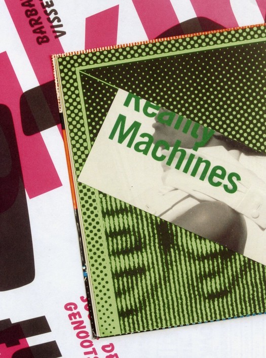
Page from Recollected Work showing a recycled page from Hover Hover and other elements, 2005
This is a pain. When a project is mentioned, there is no easy way to locate a picture, although you can be certain it won't be next to the passage you are reading. But the text is fascinating. These are some of the most unsparingly candid confessions about the sheer slog and awkwardness and grinding disappointment of designing ever committed to print. Looking back over their work, Mevis and Van Deursen find it "full of mistakes and bad choices and missed opportunities", the inevitable result, they suggest, of taking creative risks. They admit they are prepared to accommodate almost any petty demand from their clients — make it bold, make it black, make it italic, put it on the back, take it off the back — but they never walk away from a job and somehow something tolerable usually emerges in the end. "As my father would put it," says one of them, "We have no spine! Perhaps you need to have no spine."
In one of the best sections, they describe the debacle of their 1996 diary for KPN, the Dutch telecommunications company, which used informal photographs of ordinary environments — images intended to show "how casually the company's services were integrated into people's daily lives". The diary, regarded as a prestigious design commission in The Netherlands, was created for KPN's 60,000 employees. Mevis and Van Deursen wanted it to represent everyone from the mailman to the director. The company hated its inelegance and destroyed many copies. "Nobody yelled at us," say the designers. "It was all very interdepartmental ... everybody wants to be on one of these groups, everyone is willing to give up some of their free time to meet designers and artists, it's exciting. But then once the project is completed, once this thing comes back as a kind of monstrous thing, suddenly the committees have dissolved, nobody is responsible. No-one signed it off. There's nobody there. There's only the rumour of a raging director who wants to throw them all away and threatens to cancel the whole project for ever ..."
People use the phrase "too much information" when someone has said rather more than the etiquette of a situation demands. I would guess that Elliman knew he had some unusually frank observations in the can and decided to quit while he was ahead.
Mevis and Van Deursen's honesty and openness, their utter lack of self-serving bullshit — to recall a recent DO thread — is hugely refreshing. Designers putting together their own monographs are often constrained by the idea that their book can serve as a glorified practice brochure. Here, for once, is a monograph that seems oblivious to what future clients might think if they happened to see it. Mevis and Van Deursen's self-critical account of their fallibility as designers is all the more intriguing in the light of how their colleagues see them. For Danny van Dungen of Experimental Jetset, quoted by Emily King in her Print profile, "Trying to stay true to your principles is extremely hard in graphic design ... In these times, we really draw a lot of inspiration from the mere idea of Mevis and Van Deursen being around." And despite what the pair say about producing perhaps one project a year with which they can be entirely happy, their work mainly for the cultural sector has always seemed highly uncompromising in its structural organisation and sometimes brutal typographic form.
One thing Recollected Work does seem to confirm is that Mevis and Van Deursen are — as King reports they claim themselves to be — "post-political". In Print, Van Deursen is quoted as saying: "We just try to take the work we do seriously, and to come up with answers within graphic design, but we are not ideologically driven."
There is no further discussion of this point so it's not clear why this is considered important to state or what its implications might be for their way of designing. If Mevis and Van Deursen are non-ideological, but they nevertheless advocate designer autonomy, then what exactly is it they bring to the design process? To assert that designers should "have a say" that goes beyond the customary degree of professional involvement in a project is simply to repeat yet again, with diminishing returns, what designers have been demanding for the past two decades. Far more interesting to consider, if this claim is serious, is what designers, having sometimes won that freedom, can do with it. There has to be a basis for action. Mevis and Van Deursen see themselves in some sense as editors and the term "visual editor" has a certain amount of currency in Dutch graphic design. But to make a selection, to decide what to leave out, to put things together, to create meaning of whatever kind, an editor needs a point of view and a sense of purpose that goes some way beyond simply saying: "Editing is good! I should be allowed to edit!"
It's disappointing that when they do have a completely free hand as editors of their own book, Mevis and Van Deursen seem so unsure of how to go about explaining their work using a carefully considered interaction of image and text. They turn their backs on their own professed commitment to ideas — "the idea is the most important thing" — and treat the book mainly as an opportunity for undemanding aesthetic play.
See also:
We Are All Editors Now. Or Are We?


Comments [17]
but i think another thing the book points to, as well as their spreads in IDEA, is the fact that all their work can be thrown together in that way because their is such a strong character to their work, to their visual treatment of text and images, that it runs through nearly everything they do. you can usually recognize something armand and linda have done. and its not through a 'signature style' exactly of treatment of imagery, its through choice and configuration of type, and layout and sequencing of images. to have such a strong character in that way i think is pretty amazing and inspiring.
one way to ensure that you always look good and smart is to make sure every individual piece in your wardrobe looks good. that way anything you throw together will work. this may be a far flung analogy, but i think the way that they did their book shows the cohesiveness of their body of work. throwing any pieces of their work together makes sense becaues there is an underlying approach, or attitude, to most of it.
06.03.05
12:57
much needed respect they deserve.
Armand Mevis and Linda van Deursen now added to a long list of Design Luminares featured in IDEA MAGAZINE Speacial Issues and Extra Issues. To include, BASS, GLASER, LANDOR
Chermayeff & Geismar many, many others.
Since Idea Magazine's inception in the late 1940s it has been the LEADING Design Publication to the WORLD. Bar None. And the only publication devoted to featuring Special Issues (full publications) of Design Luminares World Wide.
I'm extremely proud of the accomplishment of Mevis and van Deursen. Being featured in an Idea Special Issue is the Pinnacle of Design Publishing. The only publication to rival Idea Magazine is the now defunct Walker Art Center Publication, Design Quarterly.
06.04.05
12:56
06.04.05
10:04
Is it possible that M+VD's history with their clients, from whom they are "prepared to accommodate almost any petty demand," has left them ill-equipped to operate with the kind of autonomy that self-editing requires?
I ask this as someone who admires their approach, as well as their forthrightness about it. I have not seen their book yet, but it sounds like it is a lot more interesting than the typical designer monograph.
06.07.05
08:21
i think this statement is taken a bit out of context. while they may say that they are accomodating, they also have a very strong hand in shaping the work they do. usually this is done through typography, text-image relationships, and image treatment, but its done in such a way as to bring new meaning to the book. "-los amorales", a book on mexican artist carlos amorales, and "library of the museum", a book on african artist meschac gaba (sp?) are good examples of this.
i suppose its whether you support their decision on how they do their book, or not. obviously, as rick points out, their agenda was not 'hey look at us, we are great designers! we are so proud of ourselves!' its not very good reference material if you are trying to find out more about the individual pieces, or if you are trying to bite their style. but i think it does make a commentary, that graphic design work is all 'flotsam and jetsam', fragmentary, little invites and posters and things that barely exist in your mind unless you take the time to notice them. comparing their monograph to books theyve done for artists, it seems like the 'normal amount' of intervention that they have taken with their other books.
but then again, maybe it is incredibly self indulgent. im sure there's nothing really like seeing all your work spread out before you on the floor or on your desk, covering all surface. especially when all the work makes sense together, like theirs.
i havent read the text yet, but i am looking forward to it. paul elliman also published a very good essay on collecting in a book for karel martens. i forget the name of the book, but it had a white cover.
06.07.05
02:45
I would say the opposite. Since most viewers will not know the designers' work in any detail - unless they happen to be colleagues of M+VD or, like you, one of their students - it is essential to show the work as clearly as possible as a starting point for discussion. This is not an argument for dull, prosaic, visually uninteresting monographs. Meaningful complexity comes not from graphic confusion but from a thoughtful arrangement and juxtaposition of visual elements to establish previously unseen relationships and connections.
Have you seen the study of Sandberg designed by Jan van Toorn? The book deserves to become a benchmark for anyone working on a design monograph. Van Toorn's visual editing of Sandberg's body of work is exemplary. The pages present an endlessly stimulating frieze of visual examples. At first glance they could appear chaotic - they certainly convey a sensation of the unceasing flow of ephemeral projects - but there is always an underlying narrative and a guiding sense of proportion. What is important? What should be emphasised? What can be played down? You emerge from that book with a strong, detailed and particular understanding of the nature of Sandberg's graphic achievement. It's a perfect amalgam of pleasurable celebration and cool-headed analysis.
I can understand why M+VD were unable to conduct this kind of visual analysis on themselves. It's a rare designer who can be so detached. The smart move would have been to entrust the project to an independent editor with a deep understanding of their work. I believe they are much better designers than their own book makes them seem.
06.08.05
09:55
The self-made designer monograph is generally short-lived. But so, too, are so many graphic design books. How many books on the shelves feature work curated around a central person, idea, or group of high-ranking jurors -- all with the same soft drop shadows around the edges of works that have been reduced to thumbnail-sized objects? Isn't this mindless, if not just for the repetition? Regardless of their careful text and photographic relationships. There is too much information. Too much telling. Sometimes it even goes down to the paper, fonts & measurements of the objects. No wonder these books are often badly repurposed -- as though they're showing clip art free to be copied by other designers.
Mevis and Van Deursen's book does its own thing and stands out. Maybe it's not perfect, but it feels like it was made by two people with an authentic point of view, and that's rare.
06.08.05
12:23
The layout strategy is very simple. Many pages of full-bleed pictures of multiple unidentified print projects shot straight down, looking as if they were casually tossed on a table top. Every once in a while there is a page of text with extremely conversational, seemingly unedited commentary. You never once get a view of a M+VD piece like the one you see, for instance, at the top of Rick's article.
People who know the designers seem to find it a faithful portrait. People who don't know the designers seem to not know what to make of it.
Designers always struggle against the limiting conventions of presenting graphic design in print: some may recall Jennifer Sterling's famous (or infamous) AIGA 365 catalog from several years back, where each of the pieces was cropped to show only a fragment. The horror!
Avoiding the obvious takes a lot of time and trouble. Sometimes I wonder if it's worth it.
06.08.05
02:10
06.08.05
04:06
Often, though, the effect comes perilously close to being a cancellation of the work, the ostensible reason for creating the book in the first place. To viewers who would like to see the work as clearly as reproduction allows and be allowed to make their own judgements about it, books like this read as a loss of confidence in the value of the work in its own right, as a failure of nerve and sometimes, in their more flagrant distortions, as a form of bad faith.
Anyone who has done any historical research into design will know how valuable it is, decades later, to see descriptive reproductions of ephemeral material that has all but disappeared. We have the ability now to reproduce images of design with greater fidelity than ever. This has its perils, too. But it's entirely consistent with a desire to assess and analyse this visual material that, as a first step, we show it clearly. Graphic entertainment has its place, and there is a huge literature of design now devoted to this, but let's not kid ourselves that it contributes anything very useful to the documentation and critical understanding of the subject.
06.08.05
05:01
While in Osaka (for prosaic reasons) I was able to see the Mevis & Van Deursen exhibition Recycled Works at ddd gallery. This was arranged in a manner that sounds quite similar to the book under discussion. And I had a similar reaction, particularly as it was prohibited to pick up and touch the work. On a low table that filled up most of the space in the gallery the work was not haphazardly, but abundantly and expressively arranged to cover every surface - some pieces were obscured by others and those that were distinct sat on top of other pieces. So I felt some distance, a difficulty in getting ahold of what was really before me. I wanted to be able to study the work, to somehow get something out of it. I felt I really didn't have any control over how I could take this in and as if this had already been decided for me. On the other hand I was enjoying that nothing was treated as too precious, too significant, that there was some ambivalence, perhaps humor here. And I'll conceed that my desire to study the work under a magnifying glass or in a vitrine should be questioned. So I'm very curious to see the book.
06.08.05
09:25
on a side note, what i find interesting about maybe the last 20 issues of IDEA is that the work of the designers they feature is mostly professional, functioning work. much like the work of MvD. which is interesting to think about in contrast to emigre, that other magazine from the 90s whose features validated new voices in graphic design. the work featured in the latter was primarily guest design/editorials, student work, 'personal work', and entrepreneurial projects. most of the design work featured in IDEA, at least for feature articles, is client based.
06.09.05
10:19
A monograph is a book, paper or other work concerned with a single subject, so that's what M+VD's book is. However, their book doesn't do some of the things often associated with monographs, hence this discussion. Most notably, there is no "overview" text of any kind.
The market for designer monographs is limited. They often don't sell that well and publishers tend to be wary of them. Very few designers can support more than one book -- Brody and Carson are the most obvious exceptions. M+VD's book would have to sell spectacularly well for any other publisher to produce a book about them while this one is still in print. If M+VD were to disband next month, it is quite likely there would never be another book about them and this one, with all its shortcomings, would become the primary record of their work.
06.10.05
04:30
A few years ago, the University of Amsterdam Library signed an agreement with Irma Boom to purchase her entire archive —an unusual feat for a living designer. They also purchased the entire collection of drawings made by Bram de Does for the typefaces "Trinité" and "Lexicon." When is the MoMA (with its "renewed commitment to graphic design") the Cooper Hewitt, or the Getty going to get on the ball and purchase the archive of individuals like Ed Fella, Lorraine Wild or April Greiman?
06.13.05
10:34
For anyone with research interests, monographs, especially well-researched, thoughtfully assembled ones, are a useful tool. It goes without saying that someone undertaking such research will want to look at original pieces and at whole archives, if they exist. But even the most interested viewers and readers may not be able to pursue this, especially if the primary collections of a designer's work are in another country. You will probably need to be working on a research degree or writing a book to undertake this kind of travel and study.
So the monograph has a significant role as a way into an oeuvre and clearly, for more casual readers (that is, for most readers), it will be the main window on to a body of work. It is also one of the ways in which reputations are kept alive or resurrected. How well is, say, Will Burtin (1908-72) known? Barely at all, sadly, yet he was a remarkable designer. Not until there is a monograph about him -- I believe Roger Remington is working on one -- will there be any chance of a wider appreciation of Burtin's work.
06.13.05
01:06
Curmudgeonly yours,
David
06.13.05
02:52
I remember when Tibor Kalman asked me to design the book that became Perverse Optimist, I came back with a lot of zany off-the-wall ideas that were the kinds of things I fantastized I would have come up with if I had ever worked at M&Co. Hey, fuck traditional monographs, right? Let chaos reign!
Tibor listened patiently and said, "You know what you should do? A really nice clean grid and a layout with good pacing and simple typography. Then we can come in afterwards and fuck it up a little bit."
Given that he was already suffering with the cancer that would take his life in less than two years, Tibor was perhaps a little more aware of the purpose and potential value of what he was to leave behind.
06.13.05
03:59