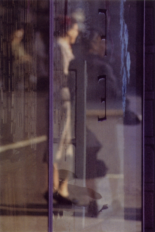
Saul Leiter, Walking, 1956
Saul Leiter’s early color photographs, unseen for many years, must surely rank as one of the great photographic rediscoveries of the last decade. These are pictures that have you instantly reaching for words like epiphanic, rhapsodic and elegiac to describe their poetic intimations and delicate painterly effects. We may have turned into a globe of digitally enabled shutterbugs, but Leiter is a perfect example of why all photographers are not the same. What kind of preternaturally hyper-trained eye does it take to find and resolve in a picture, in an instant, compositions of such visual complexity and internal harmony?
Adam Harrison Levy wrote a nice piece about Leiter for Design Observer a couple of years ago, focusing on both the New Yorker, now in his late 80s, and his paintings. Adam included a couple of photographs, one of which I’m showing again here because it belongs to a small group of pictures within Leiter’s body of color photographs that fascinate me. These are shots that incorporate fragments of lettering, usually on shop or restaurant windowpanes. While Leiter’s pictures are accidents of happenstance, transitory moments of sensation and impression that he was able to anticipate, track and capture, every element held within the frame reads with the same deliberation as a carefully pondered brush stroke or a purposefully applied wash of color. Leiter knew exactly what he was doing with these stray letters and word fragments.
There are always human figures in Leiter’s color pictures, though they are rarely presented directly, or privileged as the main subject. Instead, they take their place within a scene as depersonalized forms viewed at a remove, from behind, as a reflection, or through a filtering layer such as a misty pane of glass that distorts or enclouds them. In Walking (1956) both figures are blurred and appear to melt into their surroundings, and it is easy to miss the woman in the dark coat beside her lighter-clad companion. The photographer is on the inside looking out and vertical reflections of different kinds complicate the scene; the source of the reflection of the door or window that bisects the subjects is an insoluble conundrum. Visually compressed letters — F and E seen in reverse — add to the picture’s verticality and these ciphers float in parallel to the light-coated woman like brackets placed to indicate her head and middle body. Everything in the picture is fluid, unstable and indeterminate, yet the pieces lock together to demonstrate that other levels of possibility and meaning can be found within every cascading moment, if we give them our attention. Leiter’s images do this again and again. As the poets W.B. Yeats and Paul Éluard separately observed, in one of this blog’s favorite mantras, “There is another world, but it is in this one.”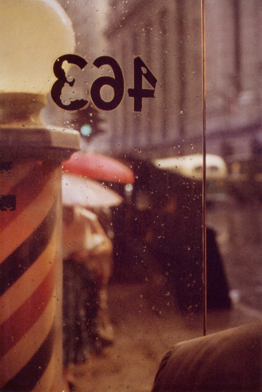
Saul Leiter, 463, 1956
Mutable glass is a perfect subject for Leiter because it allows him to superimpose two or more planes of composition, like an old-fashioned mechanical overlay taped in place on the base artwork. 463 (1956) is a relatively simple example: the broken letters are unambiguously the focal point, caught in a force field between the barber shop pole and the sharp thin vertical line that divides the panes speckled with raindrops. It’s worth adding that Leiter’s fascination with the poetic power of damaged letters in the city anticipates the interest shown by graphic designers in this kind of accidental expression, from his contemporary Robert Brownjohn to later experimentalists such as Ed Fella and David Carson. The distressed letters in Snow (1960) are grungier still and their collision with the dissolving man, as though they are floating in the air and drifting like typographic wraiths through his body, is one of Leiter’s most arresting and magical epiphanies.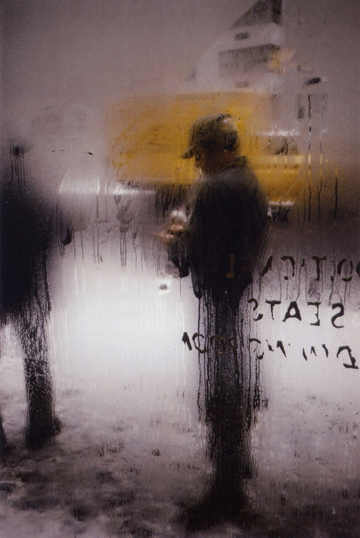
Saul Leiter, Snow, 1960
Leiter was wonderfully consistent in his photographic concerns, having begun in 1950 with perhaps his most sublimely minimal study of condensation, where the only readable sign in a world of immaterial blurs is a single, runic letter T. The fragment is always infinitely more mysterious and suggestive than the whole and the T liberated from whatever dull ordinary thing it was trying to say becomes an operating code, a statement of aesthetic intent, for the images that Leiter would conjure from the chaos of the streets in the decade to come. If I had just shown this picture without a date, could you possibly have guessed when it was taken?

Saul Leiter, T, 1950
See also:
Surface Wreckage


Comments [1]
I find it interesting that the presence of the type in these photographs makes them appear like posters. Perhaps this is something Leiter was conscious of - it certainly seems that way given the picture described.
12.21.11
05:52