
England Swings SF, Doubleday, 1968
I had barely walked into Out of This World: Science Fiction But Not As You Know It, an exhibition at the British Library in London, when I noticed a book cover that blew me away. I present it here for your enjoyment, or perhaps your dismissal.
Never having seen this strange dust jacket before, I immediately wanted to know who designed it. England Swings SF, Judith Merril’s collection of “speculative fiction” by writers from SF’s “British” new wave, was published in 1968 by Doubleday in New York. But there is no information about the cover’s creator in the exhibition (the curators focus on the authors) and when I googled the collection later, I could find only two images of the book. One of these was on amazon.com — at a gratifyingly low price for what seems to be a rare edition — so I bought it. Unfortunately, the book arrived too late for me to add a design credit to my review of the exhibition for the latest Creative Review.
I’ll come back to the designer, but let’s treat the England Swings SF cover as the work of “anonymous” for a few moments longer. This hardback jacket is highly unusual for its time and there is nothing remotely like it among the 1960s book covers in Ned Drew and Paul Sternberger’s By Its Cover: Modern American Book Cover Design, the most detailed study of the subject. The first thing to note is that the illustration and the design are inseparably integrated — is this primarily an example of one approach or the other? — and the piece looks like the work of a single hand. While there is a conventional hierarchy of information, with the title at the top in the biggest type, this is just one graphic element among many given more or less equal weight. The parts fit together only loosely and in the absence of a dominant visual idea, the viewer scans a discontinuous collection of photos, cartoon characters, slogans, abstract geometrical devices, graphic fragments and whimsical squiggles that couldn’t be more different from the purposeful, elegantly resolved line work of Glaser or Chwast in the same period.
If the collage style brings to mind a less aesthetically driven version of the British artist and printmaker Eduardo Paolozzi, who was highly visible in those years, the improvisational informality and loopy non sequiturs share something in common with Fluxus, the mail artist Ray Johnson, and the inspired energetic amateurism of the 1960s underground press. But the cover of England Swings SF also looks forward to the rule-breaking and multiple coding of graphic design in the postmodern 1980s and 1990s. (By comparison, the paperback from 1968 is both of its time and entirely ordinary.) We might want to call the design fecund, to use Elliott Earls’s proposed benchmark for quality, except that this is one of those prescient imaginative leaps into the future that vaulted so far that it disappeared from the historical record. Instances like these always make you wonder what other graphic inventions have been passed over by the insufficiently attentive canon of design-meets-illustration.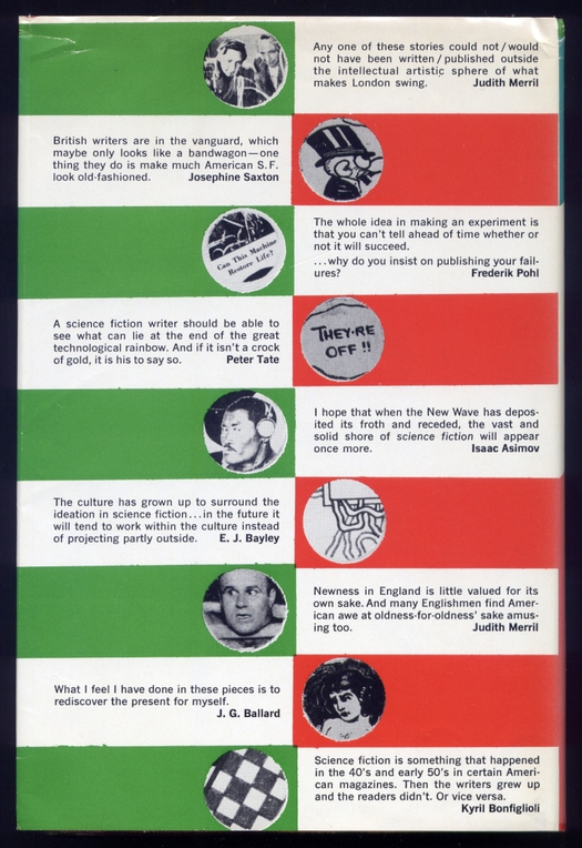
England Swings SF, back cover, Doubleday, 1968
As an interpretation of the book’s short fictions, the cover is very smart work and it assumes the existence of SF readers as visually sophisticated as they are literary. The use of Stanley Davis’s Amelia typeface, designed in 1965, for the editor’s name might gesture toward a space-age future, but other elements including the dated photos resist any such literalism. The British new wave in science fiction was highly experimental in its treatment of literary form and many in SF’s old guard were dismissive (see Frederik Pohl’s comment on the back cover, above). The collection contains three texts by J.G. Ballard — “You and Me and the Continuum” and “The Assassination of John Fitzgerald Kennedy Considered as a Downhill Motor Race” paired with “Plan for the Assassination of Jacqueline Kennedy” — as well as stories by Michael Moorcock, Brian Aldiss and Langdon Jones. American writers published in the UK during Moorcock’s hugely influential stewardship of New Worlds magazine also appear: Thomas Disch, author of The Genocides, and Pamela Zoline, still remembered for “The Heat Death of the Universe,” which she wrote as an art student in her mid-20s.
Richard Merkin (1938-2009)
Happily, the cover, unlike so many others back then, comes with a credit, “Jacket by Richard Merkin,” though without specific reference to illustration or design. The piece doesn’t directly resemble anything else I have seen by the celebrated American illustrator, painter and dandy, who died in 2009, but the attribution does make sense of the cultural mood and artistic reference points so nimbly handled in the cover image. Merkin visited “swinging” London in 1966, spending the summer there, and met artists such as David Hockney, R.B. Kitaj (an American then resident in the UK) and Peter Blake, who became his friend. “I actually feel much stronger about the British Pop Artists than I did about the Americans,” Merkin said later. “People forget that they invented Pop Art.” In 1967, much to his surprise, Blake affectionately immortalized him among the platoon of cultural heroes and icons on the cover of Sgt. Pepper — he’s in the back row wearing a brown hat.
In her introduction to England Swings SF, Merril interleaves her remarks with a collage of excerpts from Sgt. Pepper’s lyrics. For Merkin, whatever he thought about the new speculative fiction, to judge by his highly original cover this must have been a project he invested in.
See also:
On My Shelf: Richard Neville’s Playpower
Eduardo Paolozzi, 20th Century Image-Maker
What Does J.G. Ballard Look Like?
The Celebrated Mr B


Comments [2]
Thanks.
06.28.11
12:57
06.28.11
01:11