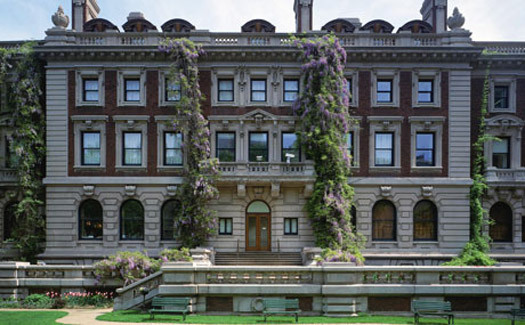
The Cooper-Hewitt's 1902 Carnegie Mansion
This month’s issue of Fast Company, “The United States of Design,” includes a profile of Bill Moggridge, director of the Cooper-Hewitt National Design Museum, co-founder of IDEO, and all around design world untouchable. The profile, by Jessica Lustig (a friend and former colleague), focuses on Moggridge’s big plans for the museum, which variously and vaguely include business partnerships, hands on programs, becoming a clearinghouse for other design organizations, and a better digital presence. What the article can’t, and Moggridge apparently won’t address, is what he’s actually going to do with the museum as a museum. When he lists the museum's constituencies, designers come last.
As Lustig points out, it is probably a plusfor Moggridge that the museum’s mansion will be closed for renovations for the next two years. He has a chance to put programming in the cloud and across the city. But what I hear in this article, and what I’ve been hearing for as long as I’ve lived in New York, is a blame-the-container attitude. It’s the building. It’s the collections. It’s the name. Yes, those things need to be fixed, but I think it is time to call bullshit on the excuses and to ask when the Cooper-Hewitt is going to put on an unmissable exhibit again. Moggridge's ideas about the museum seem to be about everything but the actual products of design. And if that makes me conservative, I suspect I'm not alone.
Here's my laundry list of things the Cooper-Hewitt should do. It would be great if you would add yours too, in comments.
1. Fix the logo. Lustig writes:
Even its own name is an obstacle. In 1994, it was renamed once more as Cooper-Hewitt, National Design Museum, Smithsonian Institution--commas and all. All of its materials use "Cooper-Hewitt, National Design Museum," as well as the Smithsonian's name and sun symbol. "It's a branding issue," says Michael Bierut, graphic designer, partner at Pentagram, and cofounder of the Design Observer website. Moggridge admits he'd like to just make the word "design" really big and shrink everything else.
This is a great idea. It is time for the museum’s many masters to give back by putting the focus on the main event, rather than their stake.
 From "Artist's Designed Wallpapers," Cooper-Hewitt
2. Celebrate the contents. And, isn't this a dumb quote from the AIGA's Richard Grefe?:
"Really, it's a matter of time," he adds, laughing. "How long can people defend a wallpaper collection?"
To the death. Hasn’t Grefe noticed that wallpaper is back? The Cooper-Hewitt’s collections are filled with treasures, and they need to empower their curators to put on exhibitions that connect those treasures to the present day. The Cooper-Hewitt only makes itself generic by pursuing the latest thing. That’s what led to ten years in which no show was without an Apple product. And the increasingly anaemic Triennials.
I enjoyed the one-room guest-curated shows the museum put on (like Kurt Andersen's "Faster, Cheaper, Newer, More"). But I would also enjoy even more professionally curated shows on the great figures of modern design (like my friend Russell Flinchum's 1997 Henry Dreyfuss exhibition) and the hidden persuasions of the things we use (or Ellen Lupton’s 1993 “Mechanical Brides") I can't believe how long ago these shows were, because I still think of them often, and they were formative for my ideas about design and history. Unlike the Museum of Arts and Design (the unmentioned elephant in the room for the C-H, along with MoMA's Architecture and Design Department), the Cooper-Hewitt has collections and a history. Use them.
3. Stop blaming the building.
"I think that the biggest problem they have [at the Cooper-Hewitt] is the building itself, which is a straitjacket rather than a showcase," says Aaron Betsky, director of the Cincinnati Art Museum. "I am afraid that the constraints of the historic building are such that it will be difficult for them to really be the kind of public laboratory for design that I think Bill would like it to be."
Design is not modern art. Most of it isn’t that big. It fits in our houses. Is it really so hard to create an armature that would allow the museum to show different objects in their 1902 Carnegie Mansion? If the best argument for design is that it solves problems, it seems to me there is a solution, and not just the usual hollowing out and opening up. From Fast Company:
The main event of the museum's renovation is the creation of a 6,000-square-foot exhibition space on its third floor for what Moggridge hopes will be "blockbuster" contemporary shows (his curators are still researching possibilities for the first one).
So now they’ll have space, but there’s nothing they are dying to put in it?
It will be interesting to see what attendance is like for the museum’s offsite events. If people still aren’t interested, is it the building at all?
4. Make a Tumblr. An online strategy is key, but I’d like less talk, more pictures. The museum has a blog, and it tweets, and Moggridge holds chats, and it is all very dutiful, but it doesn't have much attitude, and I don't see the online presence generating much interest. Especially while the museum is closed, why not open those same collections up with a Tumblr? Let the curators, interns, administrators, schoolchildren pick objects and post about their history and their enthusiasm. Ask famous design people and business leaders and educators to curate online exhibits. Make it creative rather than dutiful.
5. Challenge the sponsors (constructively). Lustig writes that the museum's No. 1 focus seems to be business. First, the museum should be planning an exhibition about the dawn of the marriage of modern commerce and culture in the 1950s. Second, they should think harder about what they are getting from those business partnerships. Target sponsors the National Design Awards, and has a seat of the board, and has shown itself to be a savvy marketer of design for the masses. (Whether it is "good" or not is another story.)
If the Cooper-Hewitt and Target are really committed to design for all, why not have D.I.Y. events for adults and children at Target stores rather than on the Upper East Side? Collapse the distinction between design museums, their shops, and shopping in a meaningful way, suggesting to consumers simultaneously how they might improve their choices, and think about design as more than a series of consumer choices. In a recent review of the TV show “Quirky,” based on a crowd-sourced design platform of the same name, Washington Post TV critic Hank Stuever wrote:
Meant to celebrate innovation and entrepreneurial can-do spirit, “Quirky” (premiering Tuesday night) instead eerily reflects the vapidity of the American economy and employment picture, where ideas trump labor and success is measured by top-level paydays instead of actual toil. Hipsters invent, while Chinese labor manufactures and shoppers mindlessly buy.
It’s a problem worth thinking about at our design museums too.
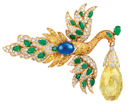
From "Set in Style," Cooper-Hewitt
6. Curate smarter. There’s nothing wrong with a jewelry show, done right. “Set in Style,” an exhibition of jewelry by Van Cleef & Arpels was the museum’s last before it closed for renovation, and set an attendance record at 172,000. First, that number is shockingly low. Second, as Karen Rosenberg wrote in the New York Times:
If “Set in Style” didn’t feel so in thrall to the company it might be less of an embarrassment for the museum. The show and its catalog, organized around rubrics like “innovation” and “transformation,” are full of breathless text that reads like ad copy. A short video supplied by Van Cleef & Arpels, showing workers cutting and polishing stones for the company’s signature Mystery Setting, engages in further brand-burnishing.
I’m not a designer per se, but I like shiny things as much as the next person. A clever, historically based show on botanical motifs in jewelry. Or the persistence of color. Or the idea of accessories. Any of these would have captured my attention, particularly if they came with some witty online promotion. Michelle Obama loves her bangles, and she might even have attended a show that seemed less aimed at women who already shop on Fifth Avenue.
"The lesson there, probably," says Moggridge, "is that the forms of design that beautify the human are always popular--so that's jewelry or fashion--and therefore one should make sure one doesn't leave them out."
Moggridge sounds flummoxed by its success, and I fear he has no taste for things. I don't think all the ideas and connections in the world can save a museum with nothing to see.


Comments [14]
- Rethink your docent/guided tour policy. On a guided tour of the "Design USA: Contemporary Innovation" exhibition I attended the guide, although very friendly and enthusiastic, was more into "Mr. Carnegie's" guests (such as Mark Twain) and the mansion's past life than about contemporary American design: she often mispronounced names of products and designers. This resulted in a very frustrating tour. Instead of having well-intentioned, but often clueless volunteers, refund your education department so you can hire students or graduates of the Parsons/Cooper Hewitt MA, but also of SVA's D-Crit MFA (disclaimer: I'm a graduate of the latter), to engage with audiences on multiple levels. This way, you'll have people who will have a chance of applying their art/design scholarship on a daily basis, and provide a better service to your visitors.
- To prove Mr Grefe you don't have to wait for wallpaper to be back to defend or celebrate it, learn from the BBC/British Museum's "History of the World in 100 Objects" project which last year represented a massive shift in how museums communicate with their audience (an opinion by Glenn Adamson, Head of Graduate Studies at the V&A, with which I absolutely agree). Through radio/podcasts, website and social media, but also an illustrated book and clever, well-designed signage throughout its halls, the British Museum managed to celebrate its amazing contents and – pardon the cliché – bring essential parts of its massive collection to life. The Cooper Hewitt could employ similar initiative to speak, for example, of the history of the US through its objects, or the history of American making perhaps – highlighting more specific design aspects than, say, the National Museum of American History would.
09.19.11
05:13
Building on Frederico's second point, the Cooper-Hewitt should (and excuse the Justin Timberlake-ism) 'put the sexy back' in design research - it's great to get visitors to "learn by doing" but it would be far sexier to champion designers to do the same. Using experiential labs and business partnerships the Cooper-Hewitt could not only access their research collection, but add to it.
For example, Jessica Lustig mentions a smell lab. Well, there is little to no publicly accessible research into emotional impact of fragrance chemicals in everyday consumer products, what research there is seen as proprietary within the industry... The Cooper-Hewitt could in helping visitors to understand their response of the design of smells, contribute to helping designers to use scent more consciously in the products they design. Imagine, a Cooper-Hewitt scratch'n'sniff catalog looking at the role of Galaxolide in American consumer culture (most of these products are probably on Target shelves now.
[Full disclosure: I'm a graduate of D-Crit, I have used Cooper-Hewitt's library extensively and wrote my masters thesis on the role of olfactory rhetoric in design - so my suggestion is totally self-serving.]
09.19.11
08:23
After years regularly visiting on a irregular basis, I almost gave up. The exhibitions more and more generally did not quite get over the line.
Sure the building was not designed as a museum. It has inherent quirks and difficulties. But that can not be continually construed and and used as an excuse. It should also not be confused with the amount of "gallery" space that is available.
Surely dealing with the building is part of the design of the exhibit.
As a Design Museum, finding those solutions is part of the mandate.
09.19.11
11:42
In a way, this is the essence of design work: to create something good and memorable out of lots of messy constrains. To call the building a straightjacket, to try to scrape it clean from the inside, is a defeatist attitude. I would suggest to open exhibition design there to teams of young architects, similar to the P.S.1 Courtyard annual challenge. They will be able to deal with “the problem” by design.
Curiously, many of the memorable shows of recent years have been staged in period rooms, even though they did not have to be. (I am thinking of Anglomania at the Met, and of many great exhibitions at V&A). The value of juxtaposition and cultural richness should be understood and celebrated, rather than suppressed with white walls.
09.20.11
06:05
09.20.11
11:38
09.20.11
11:50
Beyond that, as an eager provincial consumer of the museum's offerings, I found that the thought-provoking objects from the Trienniale—the most recent C-H show I attended—sat at the confluence of design and sustainability What I and my partner talked about for days after the show were the networked, undersea power generators and the air-pollution-scrubbing building tiles (well, OK, and the coat made from zillions of hang-tag connectors, but that doesn't really serve my point here). Working as I do for a planning firm I may be biased, but it feels like some of the most interesting design thinking and outcomes these days involve efforts to retrofit, rethink, and restore everything from public spaces to consumer goods in the interest of reducing their environmental impacts while improving their function. The reformist impulse has a long pedigree in American objects, products and design; surely it permeates the museum's collections, and just as surely it points to another area the new C-H could profitably explore.
09.20.11
12:02
It's important to note that the Cooper Hewitt, as part of the Smithsonian Institute, is run by the US government. Since all drawings, designs, and construction are subject to government review, working on an exhibition there is an extremely rigorous process. I like the idea of having younger design studios do exhibitions for both exposure as well as for the opportunity to be exposed to that kind of rigor. As cboym points out, there are a lot of messy constraints, but that's the challenge: to come up with something that is both nuanced as well as strong enough to survive all of the limitations and layers of approval a project has to go through.
Regarding the logo,the words "National" and "Museum" are just as important as "Design". Beyond featuring interesting design works, the Museum serves as a space for a national dialogue about design within an educational and cultural institution, a space for talking about design and its place in our national life.
09.20.11
01:19
09.20.11
04:08
09.20.11
08:21
An energetic Tumblr is a fabulous idea. But it sounds like serious curation itself is of renewed importance. Don't underestimate powerful curation, huh?
09.21.11
11:15
The container's only real flaw is the sound. If someone whispers in one corner of a room it echos to the point you can't hear yourself think and it becomes difficult to concentrate on the work after a while.
Nobody wants to hear it but the reason this property is not living up to the dollars they would like to see is a combination of location and patrons. Exploiting a gift shop and cafe to boost the gate is cheap and tacky but it's what venues do. The bulk of the gate are monsters. Do you know how hard it is to pay attention to the nuances in Sonia Delaunay's textile patterns over "Hey Edna, lookit this, it's yer iPhone, derrrr"?
This place will never get tourist dollars because tourists don't walk. Stop chasing them, it's a pipe dream.
Again the issues of the container (being knocked into every two seconds, blockage of entrance, lack of capacity, lack of display space, etc) can be addressed with better design as Constantin said above. The MAD is a tourist trap, the CH is a museum.
09.22.11
08:07
02.01.12
04:59
02.01.12
04:59