Designers and design historians told me over the years that they had heard about the existence of a Nazi graphics standards manual. No one could say they actually saw it, but they knew of someone who had. So it grew into something of a Big Foot or Loch Ness Monster tale, until one day I actually saw it too – and it had been right under my nose the whole time.
I had envisioned a manual of the kind that Lester Beall did for International Paper or Paul Rand did for IBM, showing acceptable logo weights and sizes, corporate typefaces and colors. I was so familiar with these standards manuals, that it never even occurred to me they were postwar formats — and decidedly modern. Maybe the Nazis did theirs in a different way.
The Nazis brand may indeed be uniformly distinctive, but for all the significance they placed on graphic design, there was more variety and greater leeway than one might think. Nonetheless, once I determined who was responsible for maintaining the NSDAP brand, it was a bit easier to identify the identity manual.
First, there were different bureaucracies: The Party’s identity was overseen by one leader, while the state’s identity was handled by another — and within these were many sub-chambers too. Dr. Joseph Goebbels’ Ministry of Enlightenment and Propaganda (PROMI) did not oversee the signs and symbols of the Party. Although his Ministry had a graphic design atelier, it was primarily for creating the propaganda materials. Albert Speer, Hitler’s architect and the designer of Nazi spectacles, did not administer to the identity either. His office designed monumental ways of displaying the existing brand.
The policing of all things Swastika was the responsibility of Dr. Robert Ley, the head of the German Labor Front (Deutsche Arbeitsfront, DAF) and the Strength Through Joy (Kraft durch Freude, KdF). Known as much as anything for his heavy drinking, this former editor of the anti-Semitic newspaper, Westdeutsche Beobachter, was not a designer or art director, but garnered considerable power owing to his intense loyalty to Hitler. One of his most ambitious design initiatives was taking over the development of the Volkswagen (people’s car) from Porsche.
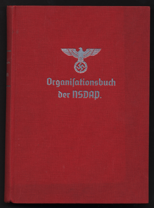
Perhaps a lesser, though significant, responsibility was developing a NSDAP handbook that detailed the organizing principles and mechanics of building the Nazi movement. It is this 550 page, red cloth-bound book titled Organizationsbuch der NSDAP, with the symbol of “Greater Germany” embossed in silver on the front, which turns out to be the elusive standards manual. The DAF was also responsible for typesetting guides and other graphic arts handbooks, but this is the graphic masterpiece of the Master Race.
It is not exactly clear how much Dr. Ley (who hanged himself after the war) was personally involved, although his introduction is in the volume. Perhaps he did not know the difference between typefaces, or even what graphic design was. But it was his office that determined the standards of stationery, enamel signs, flags and pennants, awards and badges, party uniforms and all things involving the swastika and ancillary symbols. So someone in Dr. Ley’s office knew what he was doing, though received no credit.
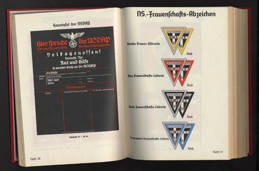

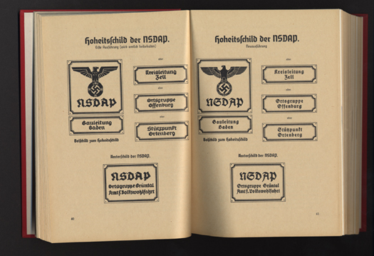
Published in 1936, The Organizationsbuch der NSDAP (with subsequent annual editions), detailed all aspects of party bureaucracy, typeset tightly in German Blackletter. What interested me, however, were the over 70 full-page, full-color plates (on heavy paper) that provide examples of virtually every Nazi flag, insignia, patterns for official Nazi Party office signs, special armbands for the Reichsparteitag (Reichs Party Day), and Honor Badges. The book “over-explains the obvious” and leaves no Nazi Party organization question, regardless of how minute, unanswered.
When I noted above that the book was under my nose, I meant this literally and figuratively. Many of the color plates, which visually establish the identity standards, have been reproduced in histories of World War II and the Nazis, without proper attribution. So, I’ve seen some of them before. Also, the Nazis issued a 255 page book, ABC des Nationalsozialismus (1933) by Dr. Curt Rosten, which in a more condensed fashion provided some early Nazi visual standards. It turns out I had this book in my collection all along without knowing its significance.
There was a standards manual after all. It just was not what I envisioned or expected. It turned out another record of graphic standards existed where I least expected it: the Reichs Gesetzblatt (Law Journal). When a graphic element was changed by law or decree it was chronicled in this document. So the Loch Ness mystery was solved, somewhat.
Iron Fists: Branding the 20th Century Totalitarian State by Steven Heller will be released in paperback by Phaidon Press in March 2011.


Comments [64]
02.07.11
10:36
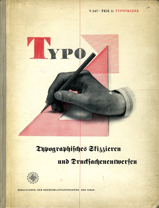
What is the first image you show (the one with the hand and triangle)? I feel like I have seen it before, and should know what it is, but I don't.
02.07.11
10:49
Other corporate "standards" manuals were not as disciplined as later postwar versions. I have one for AEG that simply shows variations on the logo designed by Peter Behrens, as well as different typeface treatments. This document is definitely not as regimented as subsequent CI manuals.
02.07.11
11:03
Could you tell a bit more here on why the Swastika was chosen? The story I heard, via a British grad student who did a thesis on the Swastika, is that the first appearance of the symbol happened on a “brochure” in the early days of the Nazi party. Basically, it was just a common clip art dingbat (the symbol held no evil connections pre Nazis and was used like other ancient symbols for decoration until the fascists began to use it). The Nazi designer/printer reversed it and used as cover art. Hitler liked it and, the rest is history.
I heard that story 20 years ago. But at the time, you said, it was wrong.
But that story sounds so banal, it fits with the way evil regimes (and bad clients) often decide on things.
02.07.11
11:17
p.s. here is one for sale http://www.usmbooks.com/ns_organisationsbuch.html
If I had the money, I would totally own this. I despise what the Nazi's stood for and did, but their visual designs were amazing.
02.07.11
11:37
02.07.11
11:56
My book, The Swastika: A Symbol Beyond Redemption (Allworth) will give you the more detailed answer.
It was at times used as decorative "clip art," but that was not in any way the reason that it was adopted by the Nazis. The sign had deep historical roots as a symbol of fertility, etc.; by the late 19th century it was adopted by Germanic "racialist" and cult nationalist groups as a symbol of superiority. Even Kaiser Wilhelm II was a student of the Swastika (and wrote a book about it). It was used by a Free Corps unit before the Nazis. And it was introduced by a Nazi member prior to Hitler's adoption.
02.07.11
12:21
02.07.11
12:22
Thanks. Interesting.
While poking around to see if that Kaiser book was online, I stumbled across this site which shows the symbol on early 1900s postcards from the USA! A good luck charm in the U.S. at the time. http://bit.ly/fpeJzW
BTW: This web site is full of images and examples any Nazi “design” hunter would find fascinating but I did not have time to investigate further: http://www.germanpostalhistory.com/
Could me fodder here for Accidental Mysteries.
02.07.11
02:22
Free download PDF
02.07.11
05:04
02.07.11
06:06
1948 M.C. Escher, 1938 A. M. Cassandre, and 1928 Herbert Bayer.
Not exact — but pretty close — visually. Think there may be a couple more, either not remembered or too elusive. Anyone else?
VR/
02.07.11
06:33
02.07.11
08:44
There is also an El Lissitzy that has some similar qualities.
http://www.ibiblio.org/eldritch/el/el.html
02.07.11
08:47
02.07.11
09:07
( Unless there are some others… ? )
VR/
02.07.11
09:20
BRG-
02.07.11
11:44
In the linked definition above, this could definitely be considered a masterpiece.
Also, in reading the piece, it seems like you could infer 2 different less offensive purposes for the use of the term 'master race'. First, in a journalistic capacity it picks up and repeats 'master' from masterpiece, making a catchier headline.
Additionally, calling this book a masterpiece and using the term 'master race' in the same sentence to me seems like a very huge piece of irony. In most cases we today tend to think that there was something very flawed, wrong with the 'master race' concept.
Lastly, it would be a point of contention to call two uses of the term 'repeatedly'.
02.08.11
12:31
My point was about the use of the superlatives in the piece, not their definitions. As a designer I understand how well they managed their brand, and I don't need to praise them to understand it.
02.08.11
01:34
02.08.11
03:38
Irony and alliteration.
K.I.:
Burke's is a very important contribution; thanks for referencing it. But "surprirsing" is appropriate since the Nazis removed Renner from his teaching post. In Typo, Renner is not only credited but given somewhat flattering short biography. That, given the fact that he was branded a ""Cultural Bolshevik," is indeed "surprising."
02.08.11
05:40
02.08.11
06:39
You wrote: "who hung himself after the war". It should be "hanged".
— Editors Note: Hi Kris, thanks for the catch. This has been corrected.
02.08.11
09:16
02.08.11
10:54
02.08.11
11:02
02.08.11
01:15
What is really more interesting and rare are the RZM guideline books for manufacturers of NSDAP goods. They specify all the design patterns, dimensions, materials etc for producing uniforms, flags and insignia. Only approved companies could manufacture NSDAP material.
02.08.11
01:59
http://www.amazon.com/NSCI-Andreas-Koop/dp/3874397688/ref=pd_rhf_shvl_1
02.08.11
02:17
02.08.11
04:00
02.08.11
04:12
Reichszeugmeisterei der NSDAP =National Materials Authority of the National Socialist German Workers Party.
Handbuch der RZM der NSDAP was published in 1935. Other party organizations had their own handbooks too.
One of the most fascinating was produced by the Nazi "central propaganda office." It can be found at Calvin College, which retains a significant amount of Nazi documents:
http://www.calvin.edu/academic/cas/gpa/fibel.htm
02.08.11
04:30
02.08.11
04:53
02.08.11
10:55
http://dsc.discovery.com/videos/auction-kings-nazi-handbook.html
02.09.11
01:32
02.09.11
04:16
02.09.11
04:35
We are all well aware of the british propaganda posters of the time, but are there many german anti-british propaganda posters?
02.09.11
04:43
I have not seen a similar manual from the UK. However, Hitler was allegedly so impressed with UK propaganda from the 1st World War, that he commissioned a history of propaganda to show Germans how it must be done. The book is Das Politiche Plakat ((The Political. Poster: A. Psychological Study) by Erwin Schockel (who was attached to the Propaganda Atelier), 1939.
To my knowledge it was not translated into English. But serves as a key history of political poster comparing German (both left and right) posters to other campaigns.
(I cannot find an online copy as exists of the Organization Handbook.)
02.09.11
05:55
02.09.11
11:08
02.09.11
04:37
Through his aesthetic sensibility Hitler also had an instinctive understanding of the emotive power of symbols—flags, uniforms, standards and so on—and applied this in designing the party’s iconography. None of the basic ideas originated with him. His genius lay in knowing which symbols to choose and how to present them in an arresting way. The central symbol, the swastika, has been around for some time in Austria and southern Germany as an emblem of right-wing politics and anti-Semitism. Although not the first to propose it as a party sign, he secured its adoption and turned it into a pre-eminent icon of anti-Semitism. It was he who determined that it should face right rather than left and who ordained its colours. Colour, an art critic has observed, has a hot line to instinct. As such it can be used to demagogic effect, and so it was in his stark use of black, white and red. The red, which had to be blood red, was, he said, ‘to speak to the working masses’—in other words he hijacked it from the left. As he later wrote in Mein Kampf, ‘In red we see the social idea of the movement, in white the nationalistic idea, in the swastika…the victory of the Aryan man, and, by the same token, the victory of creative work, which as such has been and will always be anti-Semitic.’ The black swastika inside a white disc against a red background was not only eye-catching but also had a potent subconscious effect. ‘An uncanny power emanated from the mysterious sign,’ wrote one biographer; it radiated ‘psychological magic,’ according to another.
With these elements Hitler fashioned a party flag. When it was first flown in the summer of 1920, he himself discovered that it ‘had the effect of a burning torch.’ He also devised a party badge, party stationery, the masthead of the party newspaper and even the official rubber stamp, all bearing an eagle with a swastika in its talons. Such was the importance he attached to these symbols that he spent hours poring over old art publications and books on heraldry to find a model for the eagle. Eventually he discovered what he | wanted in an anti-Semitic lexicon where the fowl was characterized as the Aryan of the animal kingdom. He then asked a jeweler to design a model, but when this proved too feeble, he invented his own—a menacing eagle, which appeared about to take flight. Impressed by the neo-Roman emblems of Italian fascists, he also devised the elaborate standard that became the insignia of mass meetings and parades. His definitive sketch has survived and shows that he worked out every measurement and detail.
He borrowed and adapted other visual symbols. The brown shirts worn by party activists were modeled on the blackshirts of Italian fascists, just as the raised arm greeting was a variant of Mussolini’s Roman salute, though he insisted he took it from medieval German practice. Uniforms were of enormous importance, obliterating individuality and the hierarchic order of society while manifesting the encompassing power of the party and state. In the rank order of uniforms, those of the SS—black, svelte, decorated with Germanic runes and the death’s-head badge and complemented with heavy black leather boots—were the most aesthetically suggestive. These were clearly men who were not only supremely violent but also supremely beautiful. Hitler also developed a repertory of aural symbols—such as the ‘Sieg Heil,’ which had old German roots, and its variant, ‘Heil Hitler.’
[Any typos are mine--vp]
02.09.11
08:16
The first image of the “how-to” handbook cover —“TYPO” that Steven posted here is a very powerful image. In fact it is so powerful that yesterday I picked up the phone to call Edward Gottschall at his home in Maryland to tell him about it. Ed is the author of another book titled “TYPO” Typographic Communications Today which was published by MIT in 1989. In this ITC type book, which is full of over 900 illustrations from designers around the world, Ed writes about emotive power of symbols and designs influence on our culture. When I was at ITC working for Ed on the book, he was in the habit of walking out of his office and into the small art department to talk to the staff. He was very kind and would often tell me stories of his youth, as I was in my early twenties at the time. One story was of how he survived the Battle of the Bulge one cold winter night by sleeping with a cow. So when I look at these images, I think of the power of the red line and our ethical responsibility to educate future generations of designers. Thank you Steven.
02.10.11
06:07
Click on the armband and you can also buy daggers, helmets and more Nazi apparel. Curious, no?
02.10.11
12:44
Where can I download this?
02.10.11
04:03
This has been available since May 2007 as PDF
http://www.archive.org/details/OrganisationsbuchNSDAP
The pages of the PDF match your photos.
02.10.11
04:14
02.10.11
04:43
Paul and Mike, did you know what you were looking at in 2007 or did it take this article to make you understand what you've seen?
What's obvious to one is not always clear to another.
02.10.11
05:46
Knowing about it for years doesn't seem to have given some an informed or useful opinion on the subject.
And frankly, who are you to call me old?
02.11.11
12:16
02.12.11
08:32
02.12.11
01:17
Thank you for sharing such an interesting subject for the Designer's community, in the Design perspective. Thanks, also, to Robert Peters to spread the voice, as he always does.
02.12.11
03:45
02.16.11
07:21
Tommy Robinson
Leader for the EDL
02.16.11
10:23
02.16.11
10:29
Has it corresponded with the pdf.ing of this manual or perhaps a subconscious self loathing by commercial artists hired to lure consumption from the dark side? Or have designers used this font more recently as a comment on corporate commercialism? Perhaps it is just zeitgeist.
Surely, the manual's designer was a product of the German art rock school band, Bowhouse.
The LOGO is a LIE.
02.17.11
05:56
No, I have not been fascinated by fascist branding since 2000, I have been interested in the fascist way modern corporate guidelines are presented. If that makes sense.
02.18.11
07:33
02.21.11
01:55
thanks for sharing.
02.24.11
05:55
I don't care for the corporate message, but the design seems clearly derivative of Laszlo's typo-photo style and its possible the art was done by one of his students left behind. Not everyone could just pick up and go.
03.03.11
03:49
03.03.11
11:31
03.31.11
07:15
04.10.11
07:16
http://stores.ironmilitaria.com/-strse-88/Das-Organisationsbuch-der-NSDAP/Detail.bok
07.11.11
03:32
08.11.11
10:39