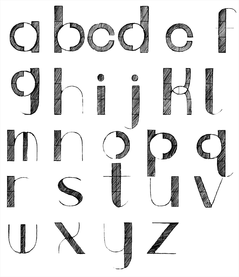
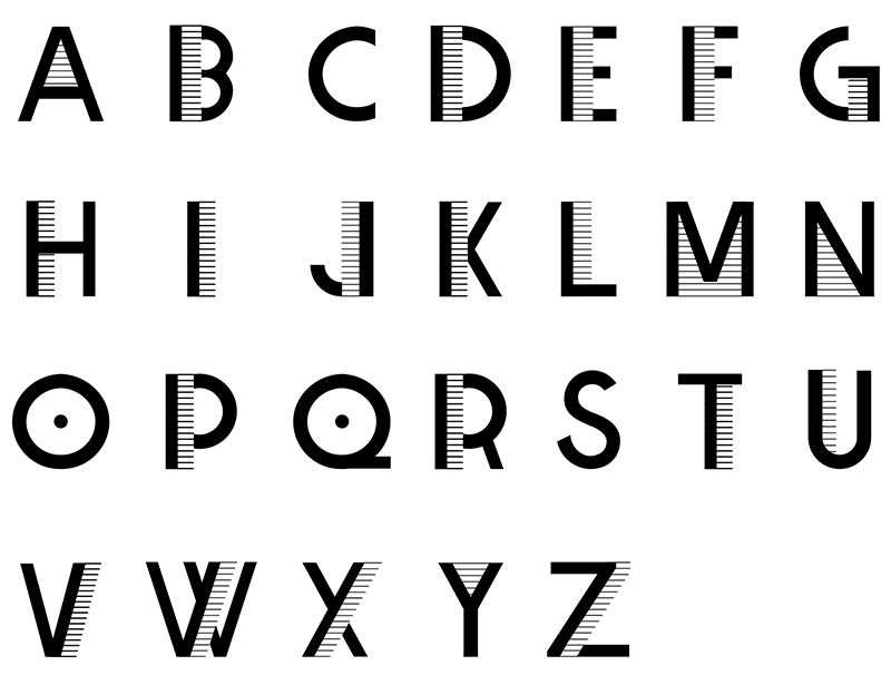
Laura Mauriello typeface sketch, ©2017
If drawing from plaster casts can be consider the sine qua non of an artist’s learning experience, graphic designers might well consider a comparable tool created expressly for the digital age: the practice of drawing typefaces based on—and inspired by—design history, whereupon they are updated by the ingenuity, instincts, and intelligence of students themselves.
For the past few years, I have introduced my students at the SVA MFA Design program to the work of certain innovative Twentieth Century graphic designers, most notably to the magnificent work of the Czech-born polymath Ladislav Sutnar. A master of sublime versatility—at once a graphic, industrial, interior, and product designer, as well as a painter and toymaker—Sutnar introduced a Modern ethos to Czechoslovakia. (After emigrating to the United States in 1939, he brought a distinct European sensibility to his later work in this country.) In retrospect, his structural discipline prefigured much of today’s web design, while his sense of play foreshadowed certain looser aspects of postmodernism, eclecticism, and style.
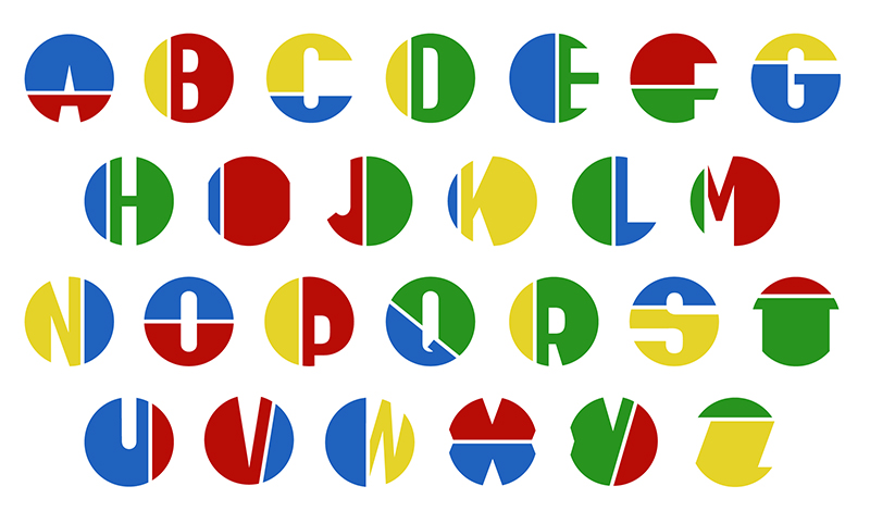
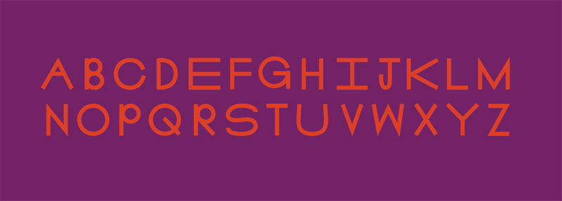
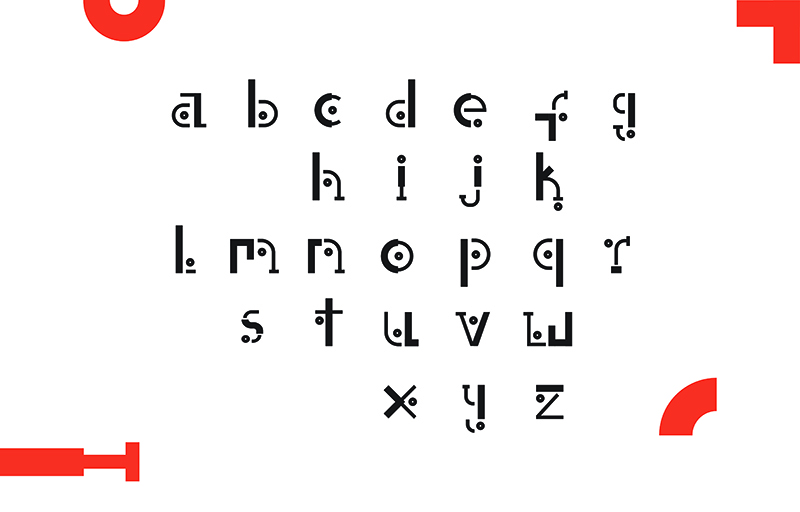
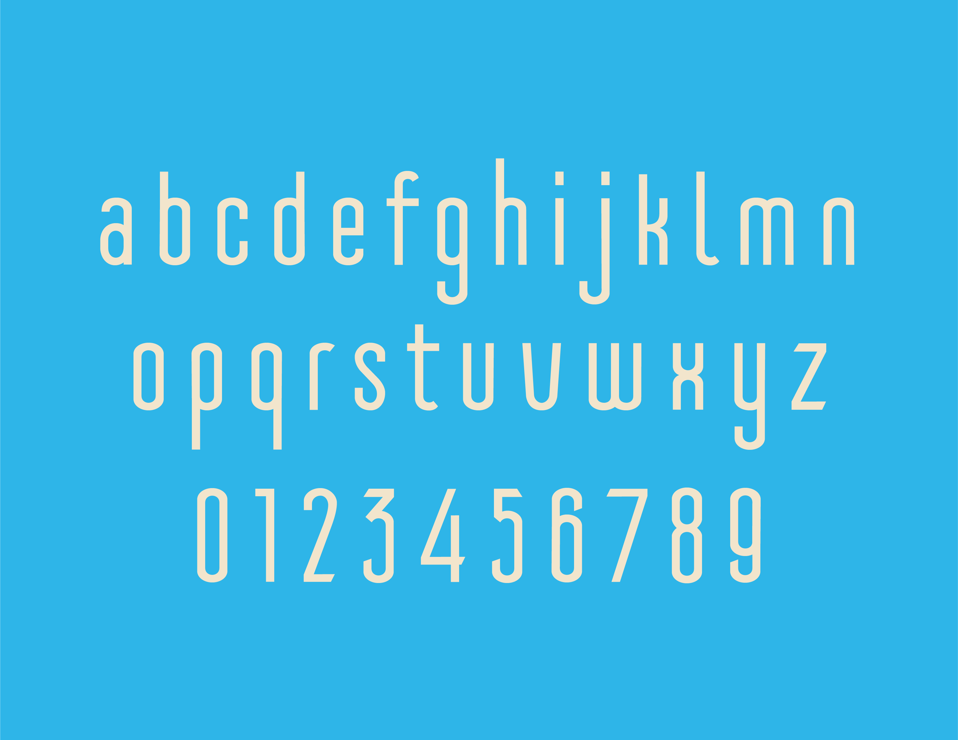
To look today at Sutnar’s body of work, a student can quickly absorb the more superficial aspects of his signature styles. But a deeper understanding can only be achieved through dissecting his actual prodigious output. In my class, students read Ladislav Sutnar: Visual Design In Action (his self-authored manifesto) in which he eloquently discusses his detailed process. On their own, they examine additional biographical literature and research as much of his graphic, typographic, product design and painting work as possible. Then, over the course of two weeks, they are asked to design an alphabet that echoes Sutnar’s work or in some way transforms his spirit—through color, shape, and form—into a display alphabet.
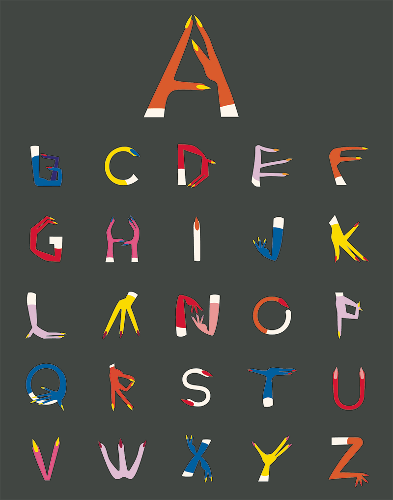
It is energizing to see how far the students will go. One pair of students, inspired by Sutnar’s toy city (and its “Sutnar Orange and Blue” color palette) created a Farsi/Arabic alphabet. Another who figured out that Sutnar loved jazz (which he did) produced a type showing that he applied to jazz recordings. Yet another student found that the “hands” in his so-called “Joy Art” and “Venus” paintings formed a full 26 letters.
Some of the results are curious one-offs, while others, with more development, could easily become workable fonts. But for me, the proof of success is the appreciation students can develop about Sutnar (or any other designer) by working in such an intimate way. This kind of hands-on research in material culture is precisely what makes history come alive.
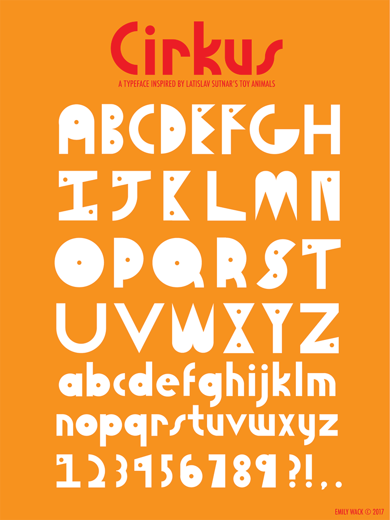
Emily Wack, ©2017
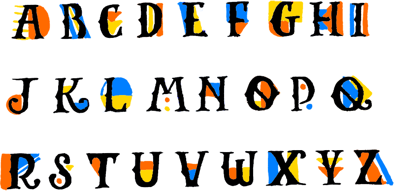
Jessica Lin, ©2017
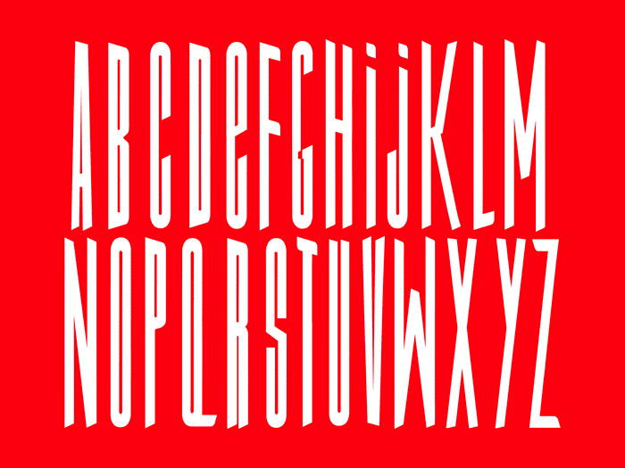
Sarah Tamani, ©2017
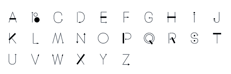
Krongporn Thongongarj, ©2017
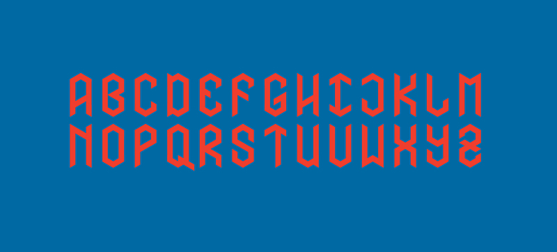
Julia Marsh, ©2017
Beatrice Sala, ©2017
Maria Leticia + Sarmento Santos, ©2017
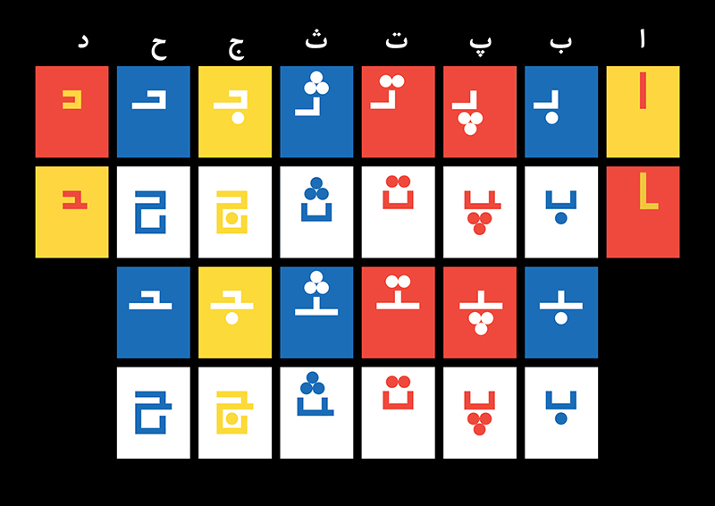
Mahya Soltani + Tala Safie, ©2017
Zhen Wei, ©2017
Mia Rexach, ©2017
Akansha Kukreja, ©2017
Shira Chung, ©2017
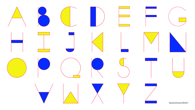
Vipasha Chauhan, ©2017
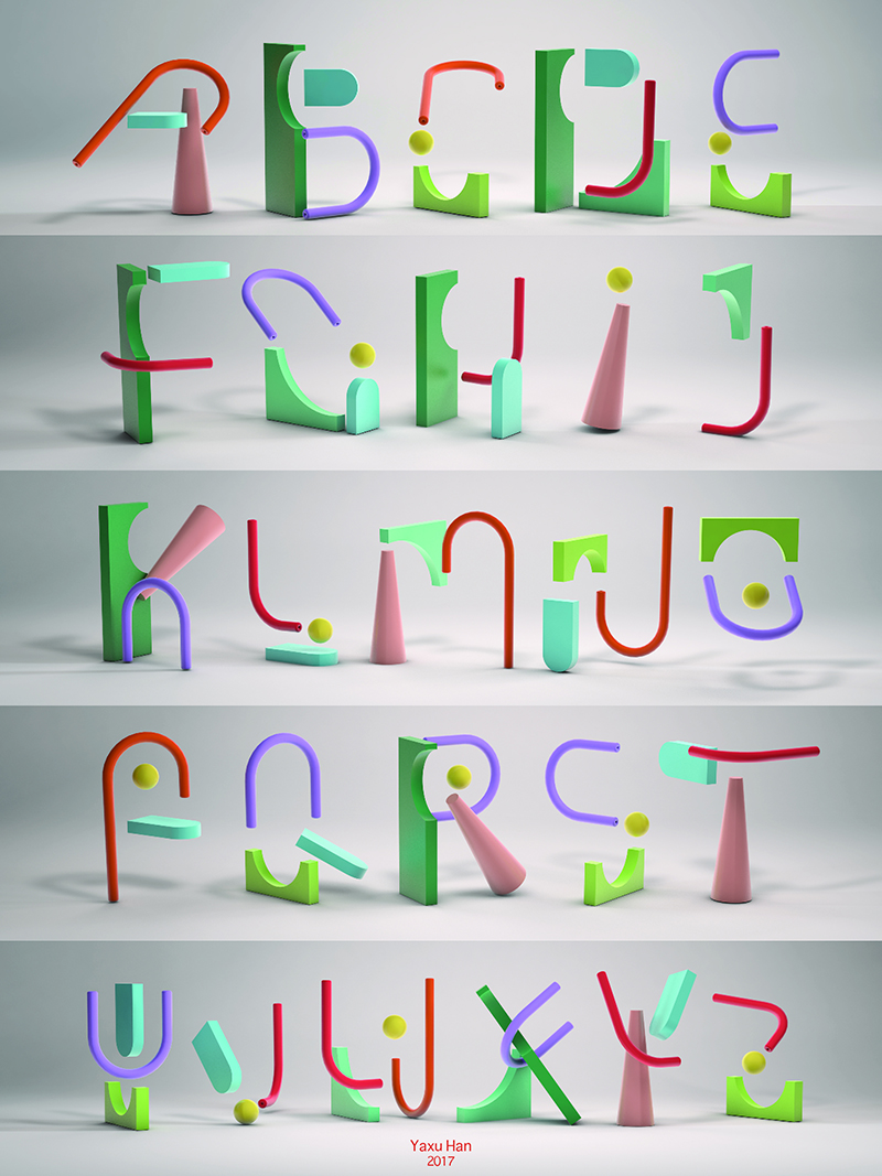
Yaxu Han, ©2017


