
November 16, 2017
Everything I Know About Design I Learned from The Sopranos
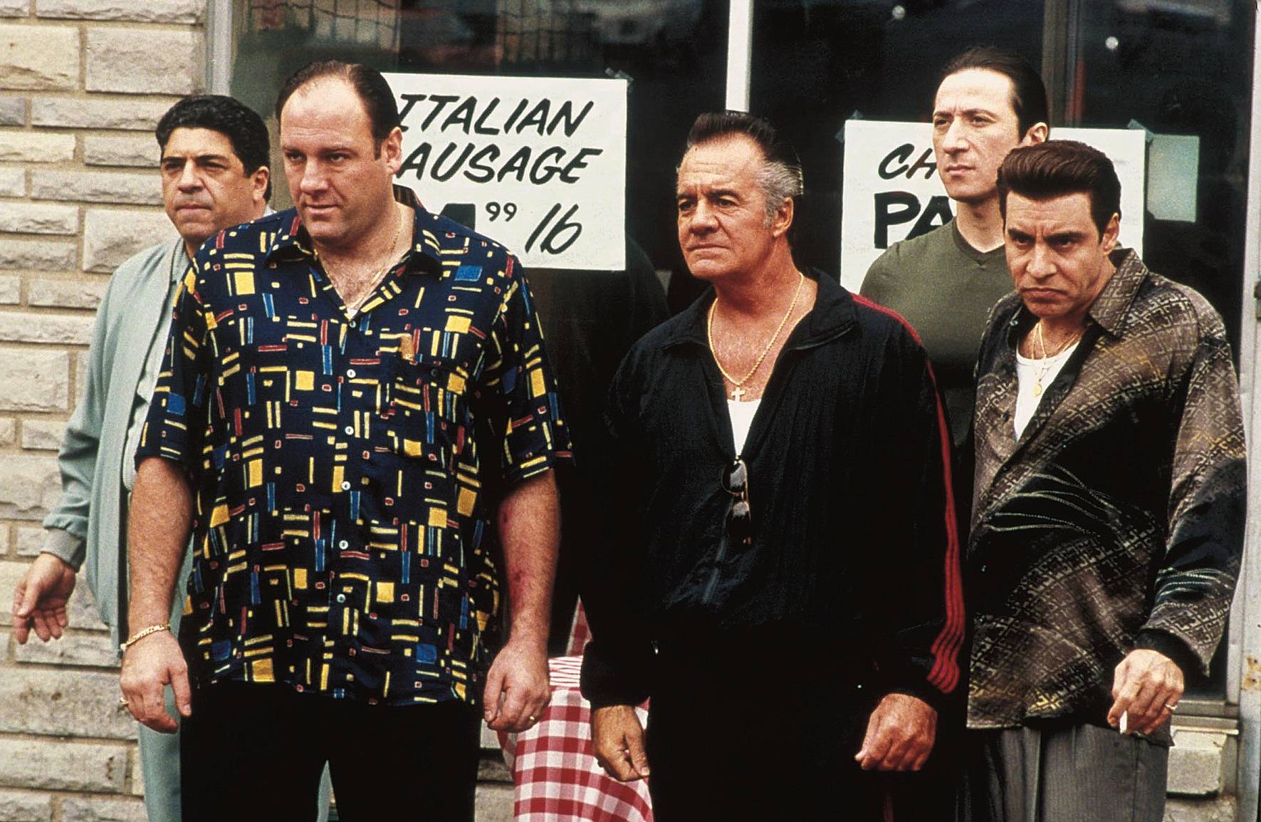
This essay was originally published on June 11, 2007, and appears in the new essay collection, Now You See It and Other Essays on Design, available now from Princeton Architectural Press
Last night, after eight years, 86 episodes, and untold quantities of gobbagool, The Sopranos finished its run on HBO.
And this is what we’ve learned.
On client relationships:
“When you’re bleeding a guy, you don’t squeeze him dry right away. Contrarily, you let him do his bidding, suavely. So you can bleed him next week and the week after, at minimum.”
One of my partners once described two designers he knew. One was determined to maximize the profit of every project he undertook, a quest that was accompanied by massive arguments with clients, and occasionally lawsuits. Another would concede every reasonable point to his clients, making less on each job, even losing money every once in a while. Which one never had repeat business? Which one worked with the same clients for decades? Take a guess. Of course, clients don’t want to be bled, but they do appreciate a little suaveness.
On creative blocks:
“My advice? Put that thing down awhile, we go get our joints copped, and tomorrow the words’ll come blowing out your ass.”
Paulie’s advice to frustrated amateur screenwriter Christopher is pretty much exactly the same as every book on creativity I’ve ever read: if you’re struggling with a problem, put it aside and inspiration will come when you’re not expecting it. While it may not be possible to follow Paulie’s prescription to the letter — my lovely wife Dorothy is generally unsympathetic when I ask for this kind of assistance — going to a museum will usually do the trick.
On the creative professions:
“Event planning? It’s gay, isn’t it?”
On The Sopranos, interest in certain things, including but not limited to event planning, fashion design, literature, and certain psychological theories, are considered indications of effeminacy. A not unsimilar macho attitude often obtains in corporate boardrooms when it comes to design. A lot of executive decision makers are comfortable with spreadsheets. Show them colors and shapes, on the other hand, and you can see the panic in their eyes as they frantically grope through their memories for that time they helped pick out the fabric covers in their beach houses. Part of your job is making these fellows comfortable with their softer sides.
On professional behavior:
“You don’t think. You disrespect this place. That’s the reason why you were passed the fuck over.”
For reasons too complicated to explain here — aside from the obvious point that they sound somewhat alike — the design equivalent to disrespecting the Bing is doing spec work.
On appropriation:
“Fuckin’ expresso, cappucino. We invented this shit. And all these other cocksuckers are gettin’ rich off us.”
“Oh, again with the rape of the culture.”
By his own admission, Howard Schultz was inspired by the coffee houses of Venice and Milan when he created his own little version in Seattle. The designers of the graphical use interface at Apple were influenced by work developed at Xerox’s Palo Alto Research Center. And some people think that the Flintstones are just the Honeymooners except set in the Stone Age. Imitation, influence, and iteration are crucial to design development. The only requirement is that the goal is transformation, not replication.
On the unintended consequences of technology:
“It sounds to me like Anthony Jr. may have stumbled onto existentialism.”
“Fucking internet.”
Okay, advanced technology may have introduced the idea of a godless universe to the Soprano household. Designers, however, believe that advanced technology is our best proof that God exists — and that He lives in Cupertino, California.
On commitment:
“I came home one day, shot her four times. Twice in the head. Killed her aunt, too. I didn’t know she was there. And the mailman. At that point, I had to fully commit.”
I heard this back in design school, and I still forget it every now and then: if you’re going to make something big, make it really big. If you’re going to make it simple, make it really simple. Or really small, or really fancy. If you’re going after a project, if you’re trying to win a competition, if you’re serious about getting the job done, don’t bother unless you’re willing to fully commit.
On aesthetics:
“Not in the face, okay? You give me that? Huh? Keep my eyes?”
Designers like to think that it’s not about how it looks. It’s about how it works, or how it communicates, or how it changes the world. All true, except it’s also about how it looks. The artifacts we make are the Trojan Horses that deliver our ideas to an unsuspecting public. Making them look beautiful — or engaging, or funny, or provocative — is anything but a superficial exercise. We all get whacked now and then. Just make sure you get to keep your eyes.
Observed
View all
Observed
By Michael Bierut
Related Posts
Equity Observer
L’Oreal Thompson Payton|Essays
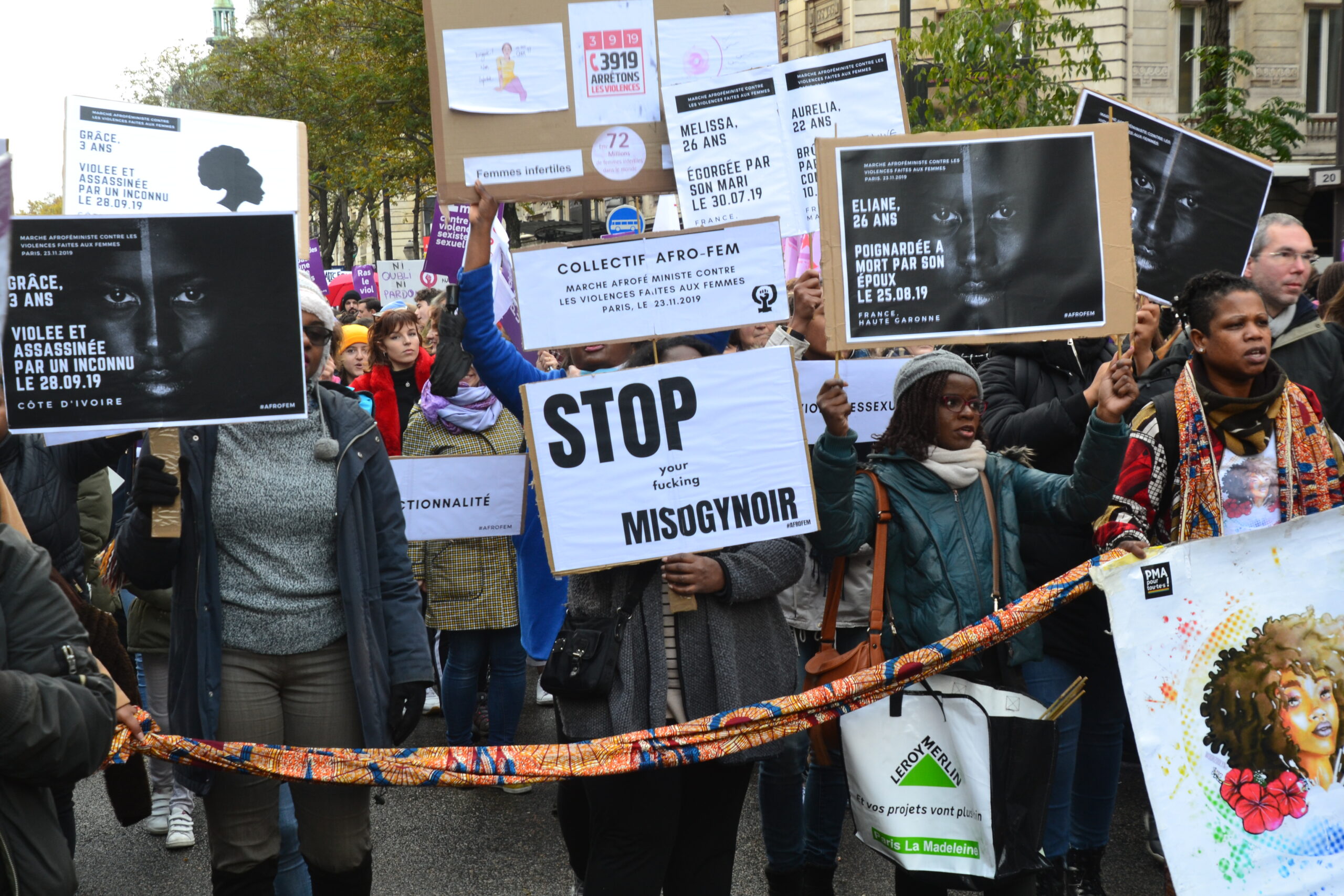
‘Misogynoir is a distraction’: Moya Bailey on why Kamala Harris (or any U.S. president) is not going to save us
Equity Observer
Ellen McGirt|Essays
I’m looking for a dad in finance

She the People
Aimee Allison|Audio
She the People with Aimee Allison, a new podcast from Design Observer
Equity Observer
Kevin Bethune|Essays
Oh My, AI
Related Posts

Equity Observer
L’Oreal Thompson Payton|Essays
‘Misogynoir is a distraction’: Moya Bailey on why Kamala Harris (or any U.S. president) is not going to save us

Equity Observer
Ellen McGirt|Essays
I’m looking for a dad in finance

She the People
Aimee Allison|Audio
She the People with Aimee Allison, a new podcast from Design Observer

Equity Observer
Kevin Bethune|Essays
