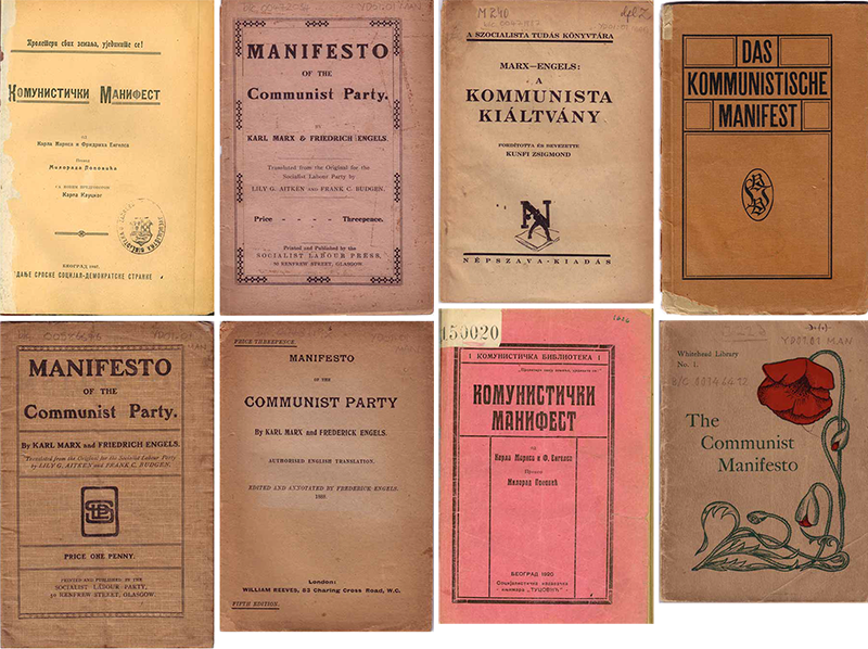
Only a handful of books have been so frequently reprinted and translated as Karl Marx and Friedrich Engels’ world altering volume, The Communist Manifesto. And so, as we pass the 100th anniversary of the October Revolution (which in 1917 saw an insurrection led by the Russian Bolshevik party) we're taking a look at all the manifestations of the Manifesto that have cropped up over the years. Safe to say, there have been many. But when the staid-looking 23-page pamphlet commissioned by the Communist League in London was first published in 1848, during a year of massive social unrest, it was not a bestseller. Nor was it a beautiful book; however even though the Manifesto continued throughout the century to be under-designed, it would not remain obscure for long.
“This small pamphlet is by far the most influential single piece of political writing since the French Revolutionary Declaration of the Rights of Man and Citizen,” wrote Eric Hobsbawm, a distinguished British Marxist historian (1914-2012), for the 2012 edition. “By good luck it hit the streets only a week or two before the outbreak of the revolutions of 1848, which spread like a forest fire from Paris across the continent of Europe.”
The German exiles Marx and Engels wrote the manifesto to express the League’s principles, and the words alone—not its cover or interior type composition—ignited the firestorm that left much of the world dangerously split between warring ideologies. The inequities that triggered class struggles between bourgeois and proletarian would burgeon into major social, economic, and political transformations that triggered costly conflicts. Such was the power of words. From the standpoint of design, there was no market-driven need to create eye-catching, stylish graphics. Ideas, and a socio-economic climate that was ripe for them, sold this book. The power of design to grab attention was not even a consideration—nor, seemingly, necessary.
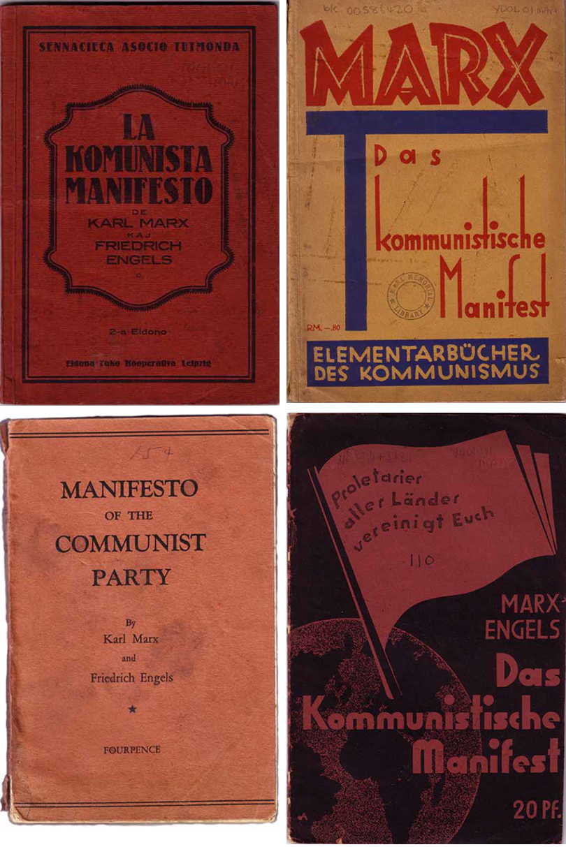
The first English translation failed to find an audience, but no one suggested sprucing up the typography as a solution to more sales. And with mass printing just hitting its stride, design was less a concern than clean type composition and cheap production costs. And so small updates were made, mostly to content and format of the original version. Marx and Engels wrote prefaces to new editions that provided further context for their ideas. The 1872 edition, Hobsbawm explained, became the foundation for all further editions—including nine more produced in six different languages that year.
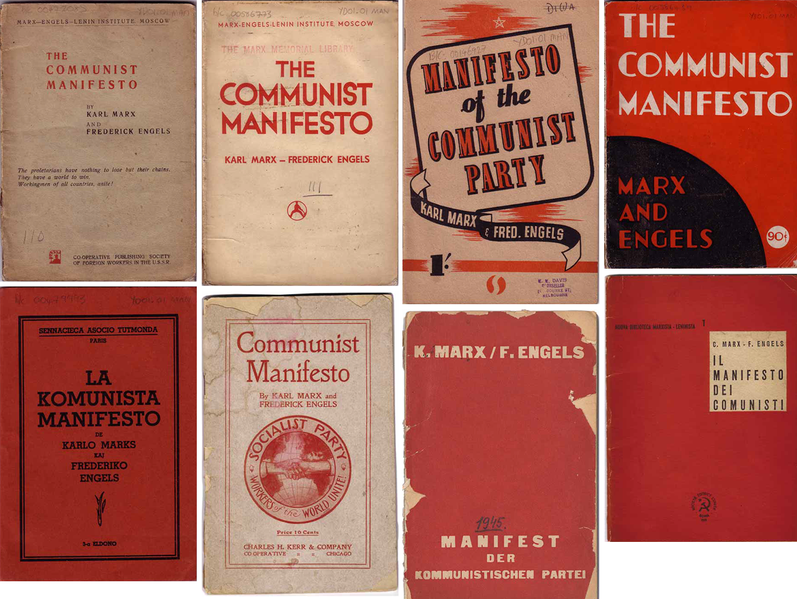
The next forty years saw the Manifesto hit biblical bestseller proportions as the rise of Marxist influenced ideas gained traction during the Industrial Revolution of the 1880s. And while this year marks the 100th anniversary of the Bolshevik Revolution, even before 1917 Marx and Engels’ manifesto was issued in several hundred editions in some thirty languages, including three editions in Japanese and one in Chinese. Likewise, it reached top-of-the-charts distribution levels when the Soviet Communist Party began printing the Manifesto in multiple languages. In the 1930s, publishing organs of American and British Communist Parties released inexpensively produced editions in the hundreds of thousands.
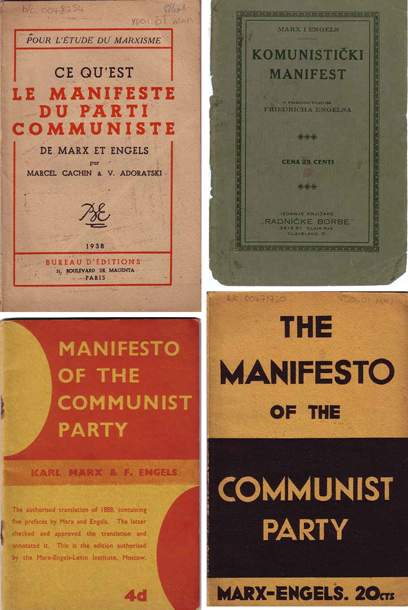
According to Hobsbawm, after 1948, Communist or other Marxist publishers were not the only ones printing the Manifesto; non-political publishers were printing the document “in large editions… with introductions by prominent academics. In short, it was no longer only a classic Marxist document—it had become a political classic tout court.” From the end of Word War II through the 1970s, the emergence of the New Left and parallel movements spurred a rekindled interest in a post-Stalinist version of Communism, and caused new editions to again expand rapidly.
The covers here are but a few of the older volumes, and the graphic design of these covers follows a similar form. But that is the point—seeing how different groups graphically addressed the book in nuanced ways shows how little the need was for hard-sell design.
Marx and Engels went on to publish another icon, Das Kapital, a three-volume assault on the capitalist system. Hobsbawn noted that “Manifesto still has plenty to say to the world in the first decades of the twenty-first century” and it is proven by the commercial publishers who today—kind of ironically—make profits from the book’s continued substantive sales (with more graphically designed covers). Still, it’s not the design but the ideas, and perhaps cost, that move books of the shelves in vast quantities. (Take Penguin’s Little Black Classics, an inexpensive offering of classic works. As of 2015, the Communist Manifesto was the top seller.) Ultimately, someone made some money on the project, giving truth to the painful pun: “Das ain’t hay, das kapital.”


