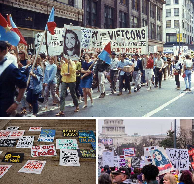
Top: An anti-Vietnam War march in the weeks leading up to the 1968 Chicago Democratic National Convention. Protesters carry traditional signs (“Stop the War”) as well as North Vietnamese flags and pictures of Che Guevara. Image: David Wilson, WikiCommons. Left: Protest signs left out after the 2008 Republican National Convention in Saint Paul, Minnesota. Image: Carol M. Highsmith, Library of Congress. Right: Demonstrators at the 2017 Women's March in Washington, D.C. Image: Mark Dixon, WikiCommons
Is there room for capital-D design in a political landscape that equates its absence with authenticity? We examine the political design landscape two years after the red MAGA cap.
The signage and imagery of new protest movements say a lot about the ways American culture is changing. The messy, glorious proliferation of symbols, memes, gags, and slogans during the Women's March in January 2017 led some progressives to lament an apparent lack of clear messaging. It seemed like a missed opportunity to unite under a clearly-defined campaign with powerful graphic. (To be clear, the right side of the political spectrum has also spent the last decade fishing from a grabbag of imagery before they landed on the low-design red cap.) This makes some sense for those who come from the fields of design and advertising and view social movements as brands to be recognized.
Organizers, however, don’t view their movements as ‘consumable.’ In reality, many movements are made from myriad individuals and platforms that occasionally come together under a unified banner. For the past year, I have been working with AIGA New York on an initiative that looks at ways designers can use graphic culture to spur civic participation. We have led workshops, hosted panels, and interviewed lots of thoughtful folks with civically-engaged design practices. A theme that has come up again and again is the tension between low-fi graphics made for protests and the high-polish imagery made for social change movements.
Slickness doesn’t always mean clarity of content, and movements can’t always be reduced to simple taglines or symbols.
This disparity is often on display at demonstrations like the Women’s March, where jokey signs sketched on cardboard share space with ernest anarchist banners and sleek lock-ups produced by groups like MoveOn, the NAACP, and Amnesty International. In the world of on-demand digital printing it’s relatively easy for groups to get high-visibility signs printed on very little notice. These signs are legible from great distances (and, importantly, by TV cameras) and show unity amongst dissimilar groups who come together (in the case of the Women’s March, in their opposition to Trump).
The problem with some of these graphics is that “easier,” in the words of Zeynep Tufekci, a professor studying protest movements, “isn’t always better.” When it’s clear that the organizing wasn’t easy, it carries more authority (hence the trope of candidates photographing their ground-down door-knocking shoes). Slickness doesn’t always mean clarity of content, and movements can’t always be reduced to simple taglines or symbols.
.jpg)
Top: The 2018 “March for Our Lives” in New York City. Source: Wikimedia Commons. Left: A protester readies a sign at the March for Our Lives. Image: Sam Holleran. Right: A protest sign left at the Bryant Park subway station after the March for Our Lives demonstration. Image: Sam Holleran
Low-fi graphic design does not have a political sensibility: it serves both left and right. As Michael Bierut, designer of Hillary Clinton’s 2016 mark, begrudgingly notes, Trump won with store-brand graphics. The iconic, if abominable, red MAGA hat was almost certainly made with an online template.
Imagery that reads as amateurish to design professionals can also underpin the authenticity of fast-moving campaigns that don’t have the time or money to bring on a design team. This was certainly true for the “I Can’t Breathe” t-shirts set in Comic-Sans and created following the death of Eric Garner in 2014. Even critics of the font found that its use in this context “conveyed the character of approachability.”
While professional design offers expediency and clarity, the process by which marchers create provisional signage itself might be key to the process of forging multiple voices into one.
Handwriting can function as a proxy for trustworthiness as well. This is true in all sorts of visual communication. That’s why Trader Joe’s, a chain owned by German grocery giant Aldi, with annual revenue over $10 billion, still employs dozens of calligraphers to hand-paint their in-store signage. Resourced organizations also encourage members who are headed to protests to create their own placards or to attend sign-making parties that build community and to make ties that extend beyond the momentary coming-together of a march. While professional design offers expediency and clarity, the process by which marchers create provisional signage itself might be key to the process of forging multiple voices into one.
The Interference Archive in Brooklyn, New York, is a unique, volunteer-run institution that catalogues and preserves graphic materials from myriad social change movements around the world, including the Black Panthers, the Combahee River Collective, the Poster Workshop, and Taring Padi. Many of the pieces in the archive were produced by people with no formal design training, and have an authenticity that is hard to duplicate. But while they may be ad-hoc in their execution, they make use of a surprisingly complex design language. According to Greg Mihalko, volunteer archivist and practicing designer, “Reconciling how one can be inspired or influenced by vernacular images while also making decisions as a trained graphic designer” can be a challenge.
Some movements have had great success with an image or wordmark that percolated up from within the ranks. The peace sign came from Gerald Herbert, an unknown designer, who presented his circular symbol on the eve of a 1958 march against atomic weapons (the three line segments are composite of the flag signs for “N” and “D” as in “nuclear disarmament”). The red square, emblematic of the student protest movements that began in Quebec in 2012, came from the felt swatches that protesters pinned to their shirts. Even the now-ubiquitous AIDS ribbon had humble, DIY origins.
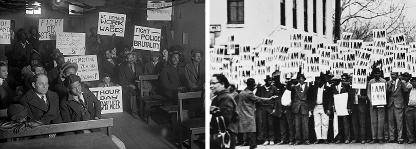
Left: Early 20th century labor protesters. Image: Harris & Ewing Photograph Collection, Library of Congress. Right: Striking sanitation workers in Memphis hold the sign that would become an icon of the Civil Rights struggle. Image: Library of Congress.
Current movements have had more difficulty finding a unifying symbol. It’s possible that a new generation of protesters who cut their teeth in the Occupy and Black Lives Matter movements are weary of overarching symbols and hierarchical structures (two things that Occupy—much to the bafflement of older activists, did pretty well without). The “pussyhat” offered catharsis in craft for those targeted by Trump and his supporters, but it has had little staying power. In new movements, words, which can both hashtagged and chanted, have more salience than symbols.
Further, the rigour and visual formality of capital-D design can be turned back on itself. Francisco Laranjo, the designer and editor of Modes of Criticism, noted that in Brazil, where an extreme right candidate has won the country's highest office, “graphic design demonstrates, again, its present inability to challenge voters of the fascist candidate… powerless in the meme-wars, fought mainly on social media… professional design is invariably defeated by amateur or purposefully amateur-looking design, appropriated by the far-right.”
In new movements, words, which can both hastagged and chanted, have more salience than symbols.
But slick visual identities can have value for organizations that have long-term goals or don’t have to respond quickly to a turn of events. A designed brand identity subtly conveys staying-power and authority. This is immensely important for organizations that want to affect change at the level of policy.
Take issue groups like Human Rights Campaign, which demonstrates their organizational acumen with clean design and the ubiquity of their logo. In March of 2013, the logo was made available as Facebook’s first-ever profile photo overlay, with nearly three million people using it in the first 24 hours. The sheer number of digital and analogue products Human Rights Campaign emblazons with their equals sign lock-up helps to make the changes they are lobbying for feel inevitable. The wordless symbol also appeals to the same universality as the group’s name, and is an indication of the strength of a really simple mark.
Homespun authenticity and slick professionalism can occur simultaneously. Most organizers employ handmade graphics to communicate messages at events and one-off protests, while pairing them with t-shirt and pins designed and distributed from a national organization. In a time when teenage activists are accused of being adult “crisis actors” in the media, DIY design elements—especially hand lettering on protest posters—convey the authenticity and labor of a bottom-up movement.
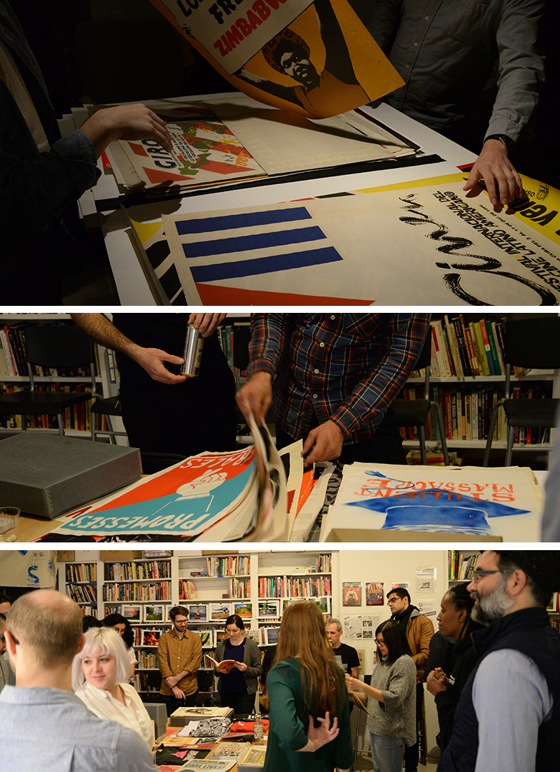
Participants examine movement organizing materials and other graphic ephemera at “An Evening of Interference,” a workshop organized by AIGA NY Citizen Designer Now Fellows at Interference Archive in Brooklyn, NY.
Those who make visuals are still in a testing period, spinning off images to see what works best. Caricature has been deployed extensively to skewer Donald Trump in ways that could be seen as humorous but might not be politically useful (particularly when adopted by those same people being critiqued). And assessing the impact of design can be tricky. Political imagery plays on sentiment and deep cultural wellsprings that are difficult to poll.
It’s still possible that a symbol will come forward to unite disparate groups and give traction to a new social justice movement. (It’s often only well after the fact that we acknowledge a symbol as canonical—the rainbow flag’s induction into MoMA’s collection is a good example). But it’s also important that activist images remains open and lively, and capable of holding multiple meanings. So the question isn’t which method is more successful, but what is design’s utility in that moment? The answer to that question will determine whether a marker or a mouse is reached for. The decision is yours.