
The Internet has redefined nearly everything, so is it any surprise that it is redefining the longevity of branding? Today a company can rebrand as quickly as it takes for your browser to refresh a website or your phone to update an app.
Last week, one of the most popular companies in the world did just that.
Instagram's previous logo and app icon was embraced by fans, who expressed their love by constructing countless creative iterations of it. But as 300 million users turned on their phones yesterday, they were turned off by Instagram's latest app update featuring a brand new logo for the not yet six-year-old company.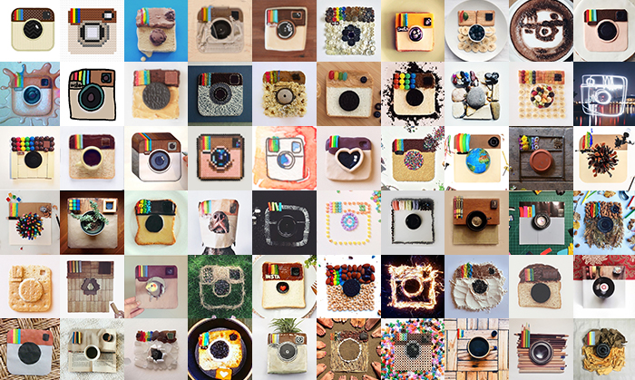
Much like Facebook changes that are initially met with anger and frustration and then quickly forgotten as the new interactions become rote, we will eventually get used to Instagram's new logo. This is what happened when Spotify, another example of a brand in its prime that surprised followers with an update, changed its app icon to a shocking new neon green color that suddenly stood out like a glowstick on our phones. That particular change was met with an indignant and righteous uproar, but how much does it bother you now?![]()
I don't think the question we should be asking is whether or not Instagram's new logo is any good. The much bigger question that bears thinking about is: Why did Instagram feel the need to change their iconic logo so soon, and so dramatically?
The Internet has a history of blowing up interactions and industries, constantly reimagining them in unexpected and more effective ways. So it's no surprise that branding is being reinvented not by the branding agencies who have been at it for decades, but by a fresh crop of founders and their in-house teams at innovative companies such as Airbnb, Uber, and Instagram.
Though there are exceptions, logos have historically stayed with a company through thick and thin--perhaps evolving slightly every couple decades or so, but with tweaks that were not too dramatic. The previous mode of thought was to modernize the brand without eroding the equity. Examples include IBM, whose highly recognizable mark has been around for nearly fifty years, the Nike swoosh which was conceived in 1972, and the UPS refresh of 2003. This is because the underlying soul of a business was not meant to change in the same way products of that business change—that is to say, to align with the latest trends.
But the world is changing, and now companies that are in the prime of their popularity are making drastic changes in-house, on their own terms, and with abandon. Why this shift? Why now? And why change something that is working—especially knowing how much most people tend to resist change?
It has been said that “there's no such thing as bad publicity as long as they spell your name right.” Anything that grabs people's attention gets people talking about you. Perhaps Instagram started feeling the heat over the popularity of Snapchat's face swaps and geo filters, and decided it was time to give the world something new to focus on. Sure, most people aren't happy with the change. But everybody is talking about Instagram today.
Will traditional companies like IBM, Nike, and UPS follow suit with radical new identities? Likely not, as major changes to the branding of those businesses would have more severe cost and implementation implications. A drastic change to the UPS logo would make every current UPS truck, airplane, and dropbox look immediately out-of-date, and every UPS store and warehouse would need to invest in new signage at a cost of millions upon millions of dollars. It simply isn't practical, as the cost would outweigh the benefit.
The same is not true for modern tech companies. The internet thrives on betas, versions, and updates. The implication of one of these companies changing their logo is that at most they'll need to replace a couple dozen office signs and push an update through the app store, automatically refreshing all 300 million instances of the icon on every mobile device. That's it. Instant rebrand. It can happen in a matter of minutes, and every single brand touchpoint will be unified with the new look and immediately garner people's attention. And while people are likely to complain, they will eventually get used it.
The video announcing Instagram's update is full of a quirky energy and wit. It makes you want to love this new mark. And yes, after seeing it on your home screen a million times (which will take roughly twenty-two days and three hours given how often we interact with it), you'll learn to love it as much as you now love that irritating song you couldn't stand when you first heard it but is now stuck in your head.
Should logos be ever changing like music and fashion? If so, I propose we go all-in and have some fun with this. Let's let Instagram have a "summer break" logo that changes into something new and exciting—and sometimes polarizing—each and every summer, but reverts back to the classic mark they've just abandoned come fall. I bet we would all feel much better about (and maybe even love) the new logo, because knowing that the other wasn't gone forever would make things right in this world.
![]()


