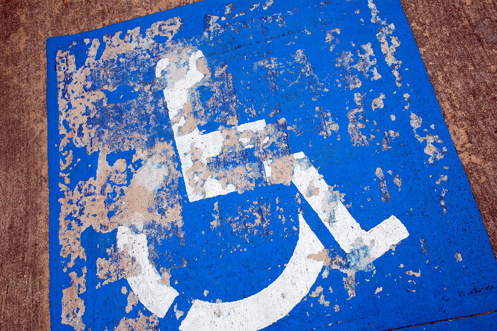
Photo by Steve Snodgrass on Flickr.
If you subscribe to the belief that good design makes life better, then there can be no better use of design than as an aid—if not a curative—for the disabled. Designers have a responsibility to develop greater accessibility, whether physically or mentally, in tactile, visual, and aural ways.
Designer and educator Elizabeth Guffey, who was born with a form of Cerebral Palsy, which has impacted her entire life, has just published Designing Disability: Symbols, Space and Society (Bloomsbury) that chronicles the evolution of the International Symbol of Access (ISA), the wheelchair icon, celebrating its fiftieth anniversary as one of the most ubiquitous symbols in the world today.
Those of us who carry on our daily lives without the challenges of accessibility may take this icon for granted. Even she admits: “For a long time, I took the wheelchair symbol for granted. The blue and white International Symbol of Access (ISA) is, on one hand, one of the most recognized symbols of our time; it’s such a familiar part of our visual environment, most people think it’s always been there…,” but “at the same time, the symbol’s very success has some drawbacks—many people think its ubiquity means that we as a society have basically solved the issue of free and equal access for all. But that’s not always the case.” After reading Guffey’s history, I will never be able to disregard the mark again. I asked her recently to discuss why this project has such importance for all of us.
Steven Heller: You are disabled. I presume this is one reason that did you decided to invest so much research and writing time in your new book Designing Disability?
Elizabeth Guffey: The Cerebral Palsy is unchanged, but my own abilities walking, standing, etc. have become more acute and limiting as I’ve grown older. Just walking across a room takes a lot of effort for me. And so, my own awareness has changed. I understand how able-bodied people may perceive these issues, but I also live as a disabled person today. And this has made me keenly aware of the symbol and its relation to reality.
SH: You write “When I began writing this book, I was under the illusion that this would be a short article about a design that shaped my life for many years.” What did you learn that expanded your extensive coverage?
EG: I thought I knew everything about the symbol, but even I was surprised to learn that it represents an entirely new way of thinking. It was designed in 1968 and only gained acceptance in the US and Europe starting in the mid-1970s. There are probably lots of people who remember a time when the symbol simply didn’t exist. But now several generations have grown up with the little wheelchair figure and take it as a normal part of life. I think that familiarity and general acceptance represents a step forward for us a society.
I was surprised to learn about North American and European approaches toward disability itself. The wheelchair symbol is actually a graphic compromise between these two camps. In North America, disabled people and their advocates often argued that disabled people are just like everyone else—if they could only operate on a level playing field, disabled people could easily assimilate. To begin with, they sought changes in the built environment. They didn’t want to live separate from others, but asked for accommodations like ramps, railings, wider doorways, etc. In parts of Europe, however, you find a different argument—namely that disabled people are, in fact, different from other people; it’s been suggested that treating disabled people the same as everyone else is inhumane. That line of thought suggested that disabled people need separate transportation, special housing, and other types of help.
Thus, for example, the US concentrated on making public services accessible to everybody. There was a big push to install elevators in subway stations and equip buses with wheelchair lifts. But the British had a slightly different approach. For many years the British National Health Service not only provided mobility-impaired people with free wheelchairs, but also little three-wheeled cars that could accommodate only one person and their chair. These were called “invalid tricycles” and they came with special privileges, like being able to park on the side-lines of athletic fields and watch games from the car. I was surprised to learn that the wheelchair symbol in use today combines these ideas.
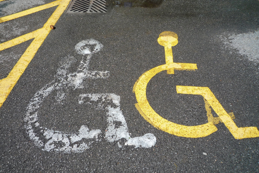
Photo by Tim & Selena Middleton on Flickr.
SH: How did this image come about?
EG: It started as a stylized schematic of a wheelchair; following the North American approach, it was intended to point disabled people legally mandated accommodations. But others insisted that it look less abstract and more “human.” This comes closer to the Northern European approach. And so, a circle was placed on the wheelchair’s back. Thus, a symbol of a wheelchair became the familiar “person in a wheelchair.”
SH: Of course, the wheelchair plays a special role in this discussion, although not all disability is wheelchair-based. How did it become the universal sign for access?
EG: This always confused me. I am disabled but don't use a wheelchair. In fact, wheelchairs are necessary for a very small subset of individuals with mobility disabilities, to say nothing of the range of disabilities that don’t involve physical mobility at all. For years that symbol troubled me. Over time, I grew to harbor a vague grudge against it. Does it mean that only wheelchair users can park in special spaces? Am I, too, allowed to sit in the specially designated seats at an airport or theater? Each time I used one of those accommodations, I would ask myself if I was “disabled enough” to use them. Even now, I remain perplexed. But, as I’ve aged, I find that I really have no choice—I need that extra help and really can’t stand around pondering this.
Researching this book helped me understand this as more than a communications problem. I found that the modern wheelchair, like the symbol, is actually a very recent invention. It was a game-changer for many disabled people. More than other groups, it was newly mobile wheelchair users who first advocated for equal rights. And so, the chair seemed a good embodiment of this new drive for equal access.
SH: You use the term “misfit design.” What does this mean, exactly?
EG: Misfit is a word with many meanings. On the one hand, the wheelchair symbol announces a basic “misfit” between disabled bodies and the built environment. Ramps, elevators, and other accommodations are included as add-ons to help disabled people function in spaces that were not designed or “fitted” for them.
But also, disabled people have often been cast as social misfits. By the 19th century, many disabled people were segregated from society, left uneducated, and lived their entire lives at home or in special schools, hospitals and care facilities. Still others were poor, beggars, or lived on the margins of society. They had trouble fitting in socially.
At the same time, the wheelchair symbol itself is something of a misfit design. Remember that it underwent a kind of retrofit. It was originally meant to represent a wheelchair, but the requirement to “humanize” the symbol led to the addition of that large circle “head.” It’s not a successful design—I would call it a design “misfit.”
SH: I recall in the Paris Metro signs that reserve spaces for “invalides.” I think it once said “war invalids.” At what point were people with disabilities considered part of society that demanded consideration?
EG: The years after WWII were a major turning point for disabled people. On the one hand, societies throughout history have felt a debt to wounded war veterans—a debt that was sometimes but not always paid. But World War II also saw a higher level of medical care than had ever been possible in the past; more soldiers were able to survive previously fatal injuries. And so, veterans with disabilities became more common. These medical advances also meant that more civilians survived life-threatening conditions. The mortality rate for polio, for example, dropped dramatically at this time, too.
You have to remember that many of these survivors were not born disabled. They took for granted that they had the same right to education, jobs, housing, etc. as their fellow citizens. Those veterans with spinal cord injuries, the many polio survivors, and a host of other people seemed at the time like miracle patients. But they were also raised with different expectations for their lives. They never had the sense that they were undeserving or deficient. And so, they didn’t believe that being disabled meant that they also had to give up the right to live full and active lives. They believed they still had something to contribute and asked society to recognize this.
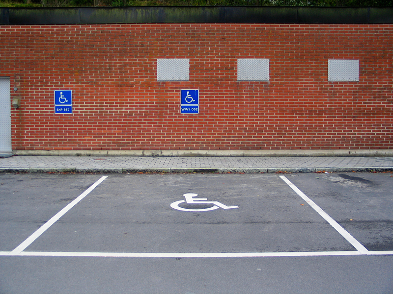
Photo by Mr. Nygrun on Flickr.
SH: The wheelchair symbol has evolved but it has always been abstracted. Curiously, it is one of the most abstract yet representational abstractions. How was it finally decided that it should be the universal mark it is today?
EG: There was considerable controversy around this. As part of their emphasis on equal rights and achieving parity with non-disabled people, the first advocates to approach the question of access—mostly Americans—believed that accommodations should not be publicized. Here, too, many people preferred that this signage should be totally abstract. Thus hidden, it could be a kind of secret palimpsest visible only to disabled people in the know. Others felt disability is not a shameful thing in itself. They argued that a representational symbol would serve a double purpose—it would advertise accommodations, but also raise visibility and normalize disability. This approach was more common in the UK and Northern Europe. The symbol we have today is a compromise between those two positions. But at least one of the designers on the original jury that selected this symbol objected to its “odd” head and the general “wrongness” of its appearance.
Its universal adoption reflects the efforts of Rehabilitation International, a non-profit charity that had branches all over the globe. They argued that there should be only one symbol in use worldwide; the group was willing to throw significant resources behind this idea. They convened a jury of designers and representatives from the medical and therapeutic establishments. Those people couldn’t agree on a symbol. And so, the chairman of that group took a bold step and added a circle onto a wheelchair form. The organization itself officially adopted the symbol in 1969.
By 1970, they declared the “decade of rehabilitation” and began lobbying hard for their new symbol to be adopted both locally and globally. They had their local affiliates world-wide distribute “information kits” that included stickers and cardboard signs of it (provided freely by corporations like 3M). These were given to newspapers, television stations, and other media. Across the globe, branches of the Red Cross received these kits, too. Rehabilitation International also promoted the new symbol at meetings of doctors, medical engineers, and rehabilitation professionals. But the coup de grace occurred when they managed to get this symbol adopted by the UN in 1974. The International Standards Association (ISO) officially recognized the symbol in 1984. But it was never part of a larger symbol family and its appearance today is quite arbitrary.
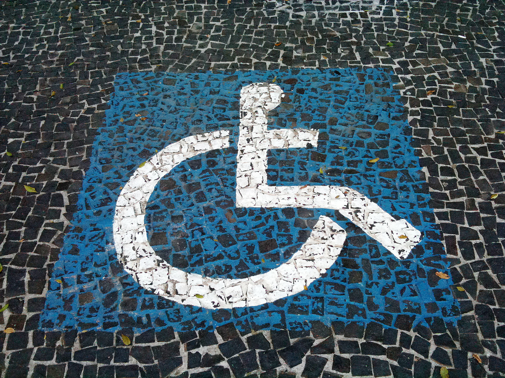
Photo by Crystian Cruz on Flickr.
SH: Finally, you end your book with a section on disabled symbolism as signs of protest. What is this a protest for or against?
EG: Our democracy promises that all citizens should be treated the same. In the wake of the Civil Rights movement, disabled people have interpreted this to mean that they have a right access to the same buildings, goods, and services as other people. The US has been very ambitious in this regard. Theoretically, American law tries to give disabled and non-disabled people the same access to all things. US law dictates that accommodations (curb cuts, wheelchair lifts on buses, but also things like extended test times) treat disabled people just like everyone else. But the goals is for them to be self-reliant and independent. This means that we rely less on caregivers and more on gadgets like automatic door openers, audio-communication tools, and other devices that can be used independently by disabled people. But this is only one approach to the problem. In many traditional societies, families consider themselves entirely responsible for their disabled relatives. You don’t need wheelchair ramps or elevators or even an access symbol if you only leave the house with your brother or son. They, for instance, can carry you up and down a flight of steps if you need it.
But, even though US culture stresses the rights and self-reliance of individuals, there’s a big gap between what is legally promised, and the realities of access today. By the 1970s, disabled people began asserting their right to equal treatment. And the wheelchair figure quickly became the embodiment of those rights. It began to symbolize the government’s commitment to equality. But it’s not always been kept. And so, some people in the disability rights movement began to use the symbol in protest marches, placing it on placards and signs. Although they made great gains, a number of problems remain. As any disabled person will tell you, just because the blue and white sign is in use doesn’t mean that accommodations are actually being made. Sadly, after 50 years in use, the wheelchair figure still has a lot more work to do.

Photo by Jen Durfey on Flickr.


