During a recent event at the Royal College of Art, Prem Krishnamurthy (of Project Projects, P!, and K.) delivered a lecture entitled “Ch-ch-ch-ch-changes.” Krishnamurthy discussed, in three distinct acts, the seemingly disparate elements of his practice: his work within his studio Project Projects; research and academic practice; and his work as director and curator of a gallery.
Krishnamurthy, it seems, fits into the interdisciplinary model that is increasingly coming to epitomize the working practice of the graphic designer. The question of what graphic design is or what a graphic designer does can no longer be resolved with a simple or straightforward answer. Within a digital age, as the boundaries between disciplines blur and skill sets begin to homogenize, the skills traditionally employed by graphic designers can now be applied across a much wider variety of mediums. Krishnamurthy, the designer, can therefore, without question, open a gallery and curate its program.
This phenomenon has been well documented in the discourse around graphic design and the idea of interdisciplinarity is one we are all familiar with. Krishnamurthy’s talk however, right from the outset, positioned itself in an interesting space that takes us down a much less trodden path. A reflexive context of performance was made explicitly clear to the audience, each topic beginning with a change of shirt and a new introduction, as if the preceding one had not taken place—“Hi everyone, I’m Prem Krishnamurthy, this is a lecture titled Ch-Changes.”
Performance is a concept that immediately places a distance between the speaker and his or her words, so when Krishnamurthy used this term, the question of identity became inherently entangled with not just what was being discussed, but how it was being delivered. The relationship between how and what seems intrinsically important to the concept of identity, particularly within the framework of graphic design. The task of the graphic designer has traditionally been to give tangible, visual shape to information; to construct it as a thing, a commodity, an object. The notion of graphic authorship, as proposed in Michael Rock’s 1996 essay “The Designer as Author,” relies on the fact that the appearance of something is as essential to its existence as anything else: what it means is a combination of what it says and how it looks.
Yet Jean-Paul Sartre, in his essay “Existentialism is a Humanism” argues that “man is nothing else but that which he makes of himself”; the suggestion being that humanity and the human being cannot exist as anything other than subjective. Sartre explains this when he continues: “Man is, indeed, a project which possesses a subjective life, instead of being a kind of moss, a fungus or a cauliflower.” The question of what we are is essentially objective and can in theory be answered simply by considering structure or aesthetic, but who we are relies on how we perceive ourselves; what we say and do and think, but most important, it seems to me, it is in the perception of the Other, a space over which we have no control, that our identity “becomes.”
This reliance on the Other makes for an interesting model, particularly in the realm of graphic design, which—despite its seemingly insistent self-reflexive nature and the constant questioning of its own position within the world—seems to be defined by the general public as concerned primarily with the design of corporate identity. For better or worse, identity has become a part of graphic design’s own “identity.”
Strangely, perhaps one way to approach the issue is through a reconsideration of the concept of branding, a term which seems to have almost become taboo within circles of designers attempting to distance themselves from a preconceived and simplistic notion of what they do.

The author's MacBook
Branding inherently depends on the defining of something or someone through the placement of a visual symbol. Consider this along side an example quite literally the closest to hand as I type. The relationship between the sleek object that is my MacBook Pro, the minimal advertisements which are used to sell the machine, the general ethos of Apple Inc., and the shining symbol on the back of the screen (directed outward). But the construction of this image has been achieved as much through the user interface (the subjective how) as through the physical existence of the objects themselves and the logo placed upon them.
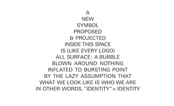
Throughout its history, the discipline of graphic design has been hardwired to judge books by their covers and seems to habitually take for granted what has been described by Dexter Sinister as, “the lazy assumption that what we look like is who we are … in other words, “identity” = Identity.” The inadequacy of this notion of clear definition and distinct contrast between things has been undeniably blurred by the digital age. We are at a stage where the idea of a singular specific role is no longer relevant and through this we can see that these demarcations were in fact arbitrary to begin with.
An actor can step onto many stages and perform a multitude of roles, yet never lose the sense of the self, for the notion of performance inherently involves the understanding that identity is a flexible thing, and that the concept of a solid, unchanging existence is fundamentally opposed to the nature of humanity anyway.
Perhaps if we were to approach the question of what we understand graphic design to be, in this way—by throwing out the tired clichés and the preconceptions, and considering it subjectively as opposed to allowing it to be elevated to some sort of reverential object in itself—then we would realize that the desperate search for a definition is itself part of the problem.