As designers, we strive for a well-communicated, pure message. Our goal being to reinforce the brand and create proprietary value. Consider the Carpenters. Now some of you may be thinking, "Oh, I love them." and others, "Really, the Carpenters? Really?" But the Carpenters were packaged and branded with a clear and specific message, one that, at times, was contrary to reality.
From 1970 through 1976, every Carpenters single was a number one or two on the charts. They had five top ten albums and sixteen consecutive top twenty hit singles. The Carpenters are one of the most successful musical brands of the second half of the twentieth-century. Their image was relentlessly upbeat, clean, and sweet. The press described them as Pepsodent-smiling, sticky-sweet, and pleasant. These are valuable attributes for your son or daughter’s prom date but minimized the Carpenters musical talent or success.
The Carpenters brand communication illustrates the success of a commercially viable image at the expense of diminishing relevant artistic value. Regardless of their musical value, innovation, and talent, the message defined them as acceptable, non-threatening, and less than serious.
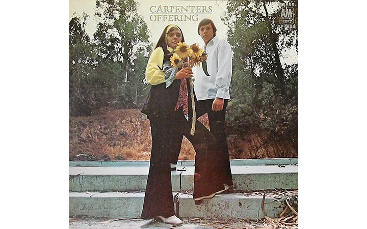
Offering (1969) Art director: Tom Wilkes. Photographer: Jim McCrary.
At the onset, A&M Records didn’t have a sharp image in mind for the group. The Carpenters released their first album, Offering, in 1969. The cover presents a photograph of Karen and Richard Carpenter in a rustic non-specific setting. The message is unclear, having something to do with nature, sunflowers, and autumn.
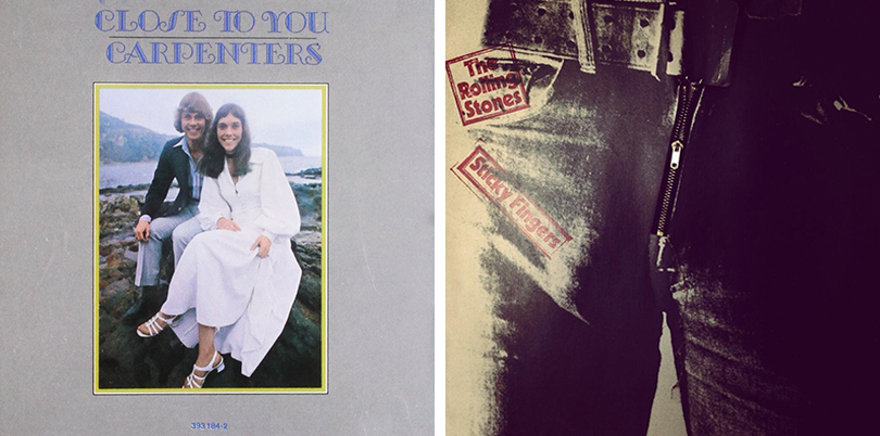
LEFT: Close To You (1970) Art Direction: Tom Wilkes. Photography: Kessel/Brehm Photography. RIGHT: The Rolling Stones: Sticky Fingers (1971) Art Direction: Craig Braun. Photography: Billy Name.
The next album, Close To You (1970), begins to craft the image more definitively. The southern California ocean background conveys a natural and west coast attitude. The clothing portrays them as innocent and clean. These are people who would be acceptable as dates, in contrast to the person on the cover of The Rolling Stones Sticky Fingers (1971). The nostalgic art-deco typeface and photographic border communicate the warmth of a vintage photo-book. But, most importantly, we now see Richard and Karen Carpenter straight on with broad smiles. Again, these are friendly people. They will not trash a hotel room.
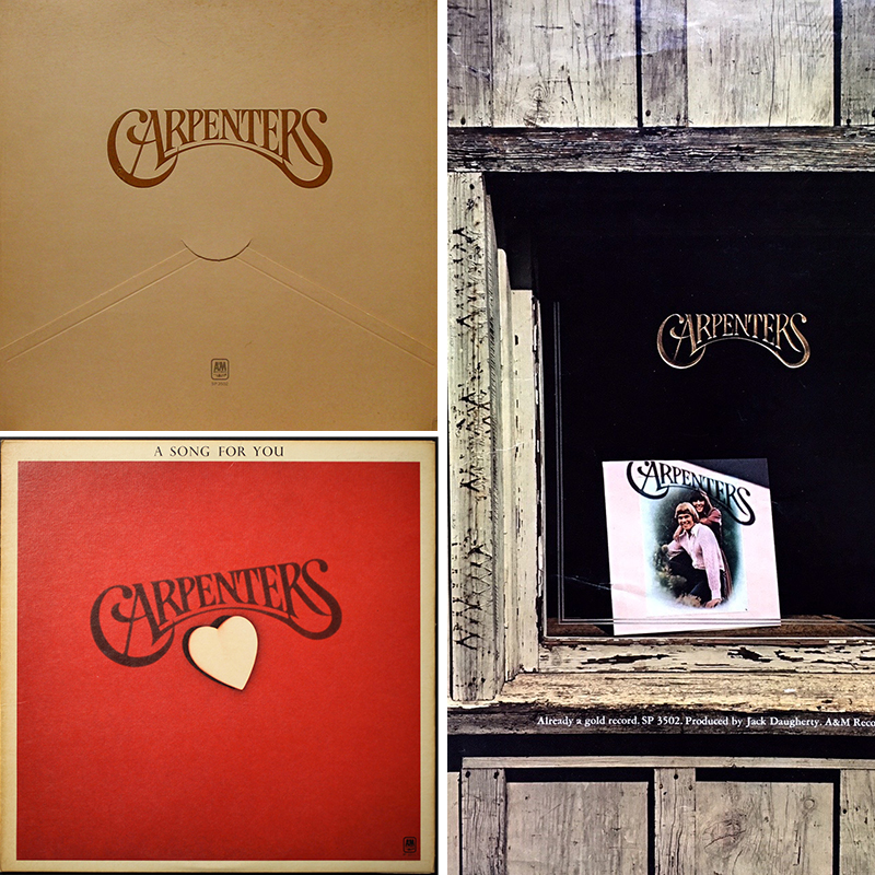
TOP LEFT: Carpenters (1971) Carpenters Logo: Craig Braun and Associates, Art Direction: Roland Young. Photography: Guy Webster. BOTTOM LEFT: A Song For You (1972) Art Direction: Roland Young. Photography: Jim McCrary. RIGHT: Advertising (1972) Art Direction: Roland Young.
Carpenters (1971) is the first usage of the Carpenters logo. The art-nouveau typographic-expressionist letterforms on a cream background reinforce sentimentality and nostalgia. The absence of a photograph tells the audience that the group is now successful enough to be represented only with their logo. They are not individuals. They are now a product. The following album, A Song for You, continues the theme, adding a sweet Valentines red background and heart.
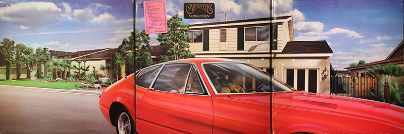
Now & Then (1973) Art direction: Roland Young. Photography (front cover): Jim McCrary. Illustrations: Design Maru (front cover); Len Freas (inside cover).
The renowned art director, Roland Young, shifted the message away from the saccharine with the three-panel fold-out cover for Now and Then (1972). The photograph continues to reinforce the southern California image. But, the duo is now obscured in the red Ferrari, driving past the family house in the Los Angeles suburb, Downey. One has the sense of a transition and change in direction (no pun intended).
Young recalls the experience, “When I was at A&M Records, I thought the Carpenters’ songs were so powerful. You couldn’t help seeing Karen and Richard in your imagination by listening to We’ve Only Just Begun. The Now And Then cover captured them with an elusive cinematic image. They are cruising in their car, driving by their mom and dad’s home in Downey, composing and arranging. I wanted an illustration, not a photograph. Notice the missing shadow on the garage door, no street lamps. It’s not real, but so real.” He continued to explain the structure, “The cover is one third of the image. It’s a three-panel package. Only by buying the album would the listener get the whole picture. I didn’t have to explain anything to A&M. They loved everything.”
With the exception of Lou Beach’s Passages (1977), Young’s unique approach is abandoned and the album covers revert to the formula of Karen and Richard’s smiling faces for most of the subsequent albums.
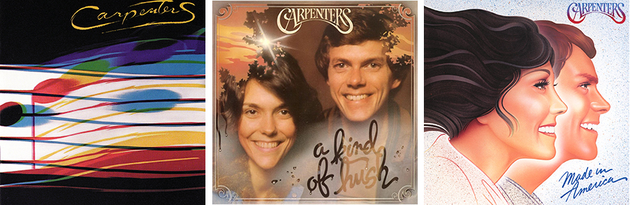
LEFT TO RIGHT: Passages (1977) Design: Lou Beach. A Kind Of Hush (1976) Photography: Jim McCrary and Bill Hennigar. Made In America (1981) Art Direction: Chuck Beeson, Jeff Ayeroff. Design: Lynn Robb. Illustration: David Willardson.
Like the Beach Boys, Olivia Newton-John, The Jackson 5, and The Osmonds, the Carpenters image was crafted to sell records as an alternative to the “dangerous and counter-cultural” element at the time. It was safe and benign. In a world of riots, Watergate, the Vietnam War, and the energy crisis, these groups provided a safe retreat.
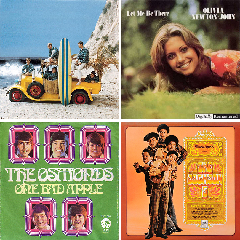
The Beach Boys, Surfin’ Safari (1962) Olivia Newton-John, Let Me Be There (1973) Diana Ross Presents The Jackson 5 (1969) The Osmonds, One Bad Apple (1970)
The happy smiles, bright photography and illustration, natural colors, and the hint of nostalgia repeatedly reinforce the communication. There is little room for the audience to accept any of the individuals with three-dimensional, complicated, or contradictory natures. We prefer the easy to identify: the Carpenters are friendly, the Rolling Stones are nasty, Bjork is alternative. In a 1974 Rolling Stone cover story, Karen Carpenter tried to remove some of the squeaky-clean perceptions, "The image we have would be impossible for Mickey Mouse to maintain. We're just normal people."
Many thanks to:
www.leadsister.com
www.discogs.com
www.richardandkarencarpenter.com