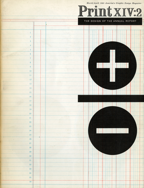
Cover of Print Magazine, designed by Jack Golden and Jack Seiden, Designers III, 1960
In 1986, I went to work for a small design office in New York City about whom I knew very little. For the next eighteen months, I was a graphic design slave: I worked long hours, was paid very little, and immersed myself in learning how to do everything in the bull pen. (As I was the only employee, I suppose I was the bull pen.) I also threw the class curve in terms of age: the studio was called Designers III but one of the three was no longer living, and the other was semi-retired. I reported to the last remaining designer, a man called Jack Golden, who was a friend of my father's and something of a kook. Back then — in the days before bottled water and sodium-reduced snacks — Jack ate an obsessively raw diet, stood on his head for a half-hour each morning, and, as far as I was concerned, never slept. An indefatigable ephemera collector, he was obsessed with design and remains, to date, the only person I've ever met besides Bradbury Thompson for whom Baskerville was a religious experience.
Nothing was ever good enough for Jack Golden, and my life in the studio was tantamount to boot camp. He used to scrutinize my work ruthlessly, and never once offered his blessing before submitting his nitpicky critique. ("Move it up a hair!" was Jack's most common refrain.) I confess that after about a year, I realized this was just a knee-jerk response: the work was actually fine as it was. From that moment forward, I would, upon receiving his input, walk outside the studio door and wait what I believed to be the requisite amount of time anyone would require to actually make the "move it up a hair" adjustment. Whereupon I would return for his approval, having done absolutely nothing.
Jack's work was dutiful but uninspired, framed by an adherence to a kind of dull, revivalist classicism in which habit became the norm. I always assumed that it had always been so, but recently, I came across a cover that Jack designed for Print back in 1960, and I was floored to see that he'd been capable of something so elegant and simple. Everything about it — from the elegant ledger grid in the background to the bold scale and placement of the mathematical symbols to the daring lack of ancillary detail — is timeless and spare, qualities I never actually associated with Jack, but which, I now realize, were probably there all along. Seeing this now recasts his work in a new light, and makes me wonder why I never asked to see his earlier work, or if I did, if I understood when or why or how it had migrated to a different place.
In the end, designers are remembered for any number of reasons — our skill, our originality, our insistence that things move up a hair. Sometimes it is a single piece of work that represents us, or a well-received lecture stored in the collective memory of an audience. Often, too, we are not in possession of what gives our work longevity: no matter how many movies Harrison Ford ever makes, he will always be accompanied by the soundtrack to Indiana Jones and the Temple of Doom when he takes the stage. For designers like Jack Golden (who died in 2002), the soundtrack may not be so familiar, but the work, like the man who produced it, remains even now as it has ever been: solid and safe, and really well-kerned. How endearing that as a young man he designed this magazine cover, so much less — and so very much more — than he would ever do again.


