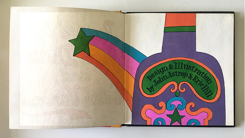
John Astrop and Eric Hill: illustration and Design, June Dutton and Edith Vanocur, authors, 1967
Design history is a land-mine field of issues. Inherently, much of the work created in the past is linked to the cultural standards of its time. What we may deem unacceptable now, was celebrated then. Does that make it bad? Should the creator be vilified? Should the offending design work be eliminated from a classroom or book?
Recently, I was asked to remove Mary Wells’ “Air Strip” campaign for Braniff Airlines from a history lecture. It was suggested that someone in the class might be adversely affected emotionally by seeing the campaign. The point was not to promote the work as a way to use sex in advertising, but to discuss issues dealing with our responsibility as communicators. For an article on propaganda it was suggested that I should remove the racist posters attacking the Freedmen’s Bureau from 1866 for similar reasons.
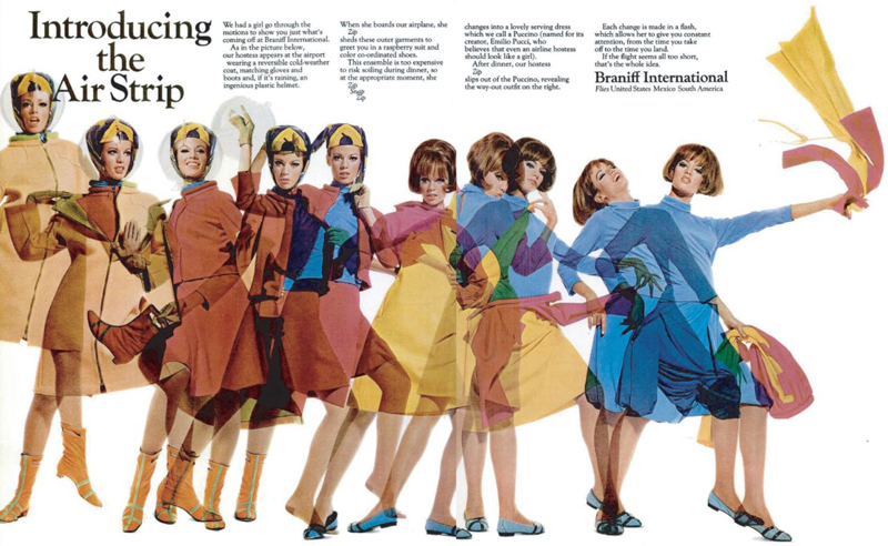
Braniff Airlines, The Air Strip, 1965. Mary Lawrence Wells, Wells Rich Green
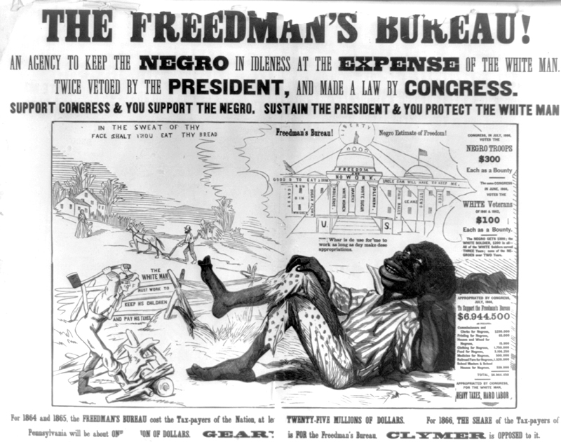
Support Congress & you support the Negro Sustain the President & you protect the white man. Poster, 1866. Library of Congress, Rare Book and Special Collections Division
Afterward, I found myself subtly veering away from any issue that might be divisive or controversial. This may be due to my uptight upbringing to avoid any unpleasantness and quickly changing the subject to the weather. Or it might be my increasing fear that a word I use may now be deemed inappropriate. In fact, I recently was told, “politically correct,” is no longer acceptable as it suggests inequity.
The argument surrounding political correctness has been ongoing for three decades. In 1990, New York Times reporter Richard Bernstein wrote that the country’s universities were threatened by “a growing intolerance, a closing of debate, and a pressure to conform” (“The Rising Hegemony of the Politically Correct” The New York Times, October 1990). Conversely, last year, Moira Weigel stated, “In fact, anti-PC has paved the way for the populist authoritarianism now spreading everywhere. Trump is anti-political correctness gone mad.” (“Political correctness: how the right invented a phantom enemy”, The Guardian, November 2016)
The broader debate cannot be solved here. But in the context of design history, an Orwellian elimination of artifacts and words can only stifle discourse, not enable it. This is not to suggest that hate-speech is acceptable as free speech. There is a long distance from a discussion about racism and poverty to spewing hateful and subjugating terms from a moving car.
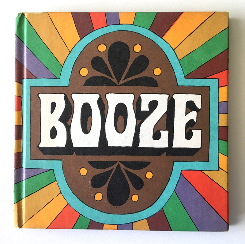
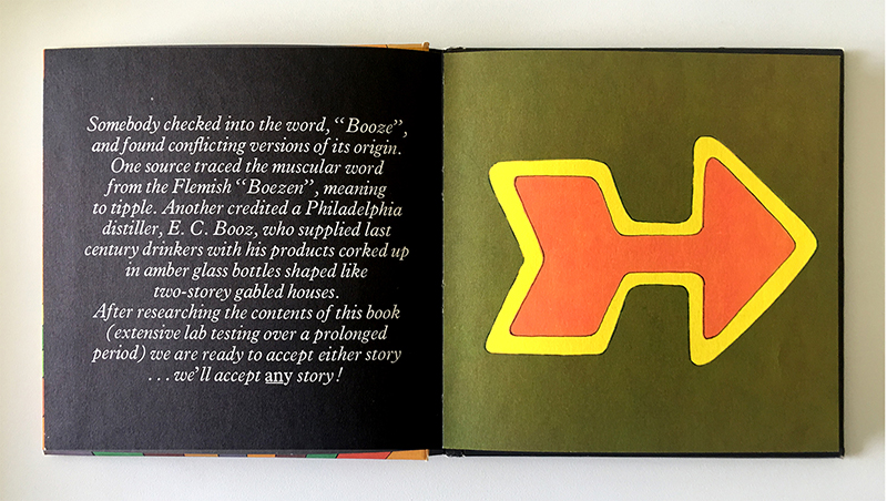
This reticence to engage anything that might be deemed controversial became apparent to me when my assistant, Simona Szabados, bought me the Booze book as a gift. Was that acceptable? Was she inferring that I was an alcoholic? If I were, would I be driven to tears and uncontrollable shaking at the mention of “booze”? If I thanked her was I promoting the use of cocktails? Was that against the rules? What the book did for me, however, was to remind me that avoiding anything contentious would result in benign and dull landscape paintings (as long as they didn’t imply ownership or class divisions). The beautiful Booze book would never exist.
John Astrop and Eric Hill: illustration and Design. June Dutton and Edith Vanocur, authors. 1967
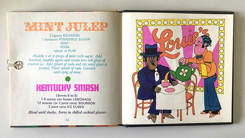
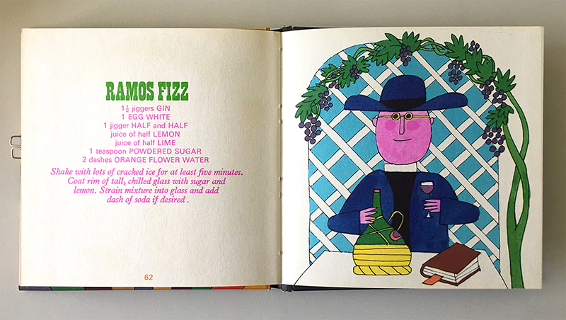
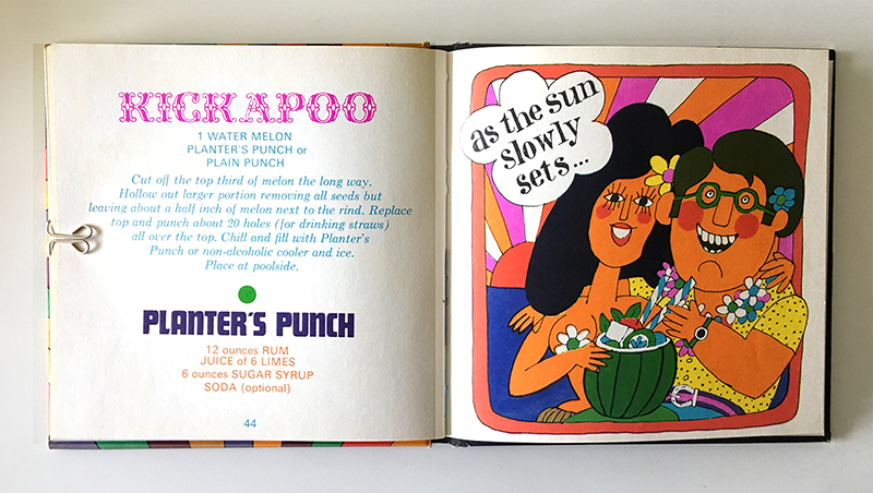
June Dutton and Edith Vanocur wrote the book in 1967. The authors clearly enjoyed drinking and, according to the introduction, were willing to engage in “extensive lab testing over a prolonged period.” The illustrations by John Astrop and Eric Hill reinforce a jovial and positive point of view regarding alcohol. And then there is the typography. Never have so many odd typefaces come together to make something so wonderful. The mix of typefaces, from what appears to be Braggadocio to Tropicana, proves that mixing different serif typefaces together is perfectly acceptable.
If I were to deconstruct the imagery in Booze I would quickly recognize the cultural stereotyping. That, however, would detract from the magnificent illustrations and subject the book to our twenty-first century values. To take this a step further and more extreme on the watch for anything inappropriate, is this not “temporal inequity”? Should I be reprimanded for assuming my time in 2017 is superior to 1967? Booze was written when executives still had three martini lunches and then slept through the afternoon. Design is not Darwinian, it does not evolve to be better over time. It is a product of its time and place.
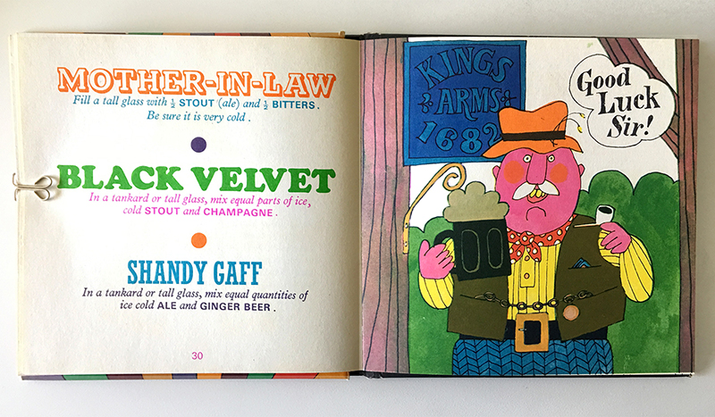
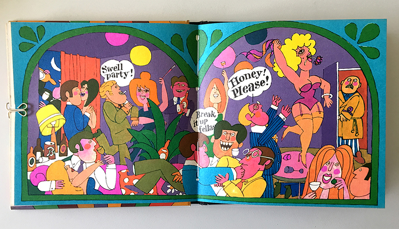
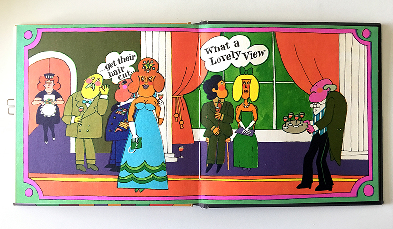
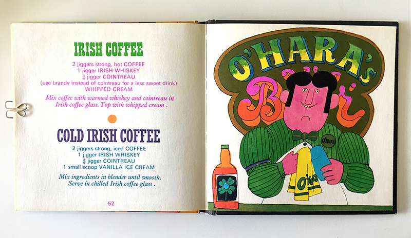
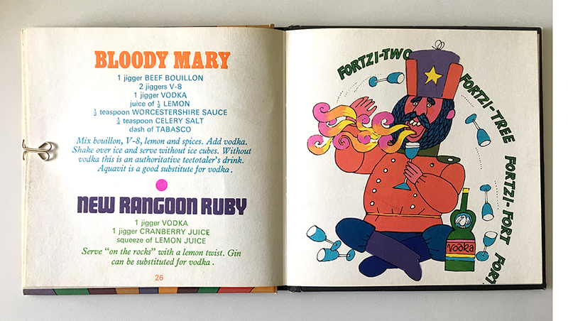
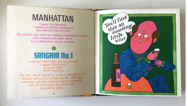
It’s difficult, however, to not notice that the hippies in paisley and polka dot shirts are “peaceniks” and pot smokers, the urban intellectual with bifocals uses words such as “amusing” (read into that what you will), Russians dress in Cossack garb and drink very strong vodka, Italians wear mobster attire and look shifty, Scottish men are hairy, burly, and drunks, and Irish men own bars. The spread with a party scene threw me, as I read “Honey! Please!” as in “Honey! Puhleeze!” coming from the two men at the bottom of the page. But it was pointed out to me that the businessman was saying this to the blonde table dancer. On the spread with the more civilized party, the military establishment General is clearly complaining to the other guest about young men needing to get their hair cut. This was a common theme during the 1960s, along with the saying, “Get a haircut and get a job.”
John Astrop and Eric Hill: illustration and Design. June Dutton and Edith Vanocur, authors. 1967
I am fairly certain that the motivation for these references was not malicious. These were fast reading cultural concepts used for clear communication. They align with Judy Prota’s campaign for Levy’s Rye Bread at Doyle Dane Bernbach in 1961. In order to expand the market beyond its base of Jewish customers in Brooklyn, Prost created the slogan, “You don’t have to be Jewish to love Levy’s.” The campaign featured photographs of a range of non-Jewish rye bread lovers. Again, to read quickly as not Jewish, these relied on cultural stereotypes: the Irish cop, the Native American with the feather in his hat, the Italian grandmother in the kitchen, and the Catholic choirboy. In 1961, this was “big idea” communication.
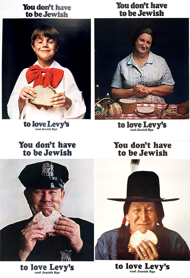
You don’t have to be Jewish to love Levy’s campaign. Judy Prota, Doyle Dane Bernbach, 1961
Design can and should be disruptive, controversial, provoking, and in the case of Booze, joyful and irreverent. If we eliminate cultural artifacts that do not adhere to our current principles, we open the door to removal of anything “disturbing” from the historical canon. If we do not discuss the difficult concepts and sweep them under the rug for fear of criticism, we create a culture of fear and silence. As designers, we walk the fine and constantly shifting line of what is acceptable and what is not. It would be easy to retreat to safe and wholesome subjects, but as Tibor Kalman said, “If you only do work nobody hates, nobody will love it.”