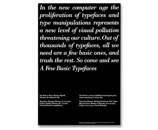
Massimo Vignelli, Exhibition Opening Invitation, School of Visual Arts, New York, 1991
Here are some things I was not allowed to do as I began my first job:
Use any typeface other than Helvetica, Century, Times, Futura, Garamond No. 3, or Bodoni.
Use more than two typefaces on any project.
Use more than three sizes of typefaces on any project.
Begin any layout without a modular grid in place, including a letterhead or a business card.
Make visual references to any examples of historic graphic design predating Josef Muller-Brockmann or Armin Hoffman.
Incorporate any graphic devices that could not be defended on the basis of pure function.
When I arrived as the most junior of junior designers at Vignelli Associates in 1980, my portfolio couldn't have been more eclectic. Filled with excitable homages to everyone from Wolfgang Weingart to Pushpin Studios, my design school work begged for a diagnosis of Multiple Designer Personality Disorder. You might have expected me to rebel against the strictures to which I was subjected by my first employer. Instead, I willingly submitted to them. For ten years. And, as a result, I am a better designer today.
You may react to this with horror. That was certainly the reaction when the now-ubiquitous Amy Chua burst on the world several weeks ago with her Wall Street Journal essay "Why Chinese Mothers Are Superior," an excerpt from her memoir Battle Hymn of the Tiger Mother. The essay, which has been called the "Andromeda Strain of viral memes," made a no-holds-barred case for subjecting the young to draconian rules. No TV, no sleepovers, no video games. Instead, 10-hour violin lessons. Chua also advocates zero tolerance for A-minuses on tests and even (heads up, graphic designers!) the rejection of less-than-adequate handmade birthday cards. In an age of permissive parenting, the Tiger Mother struck a nerve: as of this writing, the original essay has received 7,600 comments and counting.
All of this got me thinking about my own strict upbringing as a designer. I was completely non-ideological when I graduated from college. I didn't regard Helvetica-on-a-grid as the apotheosis of refined reductivism as did the Swiss modernists or the founders of Unimark. But nor did I see it as the embodiment of Nixon-era corporate oppression as did designers like Paula Scher. To me, it was just another style.
But it was a style I liked, and I submerged myself happily in its rigors when I took my seat at my first job. The rules weren't written down anywhere or even explicitly communicated. They were more like unspoken taboos. Using Cooper Black, like human cannibalism or having sex with your sister, simply wasn't done. For many young designers in the studio, the rules were too much. They resisted (futilely), grew restless (eventually), and left. By staying, I learned to go beyond the easy-to-imitate style of Helvetica-on-a-grid. I learned the virtues of modernism.
I learned attention to detail. Working with a limited palette of elements leaves a designer nowhere to hide. With so little on the page, what was there had to be perfect. I learned the importance of content. Seeing Massimo design a picture book was a revelation. No tricky layouts, no extraneous elements. Instead, a crisply edited collection of images, perfectly sized, carefully sequenced, and dramatically paced. Nothing there in the final product but the pictures and the story they told.
I learned humility. I was a clever designer who loved to call attention to himself. The monastic life to which I had committed left no room for this. It became my goal, instead, to get out of the way and let the words on the page do the work. Ultimately, I learned about what endures in design. Not impulsiveness and self-indulgence, but clarity and simplicity.
There was another side to modernism, though: its legacy as the great leveler. Massimo once told me that one of the great aspects of modernist graphic design was that it was replicable. You could teach its principles to anyone, even a non-designer, and if they followed the rules they'd be able to come up with a solid, if not brilliant, solution. To me, this was both idealistic — design for all — and vaguely depressing, a prescription for a visual world without valleys but without peaks as well. Sometimes impulsiveness and self-indulgence were no more than that, but every once in a while they were something you might call genius. I worried about genius.
So I permitted myself the occasional indulgence after I had been at Vignelli for a while. Once I did a freebie poster using Franklin Gothic for the AIGA. "Why did you use that typeface?" asked Massimo, sincerely baffled. I think he would have been satisfied if I said that I had lost a bet, or that I was drunk. Instead, I just, um, felt like it. I mean, Ivan Chermayeff used Franklin Gothic all the time! Was it really that bad? Another time, designing a catalog for an exhibition of vintage photographs of the American west, I created a cover that imitated a 19th-century playbill. What pleasure it was to work with a half-dozen typefaces out of Rob Roy Kelly's fantastic book, American Wood Type. In so doing, I managed to actually break at least three rules at once (unauthorized typefaces; too many typefaces at once; and, perhaps worst of all, historical imitiation). Massimo pronounced the result "awful," a word he could (and still can) provide with a memorable inflection while seeming to gag. I still like that cover.
By the time I left Vignelli Associates in 1990, I felt I was ready to move far beyond the limiting strictures of modernism. The period of graphic self-indulgence that followed is now a bit painful for me to contemplate. After a time I came to appreciate the tough love that my favorite mentor had so painstakingly administered for a full decade. The turning point came in about 1996, when I received a call to design a book for Tibor Kalman. This was the monograph that would become Tibor Kalman: Perverse Optimist. I was surprised and pleased. As a designer at Vignelli Associates, I had followed the work of M&Co. with interest and admiration, noting how often they broke every design rule in the world with cheekiness and impunity. I arrived at my meeting with Tibor, brimming with notions about how my book design would embody the irreverence of the M&Co. worldview.
Tibor listened patiently to my ideas — there were lots of them — and then paused for a long time. "Well, yes, you could do some stuff like that," he responded carefullly. "Or, we could do something like this. You could work out a good clear grid. We could edit all the images really carefully. Then you could do a really nice clean layout, perfect pace, perfect sequence. You know," he added with a smile, "sort of like a Vignelli book. And then we could fuck it up a little."
I then realized that, whether you credit (or blame) your mother or your mentor, you can never fully escape your influences. The rules you grow up with are what make you, as a person and as a designer. The trick is to remember, every once in a while, to fuck them up a little.
This essay was originally published in January, 2011.


Comments [61]
01.31.11
09:53
01.31.11
09:57
I've only been a professional designer for two years, but that time has been spent designing for the web, where I've already seen countless trends flare into existence and then burn out with all the permanence of a firework. That's brought me to the point where I no longer feel pressured to achieve "design genius," and am happier striving for those principles Massimo taught you.
01.31.11
10:00
This was a great read.
01.31.11
10:06
01.31.11
10:19
01.31.11
10:26
01.31.11
10:40
@Maria, if you think seeing Massimo speak was great, in the words of Bob Wages "Once you've partied with Massimo, everything pales in comparison."
01.31.11
10:51
I think he called on you, Michael, because he knew that you were the best to design a normal, quintessential-looking book- whether in spite of or because of Vignelli's Modernist training. It is this ability to look into the essence of things, which is not replicable and which goes beyond rules and typefaces.
01.31.11
11:07
When I worked at Bruce Mau Design, Bruce wasn't doctrinaire exactly, but for years our presentation documents, and much of our public output, defaulted to News Gothic. Other than that, we pretty much used Franklin Gothic, Perpetua (our Bodoni as it were), Interstate, and occasionally Trade Gothic. As the reality of the (pre-html5) internet became apparent, we surrendered to Arial and Verdana. Eventually Helvetica and Helvetica Neue creeped in, always a surprise as Bruce was closer to Paula Scher on the matter of the former. But we obviously fucked things up a little from time to time.
01.31.11
11:34
Less is always more.
Peter Darnell
Principle
Visible Works Design
01.31.11
12:31
01.31.11
01:03
I am Asian and having to deal with strict parents has been a difficulty I'm still having trouble with. But I know that the upbringing I had has helped me to be a better designer and a student. All that's left to do is "fuck it up a bit".
Looking forward to my future. Thanks again for a well-written article!
01.31.11
01:08
01.31.11
01:12
01.31.11
01:14
01.31.11
01:42
01.31.11
02:21
In an early job, in addition to my excessive self-consciousness about grids, I learned the hard way to be ever mindful of the provenance of the type I chose. The design I'd come up with for the Cultural Institution's gala was deemed to be "like the opening for a shoe salon."
Fast forward to the recent book I did with a colleague about 19th century 'artistic printing' and all its unrestrained and previously unheralded wackiness. The artistic printers were lambasted (sometimes rightly so) for their excesses and experiments. The critiques from the time seemed laughably familiar and comforting. I feel in some small way the 19th century set me free! (although I did obsess over the grid when designing the book)
01.31.11
02:33
It's been a while since I've read an MB article here. Good to have you back.
01.31.11
04:03
01.31.11
04:39
This article on the other hand speaks of something else- Discipline and the need to have it in an age where "Visual Pollution" as Mr Vignelli says so nicely is ever on the rise.
01.31.11
07:24
VR/
01.31.11
10:53
I, too, grew up with the same rules at Page, Arbitrio & Resen, though the permissible typefaces were a slightly different set. No colors were picked without hearing Josef Albers invoked. Like you, something about all that Modernist aesthetics sunk in and like you, I sought to rebel only I ran away from design towards art…and then to realize that this stuff is so ingrained in me. I've stopped running. And just now, the fun is about to start.
02.01.11
02:12
02.01.11
08:58
As I read it, the essential point of this article is: the path to being a better designer is to arbitrarily diverge from the ideology of one of the field’s most doctrinaire practitioners—essentially denying everything he stands for. I’m no Vignelli scholar but his philosophy strikes me as one where you have to be “all in” or nothing. How is it possible to praise discipline while indiscriminately abandoning it?
I also have serious questions about this tenet of “fuck them up a little.” Might this up-fuckitude be defined just a bit? Are we talking PMS 811, symmetrical layout, using upside down “5”s in place of “S”s? And quantification: how much up-fucking is proper? Plus, how do we know when it’s suitable to do—as its instance is described (need I add the modifier “vaguely” here?) as “every once in a while.” And how do we square this random with-screwing with the previous directive against “impulsiveness”? (Is this a clarion call for strategic, considered, up-fuckization?) Or is impulsiveness bad only in combination with “self-indulgence”?(Which evidently is acceptable if one chooses to simply use Franklin Gothic while on an anti-Modern bender.) Or is impulsiveness contraindicated only if it results in a design formality that offends Michael Bierut’s sensibility?
I’m also trying to reconcile the widely praised invocation to “clarity and simplicity” with, say, Marian Bantjes’ work—also widely praised. Is this actually a secret critique of “I Wonder”? As the author has employed Marian on multiple occasions, it’s obviously not a total rejection. Is a dose of Bantjes an example of up-fucking? (Or are we just talking about her vocabulary?)
So, I’m confused if I’m supposed to be reading this article as pure amusement or if it’s meant to provide serious design thought. I’m likely color-blind in this area as it often seems—as in the comments section here—that designers are talking a secret language I don’t follow. They all seem to get it—what’s wrong with me? (Line forms to the right, hope you packed a lunch.)
As a delightful collection of anecdotes, this article is another winner. However, its ultimate application seems to be only to the career of one man. We should all be so lucky. However, we’re not. And it would be great if, under those more common circumstances, design writing had something to offer.
Just kidding, I loved it!
02.01.11
10:29
I am also delighted to see the banner of Modernism, blowing in the wind, in all his glory.....
02.01.11
12:01
Thanks Michael! I would have loved to have Massimo as my mentor. I am sure he would have made me cry every day—but would have been so worth it!
02.01.11
04:01
“You know,” he added with a smile, “sort of like a Vignelli book. And then we could fuck it up a little.” — Tibor Kalman
Vignelli refers to this as this device as ambiguity. I just finished designing a little 32 page booklet for the school. The design started out being based on the Vignelli Canon—A5 booklet, grid design with Bodoni and Helvetica fonts. The template was a perfect match for an interdisciplinary, place-based program. One of the captions read “the study of New York City—through the lens of the Bronx.” I even got to design a modernist map of New York City with a sampling of 15 field trips students would take with their teachers. But the fun part was deconstructing the design to enhance the text, or as Tibor would say — “fuck it up a little.” Perhaps Vignelli would say after reading your essay “Syntactics Yes, but with Ambiguity.” Great work Michael!
02.01.11
09:45
"Vignelli refers to this device as ambiguity."
02.01.11
09:51
Kenneth: I concede that this story's "ultimate application seems to be only to the career of one man," me. What is easy to miss about the (seemingly "all in") Vignelli philosophy is his interest — an Italian characteristic, I've always thought — in ambiguity. Carl Smith is correct that on that point Massimo and Tibor would have agreed. It may be too pat an answer for you, but in my mind at least it helps explain most of the questions you raise in your third paragraph.
Also, since the whole piece started as a parody of the original Tiger Mother article in the WSJ, there is an undercurrent of irony that might be missed by people seeking "guidance on how to design." For what it's worth, Amy Chua claims that her irony was missed as well.
02.02.11
12:22
02.02.11
02:06
02.02.11
08:15
I don't agree with Kenneth's idea that this essay does not apply to others. While I did not have the rare privilege of working with Vignelli, I did experience learning many of the same ideas. The essay reminds me of that. It's always worthwhile to be reminded of how we learned, who we learned if from, and what our guiding principles are.
I think the essay also applies to others in the broadest sense in its expression of the idea that learning from a mentor is a valuable experience--an irreplaceable way to become skilled at a discipline That's the take-away actionable and repeatable principle.
Okay, yeah, we cannot all be mentored by Vignelli, but some of us can at least be mentored by FitzGerald. Having said that, I'll add that I think maybe Kenneth was delivering a "hearty kicking," with his tongue firmly planted in cheek.
02.02.11
10:21
Thanks again!
02.02.11
11:55
Here are some of those rules;
1. Use any typeface that is appropriate for the project.
2. Use as many typefaces as is appropriate to the project.
3. Use as many sizes of typefaces as is appropriate to the job.
4. Begin any layout without a modular grid in place, including a letterhead or a business card, but use a grid if it helps.
5. Make visual reference to any examples of historic graphic design, including modernism, that are appropriate to the project.
6. Incorporate any graphic devices that are appropriate to the function of the project.
Yes, these rules are a bit more open ended and perhaps more difficult to master (and as a purveyor of type they serve me well on more than one level). But, as Amy Chua wrote, "nothing is fun until you're good at it. To get good at anything you have to work."
02.03.11
10:19
02.03.11
10:40
Modernist or not, I think both Michael and Rudy both understand that design is for the public and to be a great designer you must improvise to create meaning for your audience.
02.03.11
12:33
Michael's statement and Massimo's response are marvelous and stand with no further comment necessary.
The significant part of what Michael says (for me) is the recognition that to know something well (to really know some - thing - any - thing... well) is so difficult that it requires years of practice and assimilation. To study a clear philosophy such as Massimo's teaches the ancient tenets of grace, truth and beauty, as well as the effectiveness of problem-solving. In addition, an apprenticeship with a master teaches design practice as away of life - in and out of client relationships and in and out of personal issues. I also learned this way the first time (though I had many masters rather than one).
Another way of learning is to study academically - as Kenneth did (in art and design). Then to teach, write and practice (as he does now), learning life and client relations as we go. Equally effective and unique - and infinitely more democratic (there are very few masters around). Kenneth chose post-modern masters and colleagues to emulate. Paul Rand and Massimo Vignelli may not have been consciously among them, however without them the new would not have emerged. So as I’ve said many times, ones position along this line of old to new comes from ones experience.
"The rules of postmodernism" for some have been expressed as “the rejection of modernism”. Every era must end. And I think it’s therefore fair to say only now (after the end of postmodernism) could Rudy Vanderlans make a list of "postmodern rules". In the full-thrust of the postmodern movement (in Graphic Design - which was much later than art and music) it would not have been desirable or possible to have any such list of “rules”. The form was (it’s practitioners believed) being invented in the moment.
My contention is that Modernism and Postmodernism both live as examples of successful design practice from which anyone can still learn. The new practice of Relationalism (some prefer Post-postmodernism) deals with issues in design and society that have emerged since postmodernism ended in the late 1990's (cf Frederic Jameson and Nicolas Bourriaud). The battle between the "multiple modernisms" is over now. It's time to consolidate our energies in allowing the new to emerge effectively, while acknowledging and expressing our collective gratitude for the old.
02.03.11
12:59
02.03.11
01:04
02.03.11
03:15
02.03.11
04:04
02.03.11
05:12
Thanks again for your article!
02.03.11
07:58
02.03.11
09:44
Sure, more can be more… HALLELUJAH! — but more often, less is more.
Clients ultimately feed us and our families. How many clients have asked you to "fuck things up a little?"
In most instances, thoughtful design and attention to detail actually mean more to clients than multiple visual elements or "busy" layouts — no matter how well executed. And they've never heard of our design awards, magazines, blogs or the AIGA — sorry folks.
For what its worth… thanks Mr. Bierut. (And thank you Mr. Vignelli for your influence/s.)
VR/
02.03.11
11:20
But I was particularly struck by Rudy VanderLans 'oppositional' stance. In relation to his first three points, Massimo did;
1. Use any typeface that is appropriate for the project.
– they were, Helvetica, Century, Times, Futura, Garamond No. 3, or Bodoni.
2. Use as many typefaces as is appropriate to the project.
– he did, consistently, two!
3. Use as many sizes of typefaces as is appropriate to the job.
– again, he did, three!
As 'snide' as the above might sound, I am hinting at what I think is an often missed point about Vignelli's 'rules' – I think its more about understanding how much can be done (just about anything worth doing) with so little (or few) that excities me about his design, but also design in general.
Lastly, R VdrL's throw away point that modernism is easy to master is just plain wrong! Indeed I would counter that his 'rules' are no rules at all, and who can't 'master' that?
02.04.11
12:08
In regards to a strict upbringing, constraints put on a child are circumstantial. Helpful to a child growing up, if and only if, there is room for that child to generate their own constraints. Danger here is, once the circumstances change, are you able to generate your own constraints to be creative?
I was raised, and professionally groomed with both strict circumstantial limitations, and the ability to generate my own. This balance gives you the flexibility to create, then break the rules as you see fit.
02.04.11
01:37
Does a strict upbringing make you a better designer? It can give you better results in less time, but may limit the way you see.
The Rock Man in The Point knows what's up.
"Did you ever see...a pterodactyl?"
"Well...did you ever want to see a pterodactyl?"
02.04.11
03:44
To understand part of the history behind this article read Massimo Vignelli vs. Ed Benguiat (Sort Of) Annotated by Julie Lasky.
Also please note Kenneth FitzGerald’s comment at the end as a special treat.
Here are a few lines from Print's September/October 1991 issue:
Julie Lasky: The way you’ve described Emigre makes it sound like what someone might have said about Dada in the ’10s and ’20s.
MV: No. Dada was just the opposite, as a matter of fact. All the Dada expressions were absolutely conceptual. They never had anything to do with the value of the artifact. Now, in this culture, it’s the other way around; we are completely involved with the value of the artifact and use that to express meaning. Therefore, we’re much closer to music. We like music and we can’t stand noise. What we see here in Emigre is noise. Noise is a sound that has no intellectual depth.
02.04.11
09:39
My first boss actually works and lives by three principles: discipline ("the search for structure"), appropriateness ("the search for specificity") and ambiguity ("the search for fun"). My piece focused exclusively on the first, but Rudy Vanderlans and Carl Smith quite rightly raised, respectively, the second and third.
02.05.11
08:44
But I must ask, of anyone who cares to answer, why did Robert Appleton feel the need to address his post to the famous four? Are the rest of us not worthy?
So as not to end on a downer... if any of you have not yet bought a print copy of The Vignelli Canon, go get it its a treasure!!
Ix
02.05.11
07:48
I don't know much but I know this: I am not famous.
02.05.11
08:17
I've been kind of wondering why he wrote: "Michael's statement and Massimo's response are marvelous and stand with no further comment necessary"--but then proceeded to add four paragraphs of comments.
02.05.11
08:24
Regarding my comments: I love to chastise the design profession for its obvious frailties.
And on the selectiveness of my address: Among other things, I'm Scottish, and we generally prefer to get to the bottom line right away. Someone once commented that if the national Scottish peasant dish is a single potato, and the national Italian peasant food is a pile of spaghetti, then this alone may be all that's required to explain the Scottish desire for simplicity - and incidentally, why they also "Love New York".
02.06.11
08:37
02.06.11
08:46
The parallel between rearing a child and teaching a student/young designer seems completely valid. Inevitably one will begin to form their own ideas and rebel (maybe through using, gasp!, a handful of western typefaces on one project). The lesson to be learned is that there is value is being disciplined and practicing. "Fucking things up" seems a bit juvenile but I suppose most of us go through that teen angst phase before forming a unique adult identity. I have seen designers stagnant creatively after years of 8-10 hour days "practicing" the rules of insistent creative directors or faithfully following brand guidelines. It's not pretty... it's boring and it doesn't really add much to the design dialogue or visual culture.
02.09.11
12:22
03.10.11
06:11
04.10.11
10:28
This gonna be really Handy "Guide" or say will be the "Ray of Hope" for me.
Thanks once again & thanks for fu*king a little :P
04.15.11
03:48
04.16.11
05:02
You, or rather Massimo, posed a very interesting idea about modernist design and how it could be taught to anyone, even non-designers. At first the idea makes it seem as if it is perfect. It is a style that can be utilized by non-designers to execute brilliant ideas. However, at second glance, it is a very depressing idea because if true, what is the point of professional designers? if modernist design can be used to turn out clear and effective design by even the least experienced, boot-legged adobe PC software, template following amateur, then there really is little point. Right? It would appear so but no. While non designers would be able to follow such templates and the basic ideals of modernism, it takes a true professional designer to successfully fuck modernism up enough to communicate masterfully.
04.24.11
06:55