Computer users are zealously proprietary about the fonts they use for their everyday HMIs (human machine interfaces). However, this same attachment to one or another style seems to exclude the increasing number of HMIs on automobile dashboards. Although the most legible typeface can mean the difference between concentration and distraction and what that implies, most drivers simply accept what comes standard with the vehicle they buy or rent, as if bequeathed from above. But that will soon change. Since 2011, Monotype Imaging Inc. and MIT’s AgeLab have been collaborating on a study “to prove to customers and the [automobile] industry that typeface design can make a difference—that using typefaces that are conducive to glance-based reading could have an impact on driver distraction,” says Monotype’s London-based legibility director, Dr. Nadine Chahine.
With a PhD in eye-motion studies, Chahine, a specialist at designing Arabic fonts derived from Western type families, has been focusing her eyes on legibility for new digital platforms. Working with AgeLab colleagues, Dr. Jonathan Dobres, Ph.D, a Research Scientist in cognitive psychology and Dr. Bryan Reimer, Ph.D, Research Scientist and Associate Director of The New England University Transportation Center at MIT, they have made exhaustive analyses and issued a white paper titled,
“Utilizing Psychophysical Techniques to Investigate the Effects of Age, Typeface Design, Sizes, and Display Polarity on Glance Legibility,” which they hope will make designers and engineers more aware of a growing perceptual concern. While not bedtime reading, it is filled with fascinating data about our current screen-based behaviorial concernrs.
MIT’s AgeLab is ideal to conduct these studies because of its multidisciplinary approach in researching issues affecting people of all ages with their team of around thirty members including social scientists, psychologists, engineers, and computer scientists. They also grasp the fact that design (and design comprehension) “intersects with nearly all projects we undertake, whether or not those projects are about design, per se,” Dobres says, pointing out that AgeLab developed the uniquely designed AGNES (Age Gain Now Empathy System), a wearable suit that modifies the user’s posture and flexibility to mimic the effects of old age, which has been used to help representatives from CVS “live the experience” of shopping in their stores as an older person.
Many of AgeLab’s investigations stress driving behavior in both a simulator and on real highways. “In most cases, we are interested in how the driver incorporates the use of a voice system, smartphone, or wearable device into the demands of driving, and what effects this might have on vehicle control, driver behavior, and even their physiological response to the stress,” Dobres adds. “More broadly, we are interested in how both younger and older drivers manage their attention while on-road.”
Although experimental psychologists have explored legibility and reading for nearly as long as the field of psychology has existed, studies of reading in enforced glance scenarios, such as in-vehicle screens and smartphones, are in the early stages. Much of the pre-existing research on glance legibility can be found in other automotive research, notably the legibility of road signs and license plates. “If we are looking at the overall history of legibility studies (answering questions like how fast can one read, how far can a stimulus be, how small to be read and at what distance, how fast can one spell check, how fast can one identify a letter etc.),” says Chahine, “there’s been interesting work done in various methods but it is not sufficient to answer all the questions of how typography influences reading under the various reading scenarios.”
The scenarios for the digital space addressed through this study include “lexical decision” or yes/no task where a person is shown either a word, or as Dobres explains, a pseudo word (a set of letters that is pronounceable but is not a word, like “shough”), and asks them to determine whether what they were shown was a valid word or not. “The difficulty of the task depends on how long the word/pseudo word is displayed on the screen.”
Another scenario, the “adaptive staircase” refers to how “we control that display time. When a person makes three correct responses in a row, display time is reduced to make the task harder; get one wrong, and the task is made a little easier by increasing display time. Following this “3-down, 1-up” rule, the system will eventually converge on a display time corresponding to about eighty percent word recognition accuracy.” Apparently, more legible typographic configurations should require less display time to hit that 80% accuracy point compared to less legible designs.
The typography on road signs is intensely debated, and now type is more visible than ever. “The difference we do get in today’s world is all the extra distraction and visual and cognitive interference that is almost nonstop,” Chahine explains. “This is a whole new way to live, and by extension, to read and we are only just starting to understand it.” Nonetheless, there is really no best or worst typeface: “It all depends on the context in which it’s used,” Dobres says, “In terms of automotive HMIs, I think it’s safe to say that most car makers and designers would stay away from typefaces like the handwriting font, Papyrus.”
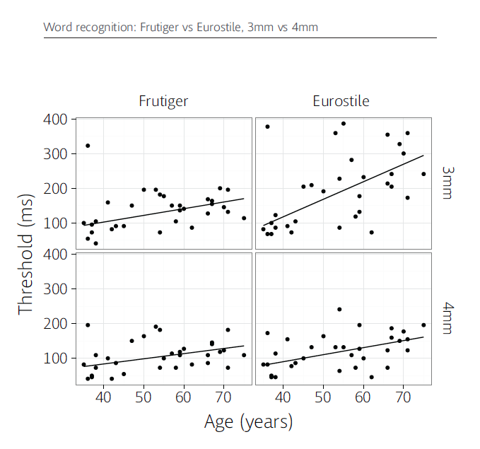
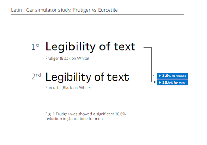
The faces chosen for this study are the ’60s-era Eurostile, which Chahine says “came directly from the automotive world, where Eurostile was very popular at the time we started our research.” Eurostile, an angular sans serif shows up on in-vehicle interfaces from quite a few manufacturers, “probably because of its ‘futuristic’ look,” presumes Dobres. This face was contrasted with the popular Frutiger sans serif typeface, rather than other well used bold sans, like Futura and Helvetica because “coming from our own view that Frutiger is more legible for such applications. At this point, we have not studied many of [Monotype’s] other best sellers. I would definitely love to see how they all compare to one another,” says Chahine.

An essential fact of life is that as we get older, the time for accurate reading must increase. “We found that the conditions that were least legible overall—such as Eurostile set against a dark background at a small text size—got worse faster with age. Slower response times were evident in people as young as thirty. Less legible conditions seemed to have a steeper ‘aging cost’ across the lifespan.” Dobres says.

The Monotype / AgeLab report states that “The mobility of displays in vehicles, portable electronics, and wearables has also begun to change the ways in which that text is read.” Dobres explains that this has occurred “First and foremost, it’s the supremacy of the glance. Prior to smartphones, glance reading was not as common, perhaps beginning and ending with signage or specialized instrumentation and displays. Now, of course, we glance constantly.” Text is now dynamic and changing; “It used to be that a driver could memorize the button positions on the console. But now the hardware is rapidly being replaced with software, and the driver can’t rely on muscle memory. Tesla, for example, features a giant touchscreen in its center console, preserving just two hardware buttons.”
The report further states that “a typeface may visually express any number of subjective attributes—feminine, masculine, fun, austere, retro, futuristic, generic, rebellious, and so on”. Since different auto makers employ somewhat different typography, there is no one standard or solution rather as a goal of the study Chahine says is to develop a growing understanding of how different factors can affect legibility. “It’s about the balancing act that we need to do when we sit down to specify the typeface, its color, weight, size, spacing and a host of other factors. Different clients have different brand personalities and the typeface is part of that. The trick is how to match legibility requirements with those of branding.”

So, is there a perfect face for automotive HMIs? AgeLab’s Dobres concludes “There is no ‘Platonic typeface.’ This research is really about establishing data-driven guidelines to help designers through the huge forest of options they have today. They may even help designers overcome their own psychological biases. What looks elegant and subtle to a twenty-something UX designer might be a blurry, hazy struggle to a sixty-something user. … research such as ours could give designers a perspective on things beyond that experience.”


 Steven Heller is the co-chair (with Lita Talarico) of the School of Visual Arts MFA Design / Designer as Author + Entrepreneur program and the SVA Masters Workshop in Rome. He writes the Visuals column for the New York Times Book Review, a weekly column for The Atlantic online and The Daily Heller.