Supermarket door graphics (Design: Caitlin Garrison)
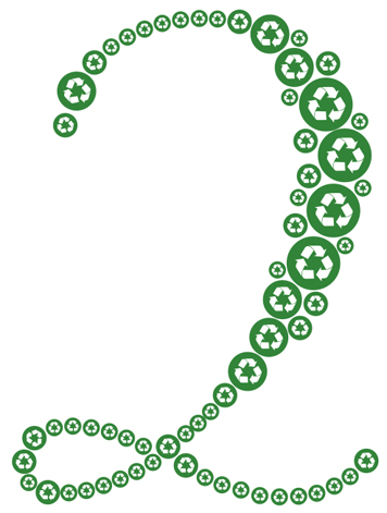
In 1988, the Society of the Plastics Industry developed a resin identification code — a numbering system from 1 to 7 — categorizing different types of plastic. The code is centered in a triangle made of arrows chasing each other. This mark is commonly misidentified as the recycling symbol. Though the system was instituted to “facilitate the recycling of post-consumer plastics,” the chasing arrows graphic is meaningless. Plastic imprinted with the arrow symbol doesn’t indicate that the material is made from recycled content nor that the plastic can be recycled, misleading many.
Did it surprise me that the "recycling symbol" at the bottom of my yogurt container had nothing to do with its recyclability? Yes. (As it turns out, my city doesn’t take #5s.) So why was it there? My curiosity led to findings around which I built a design class.
Too often, we work under assumptions. Or, too often, we work without investigation. As a teacher at North Carolina State University College of Design, I want my students to recognize the former and reverse the latter. Our class is not about recycling per se. It is about understanding the systems we live in, finding the flaws and evaluating them. Our three Rs are research, rethink, redesign.
We started with an exemplary case study, the Green Dot system in Germany (Der Grüne Punkt) where 65% of municipal waste is recycled (compared to 32.5% in the US). With Green Dot, the onus to recycle is placed on the manufacturer, under a “polluter pays” principle. They are responsible for the lifecycle of their product—a strategy changing the way things are made. Recycling starts before manufacturing, at the point of design, not as an afterthought. Packaging has dramatically decreased. Toothpaste doesn’t come in a box. A bottle is reused 25 times before being recycled. All are notable outcomes.
Then our class watched the "Story of Stuff" and "Waste = Food"; we read Cradle to Cradle: Remaking the Way We Make Things and Recycle: The Essential Guide, our essential guide. We went on tour of our local Merf (materials recycling facility). We envisioned the landfill as land-full.
As we became aware, we became depressed. It ain’t easy being green, but worse feeling blue. There is a trash vortex in the Pacific Ocean twice the size of Texas; our landfills mummify waste; plastics hardly decompose, contributing to 60% of beach pollution. Even though the class mascot is a turtle who swallowed a plastic bag thinking it was a jelly fish — named Choking Turtle — we vowed not to use scare tactics to educate (as environmental campaigns sometimes do). Why remind folks that, as noted by Stephen Jay Gould, “Homo sapiens...has limited prospects, entirely self-imposed, for geological longevity.” Instead, we aimed to spread positive messages, to make information accessible, to make people aware.
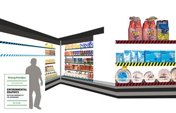
“To study design is to consider what does not yet exist,” says the dean of our college. We recognized that valuable information is missing from the grocery store. For example, products commonly list content, not container, ingredients. Aren’t both important? So we targeted the supermarket. But how do you inform without infuriating? How do you get people to practice what you don’t want to preach? Laden with grocery bags, why add heavy information to the shopper’s load? A light-hearted dialogue may have enough power to change people’s minds. Thus, we partnered with Dale Carnegie, figuratively, to make friends and influence people. Our graphics wouldn’t “criticize, condemn or complain” but give “honest and sincere” information to “arouse in the person an eager want” to help the environment.
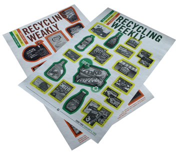
Coupon broadsheet (Design: Britt Cobb)
So we bet on the power of visual wit and charm. This flyer isn't a coupon weekly left in your cart, but a redesigned pamphlet: “Recycling Weekly” on one side, “Recycling Weakly” on the other. The design organizes sale items into recyclable and straight-to-landfill material.
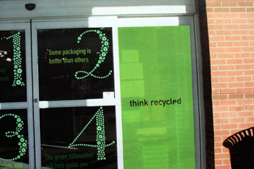
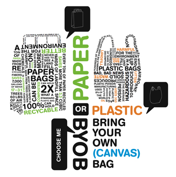
Door graphics (Design: Caitlin Garrison)
At the entryway, large-scale numbers are both instructive and seductive. They ready you for shopping: “Stop before you shop: Some packaging is better than others.”
Caution tape rating system (Design: Susan Baker)
When shopping, you’ll notice that each shelf is coded with colorful construction tape. Green/white stripes indicates a fully recyclable product, made from recycled content. Red/black stripes indicates a landfill product, and is made from non-recycled sources. Other colors refer to partial recycling. This rating system makes you “proceed with caution” as you purchase.

Meat section postcard (Design: David Mitchell)
“The packaging of this delicious meat product cannot be recycled...” states a tromp l’oeil mailer hidden among the meat. This postcard campaign puts pressure on the manufacturer without boycotting the product. You like their product, not their packaging.
Comparison shopping floor graphics (Design: Kristen Morrison)
Point-of-purchase reading: a floor graphic to help you answer the "paper or plastic" question.
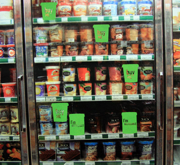
Freezer graphics (Design: Caitlin Garrison). Some freezer containers can be recycled. These charming “buy me” door decals help identify them.
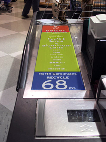
Conveyor belt (Design: Rachel Cannon). Colorful conveyor belt with statistical reminders.
Upon checkout (and to help the consumer later at home), our redesigned receipt organizes your purchases into three categories: recyclable, partially recyclable and non-recyclable. An ASCII image of a ruler-wielding nun appears on a receipt with too many straight-to-landfill items. Tsk, tsk.
In our classwork, student studies also included other projects: mirrors strategically placed in the supermarket that say “I am a recycler” (designed by Nida Abdullah); a designer toy point system (designed by Ariana Farquharson); and a signage program hanging from the rafters (designed by Darwin Campa).
Our throw-away society functions on a presumption: somebody else is taking care of this waste. Investigation suggests otherwise. The landfill is a flawed design. Even recycling, in its current mode, is deficient. Only when people become aware of facts, not fallacies, will there be an end to our ecological Dark Ages.


Comments [27]
05.25.08
01:10
In actual practice though, I think a lot of these campaigns aren't that useful. Informing people about recycling on conveyor belts is a great idea, but if certain types of containers are really very harmful the government should place laws to prohibit them instead of relying on consumers to purchase more green products, which are often times more expensive. If just telling consumers that a certain purchase is harmful to other people or the environment, then we would have already seen a decline in the sales at Wal-Mart who's poor practices are well-known.
Designers can make a difference in the political arena, but we shouldn't forget that we can deliver other information to make the world a better place. Imagine, for example, a math book that explains Calculus in a way that an everyday person could understand. Too often people think that if design is to make a difference it should be about a leftist cause. There are so many other ways in which design could be a more effective tool for positive change.
05.25.08
01:58
05.25.08
09:34
05.25.08
01:12
05.25.08
04:42
Daylight savings time.
Just sayin'.
05.25.08
05:42
05.25.08
07:01
If these strategies are desired by companies or demanding consumers, then graphic design will be an integral part of delivering the message. I don't think graphic design will be the impetus for the change.
05.25.08
08:25
05.26.08
10:38
I'd be interested to be a fly on the wall in the meeting where a retailer tells a supplier that they are going to display that supplier's product on a bottom shelf, surrounded by red hazard tape, then tell customers not to buy it. Money makes the world go 'round, and may in all likelihood be its demise.
If the general public cared about what they put in their mouths, where stuff comes from, or what happens to it after it leaves their hands, then Whole Foods would be as large as Wal-Mart, and Wal-Mart wouldn't exist.
05.26.08
03:44
Bravo on a great class project.
05.26.08
06:06
Shirley, you jest.
05.26.08
06:06
05.27.08
01:35
I think consumer demand for recycled products is high right now. However, the number of companies willing to make the switch to buying used materials is obviously lower than how much we want to recycle.
Anyone have an answer? I'd like to be able to recycle my glass.
05.27.08
11:02
"A strategically placed plastic chart — in the soft-drink aisle — with color-coded numbers based on local recycling practices."
AS others pointed out, this doesn't make the other products look "too" bad. Plus the flow chart idea is perfect. Recycling is a cycle and well represented that way.
My second favorite idea is the positive idea - mirrors strategically placed in the supermarket that say “I am a recycler”. Definitely no guilt there.
My third favorite idea is the charming “buy me” freezer door decals. But often these containers are plastic or waxed chipboard (usually unrecyclable).
Great Job!
05.27.08
12:34
Golden, and those who think like him are a big problem. Marginalising (and dismissing) recycling as an ideological whim ('a leftist cause') is not going to help our prospects for sustainability. Give me a good leftist cause any day (human rights? environmental conservation? social justice?) over the dead-end denial and self interest that got us in this shit.
05.27.08
10:08
You have the history of the chasing arrows recycling symbol wrong, or at least incomplete. Not that Wikipedia is the ultimate authority, but you might want to have a look at their entry under Recycling Symbol. Or, do a google search for "history of recycling symbol." You will find it widely documented that this symbol was designed in 1970 (probably before many of your students were born), by a college student named Gary Anderson, at University of Southern California, in response to a nationwide contest conducted by Container Corporation of America. A contest conceived to find a design for a symbol which would mean recycling and recyclability!
You dismiss this symbol as "meaningless" but I don't think you could be more wrong. I think this is a faulty premise, on your part, from the get go. I am quite sure it is very, very widely recognized as THE recycling symbol--exactly as it was meant to be!
Contrary to what you write, the chasing arrows recycling symbol with the #5 (or any other number, a much later addition) does have everything to do with your yogurt container's recyclability. This symbol means that your yogurt container is made from a particular type of plastic (in this case polypropylene). If your yogurt container makes it into the recycling stream, it should go along with all the other polypropylene. That is quite a bit of information for the little chasing arrows/#5 symbol to convey. But, that's exactly what it means--both to you and to the person at the recycling center who separates the 1s from the 2s from the 5s!
As it happens, polypropylene is not collected for recycling in your community. So, you cannot put your yogurt container into your community-sponsored recycling curbside collection (or whatever you do with the other recyclables that your community does accept). Of course, you had to rely on your community to tell you that it will not collect #5. But, now that you know that, it is easy to know what to do with your yogurt container. The #5 recycling symbol tells you, and others, perfectly.
Whether or not any #5 plastic actually ends up getting recycled is a whole other matter. Perhaps, as this interesting work suggests, we should think twice before buying yogurt in a #5 container, if it will not get recycled. There is certainly a big need for education around this. But, it doesn't do to start with a premise that is faulty. Would you come to different solutions if you began from the premise that the symbol IS meaningful?
05.27.08
11:43
The "chasing arrows graphic" is not meaningless, but it can be misleading. When combined with the resin identification code, it leads consumers to assume that the product can be recycled.
05.28.08
08:45
And I love the thinking that saving our only planet is a "leftist cause," while improving the legibility of calculus text books is a tool for positive world change. Wow.
05.28.08
01:17
05.29.08
03:45
I only wish half of the classes I am currently taking and will take soon would be this rewarding.
05.29.08
07:04
great work!
05.30.08
11:01
06.01.08
12:18
The Story of Stuff begins almost reading out of Das Kapital, but concludes in meaninglessness. Capital and the state, will not be severed for the sake of humanity. Instead their link is a deepening effect, necessary for more securititization of social space and a re-organization of capital for the coming green capitalism - think post-world war 1 and 2. It is important for designers to reflect on this and defend our integrity and gains from not being swept away by the salvation of green capitalism, carbon credits as atonements and uncritical support of rhetoricians of "Hope."
Furthermore, what would a communication system working to circumvent ecological crisis look like, if it was not attempting to synthesize a Western Individual value system with the needs of the earth? If, on the contrary, such a system was producing a affective circulation in the consumer/worker to reveal a desire for human utopia with a direction of ecological sustainability?
06.04.08
03:32
Some of the means no matter what you do will be in some way
offensive, but it's just another way to get people to stop and think.
That was an excellent project, with a beautiful and fun concept.
06.20.08
02:40
We have to be careful, however, not to get too wrapped up in the green "trend," and examine what factors will create the biggest environmental impact -- putting pressure on politicians and businesses, consuming locally grown/manufactured products, consuming organically (not to be confused with the often falsely marketed "natural," "free-range," or "green" products), knowing toxins and labeling them as such, and reducing meat consumption -- and these important factors regard the food industry alone. Much like consuming a (red) shirt does little to save the earth, we need to evaluate the effectiveness of solutions at the core to resolve what has become a crisis.
Regardless, any step forward is in the right direction, and I am elated environmentalism has become a focus. Thank you so much for teaching these concepts. Design is a product's package, that often speaks louder than the product itself. So let's evaluate our decisions, re-evaluate, and re-evaluate again -- and then voice ourselves as one, and as loudly as we can.
- NCSU College of Design Alum
06.30.08
07:33
GO SEENYAS!
12.06.08
01:46