On the surface, reviving a typeface from the first half of the twentieth century is not so dissimilar to reviving one from centuries past. While both instances involve types made in metal, the former is different in that we usually have more material to work with. Not only do drawings, correspondence, proofs, patterns, matrices, and punches survive, but most of the time we have the cast type as well. Seemingly, there is little left to interpret (beyond accounting for the weight gain inherent in letterpress printing). But the newly released Eric Gill Series of seventy-seven typefaces from Monotype, where two of the three families are revivals, is evidence that modernized versions have their own pitfalls to overcome.
Eric Gill (1882–1940) was a product of the Arts & Crafts era, an individual with a multiplicity of skills and interests. He was a sculptor, lettercarver, engraver, illustrator, typographer, and type designer. He began the latter activity at the instigation of Stanley Morison, Typographical Advisor to the Monotype Corporation, in 1925 with work on the typeface that became known as Perpetua. While Perpetua was still in progress—it was not released until 1929—Morison asked Gill to design a sans serif that would compete with Futura and its clones. Futura, designed by Paul Renner and released by Bauer in 1927, was an instant sensation, forcing type foundries and composing machine manufacturers in Germany (and then throughout Europe and the United States) to quickly respond. While many tried to emulate the geometric features of Futura, Monotype sought a sans serif that would retain some link to the classical typographic heritage of Renaissance Italy and sixteenth-century France. In Morison’s view, Gill, who had studied calligraphy with Edward Johnston, was the perfect person for the project. A year earlier he had designed a sign for the Bristol bookseller Douglas Cleverdon using sans serif capitals that were neither grotesque in the nineteenth-century manner nor geometrically reductive like Futura.
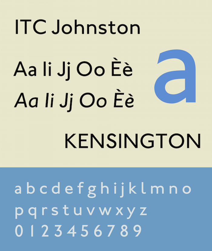
The typeface that Gill drew for Morison and Monotype was clearly indebted to Johnston’s Railway Sans, designed for the London Underground in 1916, but it also harked back to the first sans serif typeface, “Two Line English Egyptian“ of William Caslon IV, issued a century earlier. It was released in 1928—before Perpetua—and named Gill Sans to take advantage of Gill’s celebrity as a sculptor and illustrator, and to signal to the trade that it was not a grot like Akzidenz Grotesk, Venus, or the Corporation’s own Monotype Grotesque, released only two years earlier. Most importantly, it was also not a Futura wannabe.
Johnston's Railway Sans
Thanks to C. G. G. Dandridge, the Advertising Manager of The Great London & North-Eastern Railway (LNER), Gill Sans got an immediate boost in popularity. He chose it as the perfect typeface for standardizing the railway’s printed material—everything from timetables to handbills, leaflets to posters. In his view Gill Sans had impersonal elegance as well as simplicity that would enable not only printers, but also sign painters and poster artists, to create a comprehensive and coordinated corporate identity for LNER. Over the next several decades other prominent English businesses and institutions—from the BBC and Penguin Books to the Church of England—adopted the Gill Sans family as their in-house typeface, helping it to become the country’s “national” typeface.
The Gill Sans family was, from the start, full of internal contradictions and inconsistencies. Even the naming of the faces was uncertain with it being called Gill Gothic while in production and then Gill Sans-Serif initially after release before the simpler Gill Sans was settled on. But the confusion did not end with Gill’s death in 1940 or the end of the hot metal era in the 1960s. As Gill Sans was adapted for phototype and then digital type, new weights (such as medium and heavy) were added and old names were altered (e.g. Gill Sans Bold Extra Condensed became Gill Sans Extra Condensed Bold). More significantly, decisions had to be made about which sizes of the metal designs should be the models for the photo versions where three optical sizes were manufactured (though often customers used only one). This was no simple matter as some characters (such as the distinctive Gill Sans a) differed greatly from size to size. In short, the Gill Sans family, despite its long-lived popularity, was a mess and in need of a serious overhaul.
This is precisely what Monotype Imaging, the successor to the Monotype Corporation, has just done. In November they released the Eric Gill Series, consisting of a heavily revamped Gill Sans family (Gill Sans Nova; 43 fonts) along with a revised Joanna family (Joanna Nova; 18 fonts) and a newly invented sans serif companion to the latter (Joanna Sans Nova; 16 fonts). The project was overseen by Steve Matteson, Creative Director of Type at Monotype Imaging, but executed by a team of three designers: George Ryan designed the Gill Sans Nova fonts, Ben Jones handled the Joanna Nova fonts, and Terance Weinzierl created Joanna Sans Nova.
Joanna Nova Thin and Ultra Black
Even when considered a group effort, the Eric Gill Series is a staggering achievement, one that invites as much skepticism as awe. In the case of both Gill Sans Nova and Joanna Nova there is skepticism that an old favorite has been improved and instead trepidation that it has been ruined. Despite these kneejerk worries, first impressions of Joanna Nova and Joanna Nova Sans are generally positive. But Joanna, designed by Gill 1930–31 and used to set An Essay on Typography, does not have the same hold on designers’ imaginations, despite its cult following, that Gill Sans has. And if designers have little emotion invested in Joanna, they have virtually none invested in Joanna Sans. It is Gill Sans Nova that everyone will be parsing, the subjectivity of memories of and experiences with Gill Sans make a clear response to the new design difficult.
Even when considered a group effort, the Eric Gill Series is a staggering achievement, one that invites as much skepticism as awe. In the case of both Gill Sans Nova and Joanna Nova there is skepticism that an old favorite has been improved and instead trepidation that it has been ruined. Despite these kneejerk worries, first impressions of Joanna Nova and Joanna Nova Sans are generally positive. But Joanna, designed by Gill 1930–31 and used to set An Essay on Typography, does not have the same hold on designers’ imaginations, despite its cult following, that Gill Sans has. And if designers have little emotion invested in Joanna, they have virtually none invested in Joanna Sans. It is Gill Sans Nova that everyone will be parsing, the subjectivity of memories of and experiences with Gill Sans make a clear response to the new design difficult.
The impulse to compare Gill Sans Nova to its hot metal forebears (the “original” Gill designs) while ignoring the phototype versions or the current digital incarnations, is a mistake. Overall, the attempt by Monotype Imaging to bring some order to the Gill Sans family has to be welcomed.
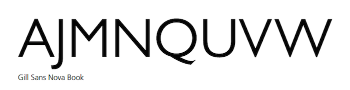
While the big picture is good, some of the details of the Gill Sans Nova family are less so. In redrawing the letters Ryan has improved on many of the curves (e.g. the bowl of R) in the Gill Sans MT Pro version, but at the same time it appears he has subtly reduced the stroke contrast in a number of characters (e.g. G, a, e, t). The strong stroke contrast found in some letters—but not all—of Gill Sans has always been a hallmark of the design, something which one either found charming or irritating. It was a feature that, even more than the distinctive form of its G, M, and R, set it apart from nearly all other sans serifs, whether grotesque, geometric, or even humanist.
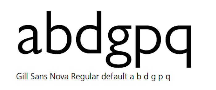
More obvious than this adjustment of stroke contrast are the changes to several letters such as the presence of rectangular dots on i and j in Gill Sans Nova Book (previously they only appeared in Gill Sans Light); shrunken circular dots on the i and j of Gill Sans Nova Bold; a steeper angle to the triangle of t in Gill Sans Nova ExtraBold and the absence of the triangle of t in Gill Sans Nova Book; the leftward shift of the tail of Q in Gill Sans Nova Medium, Bold and Heavy (though it has shifted rightward in Gill Sans Nova ExtraBold); and the shortening of the arm of r in Gill Sans Nova Light and Book. Some of these changes are welcome and some are not. But all are clearly done to make the Gill Sans Nova family more consistent across its many weights—with the notable exception of the wacky UltraBold which, presumably out of reverence for its notoriety, has been left alone.
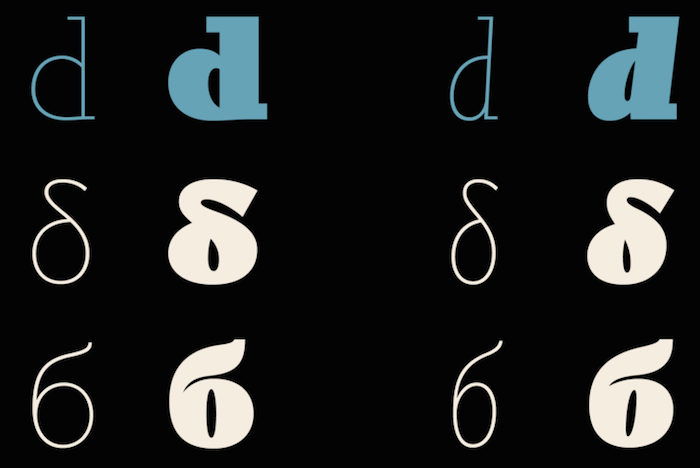
The spirit of homogeneization in Gill Sans Nova is most evident—and questionable—in the treatment of the b d p q group of letters throughout the roman fonts and the Q in the italic fonts. Gill himself was inconsistent in his design of the b d p q group of letters. In some weights he made all of them crotch-less while in others he only did that to the b or to all but the p. In the bold weights his decisions made sense as they solved the difficulty of joining bowls to stems without the distortion that mars similar weights in Futura. But in the lighter weights, Gill’s decisions appear arbitrary to many. Ryan chose to give all of the roman fonts crotch-less forms of b d p and q. This ties the romans closer to the italics where Gill consistently used that form for b d and q but never p. For those who prefer the more traditional b d p and q, alternates are available. (The italic Q is even more erratic than the b d p q group of letters.
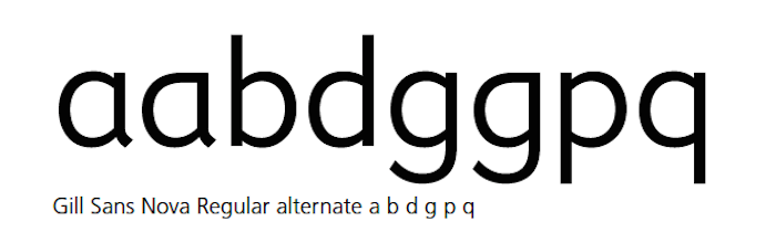
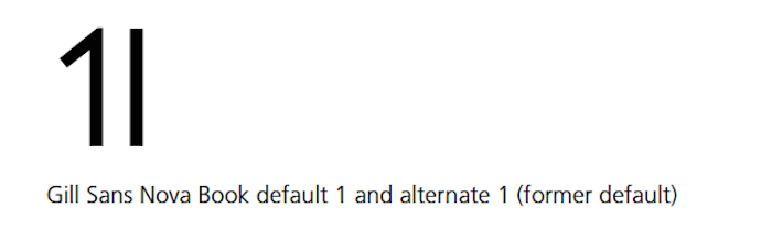
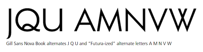
Faced with the contradictions and inconsistencies of the hot metal cuts of the Gill Sans family Ryan and Monotype Imaging have chosen to make available virtually every variant of a letter that Gill drew. Thus, in addition to the alternates just mentioned, there are all of the “Futura-ized” letters (single-story a and g, nearly straight J, pointy A M N V and W), crotch-less single-story a and g, U with a leg, cursive e, the titling Q, and flag-less 1 (Gill’s original design) as alternates. This kitchen-sink attitude is made possible by the infinite glyph palette that OpenType fonts have. But it also keeps various constituencies from complaining about the absence of beloved characters. With the Character Style feature in InDesign it is easy for users to customize Gill Sans Nova to fit their personal vision of what “Gill Sans” should look like.
Gill Sans Nova is the perfect type family for the DIY generation.


Comments [1]
02.19.16
05:04