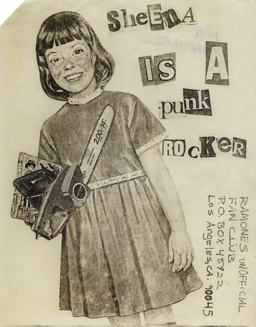
Ramones Los Angeles fan club mail-out, USA, 1977. Source: Punk: An Aesthetic (Rizzoli)
For a musical and social movement that snarled in the face of authority and wasn’t averse to spitting at its friends, punk has received a great many shelf inches in the last 30 years respectfully devoted to histories, reassessments and eyewitness accounts. Today, there is even an academic journal exclusively devoted to the pursuit of punk and post-punk studies, which has just published its second issue. There can’t be much left to say about the music, clothing, media outrage and legendary gigs, but the graphic expression of punk has received less critical attention. Now, within weeks of each other, two thick, illustrated volumes have appeared: Punk: An Aesthetic (Rizzoli) edited by Johan Kugelberg and Jon Savage, and The Art of Punk (Omnibus Press/Voyageur Press) by Russ Bestley and Alex Ogg. Kugelberg and Savage have also curated “Someday all the adults will die!”, an exhibition of punk posters, handbills, record covers and ’zines at the Hayward Gallery in London.
The books are nicely complementary, with fewer overlaps in what they show than one might expect. Both address British and American punk, with the Rizzoli survey leaning towards the US, and the Omnibus volume inclining towards the UK, while also showing a strong awareness of punk scenes in other countries. Anyone nursing a serious interest in this subject will need to buy or consult both titles.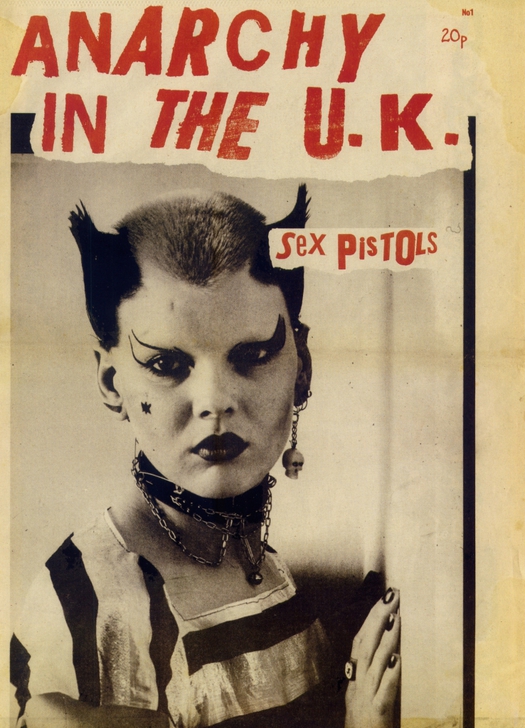
Anarchy in the U.K. fanzine, UK, 1976. Photo: Ray Stevenson. Design: Jamie Reid. Source: Punk: An Aesthetic
The editors’ approaches are different, too. Kugelberg and Savage’s book is more of an album, with the images presented in art-book style on a plain white page (no objections here — it’s good to be able to see the work clearly without punk-inspired page layouts intruding). These are smart writers and Savage, author of England’s Dreaming: Anarchy, Sex Pistols, Punk Rock, and Beyond, is a key participant in the era; his punk archive is now stored at Liverpool John Moores University. But neither author is a historian or critic of graphic art, design or visual culture. “The history of the punk aesthetic cannot be told, only shown,” claims Kugelberg, somewhat unpromisingly. Savage made punk collages with the artist Linder Sterling and he has some good observations about punk montage: “In the act of dismembering and reassembling the very images that were supposed to keep you down and ignorant, it was possible to counteract the violence of The Spectacle and to refashion the world around you.” He points to the visual influences of John Heartfield, Martin Sharp’s work at Oz magazine, the feminist artist Penny Slinger, the Beach Books 1960s pamphlets, and Dawn Ades’ Photomontage (1976). I bought Ades’ trail-blazing study when it came out and would love to hear more: which punk image-makers were looking at the book and what did they get from it?
Bestley and Ogg write with a carefulness of phrasing and appearance of academic detachment that only partially masks the same devotion to punk as listeners and fans. Punk graphics was the subject of Bestley’s PhD and he curated the earlier exhibition “Hitsville UK: Punk in the Faraway Towns”; he is course director of the graphic design MA at the London College of Communication. Ogg is author of No More Heroes, a history of British punk, and an editor of the Punk & Post-Punk journal. “It is important to question the notion of a direct association between work by prominent early punk designers and the emergence of a radical new visual language of parody and agitprop,” they write. “To an extent, the techniques adopted by Jamie Reid, for instance, were already widely accepted as the natural languages of anger and protest.” Such a comment can only be addressed to readers who know nothing about the histories of graphic design and graphic protest. As Savage and Kugelberg point out in their exhibition intro, punk’s precursors and putative influences include Dadaist collage, the Situationist International, the mail art movement, the graphics of counter-culture protest, and the 1960s underground press. I say “putative” because none of these connections is explored in depth and definitively established in their book.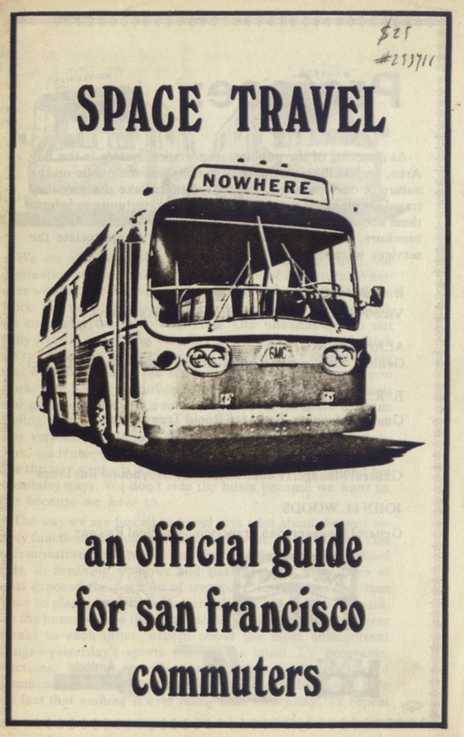
Situationist pamphlet by David Jacobs, USA, 1973. Source: Punk: An Aesthetic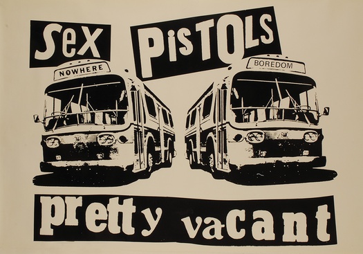
Sex Pistols, Pretty Vacant poster, UK, 1977. Design: Jamie Reid. Source: The Art of Punk (Omnibus Press)
The buses appear to come from David Jacobs’ design. Reid claims he sent the Situationist group the image in 1973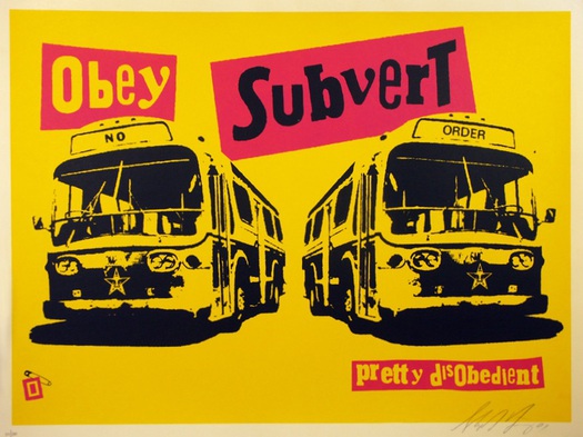
Pretty Disobedient, screenprinted poster by Shepard Fairey, USA, 2001. Signed by Fairey
It was valuable to revisit so many original pieces in the exhibition after looking at small reproductions in the two books because the show communicates the explosive energy and “messthetic” rawness of punk graphics with persuasive power. This was an art of expediency, making use of collage, cartoon drawings, hand-lettering, rub-down lettering, ransom-note lettering, stencils (Savage and Kugelberg include a fantastic display of used stencils made by Crass), rubber-stamping and black and white Xerox copying, as well as silkscreen and offset litho. Looking at the discordant profusion of examples in the books, I kept trying to single out less familiar pieces that were highly accomplished as “design” from the many pieces that are hugely expressive and exciting, but not original or well resolved when seen in strictly graphic design terms. In the show, savoring scores of examples packed together at full size on the walls, those distinctions seemed irrelevant. These were raucous, vitality-filled transmissions from a turbulent graphic universe totally different in intention and effect from the smooth, orderly, design history-conscious parallel universe of professional design aesthetics, purposes and training. There didn’t necessarily have to be any points of contact or interchange between the two co-existing spheres.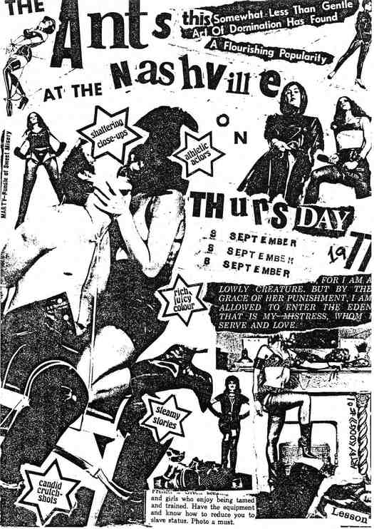
Flyer promoting a gig by Adam and the Ants, UK, 1977. Design: Adam Ant. Source: The Art of Punk 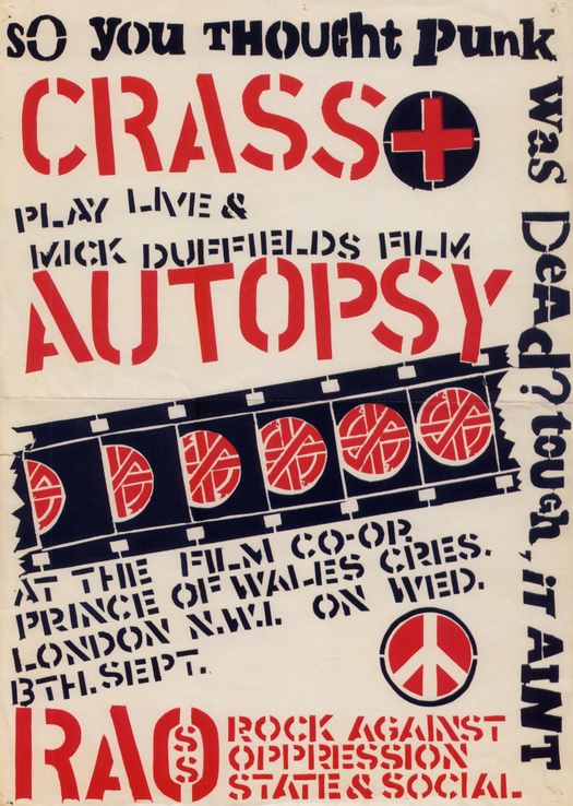
Poster promoting a gig by Crass, UK, 1978. Source: Punk: An Aesthetic
But the question of the relationship between punk D.I.Y. design in its most basic or amateur forms and the later development of graphic design cannot be avoided for anyone who is both sensitive to punk’s impact and legacy (“the immediate implementation of D.I.Y. grassroots culture among the young” — Kugelberg) and committed to graphic design as a medium. Kugelberg and Savage say that the “anarchic upsurge in graphic creativity . . . revolutionised design,” a clear attempt to assert punk graphics’ significance beyond the punk subculture, yet this claim, too, can only be substantiated by a lot more detailed research. (In my book No More Rules, I connected punk’s anti-design ethos to the late 1980s/early 1990s idea of “deconstruction” in graphic design.)
In the UK, the punk-related designers that had most influence in the early 1980s were a handful of individuals such as Malcolm Garrett, who had been formally educated as graphic designers (in his case at the University of Reading and Manchester Polytechnic), though design’s mainstream was, in fact, slow to learn from and assimilate the lessons and styles of subcultural music design’s new wave. In any case, the graphic sensibility of Garrett’s work for Buzzcocks and Magazine, shown in The Art of Punk, has always seemed closer to “post-punk” graphic design than to what is commonly understood as punk — even allowing for Bestley and Ogg’s precautionary advice that “there is no one standard punk visual language” and that “a notion of a pure or authentic punk style is difficult to justify.”

The Desperate Bicycles, “Occupied Territory” 7-inch single, Refill, UK, 1978. Source: The Art of Punk 
Prag Vec, “Existential” 7-inch single, Spec, UK, 1978. Source: The Art of Punk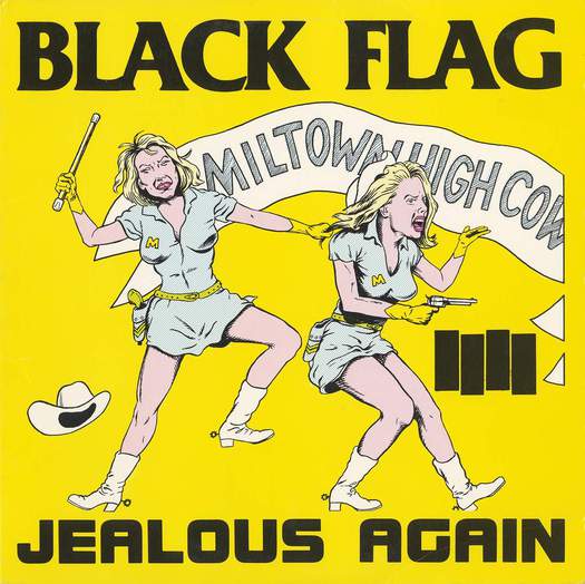
Black Flag, “Jealous Again” 12-inch EP, SST, USA, 1980. Design: Raymond Pettibon. Source: The Art of Punk
It is no accident, too, that the stencil-based graphic identity of Crass, one of the most highly politicized punk bands, is so well coordinated and trenchant. “Both Gee [Vaucher] and myself trained as graphic artists,” Crass co-founder Penny Rimbaud tells Bestley and Ogg. “Both of us prior to Crass had brought money into the house by doing book design and that sort of stuff. And part of training as a graphic artist wasn’t just learning type[setting], it was also thinking in terms of marketing; a lot of the projects at college were: ‘This is the product, how do you design and market it? How do you create a corporate idea?’ . . . It was a very distinct policy that things should have an instantly recognizable image.”
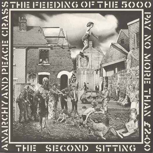
Crass, The Feeding of the 5000 LP, Crass, UK, 1978. Design: Gee Vaucher. Source: The Art of Punk 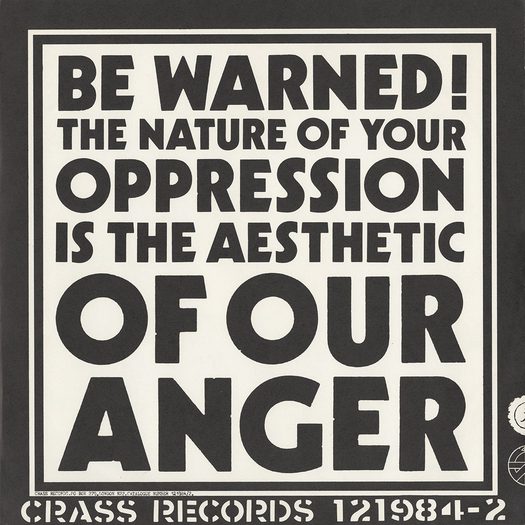
Crass, Yes Sir, I Will LP (back), Crass, UK, 1983. Design: Crass. Source: The Art of Punk
There is an old slogan and rallying cry that insists, “Punk’s not dead.” Bestley and Ogg certainly believe that. Their book ends with examples of more recent punk design, though I find it hard to get excited by most of them in graphic terms. Punk might, as they say, have employed a fairly broad set of graphic conventions, but they remain as consistent and constrictive over time as those found in heavy metal. Kugelberg deduces from punk a more general lesson for today: “Form a band, start a blog, become an artist, a DJ, a guitar player, an editor.” No one can argue with that, though many might see it as a stretch to claim that, in 2012, these possibilities derive from punk’s mid-1970s example — unless, perhaps, one were to view punk prophetically as a form of science fiction. Interestingly, this is just how Savage does regard punk: as a “jump cut” into the future. “[P]eople in Britain see punk in terms of social realism and rock music. It was pure science fiction and it was very informed by J.G. Ballard, and by The Man Who Fell to Earth, among a lot of other things. . . . I think what’s important about punk is the idea that it was for a brief period very futuristic.” That’s another intriguing insight that calls out for more excavation. 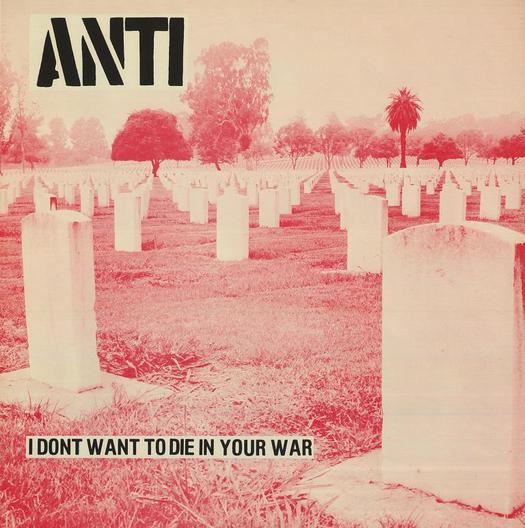
Anti, I Don’t Want to Die in Your War LP, New Underground, USA, 1982
Design: Dan Phillips, Ed Colver, Gary Kail. Source: The Art of Punk
But Darling of Course it’s Normal: The Post-Punk Record Sleeve
This essay was originally pubilshed on October 11, 2012.


Comments [1]
A nice summary of some of the key debates...
I think one of the things we were trying to unpack in The Art of Punk was the graphic design aesthetic of punk and its function and relevance to wider design practice, or otherwise.
Basically, yes, some of the innovations and radical visual styles associated with punk (which, in turn, often borrowed from earlier art movements) did impact more widely on graphic design practice, if only as an inspiration for the next generation of designers. However, part of the 'functional' aspect of punk graphics must be in the way that they talk directly to their specific audience - the punk subculture itself.
Ever since its inception, punk has struggled to occupy a space somewhere within and also outside the mainstream. I do think that some of the post hardcore and modern graphic styles you refer to as of little merit graphically are in fact completely in tune with their function and purpose, whether they look good or innovate graphically or not.
I guess they aren't intended to be appreciated by design critics or writers - they simply need to reach the punk audiences they are aiming at. I think that makes them important in some ways at least.
Best wishes
Russ
10.14.12
12:01