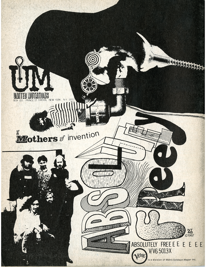
Frank Zappa and the Mothers of Invention first album, the 1966 Freak Out, defined their experimental territory and anti-establishment credentials. With Absolutely Free, their second album on MGM-Verve, released in 1967, The Mothers showed a political and social satirical side while expanding their raucous musical repertoire, which was inspired by and composed to reflect the critical moment in 1960s American culture. Likewise, the graphics used to market the album were apt and timely—both in style and deeper attitude.
Although Verve was a division of Metro-Goldwyn-Mayer, one of Hollywood’s most establishment, commercial entertainment studios, the graphics for Zappa’s record cover and promotion were suitably rebellious, having spiritually borrowed from Dada and surrealist pictographic absurdity combined with the underground press’ boisterous, unschooled anarchy.
Although Verve was a division of Metro-Goldwyn-Mayer, one of Hollywood’s most establishment, commercial entertainment studios, the graphics for Zappa’s record cover and promotion were suitably rebellious, having spiritually borrowed from Dada and surrealist pictographic absurdity combined with the underground press’ boisterous, unschooled anarchy.
The artist/designers were NT&B (Nifty Tough & Bitchin’), an advertising wing of Zappa’s own company, Bizzare, Inc., so design control was firmly held. Anti-design was endemic to The Mothers’ identity.
NT&B’s unique marketing innovation was placing ads in Marvel comics, not the usual venue for any kind of music, not the least a progressive rock band. This particular ad, however (one of many for Absolutely Free), was site specific, simultaneously appearing in the larger underground newspapers, and specifically, The East Village Other, which in 1967 was arguably at the peak of its youth culture readership and fertile ground for record companies to reach their audience. The layout was consistent with graphics produced by the underground’s usually naïf layout people. Cut and paste, high contrast Kodalith photos (perfect for offset printing) and the plethora of unharmonious typefaces. The imagery, composed as both vertical and horiztonal, spoke to the unruly side of the brain.
But the pièce de résistance of anti-design was the lettering for the title featuring letters that seem to emulate real display type, but also throw standards of proportion and balance to the wind. And as is often the case with hard-to-read typography (although this is perfectly discernable), the title is also set small in a light line gothic face, albeit with extra EEEEEs. As anti-establishment as it is, the ad codifies the prevailing aesthetic of the time.


