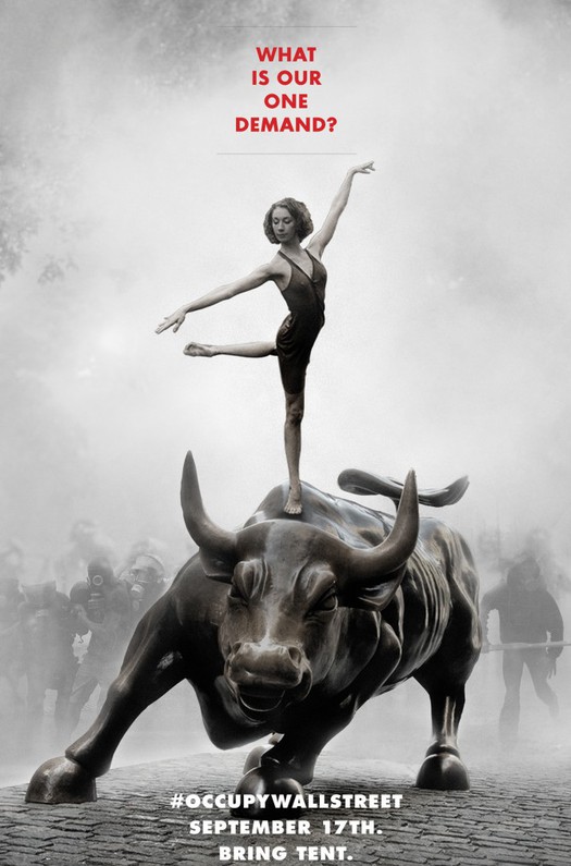
Poster, Adbusters, July 2011
Occupy Wall Street began with a poster. Adbusters co-founder Kalle Lasn described the moment in an oral history of the movement published earlier this year in Vanity Fair.
We put together a poster for the July issue of Adbusters. The poster was a ballerina — an absolutely still ballerina — poised in a Zen-ish kind of way on top of this dynamic bull. And below it had the [Twitter] hashtag #OccupyWallStreet. Above, it said, "What is our one demand?" I felt like this ballerina stood for this deep demand that would change the world. There was some magic about it.
The Vanity Fair article was illustrated with a half-page spread photo of protesters retaking lower Manhattan's Zuccotti Park after being temporarily evicted on November 15. There were also portraits of many of the protagonists in the OWS movement. What wasn't shown was the poster that started everything. Six months into the movement, I had never seen it. Chances are, neither have you. Because the poster — so elliptical, poetic and provocative in that characteristic Adbusters way — didn't matter at all. The ballerina didn't matter. The bull didn't matter. The headline didn't matter. Only one thing mattered: that hashtag at the bottom.
So, here the question. In the age of social media, does political graphic design matter?
It all seemed settled in 2008. Then, the answer was an emphatic yes. Shepard Fairey created a poster, later adopted by the Obama campaign, that will certainly rank as one of the most ubiquitous and effective pieces of political graphic design of the decade, if not the century. The Obama campaign itself seized the methods of contemporary consumer brand management and deployed logos, colors, and typography with a sophisticated precision that was revolutionary in the usually flat-footed world of campaign graphics. And the accessibility of communications tools made it possible for millions of people to download the campaign's graphic assets and contribute their own designs.
Four years later, everything seems different. Make no mistake, OWS has not lacked for graphic support, both professional and grassroots, including a response from the reliable Shepherd Fairey. And over on the mainstream side of the political spectrum, the 2012 presidential contests predictably have generated a deluge of red-white-and-blue campaign graphics that in turn have been predictably been subjected to analysis. But am I wrong that this year conventional graphic design seems like an inefficient way to make a point, never mind to create or fuel a political movement?
Consider, on the other hand, the genius of that simple #occupywallstreet hashtag. Three little words, with a call to action built right in. And, also right there was the potential for an articulated brand architecture that any corporate identity expert could envy. "Occupy" sits in the master brand position. Fill in the blanks for a potentially infinite number of user-generated subbrands, from Occupy Amarillo to Occupy Zurich. Elsewhere in the OWS communications arsenal, we find other slogans ("We Are The 99%") and some visual tropes (the Guy Fawkes mask popularized by Anonymous, now an emerging public "face" for the protest). But no typeface guidelines, no color standards, no official logos.
Of course, the goals of OWS have been elusive from the start, and clarity of message has almost always taken a backseat to the chaos of participatory democracy in action. I suspect that many of its supporters would insist that the last thing OWS needs is something as simple and reductive as a logo. Instead, many of the most effective contributions made by designers have taken the form of old fashioned information graphics like those from Jake Levitas and Occupy Design, which range from visualizations of income disparity to icons identifying recycling stations at protest sites.
Perhaps, however, the inability of OWS to develop a coherent graphic language is symptomatic of a larger challenge. Can a grassroots movement mature into a viable political force? An answer may come this week. Occupy Wall Street has called for a "general strike of the 99%" on May 1, the traditional workers solidarity day. What will the turnout be? Will spring weather bring, as some have predicted, a rededication to the cause? Or is the movement too diffuse to gain the traction it needs to move to the next stage?
One thing is certain. The graphic designer who has played the most dramatic role in the rise of Occupy Wall Street, isn't Shepard Fairey or Jake Levitas. On September 24, 2011, a group of peaceful protesters in Manhattan were pepper sprayed by police officers. The incident was captured on video and posted to YouTube, where it has been viewed over 1.5 million times. "When the pepper-spray video came out, that was the hook," said an activist in the Vanity Fair oral history. "That's what made people focus on Occupy Wall Street." The central figure in the video is a woman named Chelsea Elliott, who was subsequently identified as...a freelance graphic designer.
Sometimes, the key to political change isn't designing a logo or poster. It's simply having the courage to show up and make your voice heard, no matter what the cause —and no matter what the risk.


Comments [7]
Relevant quote by Glaser in response to the question "do you think graphic design in general possesses the power to sway political opinion?" ...
No. Most graphic design is in the service of business, whose agenda is not the same as service to the community. In most cases, designers are conveying other people’s messages. Every once in a while, there’s a degree of social consciousness among designers, but fundamentally they’re talking to themselves. Often it doesn’t go beyond that, because it’s more about relieving themselves of tension than communicating to people in an effort to change their minds. That’s a failure of design intelligence.
04.30.12
06:39
#OccupyWallStreet
04.30.12
10:57
Even in this most urban of stages, any rodeo clown could tell you what comes next...
05.01.12
08:41
An issue that I encountered at Occupy Sydney related to the question of audience and message. For instance, the slogan 'sacrifice comfort for change' held a lot of appeal to those who were spending nights away from their homes. But to others who had spent most of their lives struggling it was a bit of a joke. As one Aboriginal sovereignty activist said, some people in Australia would just prefer comfort for a change.
Another aspect was the visual politics of the policing. NSW police have an incredibly well resourced media unit that put a lot of thought into how their interactions with OSyd were portrayed in media, largely playing on a deserving/underserving protester mentality. The most violent raid was also conducted in the early hours of a dark Sunday morning, and in a dramatic office building squat eviction they used vehicles to block views of the arrestees and shone torches into the cameras of media. Conversely, the visual tactics of the squatters had been to unfurl large homemade signs with stats comparing homelessness and housing vacancies in Sydney.
The most significant factor for Occupy in terms of visuality and graphics though is the still the bulk of visual labour that sustains the problems Occupy is attempts to address. It is hard to communicate, let alone resist systematic injustice/crises when our (privileged western middleclass) perceptions are totally mediated by sophisticated regimes of distraction. Penetrating this bubble is really hard work. To some extent what is needed are alternative, more desirable images of the future that challenge the 'this is the best world possible, just accept it' way of thinking.
In this vein there are two lines from May '68 that resonate:
The future will only contain what we put into it now.
Those who lack imagination cannot imagine what is lacking.
05.02.12
02:36
Nonetheless ‘Occupy’ could benefit by a more precise gesture of organization and centralization of belief, that is by calibrating their tangible activities and by intentionally ‘branding’ them.
I say this, based on my observations I recently made in Central Park, NYC, in context with the ‘spring awakenings’. To me the ‘Occupy’ movement seemed incredibly loose, using a wide set of semiotic measures (from the above named ‘Guy Fawkes’ masks to peace flags). Finally the notion ‘occupy’ rather suggested melancholia than force in an environment like central park, where (politically lethargic) tourist are diligently shaping consumer sentiment.
05.02.12
11:30
The diversity of the Occupy movement is represented in the diversity of visuals created by and for the movement, with perhaps the guy fawkes mask becoming so symbolic precisely because of its anonymity. I would also like to point out this collection of posters: http://occuprint.org/Posters/ViewAll , which I suppose validates your point about the inconsistency of the movement's visual language.
However, In Montreal (and Quebec), for almost 3 months, there has been a massive student strike movement taking to the streets. Their protests has been visually stunning, with the adoption of key icons (the red square), colour (red, obviously), but also a slew of creative images and actions that have an amazing visual consitency in extending the "brand" (ugh...). The entire landscape of the city has changed, and red squares, banners, flags, etc. are everywhere. This has been led in part by a group of student designers from UQAM's prestigious design school.
I made a brief post about it here: http://lokidesign.net/2356/2012/04/vers-un-printemps-erable/
Some images from one of the massive demonstrations here: http://lokidesign.net/2356/2012/03/manifestation-etudiante-22-mars/
And an article (in french) here: http://www.lapresse.ca/arts/arts-visuels/201205/05/01-4522334-une-greve-signee-ecole-de-la-montagne-rouge.php
Obviously, there are no typeface guidelines, but there is certainly a cohesive visual voice. Nonetheless, the linking of that relationship to becoming a viable political force, is kind of weak. Just yesterday, student groups emerged out of 22 hours of negotiations with the provincial government.
And on the last point, about having the courage to show up... that's always been the case. But in sustaining that courage, against the assault by the state, and the usury of emotions, art and DESIGN certainly still play an important role...
05.06.12
12:53
As design, the poster was the first step in introducing the idea. The famous pepper spray moments wouldn't have happened if not for the beginning (poster). So you can't underestimate it either. But the following incidents furthered the protest. The complete lineage can be traced to Mohamed Bouazizi's self-immolation in Tunisia.
Either way, this gave me some new ideas of how art and design can further the movement. Think I'm going to go to NYC and get the next phase started.
PEACE I'M OUT
05.11.12
10:49