June 12, 2018
A Peek Into Poster House
Poster House, North America’s first-ever museum dedicated exclusively to posters, will open in New York City next year. While many museums around the world showcase European posters from the Art Nouveau, Art Deco, or Swiss Modernist periods, Poster House will be different. Chief Curator Angelina Lippert is pushing the collection beyond the traditional, with a first year of shows that span from 1990s Ghanian posters hand-painted on burlap sacks for bootleg copies of American movies to East German posters from design collective Cyan, which pushed the boundaries of early Photoshop.
“I’m excited that we’re going to be the first poster museum that really explores the depth and breadth of poster art,” Lippert says. “I want to showcase as broad an array as possible of time periods and countries.”
Lippert pulled ten pieces from the museum’s permanent collection of 3,000 images for a sneak preview that perfectly encapsulates her expansive point of view, stretching the definition of design to give it what she calls a “global thrust.”

1. Teamworkers Are in Demand, Anonymous, 1927
Lippert introduces this poster as the original “Hang In There Kitty” meme—but from the 1920s. It’s part of Chicago-based Mather & Company’s work incentive posters that encouraged employees to think of the company as a unified effort to create a functional, successful, and efficient workplace. Unlike today’s motivational posters, Lippert says, these lithographs balance surprisingly detailed patterns, like the “wallpaper” in the margins, with bold graphics (the football players) and a pithy, easy-to-understand message.

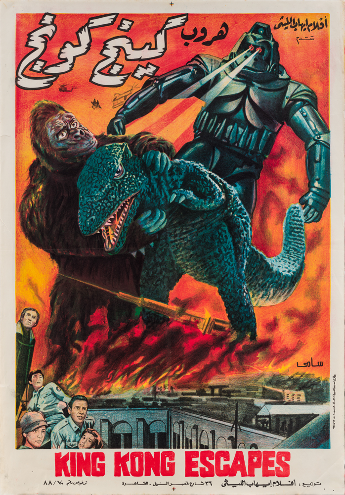
2. King Kong Escapes, Anonymous, 1967
Three very different cultures come together in one poster for the Egyptian release of the 1967 Japanese-American film. Lippert loves that this poster was illustrated, rather than just the compilation of actor headshots we often see today, and while she admits that some of the figures might feel flat to the modern eye, the drama and promise of extreme action is the selling point. “Based solely on the poster,” says Lippert, “I would go see this film a thousand times before I’d see the latest Avengers movie.”

3. Seviserek Olenler, Anonymous, 1975
Seviserek Olenler is part of the museum’s collection of 200+ Turkish pornographic posters from the 1960s and ’70s. Its overall style shows early attempts to splice and manipulate photographic images into a cohesive design. The results, Lippert says, are mixed at best, but echo Turkey’s film industry at the time—which was also very copy-paste based. For instance, a popular film like Star Wars would be redone shot-by-shot with Turkish actors.
“It’s terrifically creative and fun,” Lippert says, “And the essence of that level of camp is prevalent in these soft-core posters—the mustachioed hero in a flamboyantly fabulous bathrobe, gun and fist ready for whatever comes his way; the nude, bleach-blonde heroine in a bathtub behind him (possibly with the best aquatic tile I’ve ever seen), and the submissive, sultry alternative love interest in the foreground, against wildly clashing fonts and color panels.” It’s exactly what not to do in graphic design 101, she concludes, and yet it’s perfect.

4. Kotobuki Enema by Dentsu West, Hiroshima, 2016
“This Japanese enema poster is my favorite thing in the collection,” Lippert says. “It looks so innocent and stylized, and is advertising the grossest thing in the world but does it in such an upbeat way!”
The text reads: “Let’s empty those bowels!” as Pop Art-style food flows outward from a Barbie-esque torso. She loves the sense of humor and how effective it is without being crude. “Who thinks poop is charming?” she asks. “Whoever designed that.” For Lippert, it’s a great example of how Japan is ahead of the game in handling subjects Westerners perceive as taboo in public-facing posters.

5. Solidarność, Jerzy Janiszewski, 1980
The August 14, 1980 strike in a Gdansk, Poland shipyard paved the way for one of the largest anti-Soviet protests of the Cold War era. In the thick of the action, artist Jerzy Janiszewski hastily drew this now-iconic sign by hand; its closely spaced letters reflect workers marching together in solidarity. The logo would go on to be replicated and used time and again, and remains “one of the most potent and famous symbols of the time,” according to Lippert.

6. War Waste Energy, Masuteru Aoba,1981
Japan’s Aoba created a series of bold protest posters in the 1980s that combined his hatred of war with his love for the environment. Lippert proclaims the result as “an arresting collection of simple but powerful designs.”

7. Centra Battery, W. Mnowski, ~1975
Poland’s graphic design community was wildly creative and playful under Soviet rule, and a rare sector that thrived under communism. Lippert describes this piece as a “fantastic blend of cuteness and effective advertising,” but one that could also be misleading with its impression that Poles had a choice—this battery brand would probably have been the only one available under the regime.

8. Roth-Handle, Michael Engelmann, 1958
This is good graphic design in the traditional sense: the top finger draws your eye like a roadmap across the upper portion, while the largest hand directs the gaze down to the product. The color palette is simplified, striking, and memorable; the composition follows the basics of an Object Poster. “You really can’t get more classic than this.”
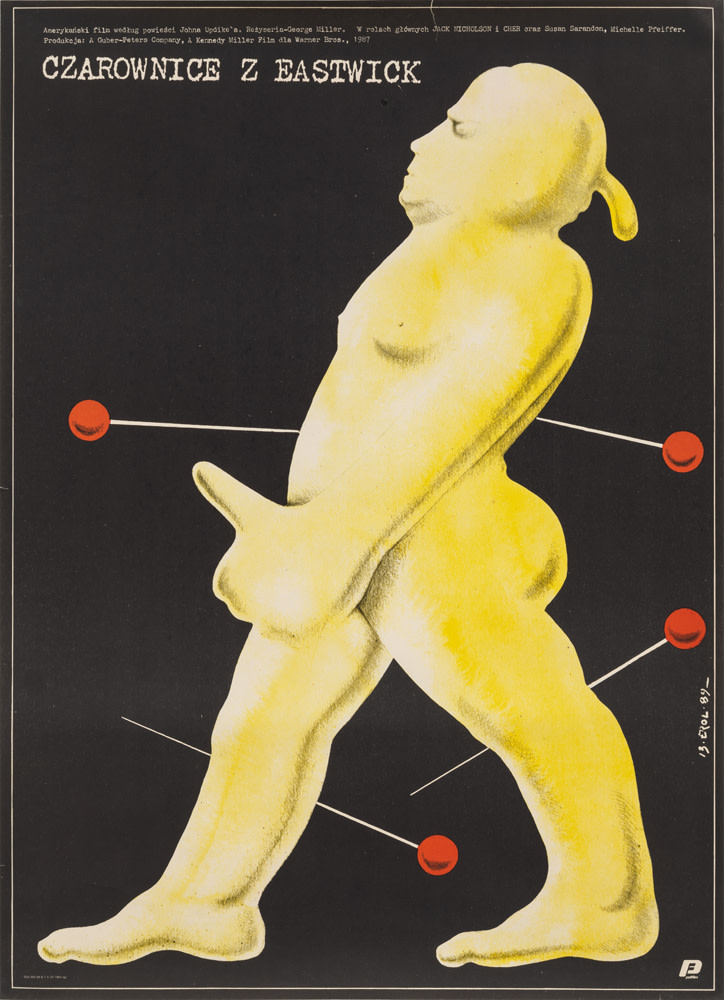
9. Czarownice z Eastwick (The Witches of Eastwick), Jakub Erol, 1989
Polish poster design was at its most creative under communism’s restrictive grip, and here Lippert underscores how “clever and funny artists could be when interpreting American movies.” Erol spotlights the wax voodoo doll the witches make at the end of the film. The thumb, strategically placed, underscores the characters’ hypersexuality, a key plot point. “It’s a tour de force summarizing a film in the simplest graphics possible,” says Lippert.

10. WCBS, Marcia Resnick, ~1975
Best known for her photography of New York’s punk scene, Marcia Resnick created this poster for WCBS Radio as an art student, constructing the doll-radio hybrid in her dorm room, photographing it, and adding the text. Lippert describes it as something that “some would consider the most disturbing radio ad of the past forty years.” Lippert loves that a student came up with something “so weird, jarring, and surreal, but also very modern. With so few female artists, the fact she did this is really cool.”
Observed
View all
Observed
By Justine Jablonska
Related Posts

Innovation
Ashleigh Axios|Essays
Innovation needs a darker imagination

Business
Kim Devall|Essays
The most disruptive thing a brand can do is be human

AI Observer
Lee Moreau|Critique
The Wizards of AI are sad and lonely men
Business
Louisa Eunice|Essays
The afterlife of souvenirs: what survives between culture and commerce?
Recent Posts
Sam Furness got serious about investing in his curiosity. Now, he’s helping others do the same. Corporate crisis is design’s opportunity In a world that feels impossible to change, emerging designer Deborah Khodanovich is starting small Elixir Design founder Jennifer Jerde believes in the human touchRelated Posts

Innovation
Ashleigh Axios|Essays
Innovation needs a darker imagination

Business
Kim Devall|Essays
The most disruptive thing a brand can do is be human

AI Observer
Lee Moreau|Critique
The Wizards of AI are sad and lonely men

Business
Louisa Eunice|Essays
