October 23, 2014
An Ideal Neighbor
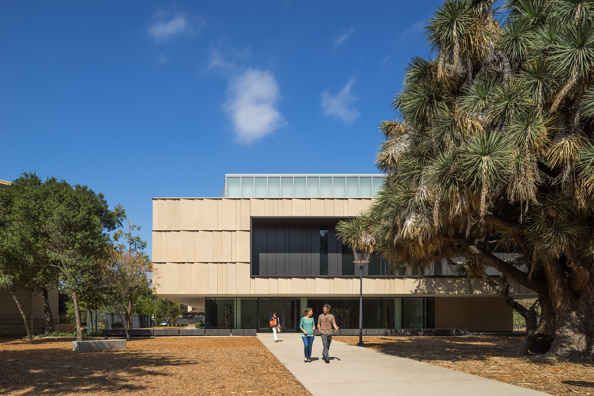
In this age of outrageous museum architecture, it is refreshing to experience a respectful, art-loving design, but there is a fine line between subtle and bland. The museum’s first floor (where the administrative and operational functions are located) feels more upscale regional airport than museum. The atmosphere—the way materials, tone, and light work together—is soothing and mild. It avoids the harsh white of a New York gallery or the bright branded palette of a temporary exhibition. Ten shades of soft white, warm gray concrete, pale wood, and ample natural light combine to produce a temperate, colorless effect.
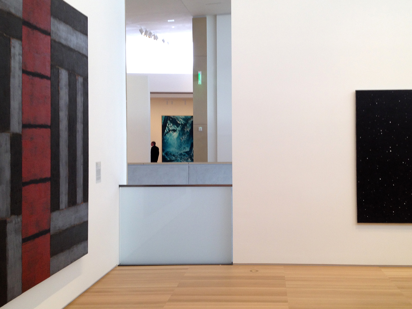
Gallery interior, view across the central staircase. On the left is Sean Scully’s Red Ascending (1990) and Mark Tansey’s Yosemite Falls (Homage to Watkins; 1993) across the atrium. Photo by Rachel Berger
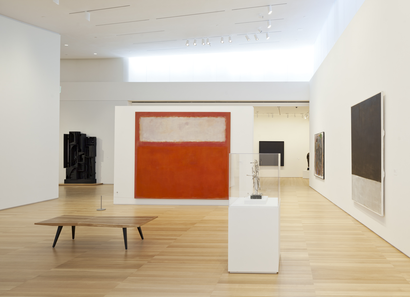
Gallery interior, with Mark Rothko’s Pink and White over Red (1957) and Louise Nevelson’s Sky Garden (1959–64) to the left. Photo © Henrik Kam
Two pieces in the collection stood out as particularly exciting for the way they played with or against the space: Robert Irwin’s disc painting (Untitled, 1969) and Bryan Hunt’s Fulcrum (1990). The Irwin is bewitching. It glows and floats in space, utterly alien, yet chiming with the gallery’s atmosphere. Fulcrum is like a splinter, a colorful spur that disrupts the pale symmetry of the panels flanking the staircase.
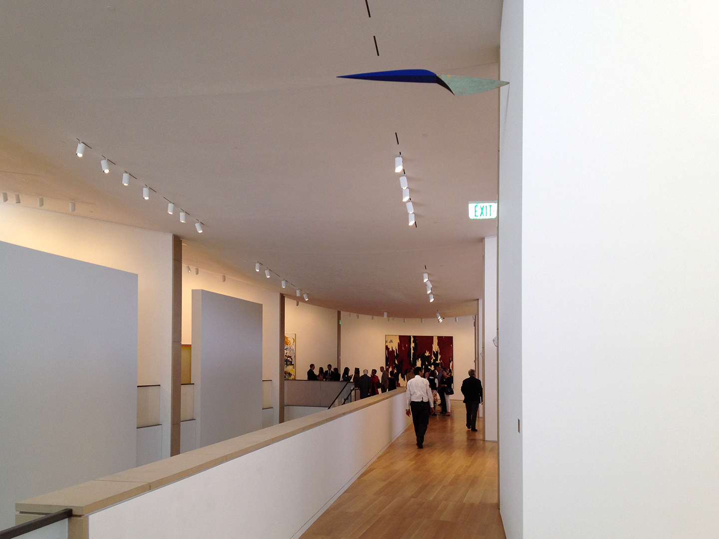 Gallery interior, with view of Bryan Hunt’s Fulcrum (1990). Photo by Rachel Berger
Olcott intends his design to reflect the way the Andersons live and the way art is experienced in their home, with sprawling, informal, interconnected spaces. I experienced the museum in that way, yet the concept of home was elusive. I crave context, which means I’ll always prefer the Gardner to the MFA, always be fascinated and stirred by the setting as much as the work itself. Having seen images of the collection in it previous life in the Anderson home, I can’t help wishing there were something homier about this new Anderson Collection. Still, I’m grateful it has been made available to all.
Observed
View all
Observed
By Rachel Berger
Recent Posts
Candace Parker & Michael C. Bush on Purpose, Leadership and Meeting the MomentCourtney L. McCluney, PhD|Essays
Rest as reparations: reimagining how we invest in Black women entrepreneurs Food branding without borders: chai, culture, and the politics of packaging Why scaling back on equity is more than risky — it’s economically irresponsible
