April 24, 2013
Beyond Gorgeous

Alexander Girard pattern instructions for needlepoint seats for the Pedestal chairs (Leslie Williamson for Dwell)
Earlier this month I had the pleasure of checking another famous modern house off my lifetime list: the J. Irwin and Xenia Miller House in Columbus, IN, about which I first wrote in 2006. The house was opened to the public in 2011, when it became part of the Indianapolis Museum of Art, and I published this account of its creation and significance then. Having studied the house for different projects over the years, it did not surprise me in person. The colors are as vibrant, the details as clever, the combination of lushness, personality and modernity as striking as I imagined. One material choice I never understood was the dark slate panels on the exterior: why not just make it white? But when you see the house in person, you understand the single-story facade as a dark band, designed to be recessive. The slate blends with the glass, which is reflective and backed with fretted drapes, many made by Jack Lenor Larsen, with gray and metallic threads. The roof and the surrounding patio read as white, flating planes. You pass through the dark band and enter a house that is all white, expansive, dotted with color. The contrast is extreme and unlike that of outside/inside in a glass house.

Glass tile wall in the blue-and-white kitchen (Leslie Williamson for Dwell)
Also unseen in most photographs is how the landscape, designed by Dan Kiley, lines up with the large sliding-glass doors in living room, dining area, kitchen, den and master bedroom. Each of these major spaces has a specific and different view. The kitchen overlooks a patchwork of stone and plants, suggesting the traditional kitchen garden, and adjacent to the most stylishly screened laundry line I’ve ever seen. Living room and master bedroom have the long view, over a bank sculpted to fall away, giving the sense of an infinite lawn beyond. The dining room looks into the middle distance; the den down a walkway to the pool. The module of the interior spreads out, and composition does not end at the patio edge.
I was in Columbus, and Indianapolis, to give a lecture on Girard titled “Beyond Gorgeous,” focusing on his work at the Miller House, the Textiles & Objects shop in New York, and the Deere & Co. mural in Moline, IL. Looking at the house, and visiting the Miller House archives, I saw many new connections between these projects. The word I emphasized in my talk, now available for viewing on Art Babble, was display. The colors and folksiness of Girard’s work should never distract from his dazzling architecture, which makes everything look like a jewel, and organizes layers of material into coherence.
Tours are available through the Columbus Visitor Center, where highly motivated volunteers lead people through the house, as well as other landmarks of Columbus like the North Christian Church by Eero Saarinen. One such volunteer, Harry Kuehn, took it upon himself to examine the construction drawings for the house, noting how carefully the architects had detailed even the unseen systems. You can listen to his talk and see his slides here. I also met Steve Risting, author of the 2013 update of the art and architecture guide to Coumbus. Sad to see the Paul Rand design go, but happy to see new photography and 14 contemporary projects.
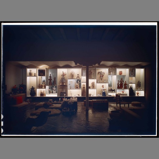
Since I doubt you’ll make it all the way through my 40-minute lecture, I’ll leave you with an excerpt from the end. I was very taken with the dollhouse Girard made for the Millers, ostensibly for the daughters, and began to see similar castellated forms throughout his work, from the Action Office environmental panels, to a wall of niches in his Santa Fe residence. What other modern architect would make this dollhouse for that real house, I wondered? And what did that say about his work?

Alexander Girard residence, Santa Fe, 1961, photographed by Maynard L. Parker (via Huntington Digital Library)
Girard was an architect who was not afraid of shopping, embroidery, dolls, and he was a modernist who understood that white rooms – whether made of adobe, marble, tile or mirror – required flowers, figures, suns and supergraphics to make them sing. The storage walls and conversation pits, the three-dimensional murals and panorama-like installations all constitute innovative ways to allow modern life to happen with stuff, to present things of the past in a modern way, and to think about beauty and intricacy at many scales.
Would anyone else have put needlepoint covers on a Saarinen chair? Would anyone else have thought the way to sell tractors was with baskets and cherry pitters? Girard connected the American past and the American present with architecture, fitting his clever, evanescent structures inside corporate headquarters, adobe houses, and split-level ranches. Italian designer Ernesto Nathan Rogers famously said that the brief of the architect was to design everything “from the spoon to the city.” Girard, who would surely have known this phrase in the original Italian, did just that.
His longest and most involved display project was his own house, where the display wall became the real wall, the kitchen cabinets were layered with textile patterns of made from beans and paint, and the garden paths were opportunities to add checkerboards to nature. These images, taken by Maynard Parker, show it in its 1950s state. But Girard lived there for decades, tinkering and rearranging, buying and storing and labeling. I keep returning to the image of the Miller girls dollhouse as a metaphor for his whole practice. He didn’t have to make that for them. It was far nicer than any Barbie Dream House on the market in 1958. But he did, because he was obsessed with houses within houses, displays within displays, the idea of opulence and order from Main Street to tabletop. He didn’t see any contradiction between rearranging tractors and rearranging greeting cards. As much as we love his love of color and pattern, as much as we respect the precision with which he could make the most cluttered room sing, perhaps the most important lesson from Girard is not to be snobby. There is beauty in objects great and small, industrial and fragile, and we limit ourselves as designers if we don’t consider them both.
Observed
View all
Observed
By Alexandra Lange
Related Posts

The Observatory
Ellen McGirt|Essays
Lessons in wandering

Architecture
Sameedha Mahajan|Design and Climate Change
The airport as borderland: gateways for some, barriers for others

The Observatory
Alexis Haut|Analysis
“Pay us what you owe us”

Innovation
Vicki Tan|Books
How can I design at a time like this?
Related Posts

The Observatory
Ellen McGirt|Essays
Lessons in wandering

Architecture
Sameedha Mahajan|Design and Climate Change
The airport as borderland: gateways for some, barriers for others

The Observatory
Alexis Haut|Analysis
“Pay us what you owe us”

Innovation
Vicki Tan|Books

 Alexandra Lange is an architecture critic and author, and the 2025 Pulitzer Prize winner for Criticism, awarded for her work as a contributing writer for Bloomberg CityLab. She is currently the architecture critic for Curbed and has written extensively for Design Observer, Architect, New York Magazine, and The New York Times. Lange holds a PhD in 20th-century architecture history from New York University. Her writing often explores the intersection of architecture, urban planning, and design, with a focus on how the built environment shapes everyday life. She is also a recipient of the Steven Heller Prize for Cultural Commentary from AIGA, an honor she shares with Design Observer’s Editor-in-Chief,