
January 10, 2018
Chain Letters: Jessica Gaddis
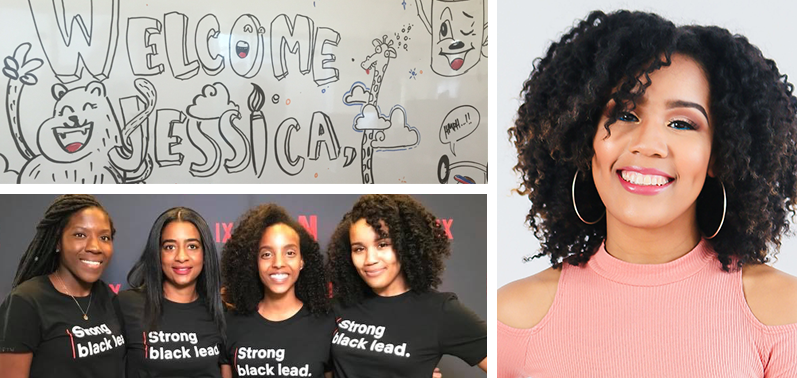
TOP: When I started at Netflix the designers on my team drew this picture on the white board to welcome myself and the two other designers that were starting. BOTTOM: My coworkers and I at the Netflix booth for Blavity’s AfroTech conference last year.
This interview is the first of a new Design Observer series, Chain Letters, in which we ask leading design minds a few burning questions—and so do their peers, for a year-long conversation about the state of the industry.
In January, we examine the intersection of design and tech.
Jessica Gaddis is a product designer working on Netflix’s Studio Engineering team. She spends her time designing apps that help manage production operations and on-set activity for a variety of Netflix’s original productions, including A Series of Unfortunate Events, Stranger Things, and more. As a self-proclaimed movie buff, she enjoys superhero movies, tear-jerking animation, and action films (sans romance). Jessica earned a degree in journalism from Northwestern University and previously worked in PR in San Francisco.
With every passing year, technology becomes more seamlessly intertwined with the human experience. In your role, how have you seen this affect human behavior?
Today’s technology offers us a pretty good balance of choice and automation. Our products can learn our behaviors, make suggestions, and even make decisions for us. This new level of maturity also comes with a new level of responsibility as people continue to expect similar experiences, features, and capabilities from all of the technology they use. This isn’t a new concept by any means—but as users are required to think less, it will be easier to frustrate them if your product lacks something they’ve come to expect.
A good example of this is the introduction of chip cards and chip readers in 2016. I found myself increasingly annoyed when I thought I could insert my chip card into a reader, just to find out that the machine wasn’t equipped to process it yet. This led to a lot of awkward moments with cashiers and many instances of me having to remove, reinsert, or swipe my card multiple times. Thankfully, some stores got smart about showing the status of their chip readers which helped to alleviate a lot of my frustration.
The lesson here is that technology may move faster than your product is able to, and that is completely okay, but don’t expect users to wait for you. A good way to combat this is by being honest and upfront about what your product does and doesn’t do. Microcopy goes a long way and is a lot less frustrating than users finding out the hard way.
The lesson here is that technology may move faster than your product is able to, and that is completely okay, but don’t expect users to wait for you.
What is a new challenge UX designers will have to address in 2018?
In 2018 designers will have to start questioning the design patterns that we use. As we make way for Voice, AR and VR, there’s a huge opportunity to go back to the drawing board and really think about the patterns we’ve all adopted. We shouldn’t continue using the same patterns and interactions just because it would be fast and easy.
For example, think about navigation. Imagine having hamburger menus in a virtual reality… what a waste. I don’t personally hate the hamburger menu, but when screen real estate isn’t an issue, why not try something different? In 2018, we should re-evaluate how we introduce these new formats to our users and try to expand the boundaries we’ve set for our designs.
The tech industry is known to have a high barrier to entry, which can skew the demographics of the designers making interfaces we all use. If the people making the interfaces don’t necessarily represent those using them, how can designers ensure that the end product is inclusive and accessible?
Well, if I’m being honest, we can’t ensure that the end product is inclusive and accessible, and that should make us all uncomfortable. Some companies wait for outrage before making changes—that’s not only lazy, but preventable. A lot of the design decisions that miss the mark probably aren’t made maliciously, but that doesn’t excuse them. There is already a solution: hire more people that don’t look like you. If your design team is homogenous, there is a problem.
User research is also a place where designers can ensure that they are being inclusive. Unless you know the demographics for every single one of your users, you should just assume that it’s a very diverse group. This may be an unpopular opinion, but designing for the majority demographic isn’t always the best route. Designers should still be considerate of how certain design decisions will impact other groups of users.
Does this mean you need a persona for every type of person in the world? Maybe not, but we should challenge ourselves to talk to all different types of users so we can get a complete picture and make more informed design choices.
Well, if I’m being honest, we can’t ensure that the end product is inclusive and accessible, and that should make us all uncomfortable.
​Let’s pretend you had the funding to start any project you wanted. What would you develop?
If I had the funding to start a project, I’d like to figure out a way teach design thinking strategies to babies. I have no clue what this would look like, but child psychology is such an interesting topic and I wonder: How it would mesh with design thinking strategies?
As everything becomes “smart,” is there anything you still enjoy doing the “old fashioned” way, and how does that affect your design work?
This may seem small, but I like picking my own music to listen to. I still buy CDs and blast them in my car and I scroll through all of my Pandora stations before deciding on one to listen to.
I feel like at some point in the future we will have given “the cloud” so much data about our moods, decisions, and thoughts that there will be a system that can determine what song you should listen to at what time. Think about an app that says, “Hey, we saw that you tweeted about having a rough day, here’s a song that you should listen to.” On one hand that would be pretty cool but on the other hand I like picking my own music so… no. I want to choose my own tunes.
Next week Jessica Gaddis asks Richard Ting, CXO at R/GA: The number of trends, tools, and technologies in the design industry can be overwhelming. What can designers do to keep up with it all?
Observed
View all
Observed
By Lilly Smith
Related Posts
Arts + Culture
Alexis Haut|Interviews
How production designer Grace Yun turned domestic spaces into horror in ‘Hereditary’ and heartache in ‘Past Lives’
Arts + Culture
Alexis Haut|Interviews
Beauty queenpin: ‘Deli Boys’ makeup head Nesrin Ismail on cosmetics as masks and mirrors

Design Juice
Rachel Paese|Interviews
A quieter place: Sound designer Eddie Gandelman on composing a future that allows us to hear ourselves think

Design of Business | Business of Design
Ellen McGirt|Audio
Making Space: Jon M. Chu on Designing Your Own Path
Related Posts

Arts + Culture
Alexis Haut|Interviews
How production designer Grace Yun turned domestic spaces into horror in ‘Hereditary’ and heartache in ‘Past Lives’

Arts + Culture
Alexis Haut|Interviews
Beauty queenpin: ‘Deli Boys’ makeup head Nesrin Ismail on cosmetics as masks and mirrors

Design Juice
Rachel Paese|Interviews
A quieter place: Sound designer Eddie Gandelman on composing a future that allows us to hear ourselves think

Design of Business | Business of Design
Ellen McGirt|Audio
