
June 6, 2018
Chain Letters: Lawrence Azerrad
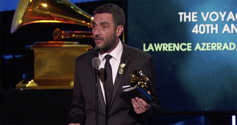
Lawrence Azerrad accepts the GRAMMY for for Best Boxed Set or Special Edition Package in 2018. Image courtesy LAD Design.
This interview is part of an ongoing Design Observer series, Chain Letters, in which we ask leading design minds a few burning questions—and so do their peers, for a year-long conversation about the state of the industry.
It‘s June, and you know what that means—the unofficial kick-off of summer concert season. This month, we examine design and music, and why fans everywhere benefit when these creative industries work in concert.
Lawrence Azerrad is a Grammy award winning graphic designer and creative director. His graphic design studio LADdesign focuses on the intersections of music, education, and cultural initiatives. Since 2001 LADdesign has worked with clients such as Sting, UC San Diego, USC Roski School of Art and Design, Silversun Pickups, Esperanza Spalding, Wilco, The Red Hot Chili Peppers, and WeTransfer. Azerrad is a producer and the creative director of The Voyager Golden Record 40th Anniversary Edition. The author of Supersonic: The Design and Lifestyle of Concorde, Azerrad’s book will be published by Prestel September 18, 2018. The book chronicles the lifestyle, experience, and design of the luxury supersonic airliner.
First and foremost, music is an auditory experience. How do you assess the role visuals play in building the listener’s relationship with your client?
Yes, music is an auditory experience, but visuals play an essential role in deepening it. An intersection of attributes (like looking, wearing, and reading) add depth to a musical experience just as multiple senses (smell, sound, and touch) deepen a culinary one, which is driven by taste. These complementary inputs strengthen one’s connection to an experience.
Artwork for music provides a stage to tell a backstory. This story could be straightforward, enriching a listener’s understanding through liner notes that provide perspective, history, and context. Or, a story can be emotional, provoking a connection through more oblique visual channels. By using illustration, photography, typography, video, digital, and stage presence to create visual metaphors, art can act as a spark to think about an album in a different way.
Artwork for music provides a stage to tell a backstory.
In some cases, art fulfills the role of articulating a larger sense of spirit. Infamous examples of this—like Jamie Reid’s art for The Sex Pistols, or Reid Miles’ album covers for Blue Note Records—immediately convey a sense of musical and cultural identity through color, typography, image manipulation, visual rhythm, and just great design. As a record becomes more iconic and appreciated, the album art becomes a badge for what this music means to its fans—not unlike a great logo representing the mission of a company. To those with a tattoo of Raymond Pettibon’s logo for Black Flag on their arm, a Grateful Dead logo on their car, or a Chance The Rapper hat, it’s very much a badge of beliefs; a public display of what resonates with them socially, politically, and culturally.
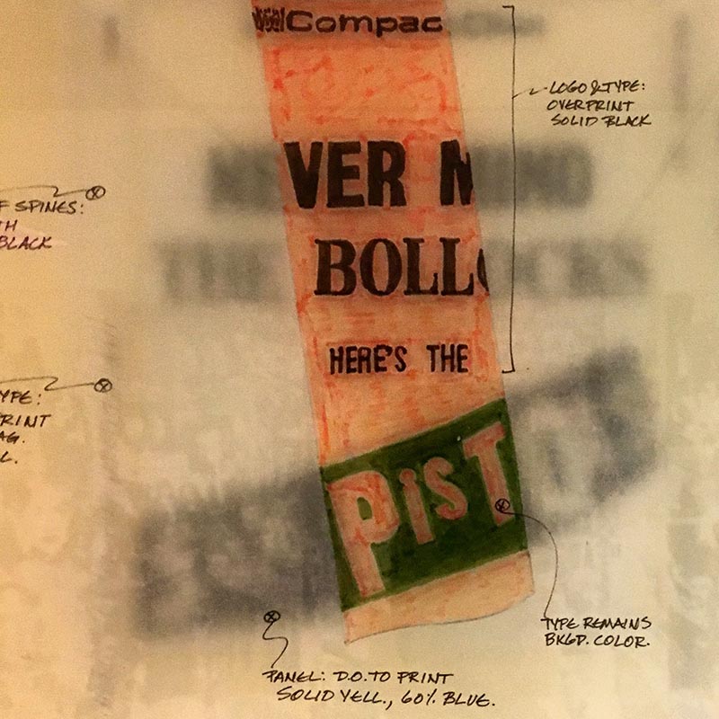
Printer’s mechanical of Jamie Reid’s artwork for Sex Pistol’s Never Mind The Bollocks. Image courtesy LAD design.
There is as much written about the death of the music industry as there is about the death of print, yet neither is gone. What parallels do you see, or what differences are there?
No doubt, the parallels are strong. Of course, for humans, the need for music and reading will continue to persist. Nobody’s going to die if they can’t hear their favorite song or read the morning’s headlines on their iPad, but our experience in this world is vastly enriched through the understanding that comes from listening and reading. Technology has gifted us access to anything, anywhere, anytime. If this very second, you wanted to hear Senegalese music from the 1930s or read the most recent edition of Mongolia This Week, you’ve got your phone. These platforms have changed the way we consume music and editorial content—and in the process, transformed our experience and expectations.
So while we have access to more, the connection is fleeting. That Electro Workout playlist may pump you up for one more rep at the gym, but you might not remember the name of the artist or album from the last six songs you just heard. And while it’s convenient to have design inspiration arrive in my inbox every day, I still have old issues of Eye magazine that I go back to and utilize much differently than an online blog. Far from being an old man waving his fist in the air, I don’t lament how everything was better in the good old print and vinyl days. There are specific and divergent value points to both experiences.
As music is shared freely or for pennies per stream, it’s on writers, musicians, and designers to uncover a new level of value.
As we think about music in the form of playlists for moods, we might consider that we don’t love the songs themselves, but merely the overall function of music in a more general way. Thinking about music through the lens of a playlist for the drive, dinner, or work changes our relationship with music itself. The sharpest downside to this is the drop-off in compensation for content creators. The general public is not that willing to pay full price for content today. Shared freely or for pennies per stream, it’s on writers, musicians, and designers to uncover a new level of value. Creating a compelling, rich experience of quality that resonates in the digital world is going to be key to both commercial success and to the success of the individual listener. I believe as designers, we can do this.
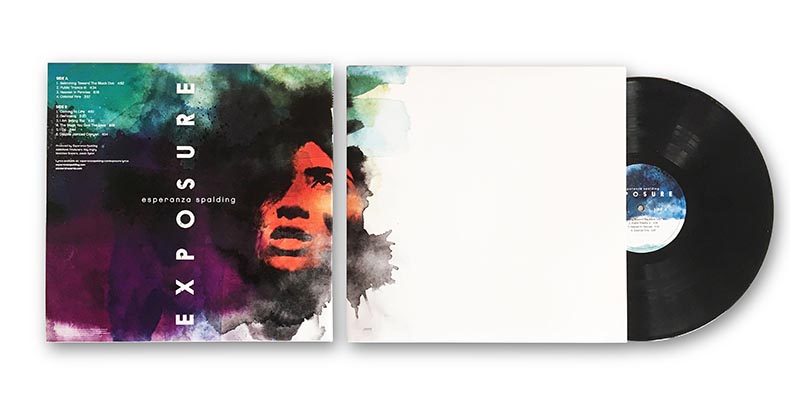
Artwork for musician Esperanza Spalding’s Exposure LP by LAD Design. Image courtesy LAD Design.
‘Zine culture was very influential to the visuals of independent music in the 1980s and 90s. Is there fan-created content that influences you today?
There’s a pretty wonderful site called Whitestone. In a subtle nod to music design history, “Whitestone” is the English translation of the German name Steinweiss—as in Alex—the first art director for Columbia Records and progenitor of modern album cover design. Described as “an initiative to push online music through visuals and interactivity,” all the site content is created by a community of hyper-talented illustrators, filmmakers, developers, and animators who, in their own words, “see music differently.”
Overall, the videos, articles, and interactive websites within reveal how design can engage the user in a more interactive and compelling way. As the user, you’re put in the co-creator’s seat. The sounds and sights are driven by your active engagement, which makes interaction less passive and engenders a sense of discovery and play (that thing that Charles Eames told us to take seriously). Not that I have any musical ability or can code close to the level of the site, but this process allows you to uncover unique aspects of music that you might not have heard before—leading to a deeper, more memorable, and fun experience. The site hosts podcasts, too, covering almost every base.
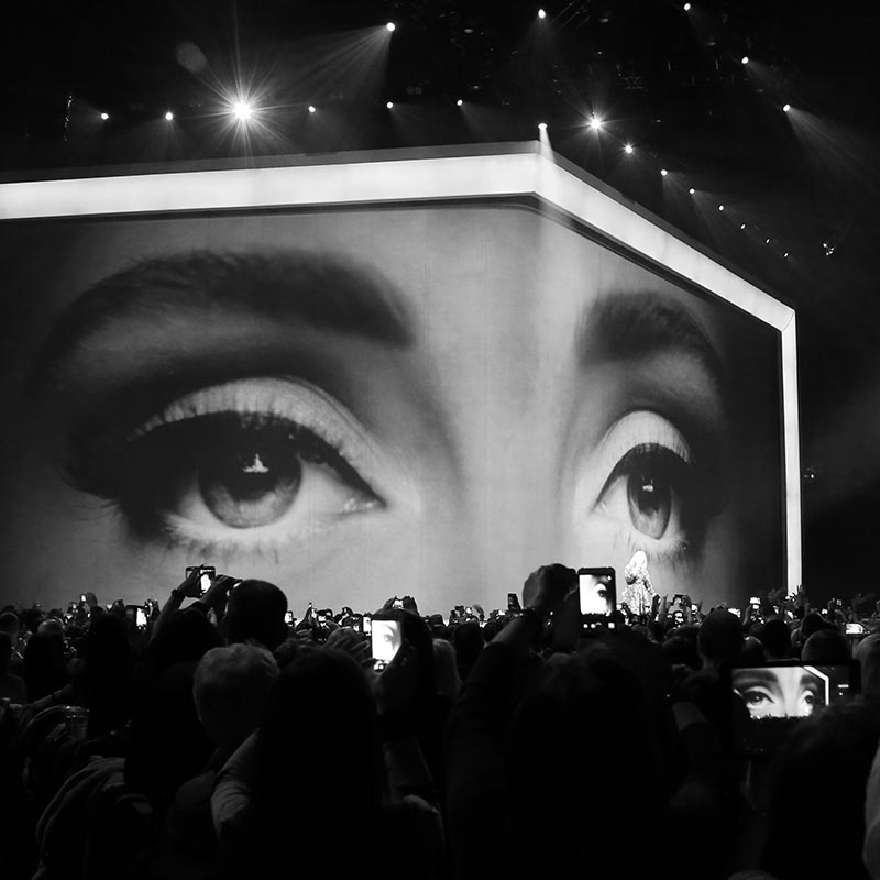
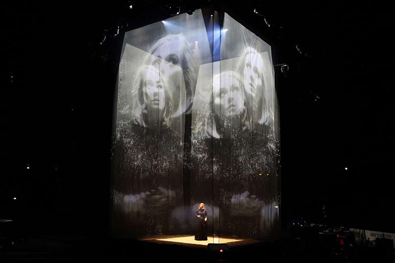
Es Devlin stage design for Adele’s World Arena tour in 2016. Image courtesy Es Devlin.
Does music’s ongoing evolution into the digital present a visual opportunity or a design challenge? What’s missing, visually, in today’s music experience?
Without a doubt, the designers of today face a massive opportunity. This is our moment to rise and figure out how to give people the tangible quality experience they’re searching for. Take the phenomenal stage design of Es Devlin. Her work stirs the souls of audiences from the Royal Opera House to the Miley Cyrus Bangerz World arena tour and quite a lot of amazing things in between. Her work is an active case study in the fact that music is not just about listening. What Devlin demonstrates is that design has the capacity to transform the way music transforms us. Design can elevate the emotional impact of music. A stronger design-music connection can deepen the ideas that move, define, divide, transform, and thrill us.
Google’s layered and thoughtfully creative Abbey Road Studios tour proves that through wonder, engagement, and discovery, music lovers can appreciate a deeper level of understanding and experience than through sound alone. In a more traditional media example, my studio’s design of The Voyager Golden Record 3 LP boxed set and book reflected the consumer’s appreciation of a tangible design object—not just in terms of commercial viability (we broke Kickstarter’s record for largest grossing music project in the history of the platform)—but in terms of what is truly most important, the impact on and appreciation of the fans.
For all of the attention given to streaming these days, there are many more examples out there of designers rising to the challenge of creating a tangible design experience. Take Frank Ocean’s Boys Don’t Cry Magazine (an unopened copy of one of those will set you back about $550.00), or the deluxe vinyl club Vinyl Moon, which provides a lushly creative way to discover new music. These objects of design and experience might be so expensive to make and purchase because they’re outliers to the norm. Limited press runs, printing on foil, pressing vinyl, giant LED walls, and cutting edge WebGL technology aren’t everywhere these days, and that scarcity drives up cost. Designers should jump to this challenge in confidence. Within the framework of an increasingly digital world, today’s physical design objects give us proof that people want quality; people want creativity. It vastly enriches the only life we have.
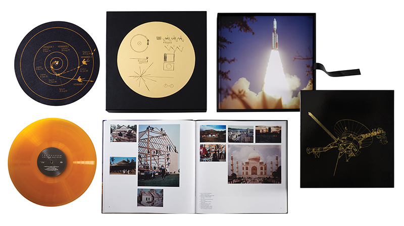
The Voyager Golden Record and Boxed Set, designed by LAD Design and awarded the GRAMMY for Best Boxed Set or Special Edition Package in 2018. Image courtesy LAD Design.
If video killed the radio star, what did streaming services kill?
Record sales and photo budgets.
From Jamer Hunt, associate professor of transdisciplinary design at Parsons The New School for Design: One of the amazing things about music is our capacity to listen to it over and over again—in some cases hundreds of times. And our pleasure only seems to increase with repetition and familiarity. What do you think it is about music that allows for that expansiveness when so many designed experiences and objects seemingly degrade with each use?
A key power of music is tied to the fact that we experience it through our own emotional lens. Whether through birth and death, loss and triumph, or a private moment using earbuds on the subway, our public and private anthems have been welded to our life cycles for eons. Other designed experiences have a great capacity to stir, move, inspire, and evoke emotion—however music has its deepest roots in the DNA of the human experience.
Today’s physical design objects give us proof that people want quality; people want creativity. It vastly enriches the only life we have.
The same song can have different meaning and power depending on where you sit on the spectrum of life. On a micro level, our emotions are almost always in flux: depending on when you listen, you may hear a lyric you never heard before, or interpret a different emotional tone that’s reflective of the mood you’re in when listening to it. Art for music works in a similar way. That poster you had in your teenage bedroom may have been a badge of protest at the time, but twenty years later you can look at it and see a level of craft and meaning you never saw as a teen. It’s the emotional viewpoint we see art and design from that changes things.
Next week: Lawrence asks photographer, artist, and director Frank Ockenfels: Design for music can be a slow and challenging process. Lengthy dances around artist approval can go into describing music through design. Yet so many photographs capture the entire essence of an artist or an album in a single instant—Clarence Clemons and Bruce Springsteen on the cover of Born To Run for one example. How do you prepare to capture an essence in an instant? How do you conjure that spirit of a song in a single day, shoot, image?
Observed
View all
Observed
By Lilly Smith
Related Posts
Arts + Culture
Alexis Haut|Interviews
Beauty queenpin: ‘Deli Boys’ makeup head Nesrin Ismail on cosmetics as masks and mirrors

Design Juice
Rachel Paese|Interviews
A quieter place: Sound designer Eddie Gandelman on composing a future that allows us to hear ourselves think

Design of Business | Business of Design
Ellen McGirt|Audio
Making Space: Jon M. Chu on Designing Your Own Path
Design Juice
Delaney Rebernik|Interviews
Runway modeler: Airport architect Sameedha Mahajan on sending ever-more people skyward
Recent Posts
Why scaling back on equity is more than risky — it’s economically irresponsible Beauty queenpin: ‘Deli Boys’ makeup head Nesrin Ismail on cosmetics as masks and mirrors Compassionate Design, Career Advice and Leaving 18F with Designer Ethan Marcotte Mine the $3.1T gap: Workplace gender equity is a growth imperative in an era of uncertaintyRelated Posts

Arts + Culture
Alexis Haut|Interviews
Beauty queenpin: ‘Deli Boys’ makeup head Nesrin Ismail on cosmetics as masks and mirrors

Design Juice
Rachel Paese|Interviews
A quieter place: Sound designer Eddie Gandelman on composing a future that allows us to hear ourselves think

Design of Business | Business of Design
Ellen McGirt|Audio
Making Space: Jon M. Chu on Designing Your Own Path

Design Juice
Delaney Rebernik|Interviews
