
September 7, 2010
Coming to the V&A: Tower of Power

A little scary, right? I’m not sure whether to critique the building, the checked suit or the 1980s absence of Photoshop on the age spots. But it is not often that a museum blogs about Postmodernism, Michael Sorkin (one of the great take-downs) and credits the (female) renderer who made the AT&T Building look the best it ever has.
Even before the building was completed, it was hugely controversial. Lots of people hated it; Michael Sorkin commented in the Village Voice in 1978:
The so-called ‘post-modern’ styling in which AT&T has been tarted up is simply a graceless attempt to disguise what is really just the same old building by cloaking it in this week’s drag, and by trying to hide behind the reputations of the blameless dead.
And, having been contacted by the original renderer, Judith Grinberg:
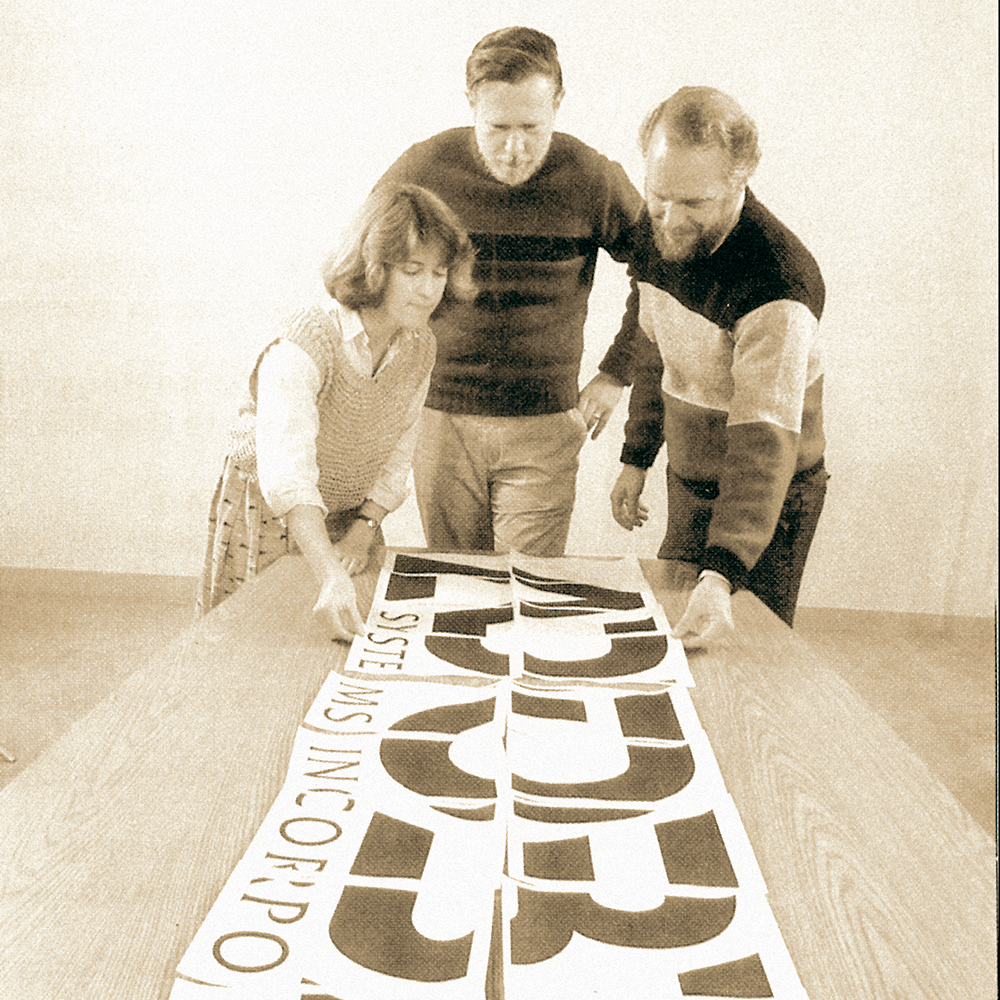
Oddly, in fact, given the difficulty of seeing the AT&T Building from a distance, this presentation gave a more complete picture (literally) than the thing itself would; as Sorkin wrote when he saw Grinberg’s rendering back in 1978, it “is drawn from an impossible vantage point (inside an elevator shaft a block and a half away).”

One of the most interesting things I learned from Grinberg is that Johnson sent her around New York to look at bits of existing buildings — the granite courses at the base of Grand Central Station, for example, and the staircase from his own earlier building at Lincoln Center. She also went to materials providers like Stony Creek Quarry, who provided the pink and gray stone that imparted a sense of classical monumentality to the structure.
Please read the V&A’s Glenn Adamson on the evolution of AT&T, a preview of next year’s head-exploding exhibition, Postmodernism: Style and Subversion 1970- 1990. It is going to be fun to read the critics try to write around their own disgust. Or is Paul Goldberger going to re-convert?
Observed
View all
Observed
By Alexandra Lange
Related Posts

Equity Observer
L’Oreal Thompson Payton|Essays
‘Misogynoir is a distraction’: Moya Bailey on why Kamala Harris (or any U.S. president) is not going to save us

Equity Observer
Ellen McGirt|Essays
I’m looking for a dad in finance

She the People
Aimee Allison|Audio
She the People with Aimee Allison, a new podcast from Design Observer
Equity Observer
Kevin Bethune|Essays
Oh My, AI
Related Posts

Equity Observer
L’Oreal Thompson Payton|Essays
‘Misogynoir is a distraction’: Moya Bailey on why Kamala Harris (or any U.S. president) is not going to save us

Equity Observer
Ellen McGirt|Essays
I’m looking for a dad in finance

She the People
Aimee Allison|Audio
She the People with Aimee Allison, a new podcast from Design Observer

Equity Observer
Kevin Bethune|Essays
