
July 12, 2004
Ed Ruscha: When Art Rises to the Level of Graphic Design
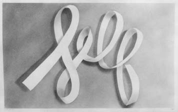
Self, Ed Ruscha, 1967
Fine artists have been taking inspiration — when not outright stealing — from the world of graphic design for a century. The list is long: Kurt Schwitters and Georges Braque, Stuart Davis and Charles Demuth, Jasper Johns and Andy Warhol, Barbara Kruger and Jenny Holzer.
But I admire one above all, not just as an artist but as a graphic designer, and I mean that as a compliment: Ed Ruscha. A new exhibition on view through September 26, “Cotton Puffs, Q-tips®, Smoke and Mirrors: The Drawings of Ed Ruscha,” at the Whitney Museum of Art in New York proves why.
Born in Oklahoma City, as a child Ruscha wanted to be a cartoonist. Moving to Los Angeles, he enrolled in 1956 as a commercial art student at Chouinard Art Institute (now Cal Arts). Ironically, it was seeing a tiny, black and white reproduction of Jasper Johns’s “Target with Four Faces” in Print magazine, of all places, that inspired him to become a painter rather than a graphic designer. But from his earliest days, he exhibited a love for typefaces — perfectly drawn, used with intelligence and passion — with which any graphic designer would sympathize.
Certainly other artists have incorporated the language of advertising and signage and publications and package design in their work. But where, say, Andy Warhol sought an offhand, almost sloppy, casualness in his mechanically reproduced small space ads and Brillo boxes, Ruscha’s lettering from the early sixties (SPAM in Frankfurter, GAS in Cooper Black, HONK in Stymie Bold) is lovingly, respectfully precise. And where an artist like Barbara Kruger would seize upon a single signature graphic style (Futura Extra Bold Italic in her case) and repeat as relentlessly as a corporation seeking a proprietary house style, Ruscha has been restless and endlessly inventive, changing typefaces to suit the messages, and inventing new ones (most notably his calligraphic “ribbon” style) seemingly just for the sheer joy of it. Similarly, he has explored different media with a vengeance; the show includes drawings executed in vegetable juices, gunpowder, blood, and tobacco juice as well as more prosaic ink, tempura, graphite and pastel.
Unlike other artists of his generation, but with an enthusiasm that, again, would be familiar to any graphic designer, Ruscha began publishing, early and often. Books like Twentysix Gasoline Stations and Every Building on the Sunset Strip were ways of documenting his deadpan obsessions at a modest cost (400 numbered copies for $3.00 each) that, he felt, anyone could afford. “I want to be the Henry Ford of book making,” he explained at the time. Obviously, at that price the books would be sold at a loss, but, he confessed, “It is almost worth the money to have the thrill of seeing four hundred exactly identical books stacked in front of you.”
A few of Ruscha’s notebooks are on view at the Whitney, and it was there, more than anywhere else, that I experienced the shock of recognition. Careful sketches of Hector Guimard’s signage for the Paris Metro, studies of how paper folds and curls, layouts of future projects with typefaces effortlessly indicated with a few scribbled lines: if this isn’t the way a designer thinks on paper, nothing is. Particularly fascinating are the frequent lists of words that serve as Ruscha’s starting point; without clients to provide the messages, he has to invent them himself. “They come about in strange ways,” he told New York magazine, “There’s no formula; they just have to be emotionally loaded. It may be something that I hear on the radio, or a lyric from a song…It’s a simple thing.”
It’s no surprise that one of Ruscha’s earliest — and most loaded — subjects is one that he returned to repeatedly: that most iconic of American typographic expressions, the landmark, once-temporary-now-permanent HOLLYWOOD sign that symbolizes his hometown to the rest of the world. Monumental, yet in its way as ephemeral as the celluloid fantasies it indelibly evokes, it’s a perfect demonstration of how graphic design can inflame the popular imagination. At the Whitney, we see evidence that Ed Ruscha has been conducting the same kind of demonstrations for over forty years.
Observed
View all
Observed
Share on Social
By Michael Bierut
Related Posts
Innovation
Ashleigh Axios|Essays
Innovation needs a darker imagination

Business
Kim Devall|Essays
The most disruptive thing a brand can do is be human

AI Observer
Lee Moreau|Critique
The Wizards of AI are sad and lonely men

Business
Louisa Eunice|Essays
The afterlife of souvenirs: what survives between culture and commerce?
Related Posts
Innovation
Ashleigh Axios|Essays
Innovation needs a darker imagination
Business
Kim Devall|Essays
The most disruptive thing a brand can do is be human
AI Observer
Lee Moreau|Critique
The Wizards of AI are sad and lonely men
Business
Louisa Eunice|Essays