
Michael Bierut, Jessica Helfand|Audio
January 2, 2020
Episode 117: Truth and Yogurt
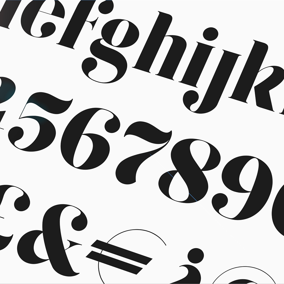
This week, Jessica and Michael discuss the trend toward chunky, serif typefaces, also known as Didones, to convey trust, authority, and good health, whether on a carton of Chobani yogurt or a wellness startup.
Jessica talks about the increasing difficulty of distinguishing between human expression and bot activity online, and the opportunity for designers to resolve that confusion:
Is it possible that a smart designer understanding transparency and truth and clarity — which is what design is, right? We are good at understanding and transmitting clarity — could there be a type of graphic or a design set of decisions in UX design, in experience design, in graphic design, that help people understand the difference between what is fake and what is real?
Michael points out that graphic designers are also
just very good at simulating things. We’re good at taking things and making them look real.
Also mentioned this week:
- Rachel Hawley, The Outline, Didone, Font of the Decade
- UX Collective, The State of UX in 2020
- Kyle Chayka on Twitter: “branding from four different healthcare startups”
- New York Times Magazine, 1619 Project
- Jeffrey Goldberg, The Atlantic, Introducing A New Look for The Atlantic
- Sui-Lee Wee and Paul Mozur, New York Times, China Uses DNA to Map Faces, With Help From The West,
- Paul Mozur Twitter thread on China DNA tracking
- Paul Mozur and Aaron Krolik, New York Times, A Surveillance Net Blanket’s China’s Cities,
- Nick Waters, Bellingcat, Are Historic Mosques in Xinjiang Being Destroyed?,
- uwu Twitter thread of Hong Kong Protest Imagery,
- Quartz, The Magical World of Japanese Anime is Becoming The Reality of Hong Kong Protestors
- Rachel Cheung, South China Morning Post Hong Kong protest art: Meet The Student Leading The Defiant Design Team,
- Inkstone News, The Art of Hong Kong protests
- Vice, Hong Kong Protest Art is a Good Blend of Wolves, Umbrellas, Dicks and Zombies,
- Design Observer, Your Favorites of The Decade,
- Dog of Wisdom on YouTube
- Steve Stewart-Williams, Twitter, Dog Playing Jenga
- Lauren Yapalater, BuzzFeed, This Dog Can Literally Play Jenga and Do A Million Other Things,
- Uncut Gems trailer
Subscribe to The Observatory on Apple Podcasts or your favorite podcast app, or follow Design Observer on Spotify or Soundcloud.
Observed
View all
Observed
Share on Social
By Michael Bierut & Jessica Helfand
 Jessica Helfand is an artist and writer based in New England. A former critic at Yale School of Art and one of the founding editors of Design Observer, she is the author of several books on visual culture including Self Reliance, Design: The Invention of Desire, and Face: A Visual Odyssey. jessicahelfand.com
Related Posts

Design of Business | Business of Design
Lee Moreau|Audio
The Past, Present and Future of Design with Lee Moreau, DB|BD Season 12 Finale
Design As
Lee Moreau|Audio
Patrick Whitney on Designing for What’s Next | Design As Season Finale
Design As
Lee Moreau|Audio
Design As Creation | Design As Consumption
Design As
Lee Moreau|Audio
Design As Short | Design As Long
Related Posts
Design of Business | Business of Design
Lee Moreau|Audio
The Past, Present and Future of Design with Lee Moreau, DB|BD Season 12 Finale
Design As
Lee Moreau|Audio
Patrick Whitney on Designing for What’s Next | Design As Season Finale
Design As
Lee Moreau|Audio
Design As Creation | Design As Consumption
Design As
Lee Moreau|Audio