July 10, 2013
Ernst Reichl: Wide Awake Typographer

Maybe it’s just me, but I get intrigued by a designer who, not knowing if or when anyone will read it, writes:
During the years I worked for Knopf they never let me design a book: I laid out the newspaper ads and the subway cards, and the closest I came to the books themselves was flap-copy layouts, and one typographic book jacket (This is a story by itself!) But six years later, when H. Wolff employed me, I had apparently gathered enough of a reputation to be trusted with book design. I have a feeling that, with The Buried Rose, I meant to get even with them. There may be more over-designed books in print, but I, at least, have never put out more lavishly.
Or this about a poetry book, as originally formatted:
The tall format
Fits the short lines
Of the poems;
And the typeface
Of all the name heads
Looks as if it had been taken
From gravestones—As, indeed, it was.
The author of the Elegies
Must have been
A very sad man,
But not quite as sad
As the illustrator, whose name
Is mentioned nowhere.
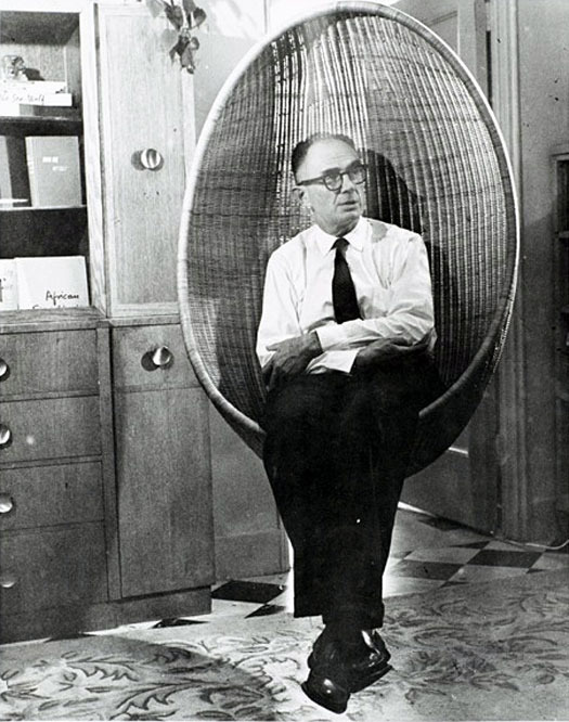
The writer of these comments was Ernst Reichl (1900-1980), a German-American book designer, active and prominent in New York’s publishing industry from the 1930s to the 1970s. He arrived from Germany in 1926 with a PhD and experience in book publishing and design. He was a ‘whole book’ designer, believing in the harmonious totality of the package and the value of one design vision for all its parts. Reichl rose to become one of our top trade book designers, prolific and award-winning. He actively promoted the profession and high standards in book publishing, by example and through writing, teaching and exhibitions.
A serious reader (he read broadly and seldom designed without reading the manuscript), Reichl was also a scholar, and a fine writer. The latter activity was an unexpected discovery in his papers by this researcher, and the catalyst for an exhibition of his books now at Columbia’s Rare Book and Manuscript Library.
Midway in his career, Reichl began to reflect on many of the books he designed in written comments; he spent more time on this during the period 1977-1978, shortly before his death in 1980. In the end, there were approximately 550 3 x 5 inch index cards on which he hand-wrote his thoughts about selected books he designed. In lively prose Reichl comments on myriad elements of book design and details of book production, several for each book. He covers typography, binding design and jackets, illustration, publishers, the publishing industry in New York, design colleagues (revered and annoying), production triumphs and problems, how well the book sold, his opinion of the book and his philosophy of book design as applied to that title. He also critiques his own work, sometimes in the moment, sometimes from the perspective of more time and experience. These comments, often sharp and humorous, are highly entertaining and informative. I know of no other book designer who has done this so extensively. In this exhibition, Reichl’s comments have been transcribed from the cards, and accompany the appropriate books in a selection of over 100 examples from his archives.
The exhibition organizes the books by these themes: AIGA 50 Books; Books for Children; Working with Authors; Book Design Concepts; Title Pages; Fun & Tradition; Bindings, Covers & Jackets; Production Challenges; Book Typologies; and Joyce’s Ulysses.
Reichl was a designer for some leading publishers (Knopf, Doubleday & Doran, Random House, Holt Rinehart & Winston), some significant authors (Gertrude Stein, Kurt Vonnegut, William Saroyan, Joyce Carol Oates) and individual books (James Joyce’s Ulysses, 1934, for which he is best known and previously described in this DO post; Austin Tappan Wright’s Islandia, 1942; Bud Schulberg’s The Disenchanted, 1950; Marshall McLuhan’s The Mechanical Bride, 1967; The Layman’s Parallel Bible, 1973). His books were regularly included in the American Institute of Graphic Art’s annual 50 Books award program. His most public contribution to the ‘conversation’ about modern book design was his collaboration with five other book designers to curate the 1951 exhibit “Books For Our Time” in New York.
While Reichl’s personal biography as an immigrant is of some interest, it is background to his professional dedication to practicing and promoting the highest quality of book design in the trade publishing industry from the 1930s into the 1970s. For Reichl, high quality meant book design that responded directly to the content of the book, that used the best type and typesetting available, the best paper available, and binding materials that were both traditional and newly developed. He wanted (and very often got) complete control of the whole book from typesetting to binding and jacket design. He pushed traditional manufacturing methods into new areas, and he experimented with binding materials and processes. He welcomed production challenges (complexity, time, money, materials, processes) and seemed to thrive when he could achieve some new result, especially if it broke with tradition.
The exhibition runs July 8 to September 13 at the Rare Book and Manuscript Library, 6th Floor, Butler Library, Columbia University.
Observed
View all
Observed
By Martha Scotford
Related Posts

Innovation
Ashleigh Axios|Essays
Innovation needs a darker imagination

Business
Kim Devall|Essays
The most disruptive thing a brand can do is be human

AI Observer
Lee Moreau|Critique
The Wizards of AI are sad and lonely men

Business
Louisa Eunice|Essays
The afterlife of souvenirs: what survives between culture and commerce?
Recent Posts
Sam Furness got serious about investing in his curiosity. Now, he’s helping others do the same. Corporate crisis is design’s opportunity In a world that feels impossible to change, emerging designer Deborah Khodanovich is starting small Elixir Design founder Jennifer Jerde believes in the human touchRelated Posts

Innovation
Ashleigh Axios|Essays
Innovation needs a darker imagination

Business
Kim Devall|Essays
The most disruptive thing a brand can do is be human

AI Observer
Lee Moreau|Critique
The Wizards of AI are sad and lonely men

Business
Louisa Eunice|Essays

 Martha Scotford taught design and design history at the College of Design, North Carolina State University.