
June 21, 2013
Every Little Thing

All photos mine, unless otherwise noted. A reader complained about my using my own photos on a previous post. I am doing because I’ve had enough of perfect, professional images of architecture, and I am trying to show you what I noticed. If you would like to follow me on Instagram, my feed is @langealexandra.
I spent part of last weekend at the Michigan Modern symposium, giving a talk on Alexander Girard, a decade-long inhabitant of the tony Detroit suburb of Grosse Pointe and a longtime designer for Zeeland’s Herman Miller. I heard talks about roadside architecture, the origins of the shopping mall, and the origins of Herman Miller’s ongoing design excellence. Though designers from Detroit (and former furniture capital Grand Rapids) often took their talents to Los Angeles, New York, Santa Fe, all of the participants struggled to define what these famous and not-so-famous names learned from Michigan. I thought the answer was all around us, where we ate, where we listened, where we walked.
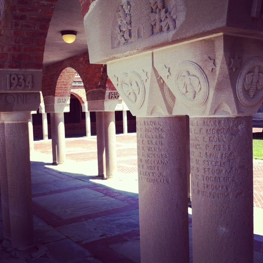
The symposium was held at Cranbrook, the educational community for children and adults alike masterminded by Finnish architect Eliel Saarinen from 1927 to 1931. Eliel Saarinen was the architect, and his romantic version of modernism is particularly strong in the buildings of Cranbrook proper. Kingswood, the girls school, is done in a lighter, more delicate style, as would have been seen as appropriate for young women. But really, the Cranbrook schools were a group project, employing Eliel, wife Loja, a weaver and teacher, and children Eero and Pipsan Saarinen to design decor, furniture, and heraldic motifs. Saarinen family friends were invited to teach, to sculpt, to weave, to carve. The end result is a set of related but not monotonous buildings where you feel every little thing has been thought through.
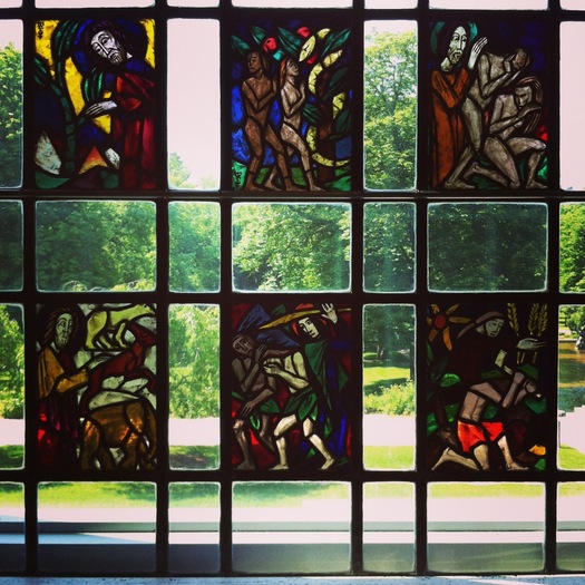
The chairs in the dining hall where we ate our breakfast dated from the 1930s; they had high backs, like some Viennese furniture of the early modern period, and each one had an inset cast-metal crane. It looks exactly like this view from 1936 today, thanks in part to an on-site carpentry studio, ready to keep the priceless furniture in repair. To eat one’s granola with a plastic spoon off such a table and chairs seems slightly unseemly. At the end of the long, barrel-vaulted room, there is a tall leaded-glass window, subdivided into smaller section. Each section has a slightly different geometric pattern, chevrons or squares, diamonds or triangles. It would have been perfectly useful and perfectly beautiful all the same, but because they could make it more detailed, they did. Being at Cranbrook gave me renewed faith in the concept that architects and their collaborators can and should think everything through, from how you sit to the railing you grasp, to the passages you walk through. Because they could make it more personal, they did.

Vintage rendering, General Motors Technical Center (via Archinect)
The heritage of that attention to detail can be seen in other, postwar modern works around Detroit. The most obvious is the General Motors Technical Center, designed by Eero Saarinen and completed in 1956. Eliel had been hired for the job, but first the war and then his own ill health intervened, and the executives at General Motors ended up turning the enormous job over to the son. We were able to tour two buildings at the Tech Center as part of the symposium (no photos), and the parallels in the process are remarkable. The younger Saarinen also called upon the talents of friends and relations, many affiliated with Cranbrook, from Florence Knoll to Marianne Strengell to Girard, and worked with GM engineers on the curtain wall system and luminous, modular ceilings. The details are well in advance of high tech: plastics and industrially-finished metal, rather than wood and molds, but the idea of customization, the ability to manage the feel of the close-to-hand and the look of the grand, urban gesture are here too. One of the most American aspects of the Tech Center, which definitely owes a debt to Mies van der Rohe’s plans for the Illinois Institute of Technology, is the glazed-brick end walls. Saarinen worked on the glazes and colors with Stengell, a weaver and teacher at Cranbrook, and also (likely) Girard. The colors are still shocking and vibrant today.
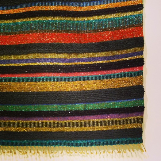
In the thorough exhibition of Michigan design accompanying the symposium (and open trhough October 13), there is a wall hanging Strengell made for Alcoa, using aluminum thread, as part of their experimental designers’ series Forecast. (it is for this series that Charles and Ray Eames invented their Solar Do-Nothing Machine.) The weaving combines traditional means with new materials to create a monumental textile. This, it seemed to me, was another example of how every little thing counts.
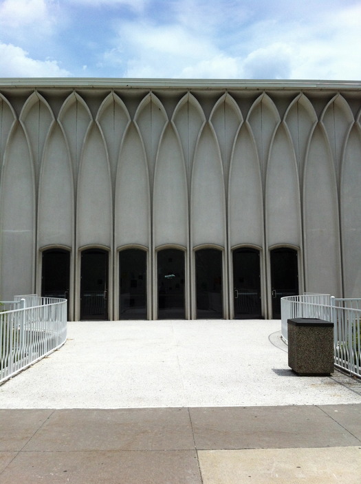
Second-to-last stop on my tour was a tour of three buildings by a well-know architect whose Michigan origins are often forgotten: Minoru Yamasaki. The architect of the Twin Towers and Pruitt-Igoe practiced in Detroit for most of his career, and was, in fact, the project architect for the Tech Center at asscoiated firm Smith, Hinchman and Grylls. He had a friendly rivalry with the Saarinen office. Between 1957 and 1964, soon after a decisive trip to Japan (Yamasaki was born in Seattle), he built four building on the Wayne State University campus north of downtown Detroit. I saw three of these, including a newly restored reflecting pool behind the McGregor Memorial Conference Center.

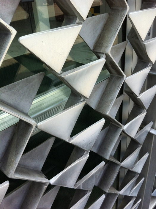
The critique of Yamasaki has often been that his work was too delicate (too feminine?) for big buildings, and that its refinement was lost at 100 stories plus. The Wayne State buildings are all much smaller, made of white concrete with metal details. Each has a different interpretation of pointed Gothic, an academic reference, but here the little arches and thin columns bring the buildings down to pedestrian scale. At McGregor, probably the nicest, Yamasaki thought of everything: sunscreens and a cast, triangle-patterned door, a sunken conversation pit and diamond-patterned mullions. It’s unusual, it’s thorough, and I found it quite beautiful. Designers are competitive people, and I think Yamasaki was developing his signature at Wayne State just as Saarinen has developed his at the Tech Center. He was also trying to think of every little thing.
Observed
View all
Observed
By Alexandra Lange
Related Posts

Business
Courtney L. McCluney, PhD|Essays
Rest as reparations: reimagining how we invest in Black women entrepreneurs
Design Impact
Seher Anand|Essays
Food branding without borders: chai, culture, and the politics of packaging

Graphic Design
Sarah Gephart|Essays
A new alphabet for a shared lived experience
Arts + Culture
Nila Rezaei|Essays
“Dear mother, I made us a seat”: a Mother’s Day tribute to the women of Iran
Recent Posts
Courtney L. McCluney, PhD|Essays
Rest as reparations: reimagining how we invest in Black women entrepreneurs Food branding without borders: chai, culture, and the politics of packaging Why scaling back on equity is more than risky — it’s economically irresponsible Beauty queenpin: ‘Deli Boys’ makeup head Nesrin Ismail on cosmetics as masks and mirrorsRelated Posts

Business
Courtney L. McCluney, PhD|Essays
Rest as reparations: reimagining how we invest in Black women entrepreneurs

Design Impact
Seher Anand|Essays
Food branding without borders: chai, culture, and the politics of packaging

Graphic Design
Sarah Gephart|Essays
A new alphabet for a shared lived experience

Arts + Culture
Nila Rezaei|Essays

 Alexandra Lange is an architecture critic and author, and the 2025 Pulitzer Prize winner for Criticism, awarded for her work as a contributing writer for Bloomberg CityLab. She is currently the architecture critic for Curbed and has written extensively for Design Observer, Architect, New York Magazine, and The New York Times. Lange holds a PhD in 20th-century architecture history from New York University. Her writing often explores the intersection of architecture, urban planning, and design, with a focus on how the built environment shapes everyday life. She is also a recipient of the Steven Heller Prize for Cultural Commentary from AIGA, an honor she shares with Design Observer’s Editor-in-Chief,