A rich and diverse range of topics were covered at the inaugural Face Forward International Typography Conference which took place over two days in December 2015, in Dublin, Ireland. Sara Jamshidi, until recently Design Observer’s senior designer, attended the peer-reviewed conference at which typographic identity, authenticity, ethnicity, and security through disciplines as disparate as linguistics, philosophy, history, and architecture were explored. Sara, along with four attendees, wrote dispatches from the conference, which we are featuring this week.
++++
What if designers weren’t bound by an ideology? asked Jamie Mahoney at Face Forward. Mahoney, Director of the Bowe House Press at Virginia Commonwealth University’s School of the Arts, hit on a significant issue that affects current letterpress practice. Quoting from Neil Postman’s Technopoly, she said: “embedded in every tool is an ideological bias, a predisposition to construct the world as one thing rather than another, to amplify one sense or skill or attitude more loudly than another.” While Postman uses this idea to critique new technology, Mahoney applies it to letterpress, pointing out that the choice of letterpress as a tool for visual communication is an ideological one as much as an aesthetic one (limiting oneself to the digital realm is also an ideological choice in her mind).
While many of the presentations at Face Forward focused on digital and screen typography, letterpress was well represented, with not only Mahoney’s talk, but presentations by John Mulloy, Mary Plunkett, Jamie Murphy, and Thomas Mayo. With its unbroken lineage back to Johannes Gutenberg and the birth of movable type, letterpress is central to the development of typographic practice and its dissemination. Letterpress has moved from being the dominant commercial form of printing to that of a niche pursuit, often with a deliberate emphasis on craft and authenticity.
What may appear to be a statement of the obvious is, in fact, an identification of a fault line that perfectly delineates the space that letterpress currently occupies. The letterpress revival borrows much of its ideology from the Arts and Crafts movement of the late nineteenth century. Both set themselves in opposition to new technology and mass manufacture, preferring instead to seek solace in an imagined past. The fact that letterpress was itself a revolutionary technology and that it was the dominant form of commercial printing into the second half of the last century, must be suppressed for this ideology to make sense to its adherents.
Mahoney’s recent work explores this question and she presented a series of case studies showing work created using digital and letterpress technology in unison. Her approach is to actively counter the inherent ideological bias in both forms and instead focus on the content of the work at hand.
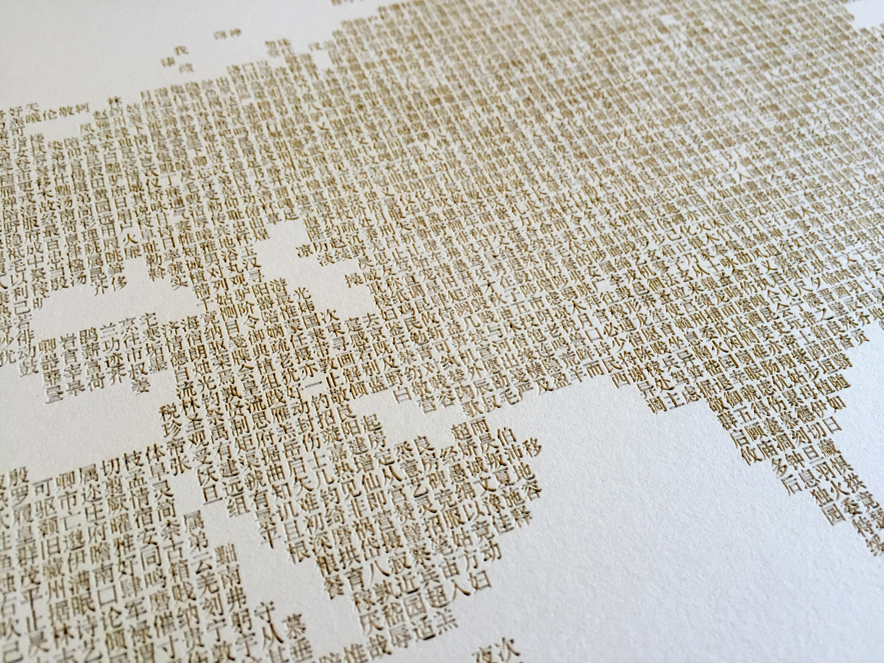
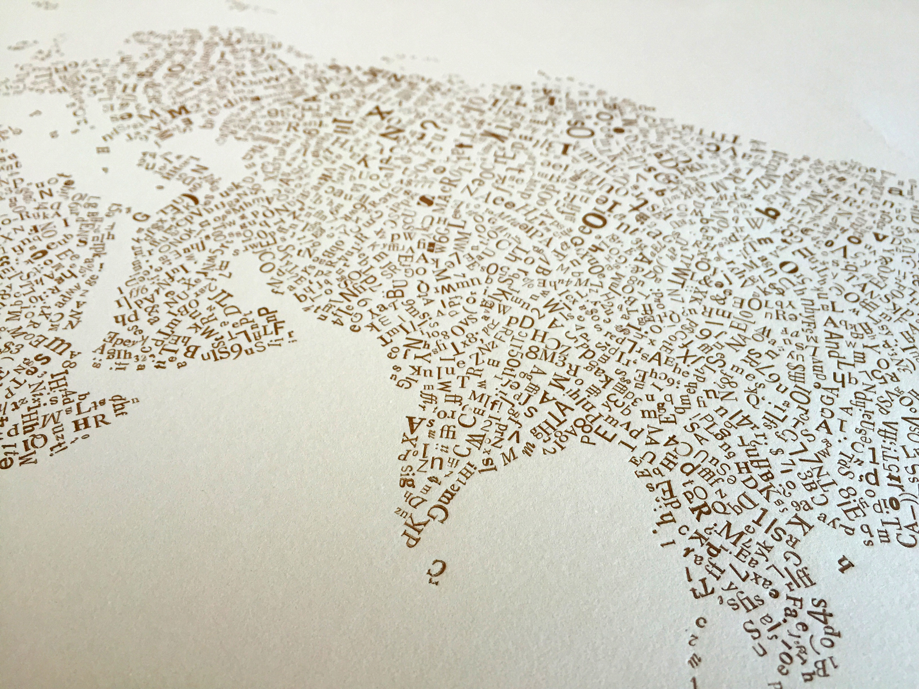
“Typology” is a large poster consisting of two letterpress-printed maps of the world. One map was printed from a laser etching of digitally set Mandarin letter forms randomly placed in the shape of the world map using the software program Processing. The second map was printed using hand-set Latin letter forms in metal type arranged using a laser cut wooden frame. While the poster is an impressive feat of printing, the digital and traditional elements exist in isolation to each other and the work doesn’t show the hybridization apparent in more recent work.


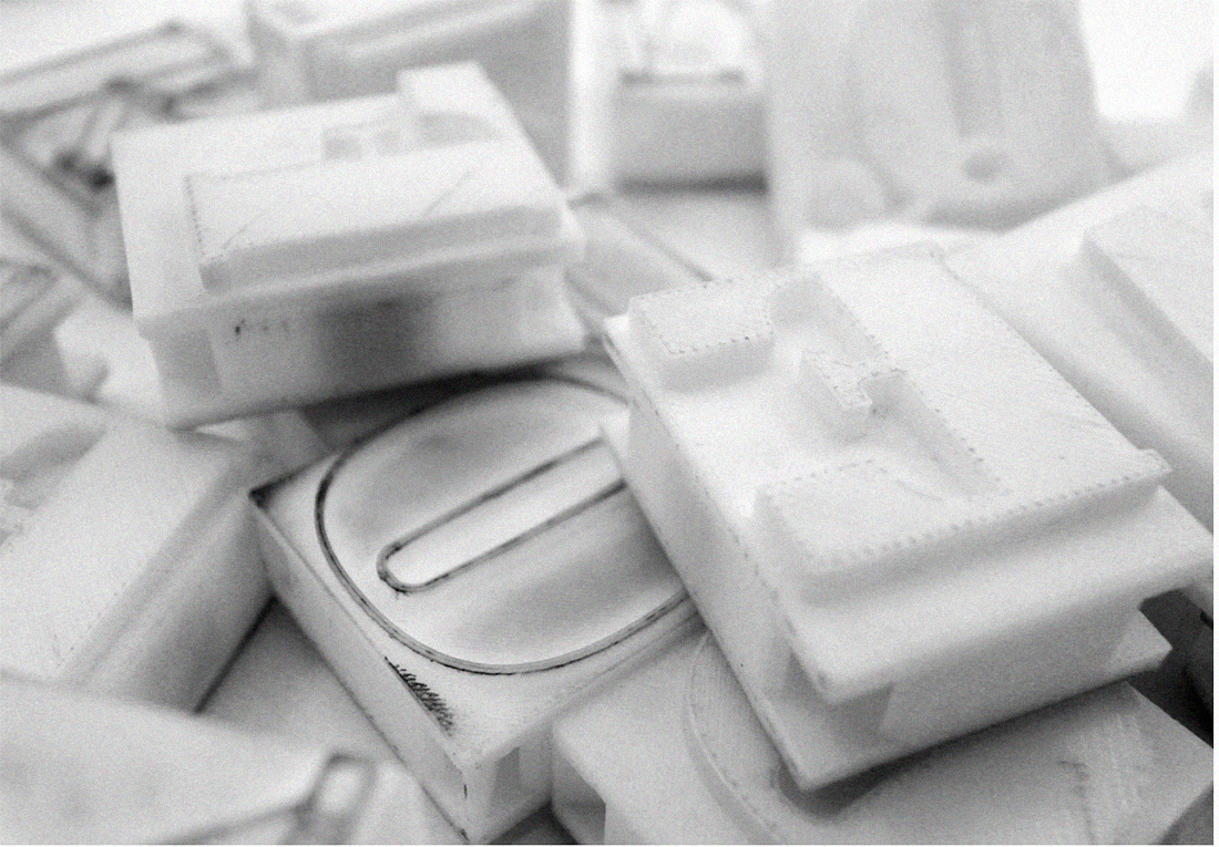
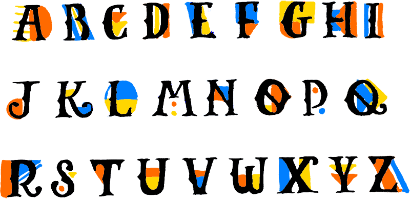
Mahoney has also experimented with 3D printed type but it is her combination of generative design with letterpress that is most exciting. Using NodeBox, a node-based software application for generative design, Mahoney initially manipulated letter glyphs to form an abstract rotated pattern in three colors. Polymer plates were then produced and letterpress printed.

Subsequently, Mahoney has used NodeBox to take larger datasets (Metallica lyrics or earthquake statistics) and created visuals to represent the data in an expressionistic manner. The resulting images were then letterpress printed using split-fountain or other techniques that accentuate the physical nature of the process. The finished prints emphasize the hybrid nature of their production, displaying the aesthetic attributes of both emerging digital design and traditional letterpress printing.


Mahoney’s main role as Director of the Bowe House Press is that of educator. In the discussion after her presentation, she stated that students are mainly drawn to the letterpress studio as the hands-on experience offers an alternative to the digital one. In other words, the students initially see letterpress as an either-or proposition, an assumption that is widespread with users of the technology.
Mahoney believes that embracing one tool shouldn’t imply the dismissal of another. By introducing the students to letterpress as another tool of the visual communicator, rather than an ideological stance, Mahoney is creating a space where a new visual language may evolve. Rather than resuscitating an outdated technology, the Bowe House Press is using letterpress to explore new ways forward.

