March 17, 2016
Face Forward: X Marks the Spot
++++
From uncertain origins X has emerged as a polyphonic sign for our times. Simultaneously ubiquitous yet elusive, the multiplicities of X were presented at the Face Forward conference in Dublin as the many instances of a character actor. The sign’s ambiguity facilitates a new mode of critical discourse around current typography, graphic design practice and pedagogy. Examination of the sign from a historical perspective offers new ways of thinking about graphic design in which the underlying social, cultural, economic, technological and political forces that have influenced aesthetic trends and material production can be exposed and evaluated. From a potent (X rating) symbol to a sign of power and democracy (Emperor Constantine’s chi-rho monogram from which we derive Xmas), to an unknown energy (X-ray) or inferior product (brand X), to a secret code (station X at Bletchley Park, WW2), to a contemporary trope (X factor), X has become “one of the defining letters of the millennium.”

Before X entered the English (Latin) alphabet as a linguistic signifier, X can be identified as a universal symbol that has stood for a meeting point, the monogram of Chronos the god of time, the four corners of the world and the four elements. Prehistoric examples of this graphic mark can be found on rock paintings, masonry and pottery from Palestine and Crete representing early examples of visual identity and ownership. Few letters follow a linear evolutionary route from visual symbol to consistent linguistic glyph. Both the visual form of X and its phonetic values shifted across languages and over time — as an abstract mark X has entered and exited several alphabetic systems over time representing several different sounds — until around 1100 BC when the Greeks formed a more visually cohesive group of linguistic signs. There is a lexical ambiguity in the phonetic modes of X. This oral/aural flexibility provides clues to its ambiguity, evidence of which is identifiable in the English language today. The common “ks” sound suggests a connection between X and “kiss” yet its origins may lie with the Anglo-Saxon (UK) use of X as a common sign on legal documents: the X was kissed as confirmation. Over time, especially in correspondence, X has become a mark of affection, sometimes accompanied by O to represent hugs and kisses: XOXO.

The role of the printer in contributing to a sign’s meaning can be found in the production of Descartes’ mathematical work La Geometrie, published in 1637: the letters a, b and c were chosen to represent three known constants, while x, y, and z were used for three unknown constants. X, because of its rarity of use, became the common sign for an unknown: the printer ran out of the other letters. In a similar exploitation of communication tools and rarity of use, the X on a typewriter was employed as both the key for a letter of the alphabet and also a sign of an error.

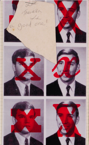
As a hand-rendered mark of authenticity X has been employed as the signature of both the king and illiterate citizen, signifying ideas of individuality yet also anonymity. For instance, as the individual mark of a voter in the UK, X is both particular and collective. Further examples of positive anonymity include Malcolm Little changing his name in 1952 to Malcolm X. That same year, Robert Capa first uses “Generation X” to describe an unknown generation of young people in a photo essay for Holiday magazine. In Douglas Coupland’s (1991) narrative X is deployed to represent an ‘unknown generation’ as a social category: a placeholder and anti-status sign in a subcultural context. In the US science fiction TV show the X-Files (1993–2002), X stands for the unknown, unclassified and rejected. By contrast, there are several examples of X meaning “experimental” (midget submarines named “X craft” launched in 1942) and “extreme” (X rating film classification, 1951–1982 by the BBFC for films of violent or sexual nature).

Sign-orientated meaning continuously shifts in the social domain of graphic design. What the life and tangential roles of X offer design discourse is a historical thread along which visual communication in society and culture, consumerism and philosophy can be more critically reflected on. The story of X is framed as a critical history because, by more thoughtfully considering past applications and interpretations of visual signs, we can be better prepared to envision a future for the discipline.
Observed
View all
Observed
By Cathy Gale

