
October 19, 2017
Assessing the Past; Looking Toward the Future
How the new AIGA Google Art Project “Across Borders: A Look at the Work of Latinx Designers” revealed insights about archived Latinx work of the past—and clues to its ascendance in the future of design.
Following previous online exhibitions that honored African American History and Culture and American Democracy, AIGA has partnered with the Google Cultural Institute yet again to celebrate Hispanic Heritage Month with “Across Borders: A Look at the Work of Latinx Designers.” I spoke with designer, professor, and AIGA Diversity & Inclusion taskforce member Julio Martínez, who co-curated the project with fellow task force member Jessica Arana. We spoke about curating the online exhibition of Latinx work (which spans decades), where Latinx design fits within design history, how his heritage inspires his work, and what can be done about the low visibility of Latinx work in design today. According to Martínez, it starts with pointing it out. Lucky for us, he is putting words into action.
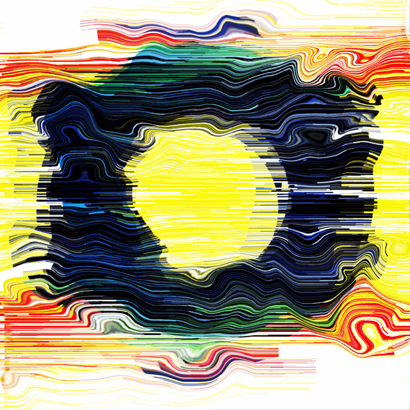
“Equality for all.” Luis Fitch, 2015. Courtesy AIGA Design Archives.
Lilly Smith: What were the biggest challenges and surprises you met in curating content for this project?
Julio Martínez: At first, we asked if we could pick designers from anywhere, because there’s a lot of great designers anywhere… but all of the pictures had to come from the AIGA archives. So that was the limitation. We kind of had to dig and grapple with it, as the archives haven’t been that updated. Due to the little work that has been captured by the organization [editor’s note: partly due to the stop of competitions for economic reasons, with the recession], there were some limitations.
There were a few [designers] that were omitted that were redundant, but that was more the exception than the rule. Once we got our list, it was more of a collaboration as far as getting images. As far as how we pick them, it’s a matter of growing the archives for future editions.
If you look beyond the organization, there are smaller initiatives that are collecting [Latino] work. But there needs to be more—there isn’t a great cohesive collection of what this work is. When I talk to Latino designers, they aren’t really worried about documentation—so much of it is in-house, so they have their own internal circuits and they have no need to expand beyond that. There are plenty of collection devices out there but they seem to be siloed. The question is, is there a way for AIGA to aggregate them?
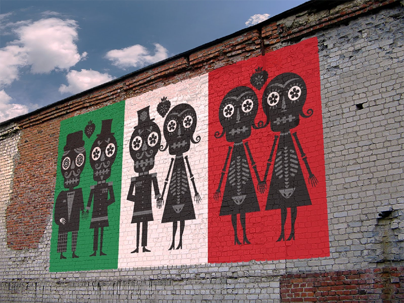
Rodrigo Corral Design, 2007. Courtesy AIGA Design Archives.
LS: The collection spans from well-known designers, like Rodrigo Corral, to lesser known designers like Claudia de Almeida, to those that are canonical, like AIGA Medalist Pablo Ferro, AIGA Medalist Rebeca Méndez, and Antonio Alcalá. Were there any highlights or surprises from curating the “Across Borders” project?
JM: My surprise was being able to enjoy Pablo [Ferro]’s titles. Being able to dig into “Dr. Strangelove,” which I hadn’t really seen before, was new to me. I’d be curious to know what my students know or don’t know. To the uninitiated, being able to find that all that great work did come from Latino designers would be a great lesson.

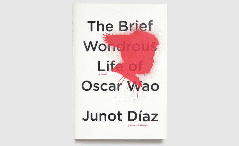
Pablo Ferro, 1964. Courtesy AIGA Design Archives.
LS: For those who don’t know the term, what does “Latinx” mean, and why is this distinction important?
JM: Jessica [Arana, Martínez’ co-curator] and I went back and forth on that… we wanted to recognize gender neutrality. I asked my students if that’s something they’re using and they’re not. But we wanted to acknowledge that term: that we didn’t want to use a gender specific pronoun, and to show that AIGA is using it. There is some newness about it, but we felt strongly about having it recognized.
LS: What is the place of Latino design in the history of design, and what else do you think can be done to enhance its celebration?
JM: From my perspective—this is the big caveat—Latin America still, up until about a decade ago, did not have a great design sensibility. It didn’t have a typographic/graphic heritage. I’m from Mexico. We have a great tradition over the last century in architecture; the arts… But in looking at visual communication, we weren’t fully cognizant until about a decade ago.
Typography in Latin America has gotten immensely beautiful… It’s just ascendant. Mexico City will be named the design capital of the world in 2018. When I graduated from design school in 2001, it was hard to find graphic design programs in Mexico. But all of that has just greatly multiplied in the last decade. It’s in a position of upcoming power. I’d be excited to see what happens next.
In California, [growth] is inevitable. In the next decade, the Latino student population will outnumber everyone else. There will simply be a lot more Latino designers. What we can do to enhance work now is just to look at it. As far as what this project is about… it’s pointing to the work that’s being done. Students don’t know about [Latino designers]. There’s a general lack of awareness. Celebrating is almost the easy part because the work is there and it has its own momentum. We just have to point to it.
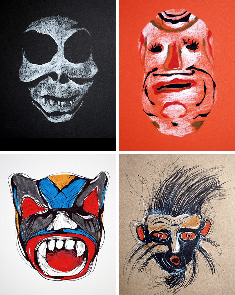
Works from Martínez’ “Cien Mascaras” project, for The Lines, a separate entity he “developed in 2010 to capture personal projects and explorations centered around typography & illustration.” Images courtesy Julio Martínez.
LS: You were born in Mexico City. When there isn’t a direct inspiration, say with your Cien Mascaras project, how does your heritage influence your agency work if at all?
JM: It’s funny because with everything I just said, I don’t take my nationality or heritage into my work. We do a lot of branding at my design firm—we’re much more about straightforward minimalism; problem-solving. So I do draw a line between those two things. In my personal illustration work [my heritage] comes out more. I don’t know if that was a conscious move. The foundation of the design school I attended was pretty Swiss. In many ways, I never went back to thinking about what my culture was until many years later. So that has been a later foray—wanting to find out a little more about that. But at that time, the train had left the station and I liked to work in a clean, crisp way. Now, I like being able to dig deeper without worrying about the client.

Left: Marks for Studio 1500 clients. Right: Studio 1500 work for Core Magazine. Images courtesy Julio Martínez.
LS: There seem to be a fair amount of trendy agencies coming out of Mexico City these days—Anagrama, Futura, Savvy Studio. Mexico City now has La Laboratorio para la Ciudad, an office for civic innovation and urban creativity. How do you evaluate the impact of Mexican design on the international scene?
JM: It’d be interesting to see how it goes beyond the states. I don’t know that it’s found its own voice. A lot of Anagrama’s work is rooted in regular branding aesthetics, but the impact that it’s had is that Latin America is ready to appreciate the work in a way that it hasn’t before. So it’s signalling that. And it’s a matter of landing on the stage. I’d have to dig deeper as to whether it’s actually influenced work. Will future students look at Futura as compared to Pentagram? We’ll have to see.
LS: Who are some current Latinx designers that inspire you?
JM: This gets into the dual side of things. A lot are illustrators: Alejandro Magallanes; Isidro Ferrer. When I look at Latino design, it’s pretty clean: think of Anagrama. It doesn’t have the uniqueness yet of someone like Alejandro Magallanes.
I mentioned Latino type. I get more excited about type in Latin America. Daniel Hernández and Miguel Hernández, who are partners; and Luciano Vergara is great. The Mexican type designer Cristóbal Henestrosa does fabulous work. I teach typography. If I had a normal agency day job, I don’t know if I’d have the impetus to keep digging. [Editor’s note: Martínez later mentioned Gabriel Martinez Meave and Mexico-based design firms Sociedad Anónima, yeye, and Monumento as sources of inspiration.]


Works from Martínez’ “Type experiment” series. Images courtesy Julio Martínez.
LS: Thinking beyond Mexico City, where is the perspective of Latinx designers absent and what can be done about it?
JM: The short answer is everywhere. I still struggle to go past the fourth or fifth name that is working in this area and doing work that I admire. It’s still just such a small percentage. Here (in California) we have a little more than most of the country. But in the Midwest and East, it’s harder and harder to find Latino designers.
One goal would be to see more Latino designers starting businesses. That’s a very biased viewpoint on my side, but I don’t know very many independent Latino-based design agencies. There’s so much design needed at all levels. The percentage of Latino designers overall is low.
There are some parallel tracks. AIGA stopped collecting work for economic reasons. When they stopped collecting everyone did. This has been a challenge for everyone. Those challenges are parallel to the industry—that there’s no fulcrum to go to.
There are a few other [archives and repositories] that have spawned on their own. But that’s a challenge of its own… Hopefully there will be more that follows.
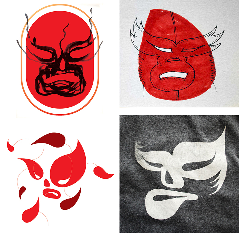
Works from Martinez’ “Luchadores” series. Images courtesy Julio Martinez.
Martínez cofounded design agency Studio1500 along with Erik Schmitt in 2007, after both had worked at Pentagram San Francisco. Martínez began teaching in 2011 in the Department of Design at San Jose State University. He later joined the AIGA San Francisco board as Diversity Chair in 2012, and joined the national AIGA Diversity & Inclusion task force in 2014.
View the AIGA Google Art Project “Across Borders: A Look at the Work of Latinx Designers,” now.
Observed
View all
Observed
Share on Social
By Lilly Smith
Related Posts

Arts + Culture
Alexis Haut|Interviews
Beauty queenpin: ‘Deli Boys’ makeup head Nesrin Ismail on cosmetics as masks and mirrors
Design Juice
Rachel Paese|Interviews
A quieter place: Sound designer Eddie Gandelman on composing a future that allows us to hear ourselves think

Design of Business | Business of Design
Ellen McGirt|Audio
Making Space: Jon M. Chu on Designing Your Own Path

Design Juice
Delaney Rebernik|Interviews
Runway modeler: Airport architect Sameedha Mahajan on sending ever-more people skyward
Recent Posts
Minefields and maternity leave: why I fight a system that shuts out women and caregivers Candace Parker & Michael C. Bush on Purpose, Leadership and Meeting the MomentCourtney L. McCluney, PhD|Essays
Rest as reparations: reimagining how we invest in Black women entrepreneurs Food branding without borders: chai, culture, and the politics of packagingRelated Posts
Arts + Culture
Alexis Haut|Interviews
Beauty queenpin: ‘Deli Boys’ makeup head Nesrin Ismail on cosmetics as masks and mirrors
Design Juice
Rachel Paese|Interviews
A quieter place: Sound designer Eddie Gandelman on composing a future that allows us to hear ourselves think
Design of Business | Business of Design
Ellen McGirt|Audio
Making Space: Jon M. Chu on Designing Your Own Path
Design Juice
Delaney Rebernik|Interviews