When looking at an individual letterform we are confronted by what is essentially an abstract image, as a letter only begins to exercise the ability to communicate semantic information when it is placed in the collective context of the other twenty-five characters of the alphabet. This is a fundamental principle of phonetic writing in languages using the Latin script, and as such, it is a concept that is often taken for granted and overlooked.
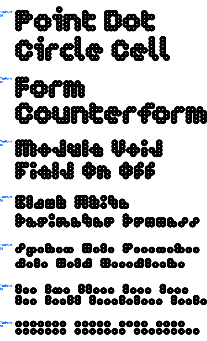
However in a new series of typefaces produced by MuirMcNeil, this relationship is unavoidable. The series is made up of four fonts, but to begin with I should make it clear that each one is really a set of typefaces by itself, following its own system of rules. For this piece, as a primary example, I will stick to simply talking about TenPoint, which seems to sum up much of what I find interesting about the collection. It is described on the MuirMcNeil website straightforwardly as “a modular type system constructed from repetitions of a single cell–a circular disc with an open counterform–within a fixed geometric grid.”

Though very quickly we get a seismic shift in the language and the ambitions for the typeface are divulged. “It is an attempt to locate typographic objects at the lowest limit of their function as vehicles of language and to codify their visual arrangements.”
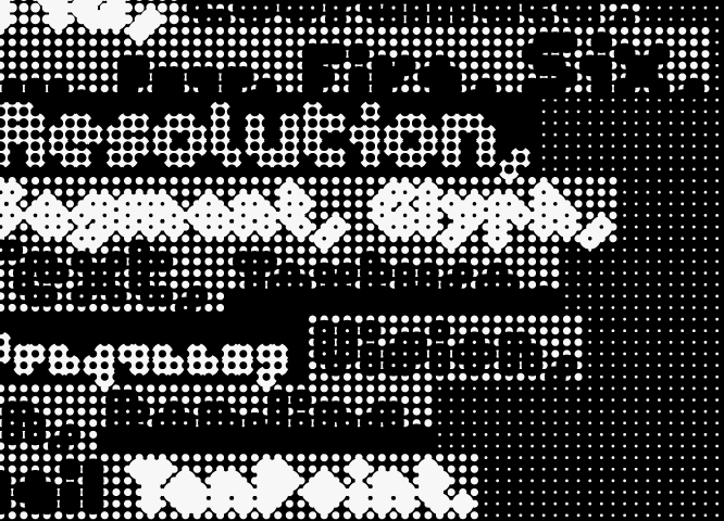
As we move through the variations of TenPoint’s system, the forms of the letters reduce and simplify; at first they stylize, as the contours become confused. Before long the letters lose their recognizable shape, yet on mass the combinations that make up the words are still just about decipherable. This comprehension is, however, quickly left behind and by the time we reach TenPoint 01 all we are left with is a series of perfectly identical black dots, stringing out where the letters once sat.
My first thought is to Samuel Beckett, whose character Molloy in the novel of the same name, declares: “You would do better, at least no worse, to obliterate texts, than to blacken margins, to fill in holes of words until all is blank and flat and the whole ghastly business looks like what it is, senseless, speechless, issueless misery.” But, before too long, my brain adjusts and I can see that the remaining text is not senseless at all, let alone blank and flat.
Yes the separate units, essential to alphabetic language, are no longer distinguishable and the structure of a phonetic system has been left behind. Yet, the values of the once expanded letterforms remain present in each black dot. Now, as with every font, the letterforms depend on their relationship with the other elements of the typeface and we are required to consider them holistically as opposed to individually.

At this point the broader design and the application of the typeface begins to work almost like a character in an ideographic writing system, in which a symbol or pictograph is used to communicate the word (Chinese characters are a common example of the ideogram in use today). The totality of the information is now contained in the image created by the broader aesthetic design as opposed to through the phonetic ordering of its constituent parts.
In much the same way as the non-representational form of the contemporary Chinese character for “horse” has evolved through iterations of increasing abstraction from an ancient pictogram depicting a horse, this collection of glyphs, which once depicted an alphabetic text, is now purely pictographic.
The physical structure of the letterform is being explored here; what is our language made up of and how is it quantified, and as such one cannot ignore the nod to the pixel, which it seems MuirMcNeil are directly referencing through this series. All four font systems, TwoPoint, ThreePoint, FourPoint and TenPoint utilize permutations of a series of dots, which constitute the body of each letter.

Whether it is through points or pixels, typefaces have always been measured in units. From Gutenberg’s application of interchangeable characters within a manageable writing system of phonetic construction, to the act of zooming into a working document on the screen until all that remains is a series of colored squares; separate unit values have always been central to typographic design. Now consider the moment when TenPoint reaches its extremity of abstraction, a point at which all that the font seems to be trying to communicate is its own quantifiable existence.
MuirMcNeil’s fonts play with the ideas of what a typeface is and what it does. Through considering its various states of existence, from language to object to image, they always come back to the fundamental notion that the letter is dependant on its constituency and its relation to something else.
As I retreat through the iterations of TenPoint, the familiar forms of alphabetic language begin to gradually return, however the re-emergence of “words” does not necessarily come as a relief; MuirMcNeil suggest that “as words, begin to become more complex, more defined and thus more identifiable. Normal service is resumed as rudimentary levels of readability begin to be achieved.”
This may well be the case, but in an age when the structure of communication is up for debate, the issues surrounding the very fabric of written language brought up by these fonts should not be immediately forgotten.
Images courtesy MuirMcNeil