January 19, 2010
Big Book, Small Reward

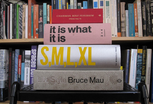
Among the trends I’d like to see disappear in this new decade, right up there with urban taxidermy and use of the term “foodie,” is the mania among design professionals for obscenely fat monographs. You’re accustomed to the formula by now: a jacketless brick of a book, gnomic text minimally deployed, full bleed images run page after page after page. It was admittedly brilliant when Rem Koolhaas and Bruce Mau introduced it, back in 1995, with the publication of S,M,L,XL. That book came as a form of liberating empowerment. The two men had applied Koolhaas’s architectural modus operandi — rethink the essential parameters of whatever program a job entailed — into the making of a book: No longer would it be a mere container for text, but a three-dimensional object in its own right, a fully integrated vessel of word and image.
The latest entry to this field, It Is What It Is, comes courtesy of 2×4, a New York firm with a long history of association with Koolhaas. The book has been received with some avidity, and it’s no surprise, for the design world had been anticipating a book from 2×4 for a long time. The firm’s principals, in particular Michael Rock, are not only gifted visual thinkers but pugnacious writers on the subject of design authorship. Rock is probably best known for his 1996 Eye essay, “Designer as Author,” often misinterpreted as a battle cry for designers to generate their own material. With “Fuck Content,” published in 2005, Rock made his position a bit more clear. It was the way of making — call it process or “treatment” — that mattered. The essay concluded with a quote from Roger Ebert: “A movie is not what it is about, it’s how it is about it.” This ostensibly applied to design as well.
What catnip it was! The designer as a transformative thinker rather than merely a form-giver, a true hero for the global age! S,M,L,XL, inevitably, became a model. Who wouldn’t want a big fat doorstop advertising their genius? Fat books feel good in the hand and they feed the ego. They impress the hell out of clients. Best of all, they’re easy to make. Designers, visual thinkers by nature, could be spared the difficult and time-consuming work of making an argument in words. Images would suffice, and if the result had a cryptic air to it, all the better, for the mystery would only add a bit of cache to the proceedings.
The latest entry to this field, It Is What It Is, comes courtesy of 2×4, a New York firm with a long history of association with Koolhaas. The book has been received with some avidity, and it’s no surprise, for the design world had been anticipating a book from 2×4 for a long time. The firm’s principals, in particular Michael Rock, are not only gifted visual thinkers but pugnacious writers on the subject of design authorship. Rock is probably best known for his 1996 Eye essay, “Designer as Author,” often misinterpreted as a battle cry for designers to generate their own material. With “Fuck Content,” published in 2005, Rock made his position a bit more clear. It was the way of making — call it process or “treatment” — that mattered. The essay concluded with a quote from Roger Ebert: “A movie is not what it is about, it’s how it is about it.” This ostensibly applied to design as well.
That quotation is repurposed in the introduction of It Is What It Is, which purports to be a “portrait of a studio” rather than a traditional monograph. “This book is a blurry telling of a blurry story,” the introduction states. “It superimposes diverse projects, scales, eras and voices onto a typical trajectory, starting from first contact and concluding with delivery into the world.” Effectively, it’s the literary equivalent of a hard-drive dump, a cliché we know from countless sci-fi and action movies. But here, instead of a rapid-fire montage that concludes with the film’s hero seizing on some lost bit of buried information, we have 1,000 unstructured pages, one image to a page, that add up to — exactly what I’m still not sure. If the argument is that the design process is messy and essentially unmapable — “practically autistic” in the book’s own words — then why waste everyone’s time in the first place?
Judged purely on its own terms — on how it is about what it is about! — It Is What It Is is a formulaic work, an appropriation of the Koolhaas/Mau system with some additional borrowings from Irma Boom, though without the painstaking craft that makes her work so special. It begs one to ponder the costs, both real and conceptual, of introducing yet another fat book into the marketplace at a time of scarcity. Make no mistake. From a materials standpoint, fat books are wasteful: they use lots of paper, and their size and weight make transportation and storage an energy intensive business. Ergonomically, they’re less than ideal: they’re too bulky to carry around and they’re a pain to navigate. But like an overgrown loudmouth at a party, they have a have a way of dominating the conversation, in large measure by virtue of their size. (This book, for instance, has now generated two posts on Design Observer.) It’s simply a matter of space. Though we like to think of the intellectual world as a zero-sum arena, where more is always better, that’s not quite the case. We only have so much space in our lives, and so much room on our shelves. Just for example, It Is What It Is takes up as much room in my design library as monographs on the work of Ed Fella, KarlssonWilker, and Robert Brownjohn combined. Something has to give.
The ultimate frustration of this book, however, comes not so much on any moral grounds but as a general feeling of lost opportunity. The book is stuffed — overstuffed — with compelling material, and one would like to see the nimble minds of 2×4 reckoning with it in some kind of rigorous and original fashion. The conceit of the book, in the end, reads as hollow, for it allows them to punt on any kind of engagement with the complex ways their work is about what it’s about. For instance, how does one juggle one’s political and moral principles with the imperatives of making money? In 2006, recall, Rock declined Laura Bush’s invitation to attend the National Design Awards ceremony at the White House, justifying the protest in an open letter that referenced the Bush administration’s “disdain for the responsible use of mass media.” But leaf through It Is What It Is and you’ll find that 2×4 also designed graphics for Koolhaas’s Chinese Central Television tower in Beijing — that is, a propaganda wing of a government assailed by human rights organizations.
Does this make Rock and his partners cynical hypocrites? I’m reluctant to arrive at such an ungenerous conclusion. I recently wrote a book about Peter Paul Rubens, a most admirable man (and occasional design professional) who took on work from some pretty unsavory regimes. Choosing and managing clients in a world of forced compromise are some of the more difficult challenges any designer faces; it would have been interesting to hear how one of the field’s leaders goes about its business. Alas, 2×4 has not given us that book. But, you know, it is what it is.
Observed
View all
Observed
By Mark Lamster
Recent Posts
Minefields and maternity leave: why I fight a system that shuts out women and caregivers Candace Parker & Michael C. Bush on Purpose, Leadership and Meeting the MomentCourtney L. McCluney, PhD|Essays
Rest as reparations: reimagining how we invest in Black women entrepreneurs Food branding without borders: chai, culture, and the politics of packaging


