Arts + Culture • Business • History • Media
April 22, 2008
The Passion of George Lois

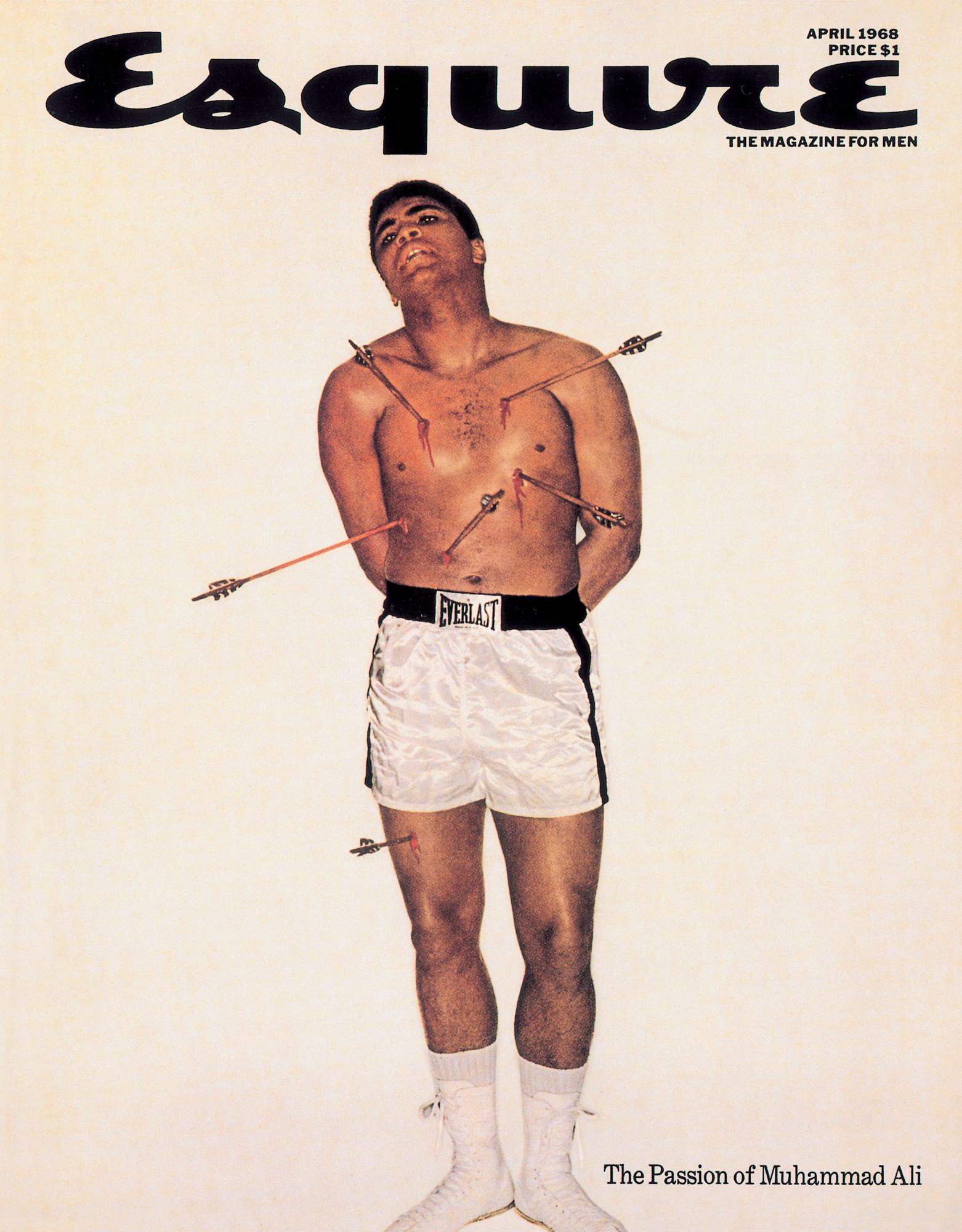
George Lois and photographer Carl Fischer with Muhammad Ali, 1968
Editor’s Note: George Lois passed away November 18, 2022. In 2008, Adam Harrison Levy wrote this essay for Design Observer, and followed up eight years later with a further retrospective of his work. In the intervening years, Adam also interviewed Gorge Lois about his most iconic recipe, which just happens to be for Thanksgiving stuffing.
If you walked through the ultramodern glass and marble lobby of New York’s Seagram Building in the early 1960s, ascended a flight of stairs past the famous Picasso tapestry, and entered the Four Seasons restaurant for lunch, you would find him seated at table 37, one booth over from what would soon become Andy Warhol’s regular spot. George Lois may have been eating Dover sole and drinking white wine, but he would also have been working: brainstorming, sketching or pitching for an account.
Advertising was Lois’s medium, and advertising, in the early 1960s, was hot. It was the go-to industry of the time, the place where ideas and money converged, where you could hurl your creativity into the marketplace and almost instantaneously make an impact. And Lois wanted impact, big time. “I think advertising should be like poison gas. It should grip you by the throat, it should bowl you over, it should knock you on your ass.”
He was one of a handful of advertising men who were at the forefront of what would later be called the “creative revolution.” America was on the precipice of major cultural and political changes, Kennedy had just been elected President and the complacencies of the 1950s were being questioned. In the world of advertising, this translated into an attack against the conventions of the old guard advertising agencies and the people who ran them. These were the men in the proverbial grey flannel suits, who actually did drink three martinis at lunch and took the 5:04 commuter train back to their comfortable homes in Westport. A new generation, made up of ambitious young men and woman, who were largely Jewish, Irish and Italian, were aiming to shake up this culture with their brand of sophisticated, rebellious and witty advertising. And George Lois was leading the way.
“They are the precursors of the counterculture. They discovered ways of using advertising to embrace this new ethic, that is the ethic of cool” says Joel Meyerowitz, now a well-known photographer but who was, in the early 1960s, just another ambitious kid from the Bronx who was trying to break into the glamorous world of advertising “It was like hipster insider stuff.”
Lois understood all this instinctively. He was in sync with the culture and he knew it. “I understood the culture, and I understood how to get ahead of the culture” he recalls now, “I used to say that I wanted to be 13 weeks ahead, which is the length of a TV cycle.”
A street smart Greek kid born of immigrant parents, he grew up in a tough working class Irish neighborhood (with a nose, broken nine times, to prove it). His father was a florist and the young Lois absorbed his sense of pride in craft, along with an enormous capacity for hard work. After a stint in art school, Lois plunged headfirst into the world of advertising and almost immediately clashed with the staid, comfortable establishment. When one account executive deliberately walked on his layouts, which had been carefully laid out on the floor for inspection, Lois quickly rolled up his art work, grabbed the overhang of the man’s imposing desk and flipped it over, sending papers and the contents of the drawers flying. “A streak of ink actually surged from the desk’s executive well and hit the wall like a Rorschach splotch” he recalls.
Lois was a rebel adman with a cause and that cause was to create ads that connected with the public, that weren’t nostalgic, or condescending or full of the usual advertising puffery. He had no interest in continuing the visual legacy of the conformist 1950s — the nostalgic depictions of an idealized family life, the rows of earnest product descriptions, the smarmy text. He was inspired by modernist design, with lots of white space and powerful images, which he hoped would elicit an almost visceral response from his audience.
In 1959 he worked on the Volkswagen campaign, which was conceived by the leading creative agency of the time, Doyle Dane Bernbach. DDB, as it was known, was the hot agency of the moment, run by another outsider, the Jewish Bill Bernbach. Bernbach believed in allowing his art directors to work directly with copywriters, in small non-hierarchical teams that generated creative energy, as opposed to the heavyhanded account-led system favored by the larger, more established firms. Lois enjoyed working at DDB so much that he set an alarm clock to go off at midnight to remind himself to go home every night.
At DDB, Lois teamed up with a brilliant and eccentric copywriter, Julian Koenig. Koenig, with another DDB art director named Helmut Krone, had come up with immortal “think small” copy for the VW ads — ads which had single-handily taken on the ultimate symbol of the consumer society, the huge, outsized, baroque chrome and metal Detroit automobile. The VW was the antithesis: small, unchanging in its design and economical. Lois and Koenig were sent to Wolfsburg, Germany by DDB to tour the VW factory in the hope that an on-site inspection would generate some more creative ideas. Lois admits that they weren’t polite guests. When being shown around the town, they asked their German guide to point out the ovens, and when they spotted the spire of a picturesque church, they compared it to the caisson of a V-2 rocket (Dr. Nordhoff, then head of VW, refused to speak to them again). Back in New York they told Bernbach that they hadn’t come up with any new ads but the marketing problem was now clear: they had to “sell a Nazi car in a Jewish town.” Bernbach wasn’t amused but the VW campaign famously went on to make that car the essence of counter-cultural radicalism.
A year later, Koenig and Lois and an account man named Fred Papert decided to strike out on their own and establish their own agency, Papert Koenig Lois, or PKL. On January 1, 1960, they took offices in the sleek Seagram Building, the Mies van der Rohe skyscraper which epitomized the cutting edge of modern design. “I didn’t have the money to pay the rent. I didn’t have an account. It was just five of us and passion.”
The passion, along with their talent worked; within a week they had landed the Renault account and PKL was up and running. Set up like a mini-DDB, with art and copy teams working in tandem and a minimum of bureaucracy, they quickly began to make an impact with their racy, visually striking campaigns.
For Wolfschmidt Vodka they showed a tomato being propositioned by a phallic bottle. “You’re some tomato. We could make beautiful Bloody Marys together. I’m different from those other fellows” read the copy. “I like you, Wolfschmidt. You’ve got taste” replies the tomato. A week later, the faithless bottle approaches an orange: “You sweet doll, I appreciate you. I’ve got taste. I’ll bring out your inner orange. I’ll make you famous. Roll over here and kiss me!” “Who was that tomato I saw you with last week?” the orange replies. Humorous and lighthearted, the campaign reflected looser attitudes towards sex in a country that was soon to discover the Pill.
Lois was quick to exploit the visual power of the new medium of television. When the agency landed the account for an obscure duplicating machine made by a small firm called Haloid-Xerox, he decided that the best way to spend their meager budget was not to launch a conventional campaign in trade magazines, as the client wanted, but to make a bold and arresting statement on TV that would instantly turn Xerox into a household name. He needed a visual gimmick that would grab everyone’s attention so he shot an ad with a little girl, who is asked by her father to make a copy of a letter. She skips over to the Xerox machine with a rag doll under her arm, pushes a few buttons, copies the letter and then puts the rag doll face down and copies the doll as well.
The ad ran during a CBS television news special and Xerox’s competitors cried foul: no copier could work that easily, they declared. The Federal Trade Commission was asked to step in to verify that the ad wasn’t a hoax. To prove that it wasn’t Lois pulled it off the air and scheduled a reshoot. He invited the FTC and the executives of CBS to the set. But instead of using the little girl, he brought in a monkey. With the cameras rolling, the chimp waddled over to the machine, dropped the doll on the copier, punched the correct buttons, and bingo out came copies of the doll. Lois had not only proved his point but he had also shot a much better ad. Sales of the Xerox 914 took off.
 But Lois’s most significant contribution to the culture of the 1960s were the covers that he produced for Esquire magazine. They were demonically inventive and visually bold; they helped the circulation for that magazine soar. The best of them turn on the impact of opposites: a young naked model, dumped unceremoniously in a trash can with the headline: “The New American Woman: Through at 21.” Or the face of Sonny Liston, the menacing heavyweight boxer, who had been imprisoned for robbery, posed as a black Santa Claus for a December issue at a time when racial tension gripped the country. According to Lois, Time called that cover “one of the greatest social statements of the plastic arts since Picasso’s Guernica.”
His most famous cover, though, is of Muhammad Ali, posed martyr-like as St. Sebastian with arrows piercing his body. This was at the time when Ali was out of jail on bail, waiting for his appeal to the Supreme Court to overturn his conviction for draft evasion. Ali was barred from boxing, and Esquire was planning to run an article about the agony of his limbo from the ring. Lois brought a postcard of the famous Castagno painting of St. Sebastian that hangs in New York’s Metropolitan Museum of Art to the photo shoot. The boxer studied the painting carefully. After a time, Ali pointed out a major problem: the painting was of a Christian and he was, famously, a Muslim convert. Ali got on the phone to his manager and spiritual advisor, Herbert Muhammad, to discuss the problem.
After some detailed theological conversations, Ali agreed to the shoot. As Lois and his photographer, Carl Fischer, worked on fixing the arrows to his body, Lois recalled that when Ali had converted he had declared: “I don’t have to be who you want me to be. I’m free to be who I want.” Looking at a now-relaxed Ali posing as St. Sebastian, Lois remembers seeing a man completely at ease with himself, a free man.
By the mid 1960s PKL was pulling in over $30 million dollars in billings. The company was the first really successful advertising start-up since Bill Bernbach and David Ogilvy had set up their respective agencies back in the 1940s. Other small, creative boutique agencies were springing up all over New York now, often in clear imitation of the PKL template.
Lois, the profane, pugnacious, ethnic kid from the Bronx, had successfully made his mark in world that had previously been ruled by men known more for their clubby conviviality than their knowledge of modernist design or their left hooks. He was now famous in his own right. The creative revolution was in full swing. The notoriety, and the work that continued to come in as a result, helped him to offset the costs of the 9,784 lunches he was, according to his own count, to eat at the Four Seasons.
Forty years later, the work Lois did in those days continues to resonate. A year-long exhibition documenting that extraordinary era, “George Lois: The Esquire Covers,” ran in 2009 at the Museum of Modern Art, New York City.
Observed
View all
Observed
By Adam Harrison Levy
Related Posts

Business
Courtney L. McCluney, PhD|Essays
Rest as reparations: reimagining how we invest in Black women entrepreneurs
Design Impact
Seher Anand|Essays
Food branding without borders: chai, culture, and the politics of packaging
Graphic Design
Sarah Gephart|Essays
A new alphabet for a shared lived experience
Arts + Culture
Nila Rezaei|Essays
“Dear mother, I made us a seat”: a Mother’s Day tribute to the women of Iran
Recent Posts
Minefields and maternity leave: why I fight a system that shuts out women and caregivers Candace Parker & Michael C. Bush on Purpose, Leadership and Meeting the MomentCourtney L. McCluney, PhD|Essays
Rest as reparations: reimagining how we invest in Black women entrepreneurs Food branding without borders: chai, culture, and the politics of packagingRelated Posts

Business
Courtney L. McCluney, PhD|Essays
Rest as reparations: reimagining how we invest in Black women entrepreneurs

Design Impact
Seher Anand|Essays
Food branding without borders: chai, culture, and the politics of packaging

Graphic Design
Sarah Gephart|Essays
A new alphabet for a shared lived experience

Arts + Culture
Nila Rezaei|Essays
