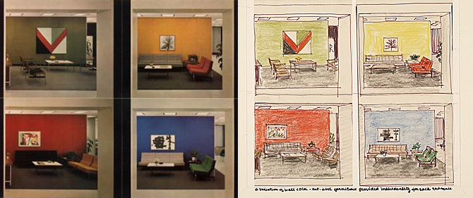
 Florence Knoll, sketches for reception areas in the CBS Building, 1964
In a recent Design Within Reach catalogue, one page was devoted not to the mission of selling nice, pricey furniture, but instead to honoring a minor mid-century masterpiece. The homage was made to a typographic relief that for several years enlivened one wall of the CBS cafeteria in the Eero Saarinen-designed, Florence Knoll-decorated “Black Rock” high-rise on West 53rd St. in Manhattan. The piece was a huge bas-relief of words about food, in three-dimensional fonts of all sorts and sizes, with food utensils sprinkled throughout. The producer of the work was Lou Dorfsman, the design director of CBS when the company, then known by its self-inflated nickname as “the Tiffany network,” moved into its black granite headquarters—a structure with all the monumental mystery of the potent slab in Stanley Kubrick’s 2001: A Space Odyssey.
To create the cafeteria wall, Dorfsman put together a team consisting of
Herb Lubalin, Tom Carnase (who made the 3-D typography),
John Alcorn, Stanley Glaubach, and Nick Fasciano. Knoll had originally had other ideas for the decoration of the cafeteria, but wisely let Dorfsman assemble his food-centric wall. The font-rich display spelled out words such as “hot dog,” “fudge,” “taco,” “halvah,” along with sayings such as “Eat, drink, and be merry.” The word “Eat” glowed in neon. And I followed its flickering suggestion, eating many a good lunch there. According to the DWR note, the wall was dismantled in 1990 but has since been reclaimed, and now appears in all its caloric/typographic glory at the
Culinary Institute of America in Hyde Park, N.Y.
I looked at the photo in the catalogue with nostalgia. I was working for CBS-TV when the company moved into Black Rock, and got a lesson in the way design can become dictatorial. The cafeteria wall was more entertaining than anything I’d seen anywhere else I worked, but life in the Saarinen/Knoll building had many less amusing strictures. When I started at CBS, most of the executive offices were in a non-descript building at 485 Madison Avenue, where secretaries and staffers even more junior than I sat in small spaces separated by frosted glass partitions that everyone chatted over. Next to my boss’s more impressive space, I had a narrow office with a window looking out on the street. There was a kind of looseness to the layout of the floors at 485, a friendly funkiness that seemed conducive to camaraderie and creativity. When I took the job, the West 53rd St. building was almost done and a move was imminent, but the Madison Ave. digs were so relaxed that I settled in and felt as permanently at home as anyone in a New York television job ever does.
When the time came for the move, excitement was high. At last, went the corporate thinking, CBS would have a headquarters suitable to its status as the top network, back when networks were the only game in TV town. I shared in the excitement until I arrived at the dark tower on the first Monday after the movers had somehow got everything across town. When I found my new office on the 35th floor, I realized with a shock that I had lost the window of my old off and now had a room without a view. In New York City, an office without a window is a kind of purgatory—and a sign of pecking order inferiority. And though I was not high up on a very vertical hierarchy, I was a few notches above the secretaries who sat at a group of four desks with a splendid view north toward Central Park. To make my windowless space even more confining, the walls were white metal, so after a few hours working on the press releases that were part of my daily chores I felt as if I’d spent a winter in the Arctic.
And here is where the dictatorship of design reared its perfectly manicured head. After a week or so, I began to wonder why there was nothing in my office to provide visual relief. When I asked a colleague who worked in the art department why she thought this was the case she—who as a privileged graphic designer was able to fill a corkboard with push-pinned tear sheets—told me there was a graphics committee, made up mostly of Knoll personnel, and that they were assigning office pictures according to executive rank. In a reflection of life itself, this meant that those at the top were looked after first, and those near the bottom were expected to wait their turn with a serf’s stoicism. The art itself was also adjusted downward, so that the top execs got original paintings by recognized artists, and D-level management types like me would probably end up in the macramé and movie poster class.
I’d been a marine grunt, so I knew a few things about a serf’s stoicism. But those stark white walls got on my nerves. After a couple weeks, I walked across the street to the Museum of Modern Art and bought a poster of a painting by Robert Motherwell, an abstract composition in blues and black (if I remember correctly). This, I figured, would fit in with the austerity of the Knoll décor, and give me some visual relief until the graphics committee deigned to drop by. Since the walls of the office were metal, I taped the poster to one of the white panels, next to the door and facing my desk, where I could see it but people passing by could not. The poster was a wonderful antidote for claustrophobia.
But it was temporary. The day after I put it up, I arrived at work to see my boss standing by the door of his office, frowning. This was unusual in two ways. First, he was a PR guy, almost incapable of frowning. Second, he never got in before I did. He beckoned to me and we went into his office. There was my poster on his desk, the tape hanging disconsolately from its corners.
“Are you trying top get me fired?” he asked, nodding toward the Motherwell. Before I could come up with a suitably sincere answer, he went on. “You know you’re not allowed to put anything up in the office. The graphics people are in charge of that, and you have to wait until they get to you. So take this thing home,” he pointed to the offending poster, “and don’t try any home decorating again.”
As he was lecturing me, the horrified realization dawned that the only person who would have seen the poster, other than my secretary, was someone on the night-time clean up staff. My boss had left before I went home the day before, so he had to find out about the poster through some kind of invisible spy network. This meant that, in the manner of East Germany’s Stasi, a lot of people were watching for any deviation from the corporate order. Some hard-working man or woman, spending long evenings dusting off desks and vacuuming floors, had been instructed to report any signs of graphical rebellion.
I took my abstract eye candy home, tacked it up in my kitchen, and learned to endure my igloo. By the time I left CBS for a better job, and eventually for life on a Greek island, the graphics committee (or should that be Kommitee?) had still not found their way down the ladder of letters to level D. I’ve always wondered what my successor finally ended up with.
Years later, as the executive editor of a photography magazine, I managed to enjoy a revenge of sorts. I was at a dinner in New York for art world luminaries. Sitting across from me was Lou Dorfsman. Lou was a nice guy, and not at all the dictator type; for all I know, the villain of the piece was Florence Knoll. But I couldn’t resist recounting the tale of the forbidden Motherwell for the enjoyment of the whole table. Did I notice a slight reddening of Lou’s cheeks? I certainly like to think so.
On my bucket list is a note to go visit that wonderful typography wall up at the Culinary Institute. I hope the neon “Eat” is still plugged in.


 Owen Edwards is the co-author of the design book Quintessence, and the author of its sequel Elegant Solutions. His latest book, Caught in the Act, a collaboration with Howard Schatz and Beverly Ornstein, was published in October of 2013.